' Landscape photography is the supreme test of the photographer- and often the supreme disappointment'
- Ansel Adams
- Ansel Adams
Statement of Intent:
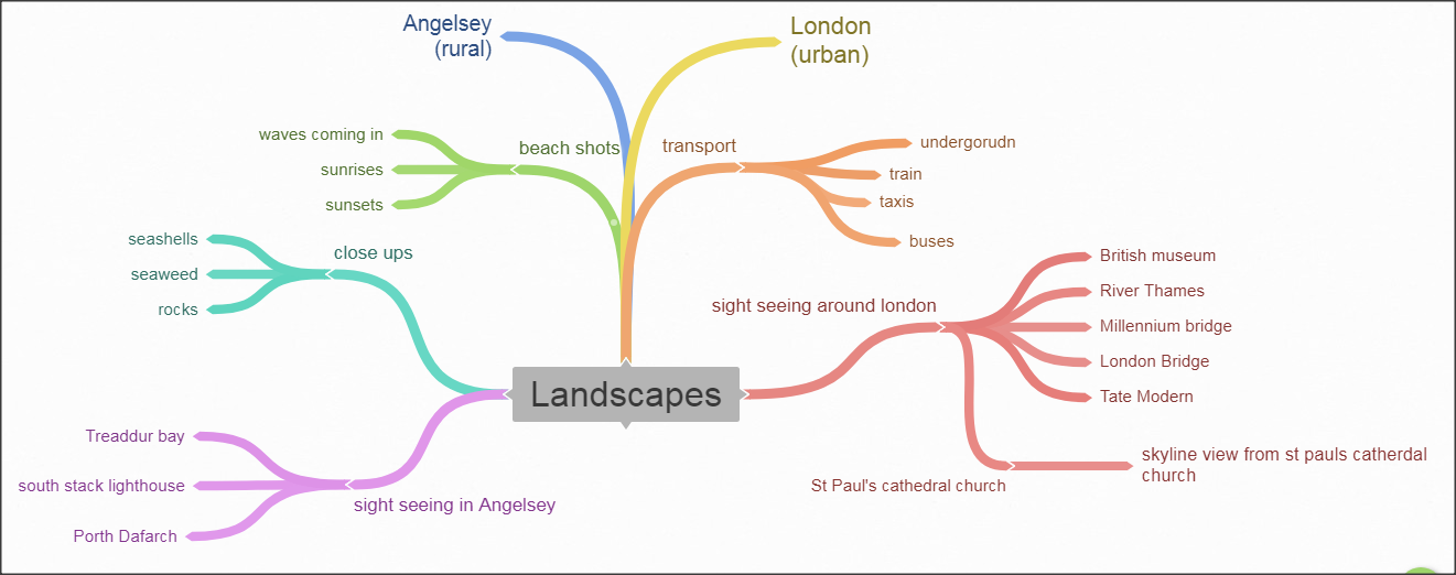
I aim to produce a portfolio of photos demonstrating my ideas, development, creative work and reflection based around the themes of Landscapes. Landscape shows the different precious unhidden locations in the world and the man-made features. I wish to portray my contrasting ideas through my photography of rural and urban landscape.
For my initial research, I will start by looking into rural photographers. I have two in mind that I will look at before I leave for my trip to Anglesey, Wales(rural areas). These are Adam Burton and Chris Reenie. I chose Chris Reenie because his rural photography really inspired me for my own work and have planned out in my head how I would like to take some pictures. I chose these two photographers because their work stood out to me the most as it really inspired me but both had different ways to display this. Also, I have been looking at two urban photographers for my trip to London. These are tom wood and Nico Goodden. They show contrasting pictures as Wood’s pictures are of old London and Gooddens’s are of modern London. They both have inspired me and show different contrasting ideas as you have old and modern London. I feel like it is important to show the contrasting views of rural and urban places as some places in the world do not get to be seen by everyone but everyone should see it's hidden beauty, that is the point of photography and this why I chose this themes, Landscapes, as I would love to capture hidden meanings in my pictures and make them effective and powerful as that is whole meaning of photography.
When I chose this theme, my initial thoughts were of buildings and fields but after looking into the project, my thoughts have widened up and I am thinking out of the box so my pictures will inspire someone else and boost my grades. I realised there are so many other routes I can such as locations, angles, architecture, rural areas, urban areas.
To show progression through my work I will start by researching other photographer and how they have taken their photos to inspire myself. Once I have taken these pictures I will develop them even further using Photoshop. I already have a lot of ideas for this project which will propel me in the right direction.
I have around an academic year to complete my portfolio of pictures as this is a big project and will need a lot of time to get it to be perfect. I aim to complete my artist research and analysis of photographs by the second week so I can go on the trips and capture the images I need to and take the rest of the time to develop my images and show my progression.
As my project progresses I will use annotations throughout my portfolio labelling my ideas and development clearly. This will also help me reflect on the work I produce. I will also seek advice from my teachers and peers on how to make my work better but also push myself to a higher grade as it is not impossible. After all my final outcomes I will show my best and worst for every picture and show my developed pictures in photoshop.
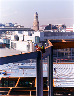
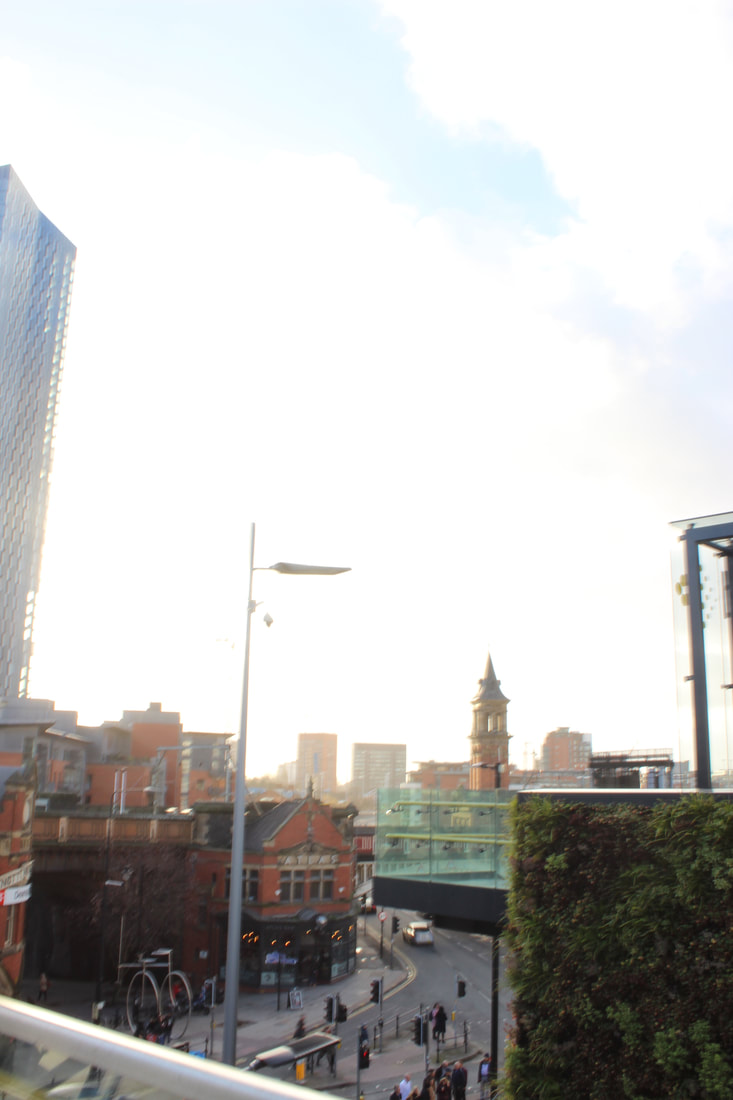
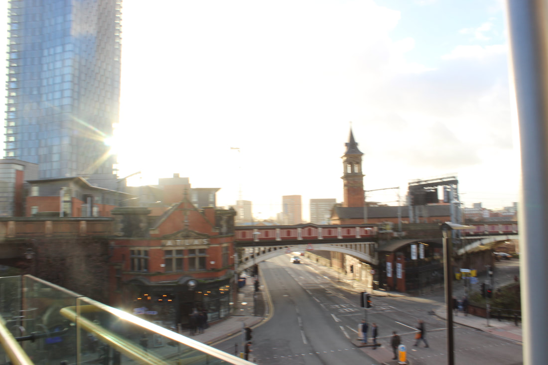
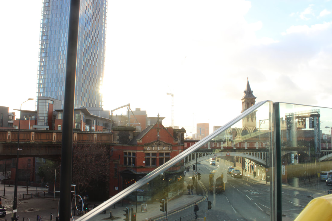
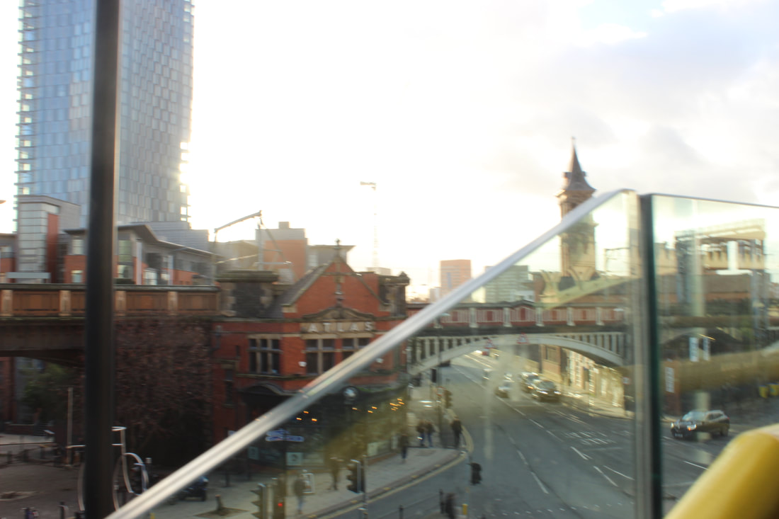
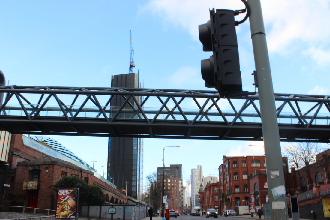
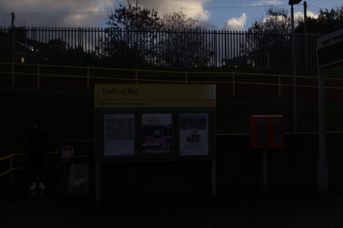
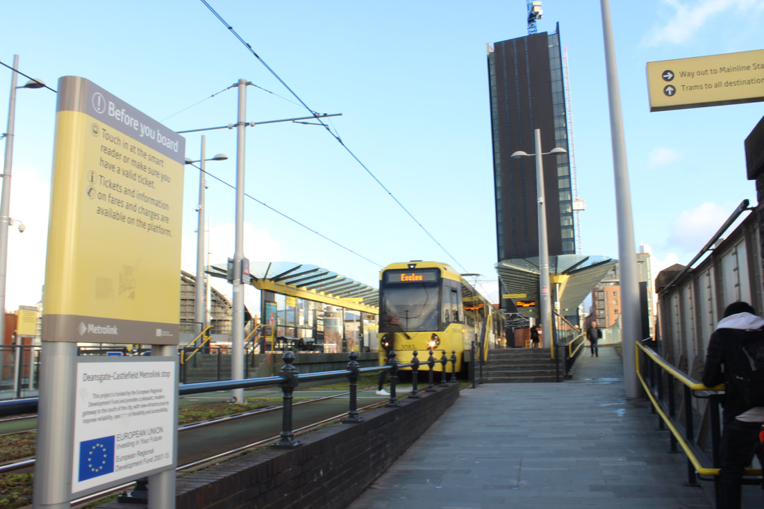
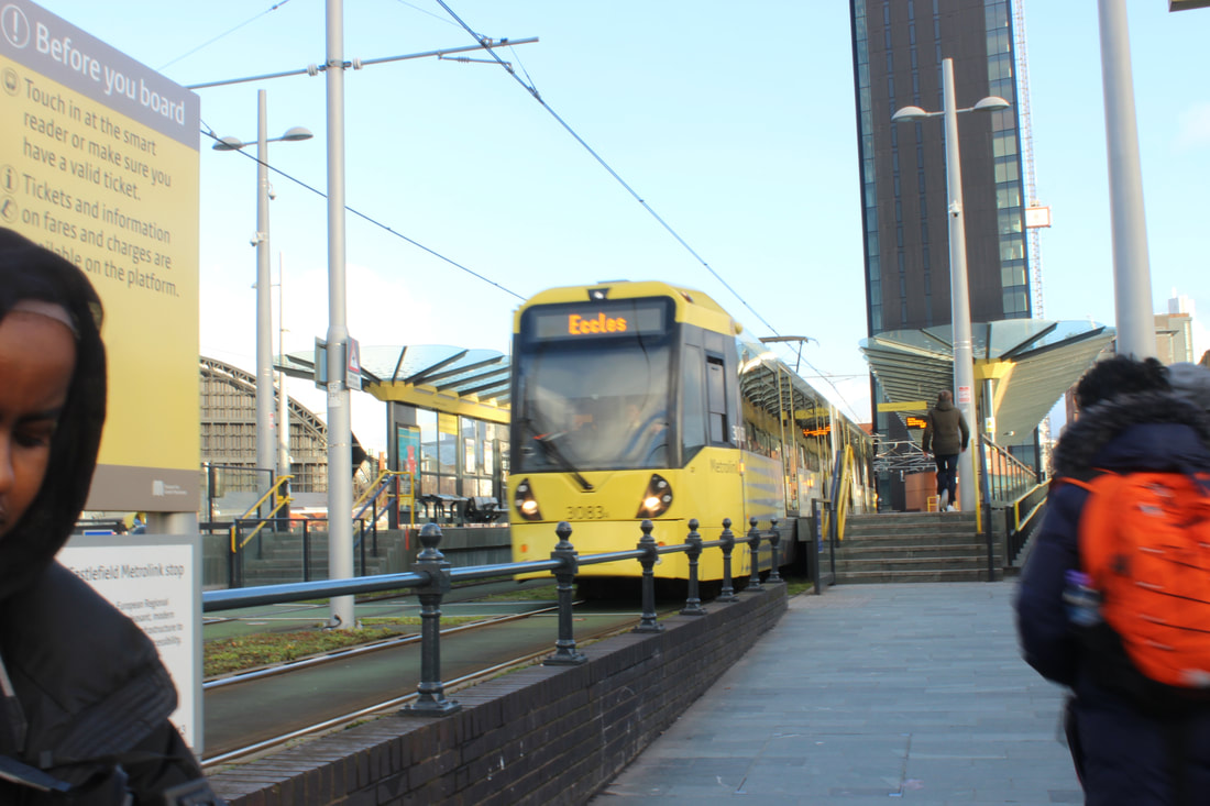
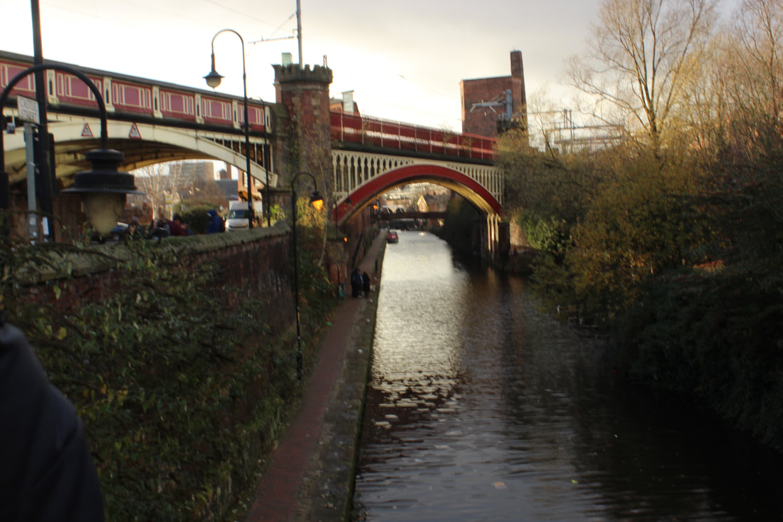
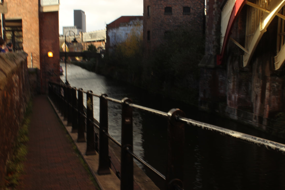
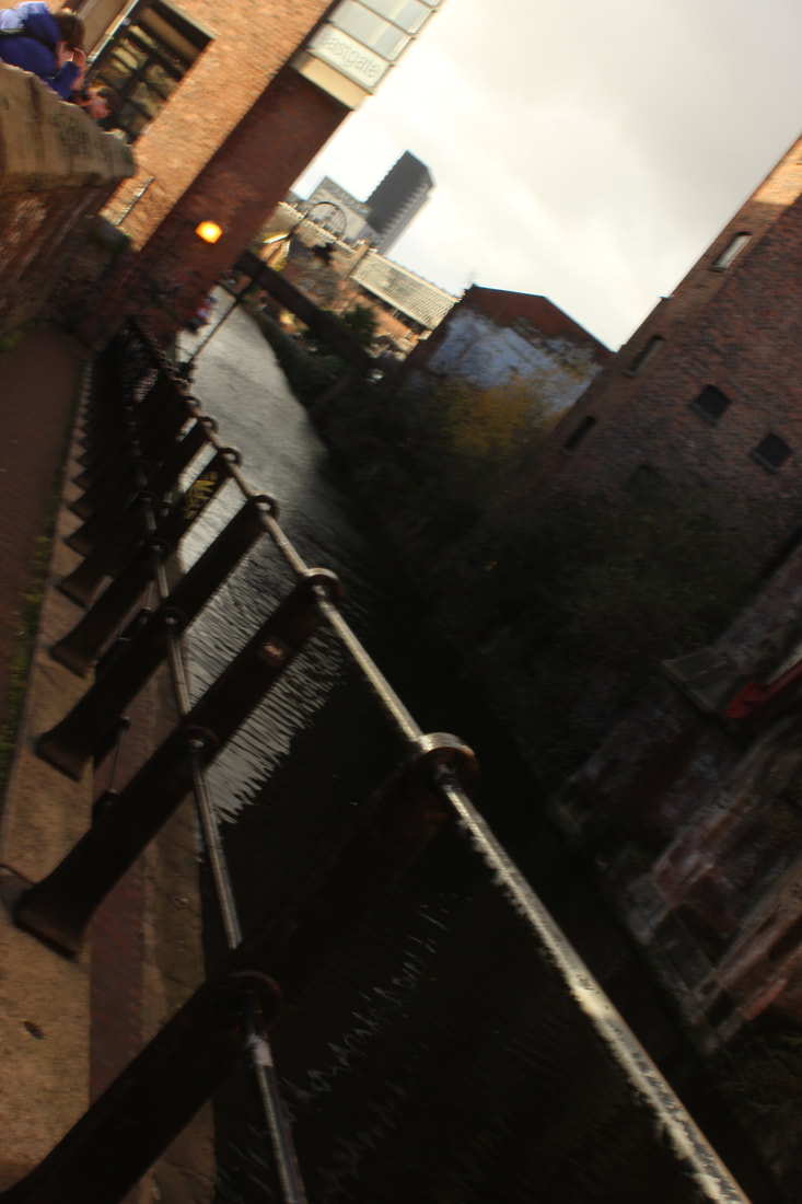
After the boom in Manchester
|
Content: I can see a man at eye level as he is fixing any damage that the boom has the created. In the background, you can see central Manchester as the tall buildings and offices shine bright in the daylight after a terror attack has happened and the city is in silence
Composition: The photographer has used a daylight florescent white balance as it is sunny and light. The shutter speed was fast because as he is in action and is fixing the damage that has been creating. The aperature was high aswell as a light was needed for the photo to look powerful and good. Connection: This connect to my work as one of our projects are landscape and this will inspire me to take powerful and meaningful pictures. Comment: I like this picture because it is very impressive and influential as it shows people coming together as one and helping to stand our city back up and this really means a lot to me as I live in Manchester. |
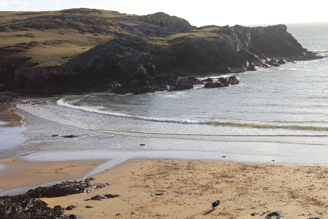
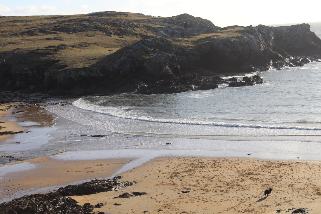
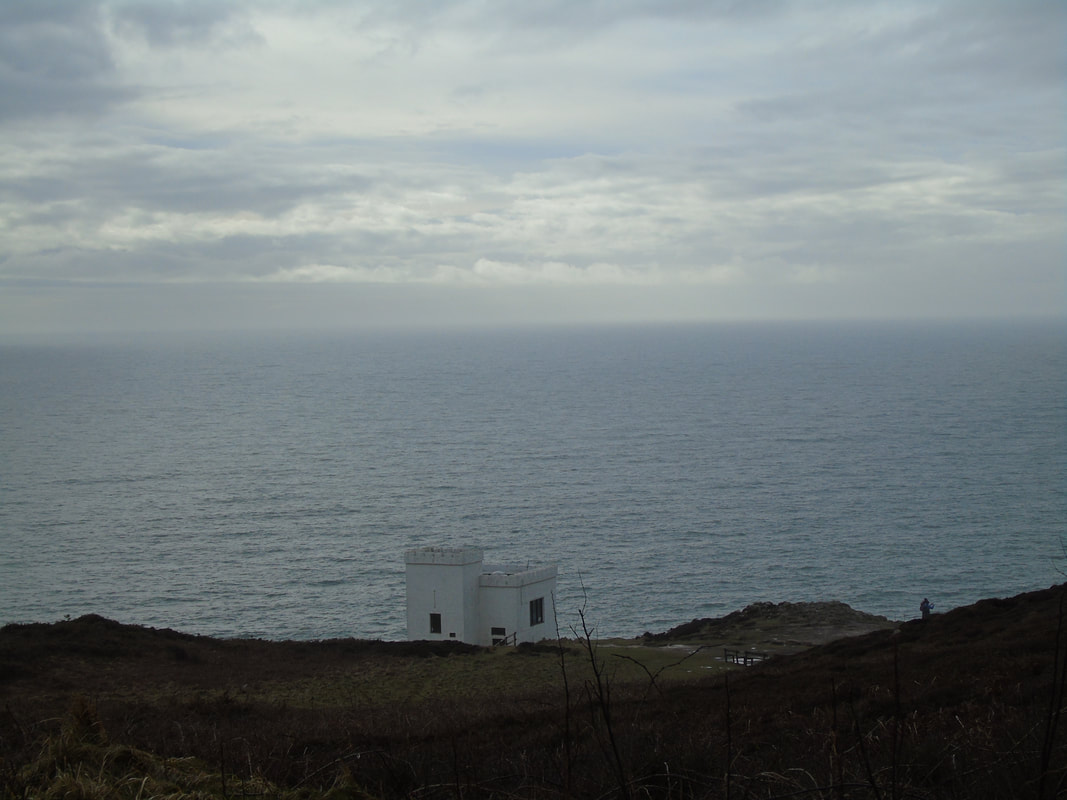
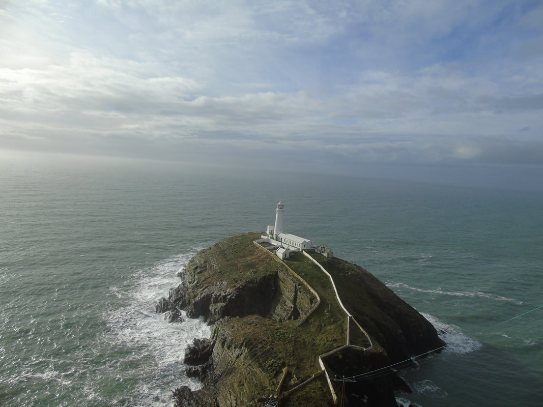
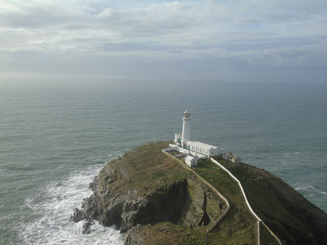
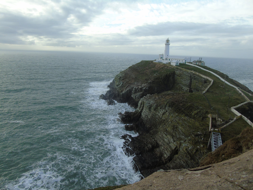
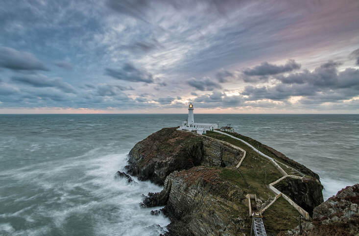
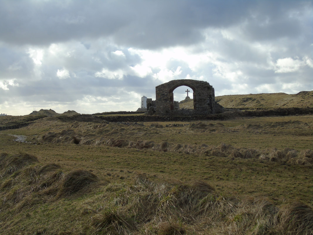
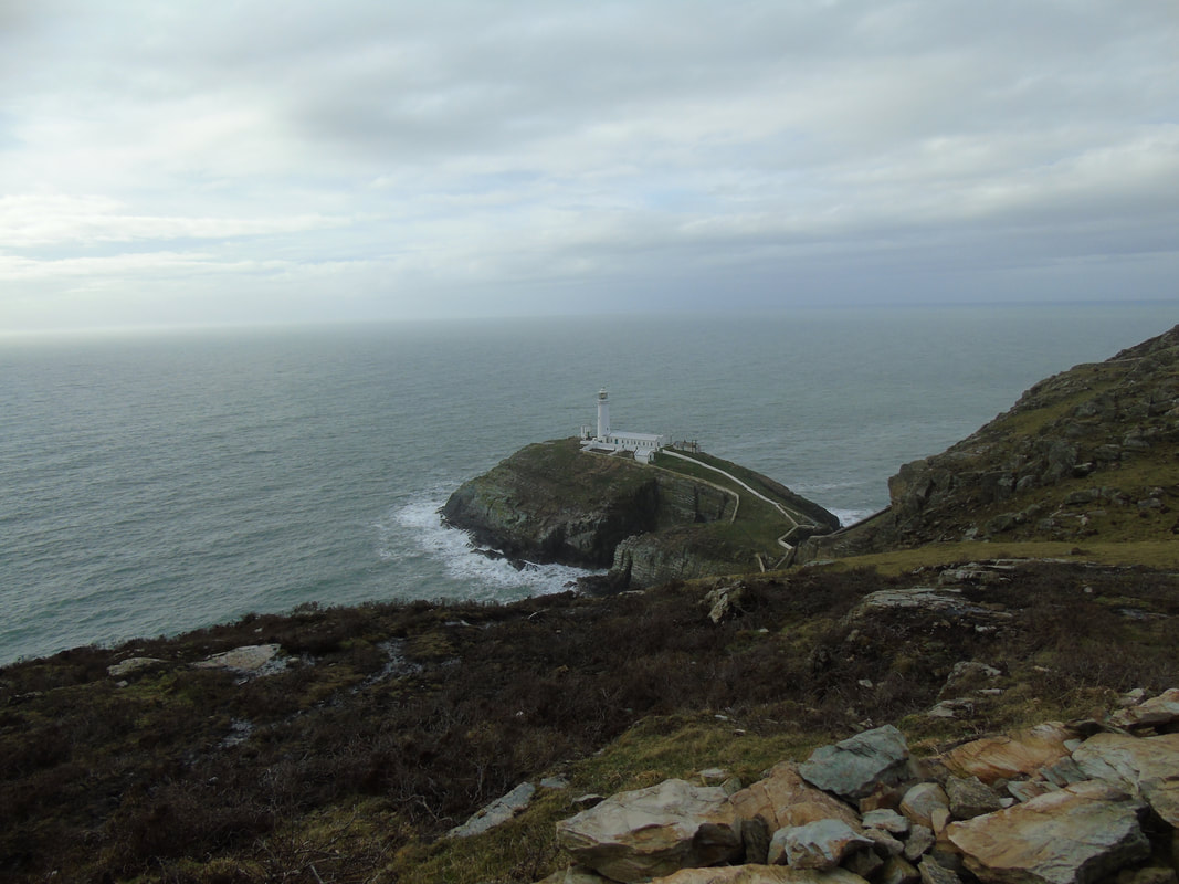
Angelsey,Wales
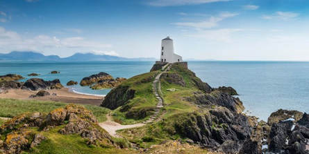
Content: The image has a little white old house based on the greeny hill which has stairs leading up to it. In the background you can see the sea which is never ending and goes all the way back. The sky is a blue which is not dull or bright and filled with white bubbly and fluffy clouds.
Composition: The photographer has used a cloudy white balance as it look likes a cloudy day. The shutter speed will be fast as it will capture the waves pushing forward. The aperture would be high as a lot of light needs to be captured to make the picture look effective. The centre of the image is the light house as it is the view point.
Connection: This relates to my work because we went to the same light house and can see the contrast of how we took a picture of the same location and can improve on angles or white balance, etc.
Comment: In my opinion, I think this picture is not as effective as others because it does not have a hidden meaning to it and is a normal and realistic picture.
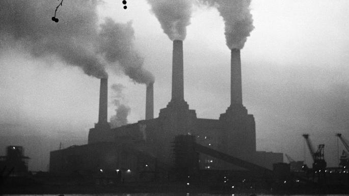
Battersea Powerstation
|
Content: In the image, you can see a power station in black and white which has dense fluffy clouds of steam coming out of the pipes. To the left in the background you can see climbing frames which can suggest something is being constructed. The power station looks quite old and fragile as there are different tones of colour in the brick.
Composition: The photographer has used a white and black white balance or a monochrome setting to get the picture black and white. The shutter speed was fast as it needed to catch the steam coming out of the pipe. The aperature is low and a lot of light wasn't needed. The power station is a eye level and us the focus point. Connection: This does not directly connect to my work but connects to landscapes as it has buildings and and is a effective picture but is different from my work. Comment: In my opinion, I think this is an effective picture as it stands out and kind of shows a hidden meaning. |
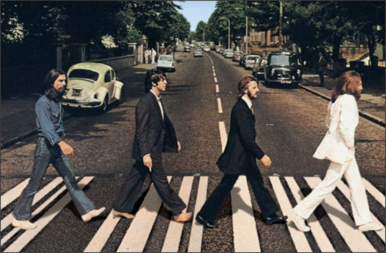
Exam-Iain MacMillian
|
Content: In the picture you can see a long straight,narrow road filled with green trees and cars in each side. At eye view you can see four men crossing the road. This picture was taken when they were mid way of crossing the road. This picture looks like it has got some filters on it as the colour has got like a orange tone to it. As you look closely into the picture it seems like a never ending road. Also you can see very grand entrances to the big and modern houses.
Composition: The photographer has used many different techniques to get this picture as their final outcome. Iain MacMilian has used a fluorescent white balance as it has a orange tone to it. The shutter speed has to be fast as the four men are in action of walking. The photographer cleverly of this picture as all the men are in sync and body language is the same too. He wanted the men to be a eye level but also get the road in the background so it also is seen at eye level too. this has a good effect on the image as everything is positioned correctly. The aperture must of been medium as a not a lot of light was needed but some was. It was a shallow depth of field as the road in the distance was not blurry, this shows the picture is focused. At each side of the image you can see cars and trees that keep on going, this shows Iain must of thought carefully about his location. The trees has a green tone to them as well. The photographer must of been stood on a ladder as he has managed to catch the distance but also to get a better view of the men. The composition of the picture is quite straightforward as he captures the four men walking in sync and then got the distance and the road that might be called after the tittle ‘ Abbey Road’ Context: IT was taken by a photographer called Iain MacMilian in 1969. It is called Beatles Abbey Road. Iain Stewart Macmillan (20 October 1938 – 8 May 2006) was the Scottish photographer famous for taking the cover photograph for The Beatles' album Abbey Road in 1969. After growing up in Scotland, he moved to London to become a professional photographer. Time was tight for the Beatles in the summer of 1969 whilst they were recording in EMI's London studios in Abbey Road, St John's Wood, and the photographer Iain MacMillan was told that he could have the group for a few minutes during a lunch break for the album cover shoot. Following a suggestion from Paul McCartney, he sat on a tall ladder outside the studio and took photographs of them striding across the zebra crossing. The photography was instantly iconic and promoted the new Beatles album. Connection: This connects to my work because we went to London and took pictures of the landscape. Iain MacMillian was a landscape photographer too and we explored the same themes as each other- rural and urban landscape. Iain thought about his pictures carefully but that's what makes it an effective picture. This also kind of relates back to my project of weird and wonderful as this is not an original or normal photo. Comment: In my opinion, I think it is a good picture as it is quite effective. The photograph has thought about it carefully (location, angles, eye level focus). He also made it not seem like an original, normal picture as it has the orange undertone to it. I like this picture because it is very rare to get such a picture in sync and be effective as this one this. |
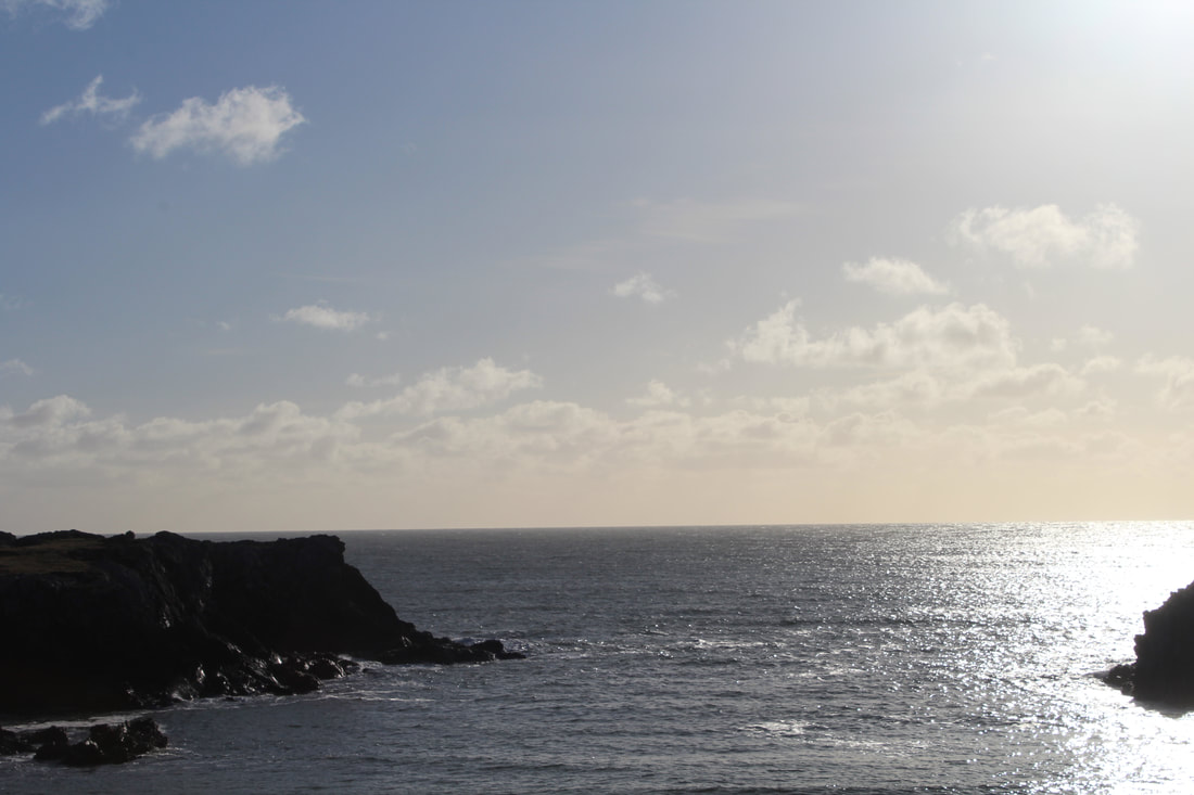
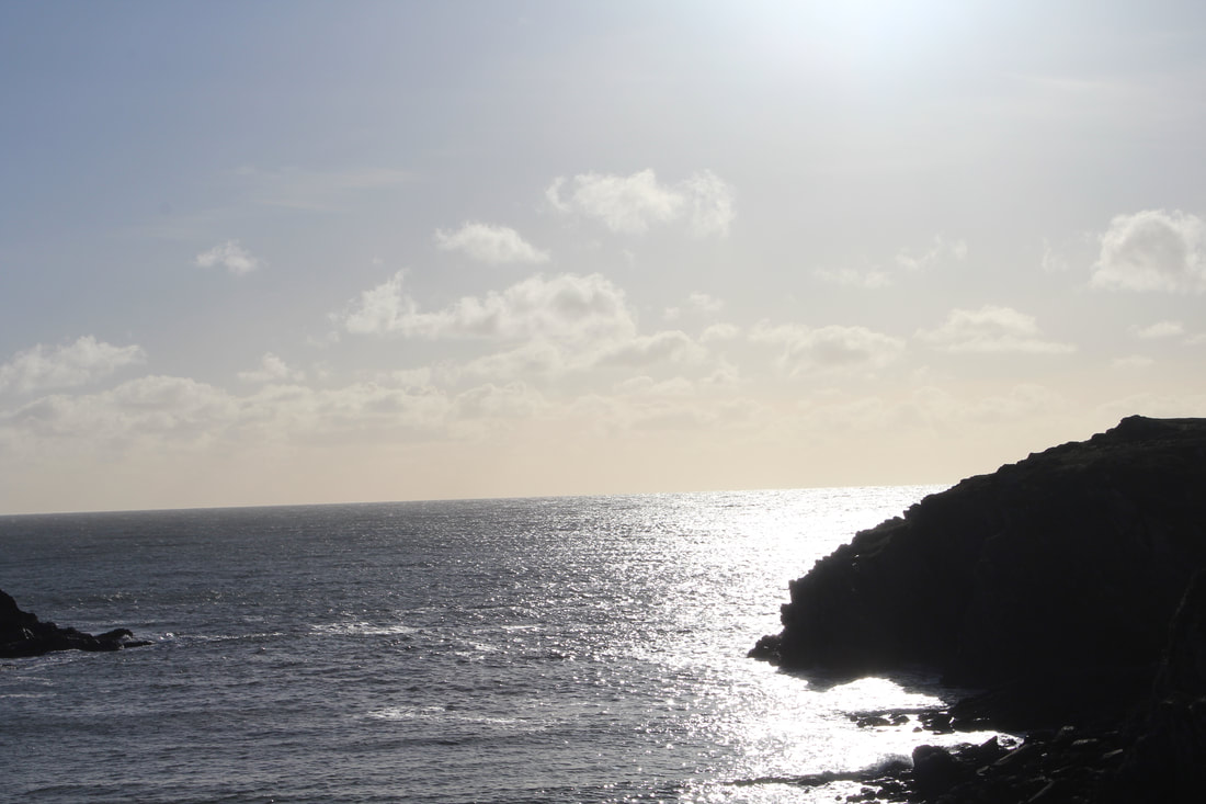
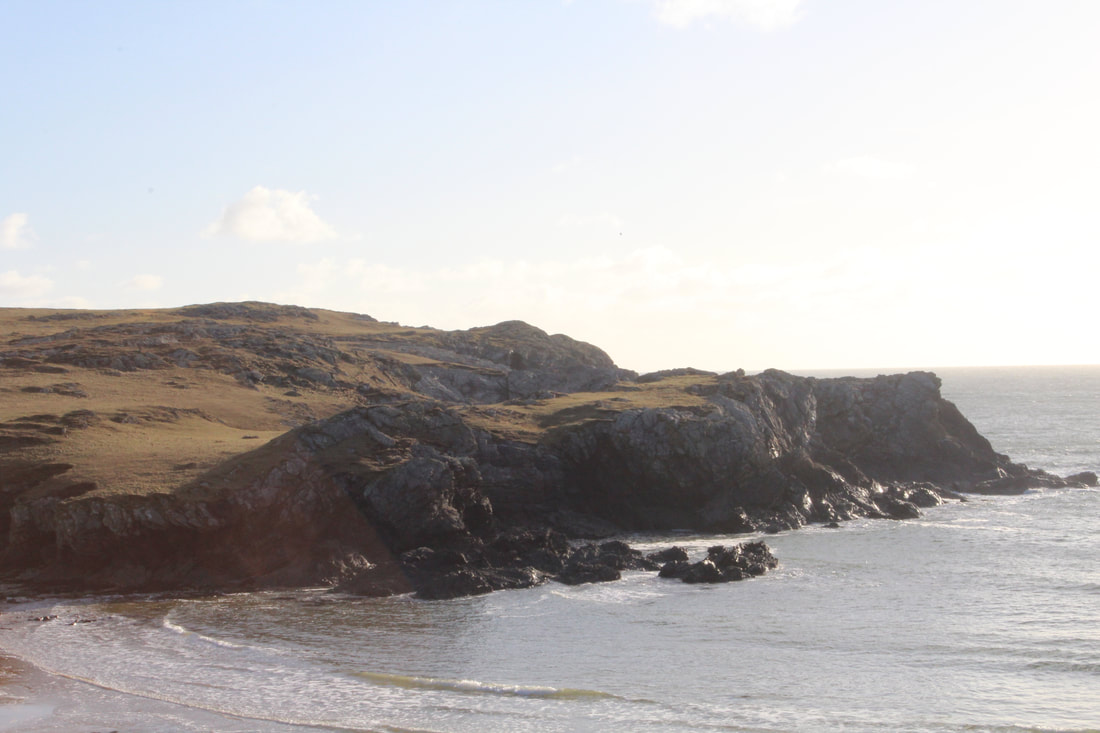
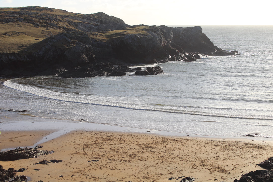
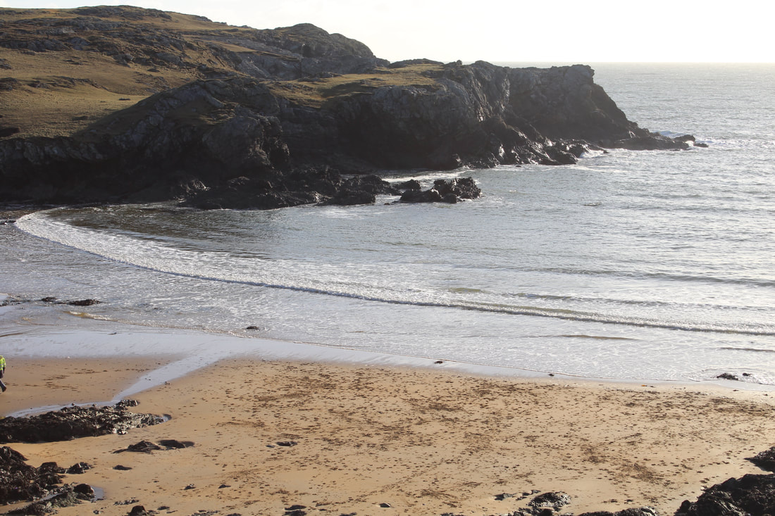
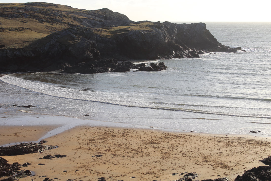
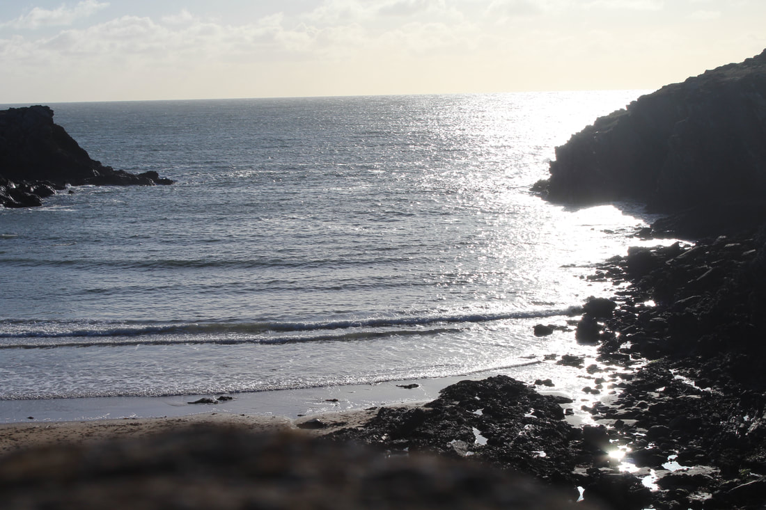
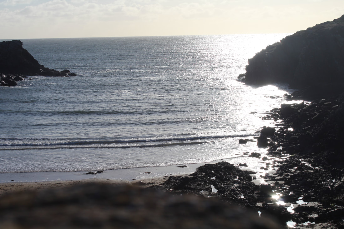
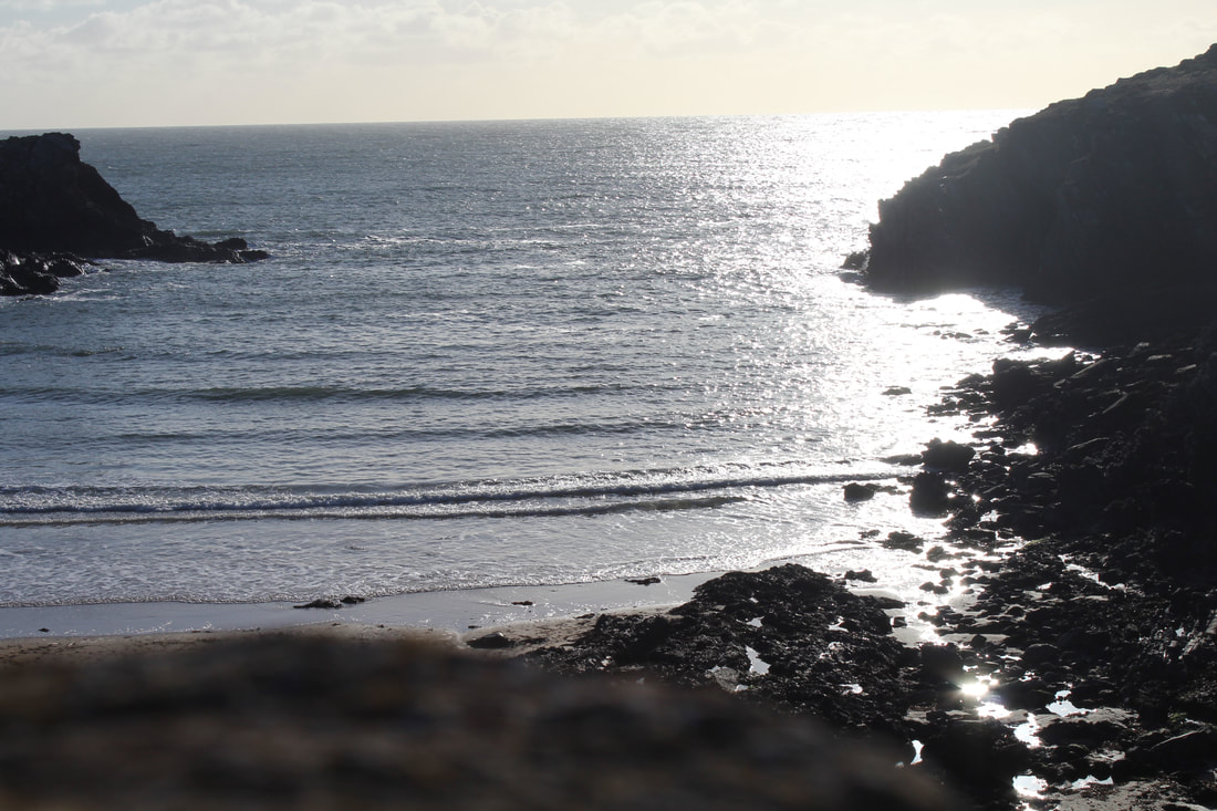
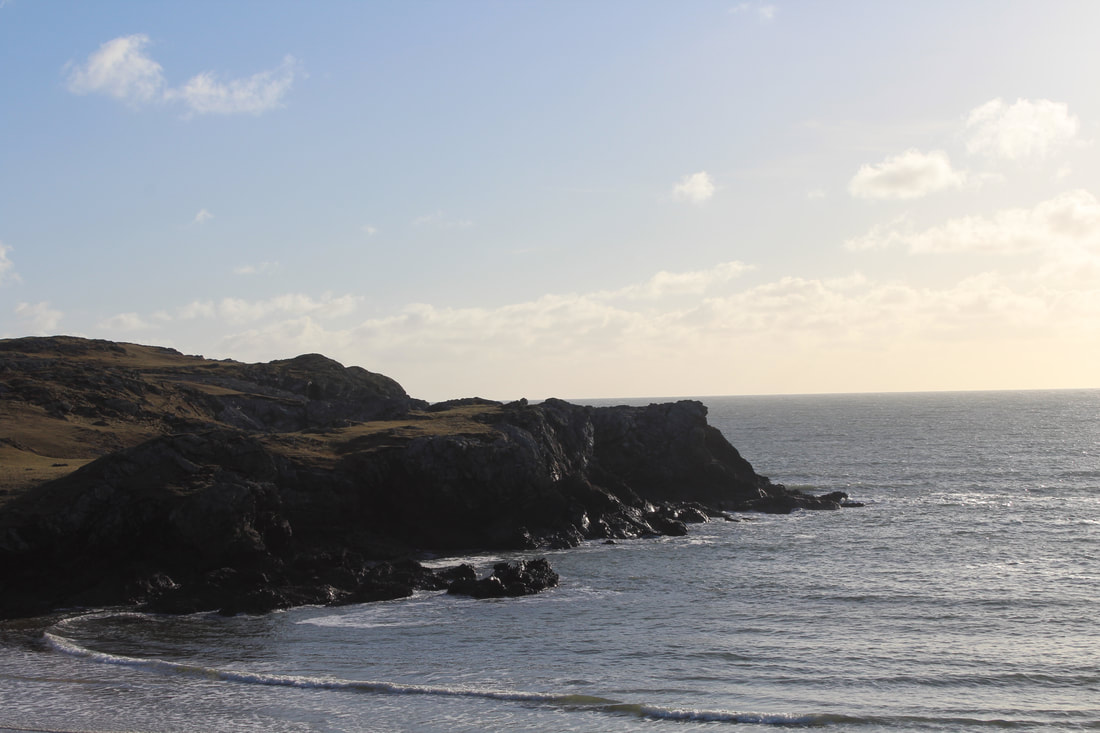
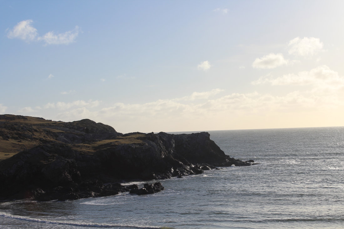
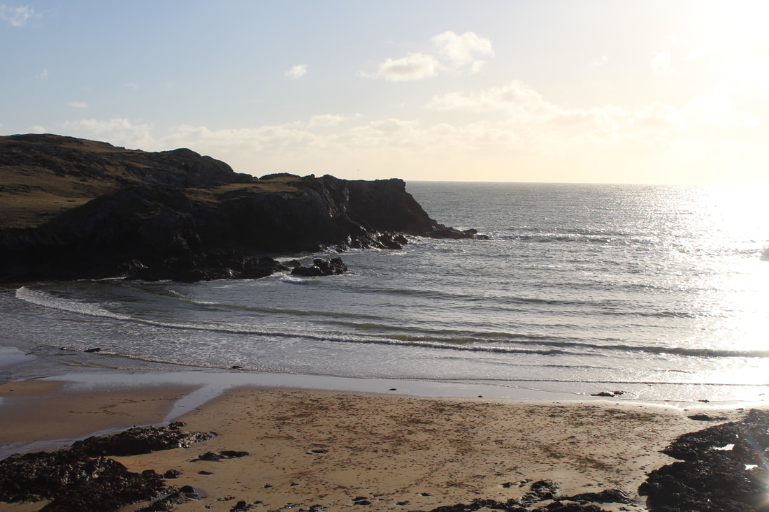
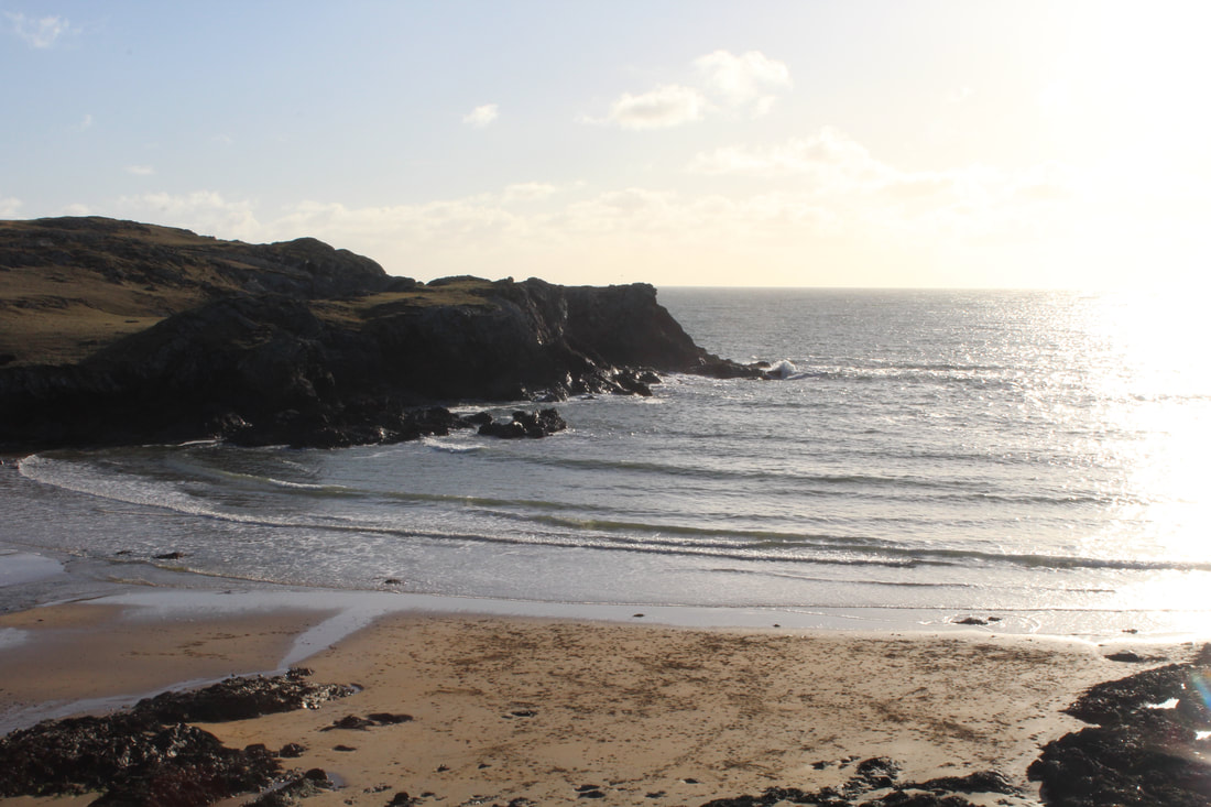
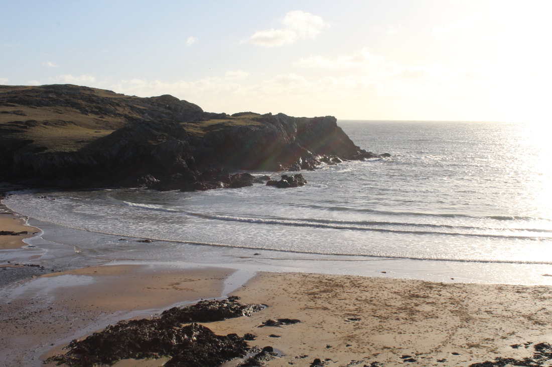
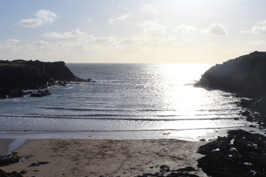
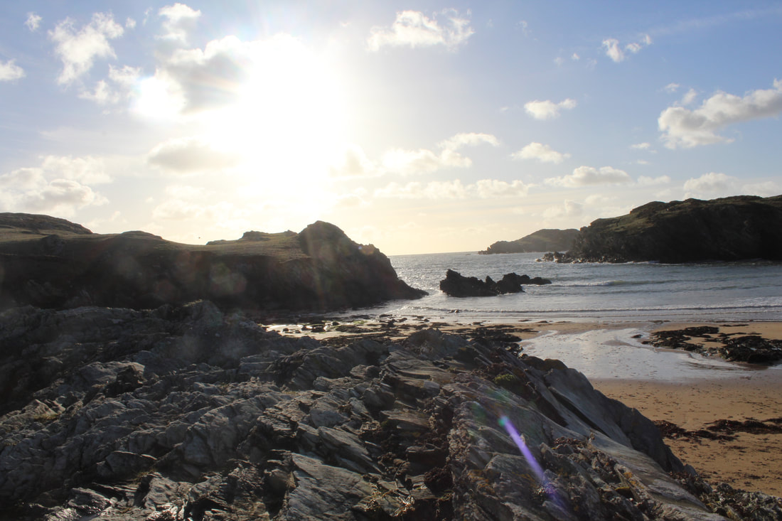
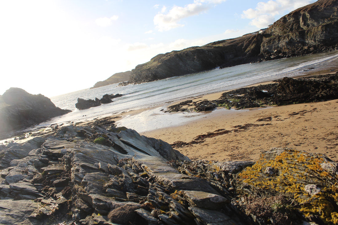
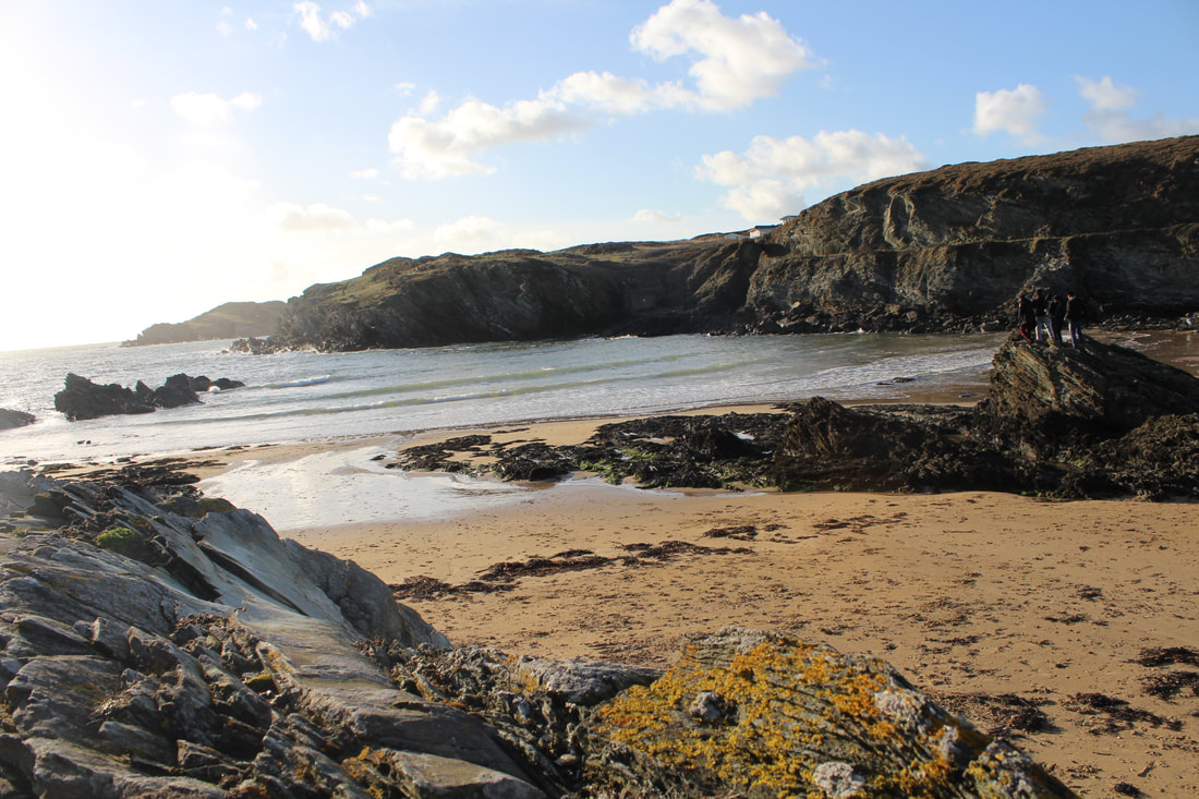
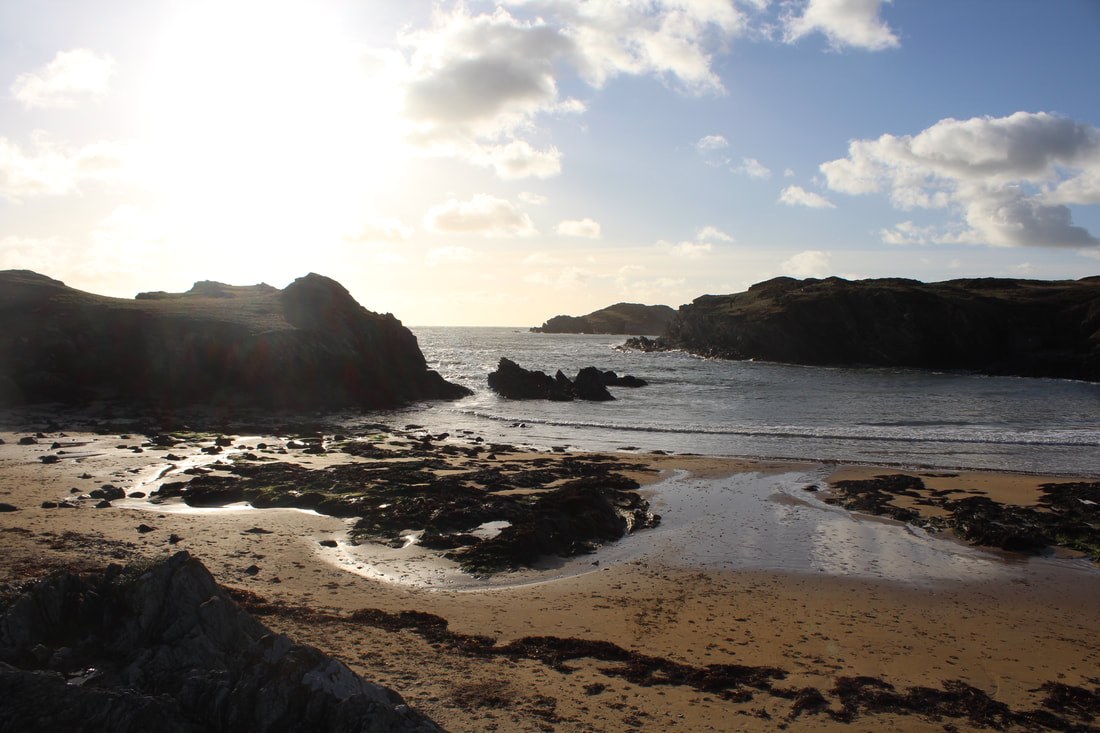
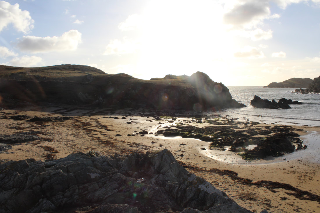
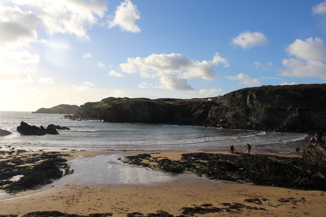
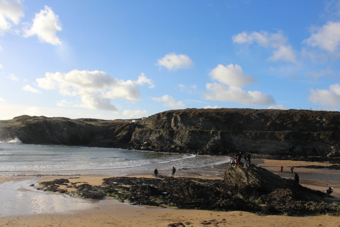
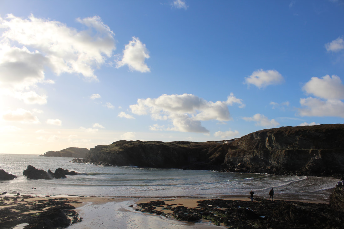
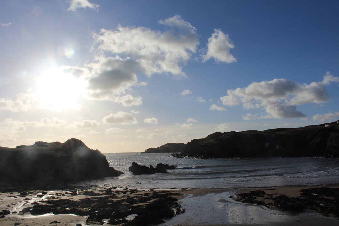
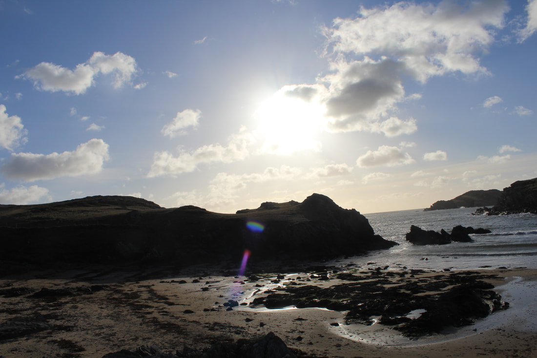
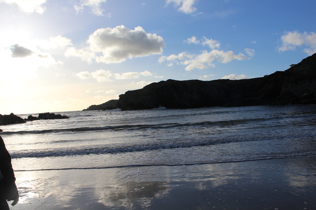
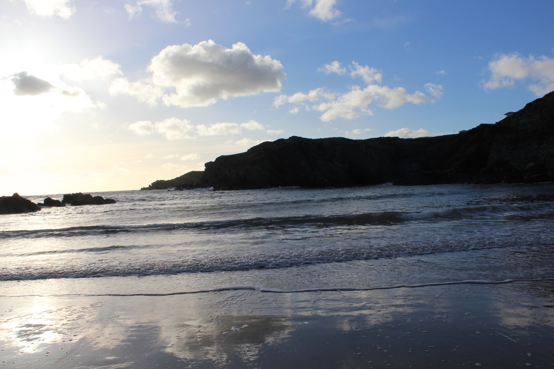
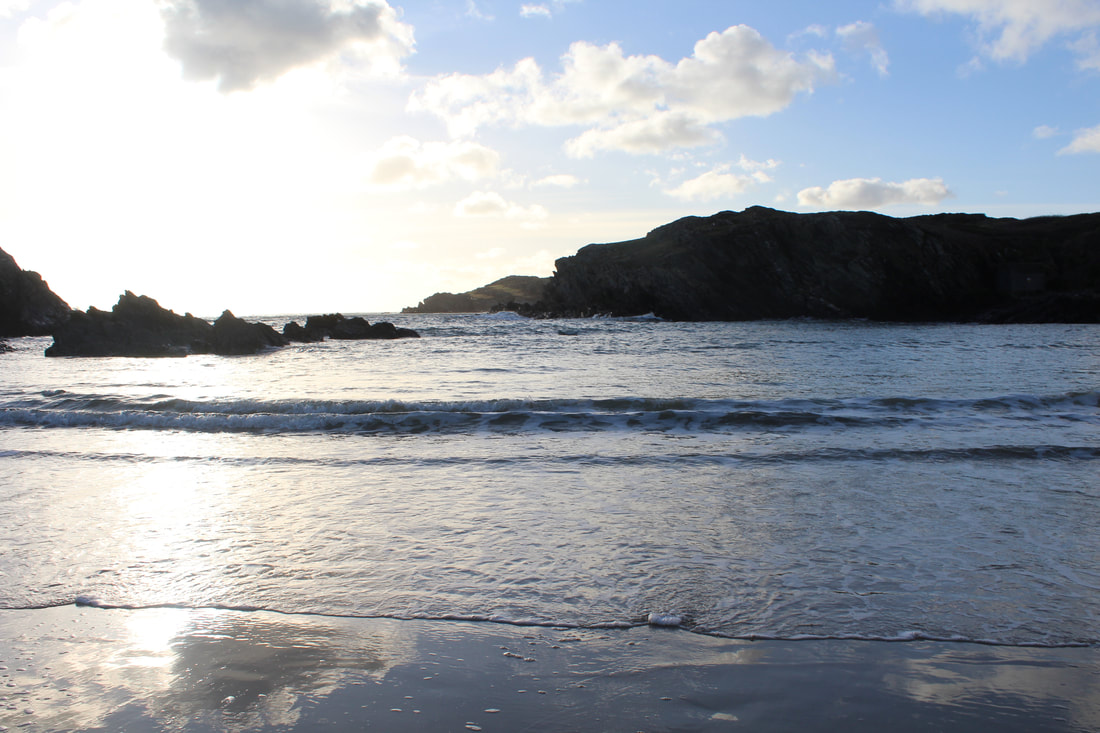
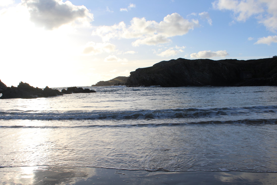
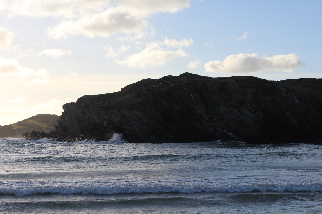
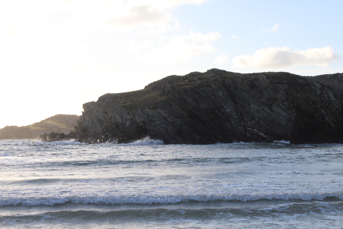
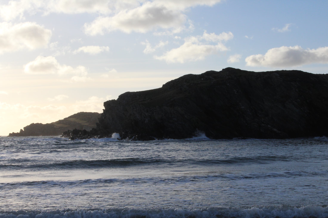
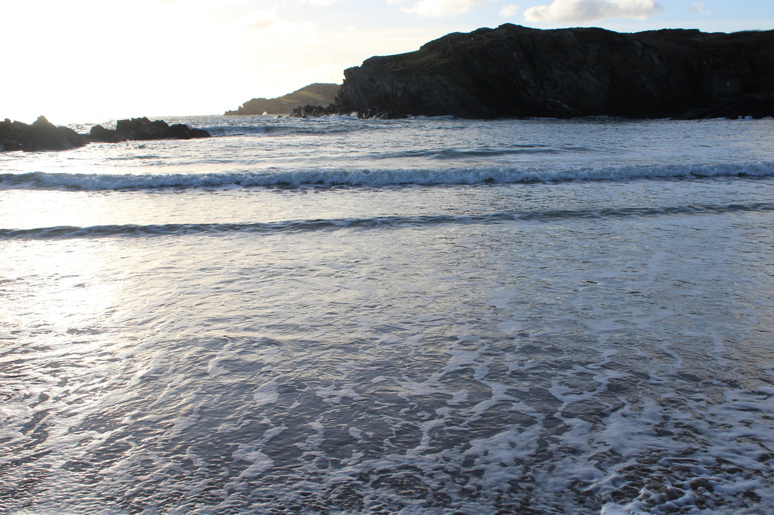
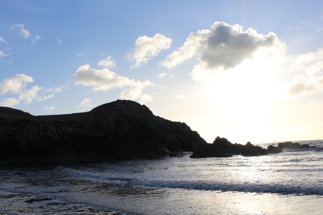
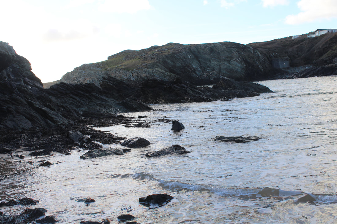
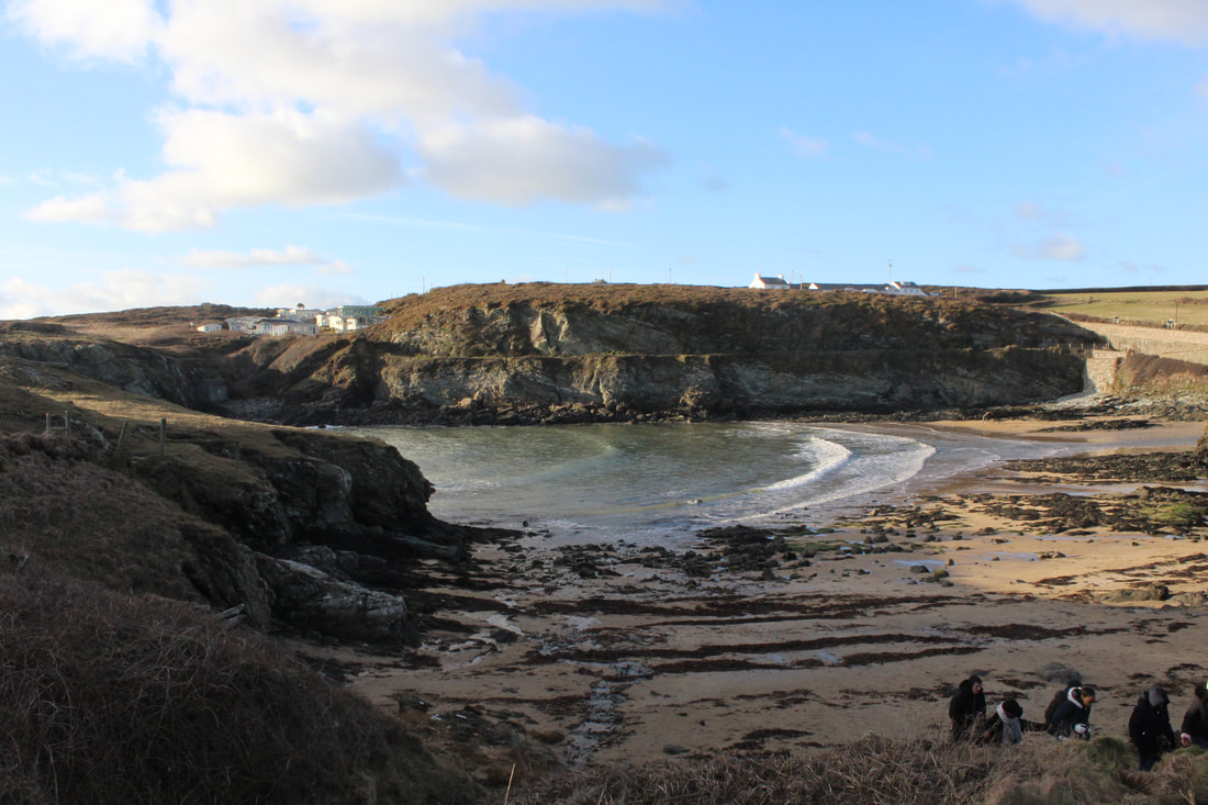
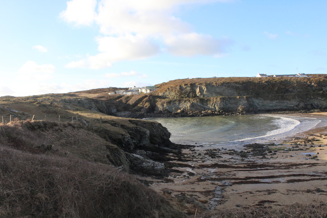
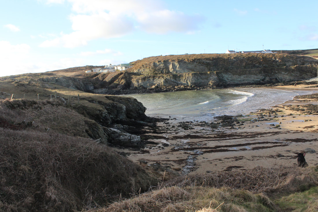
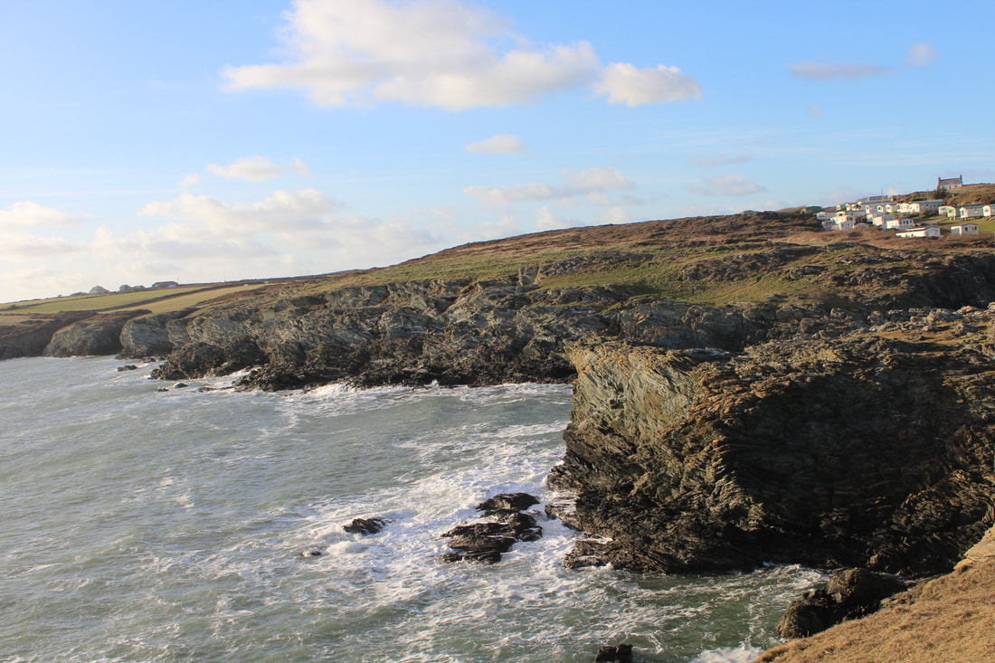
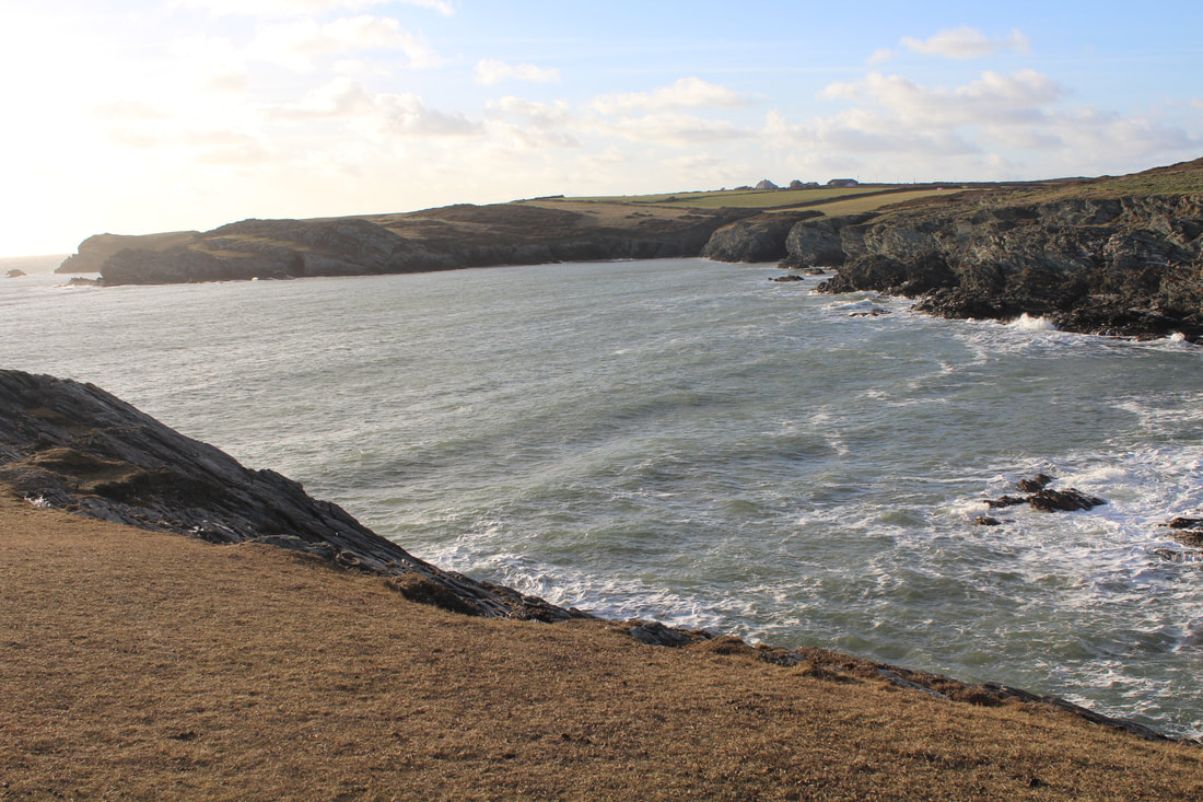
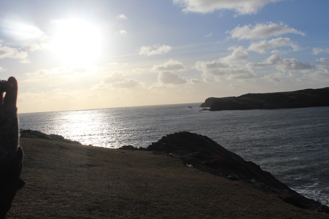
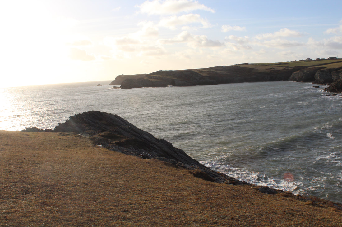
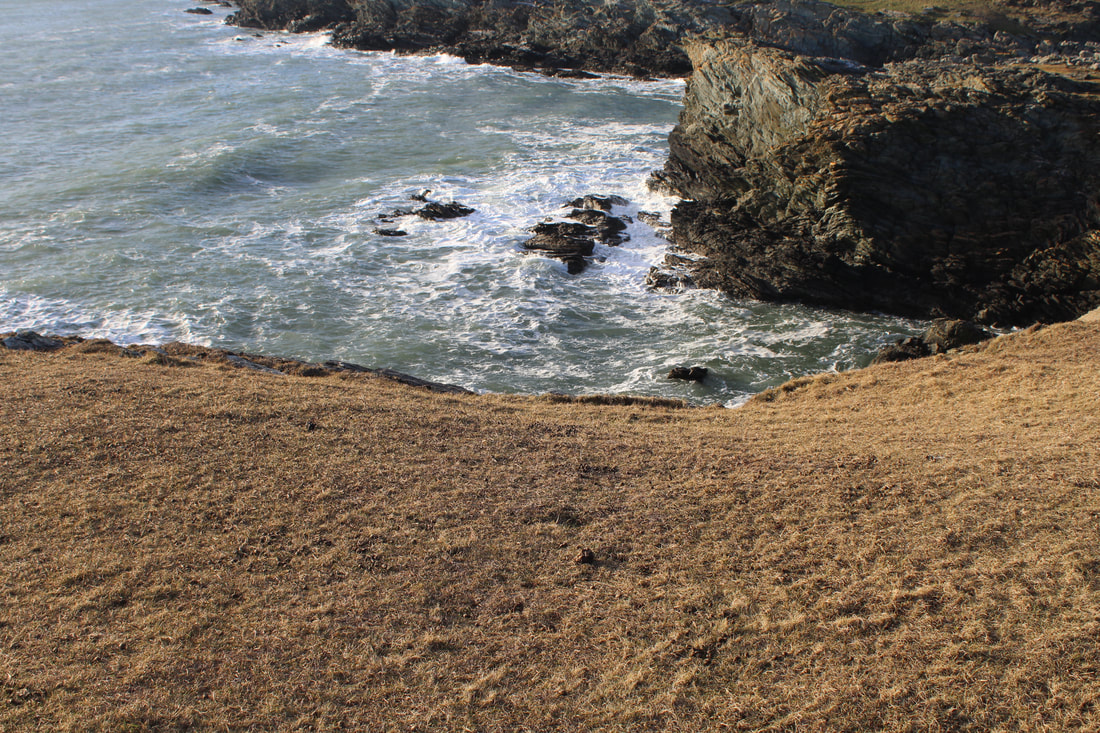
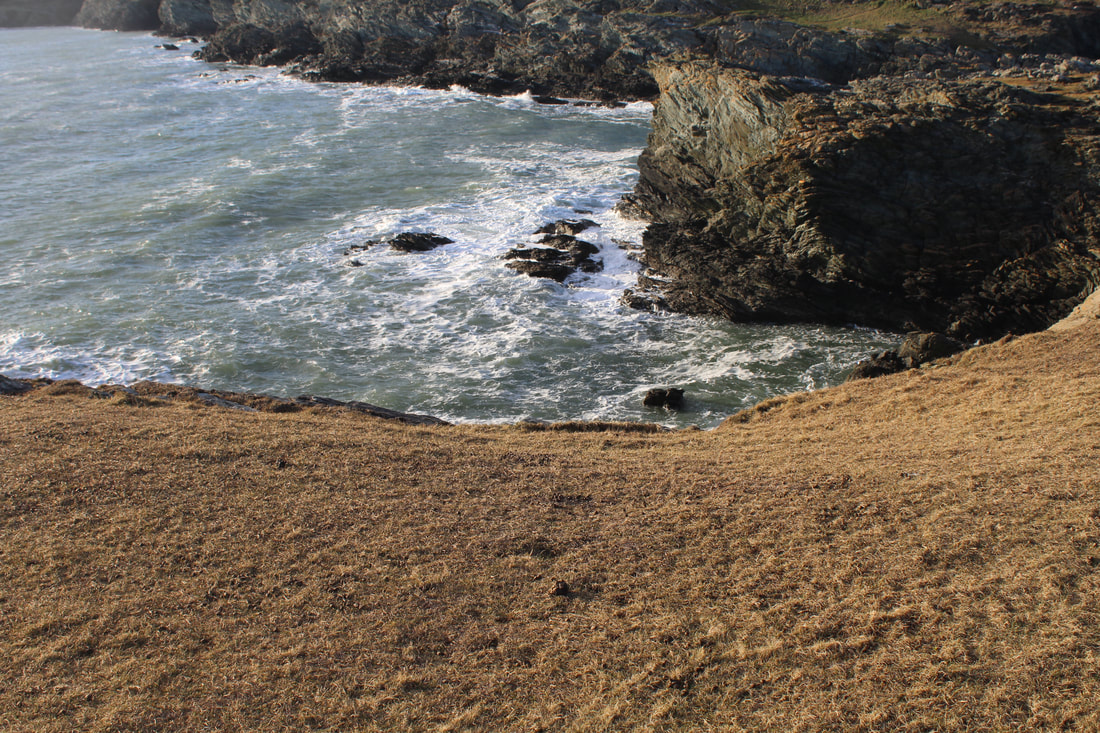
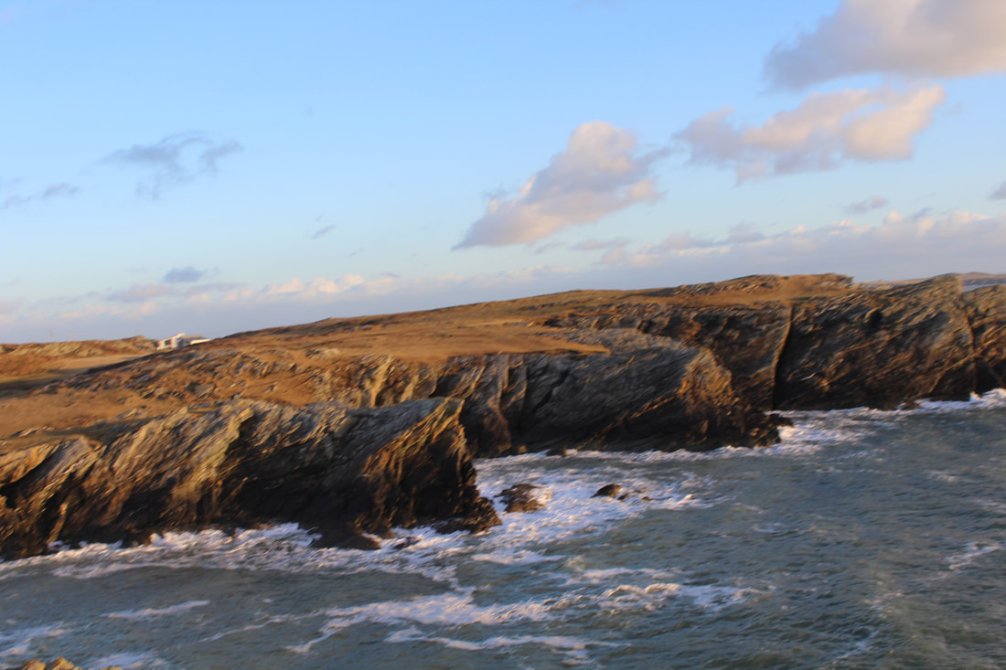
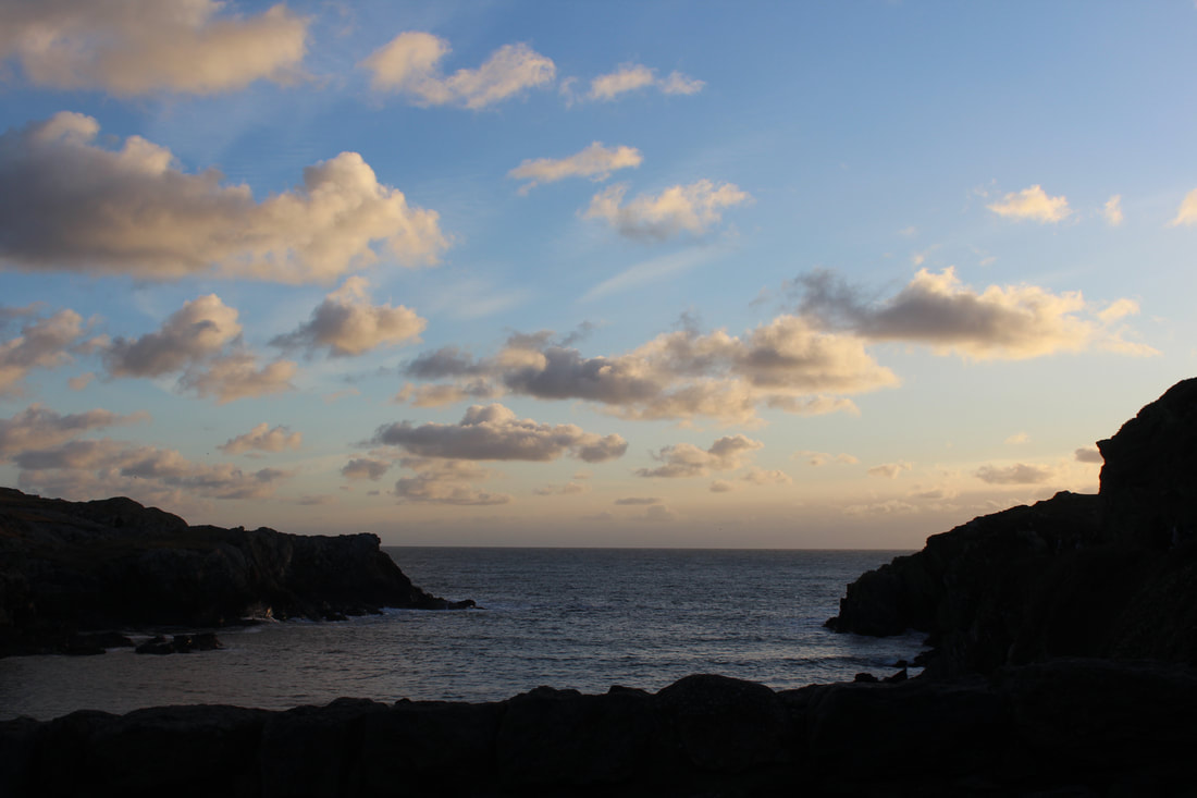
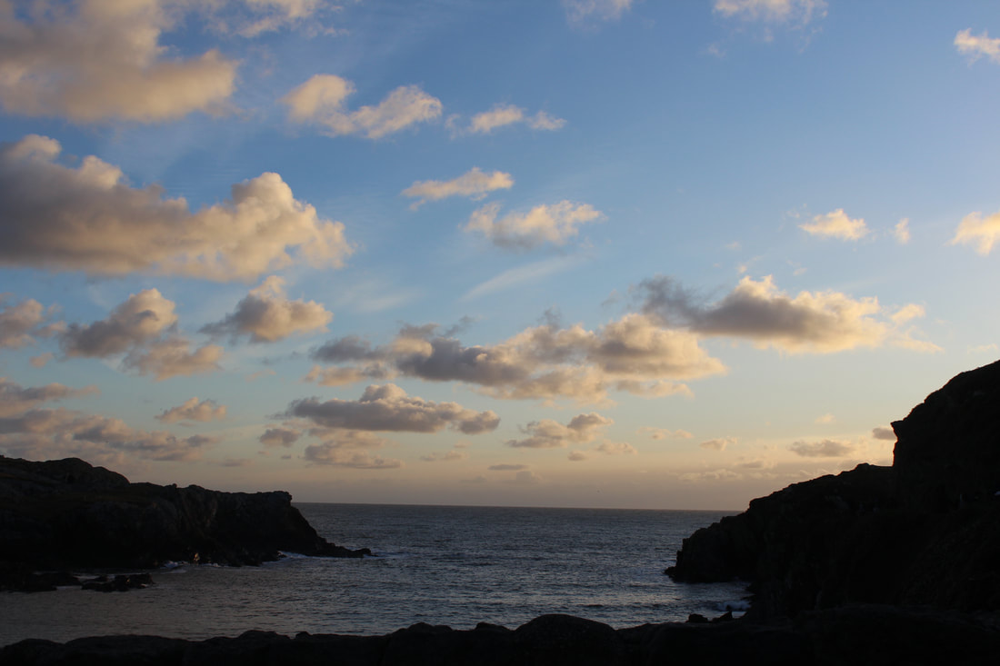
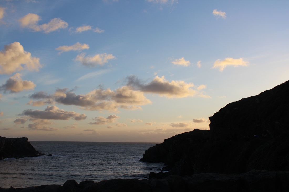
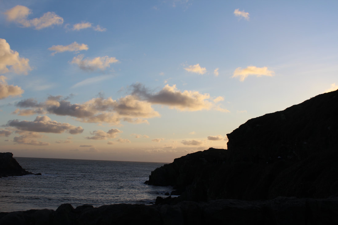
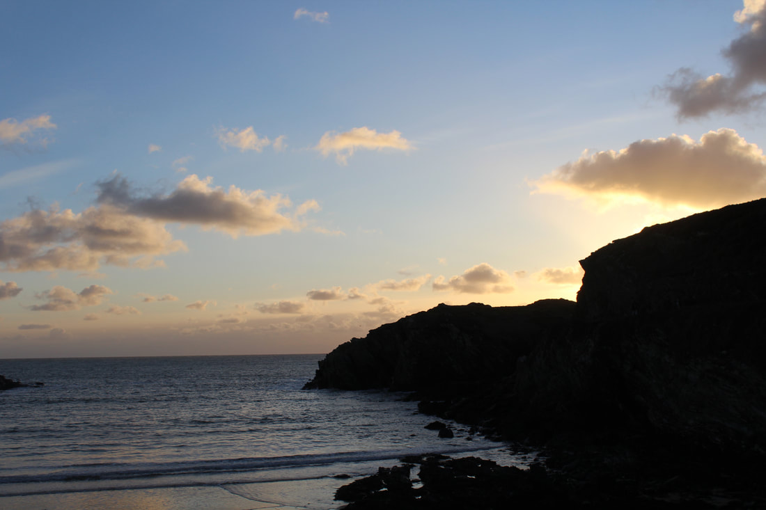
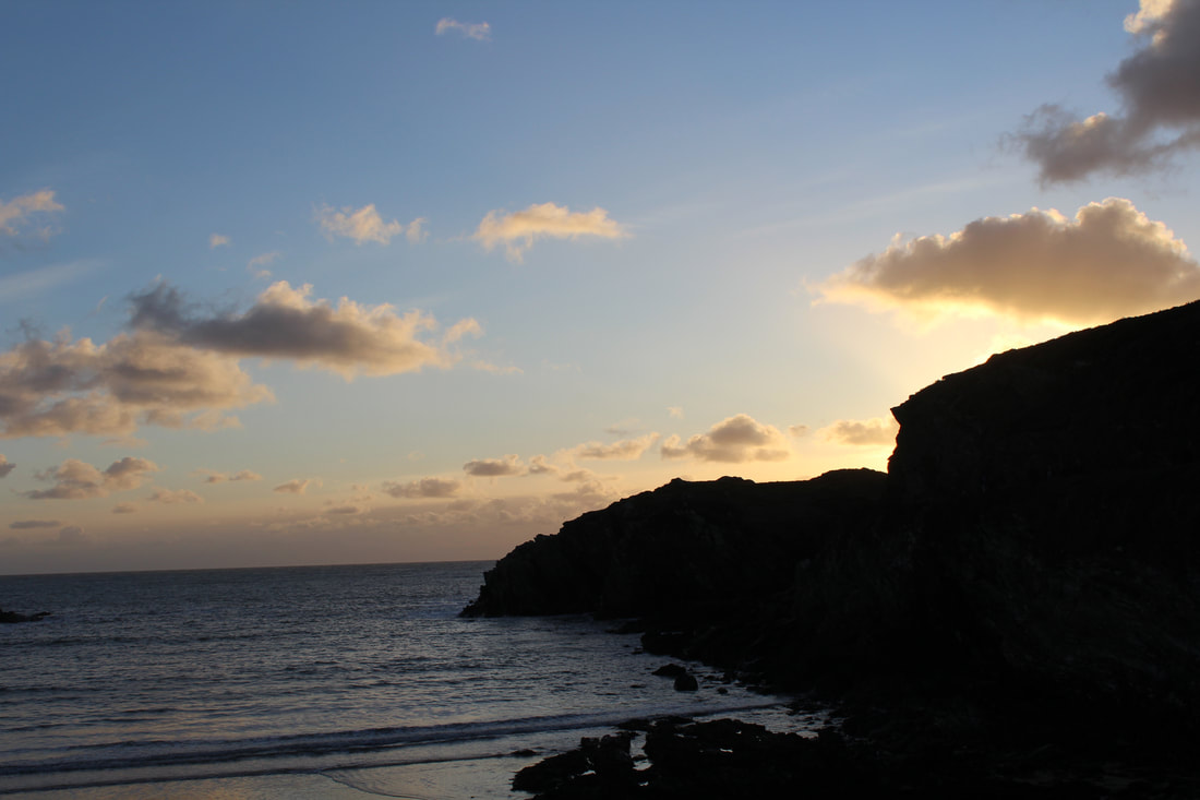
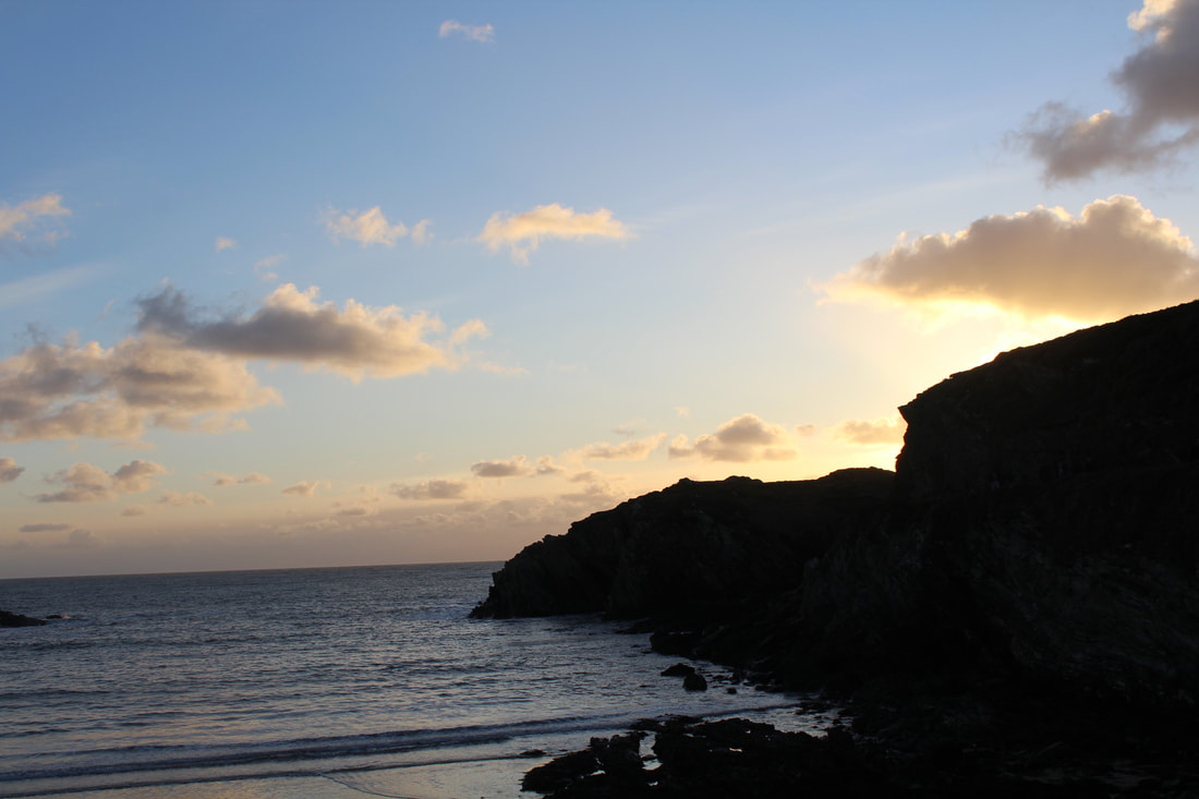
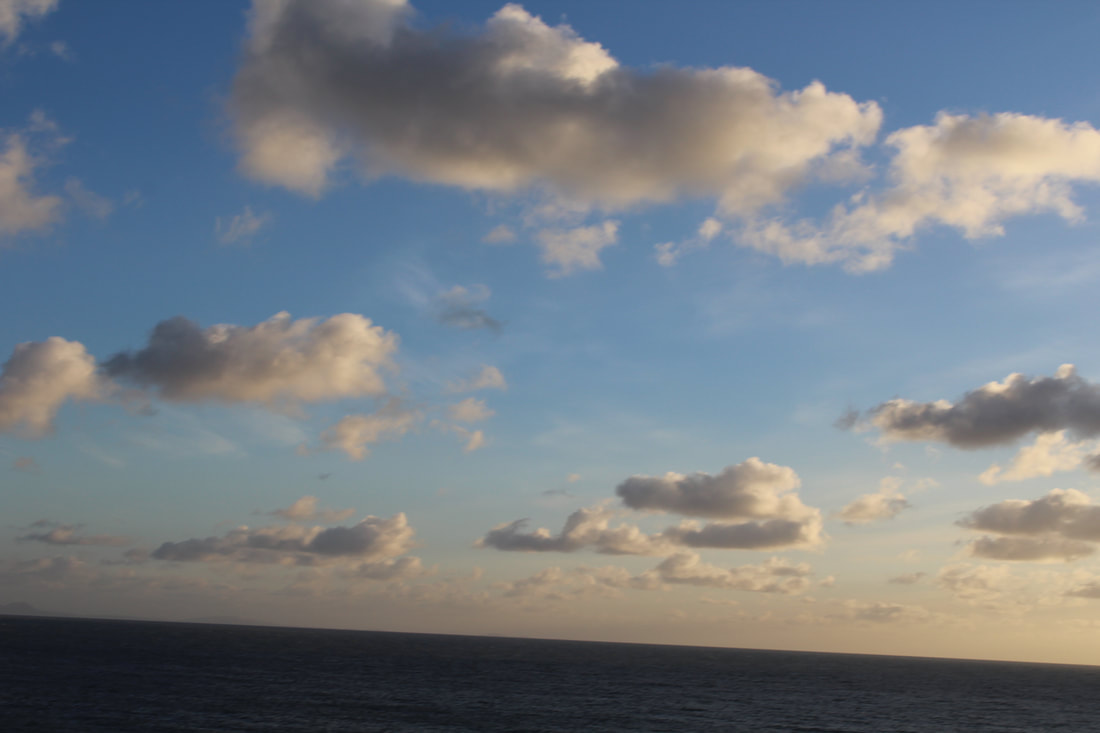
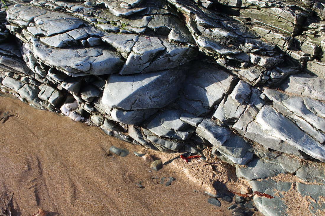
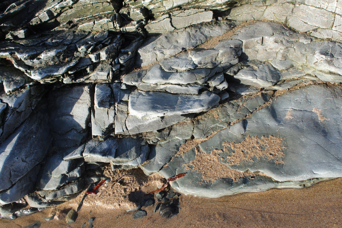
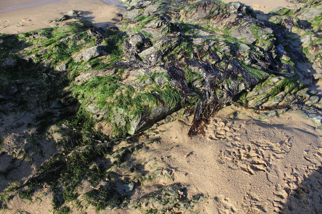
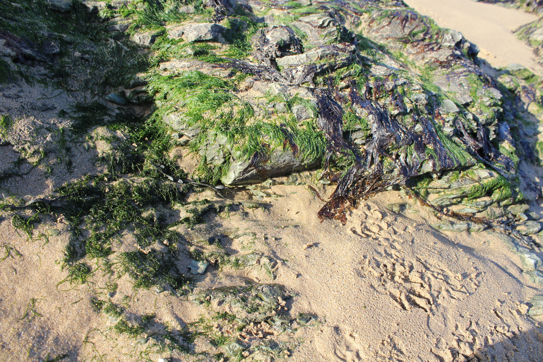
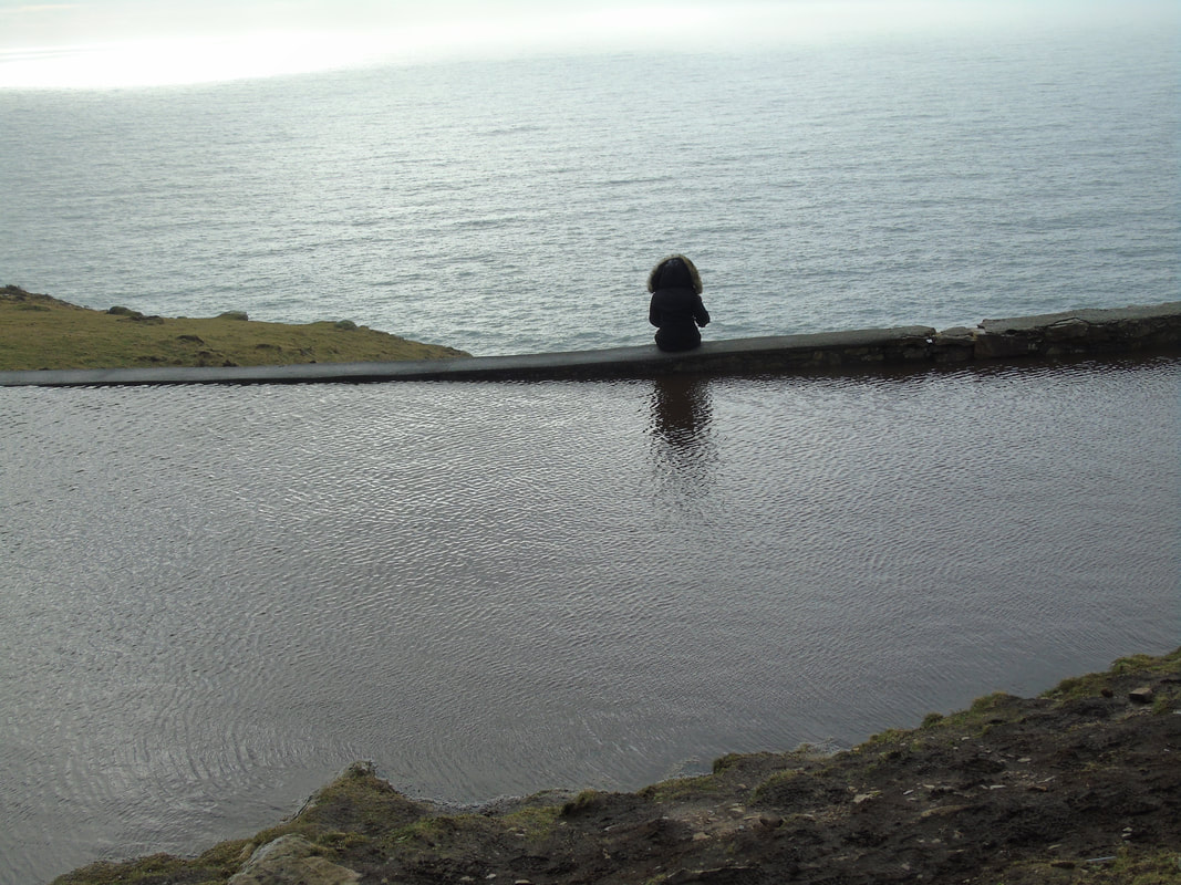
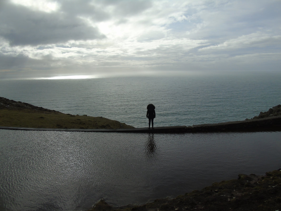
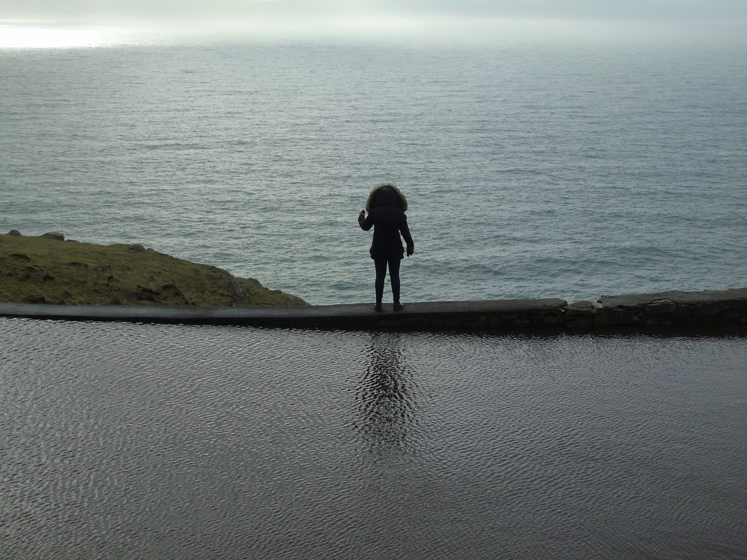
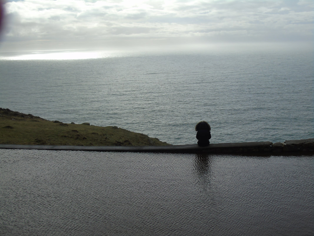
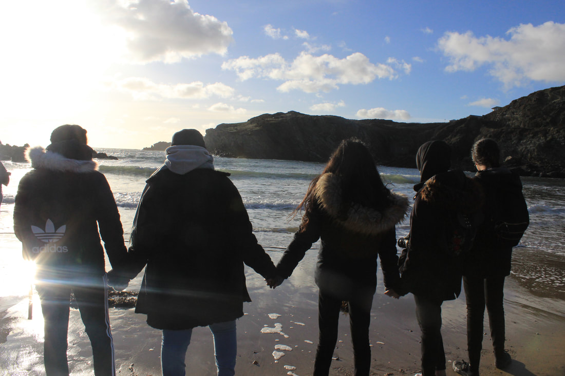
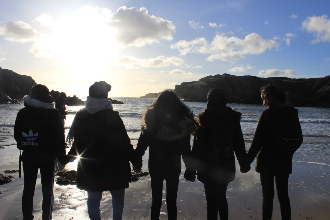
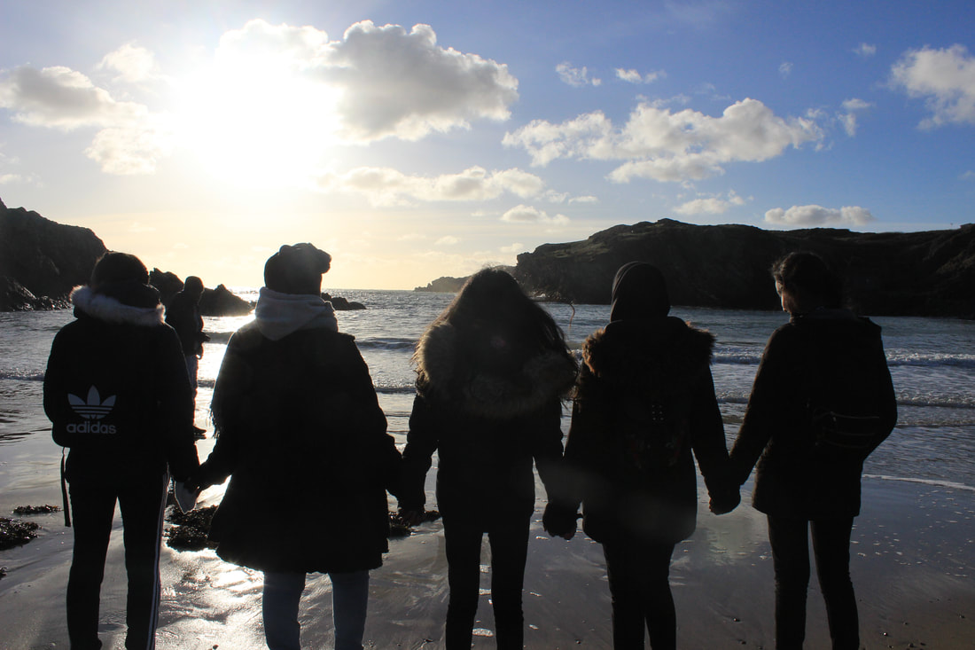
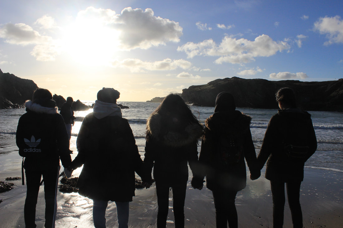
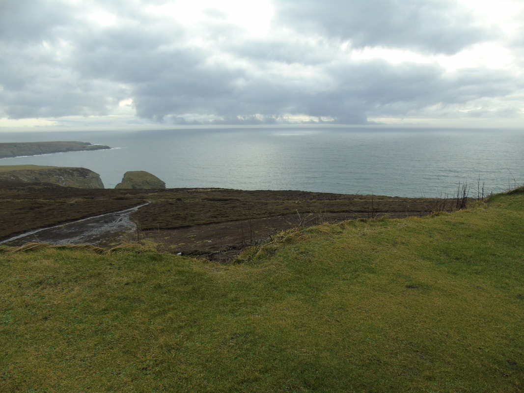
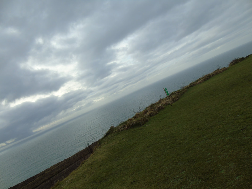
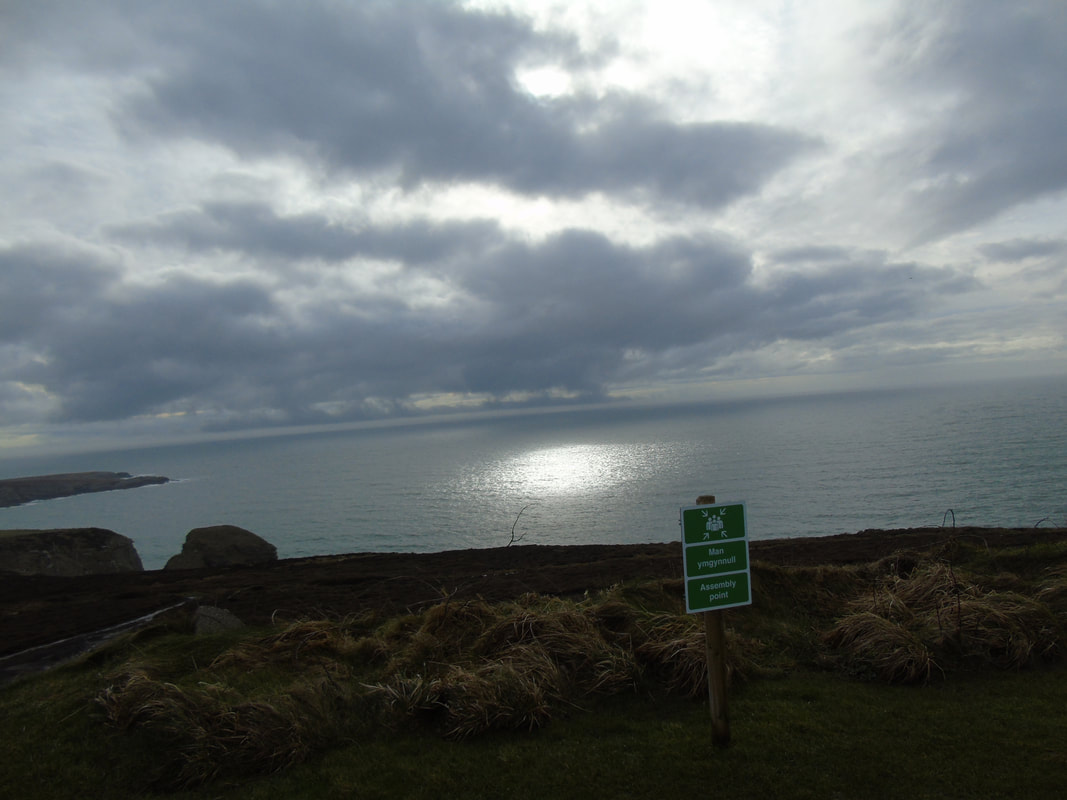
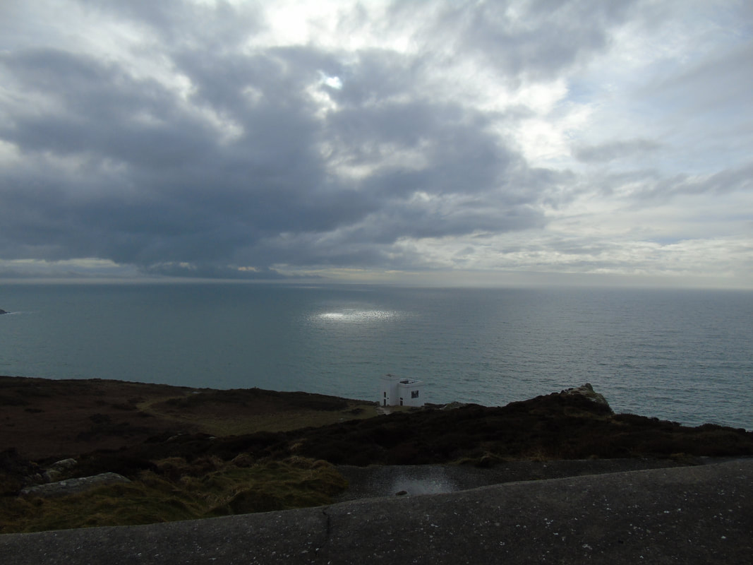
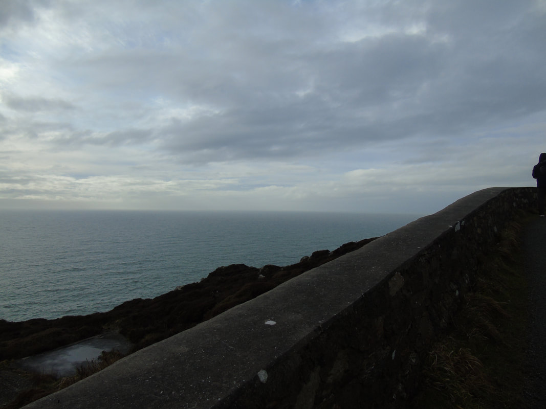
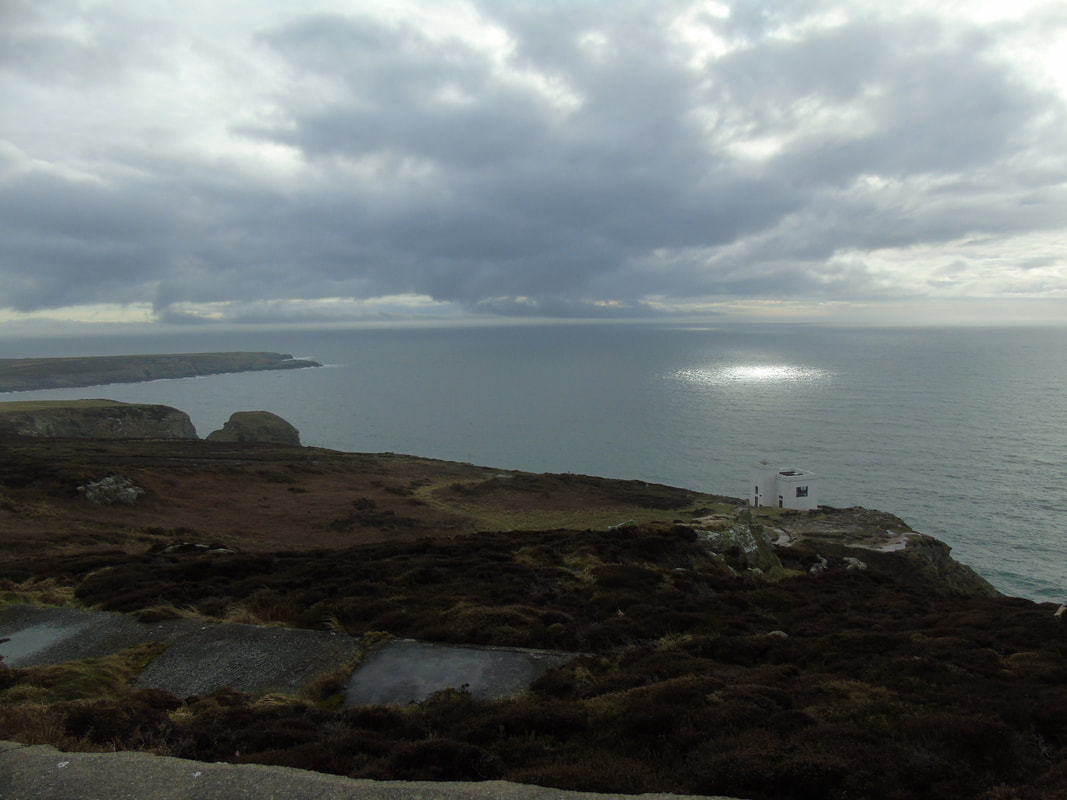
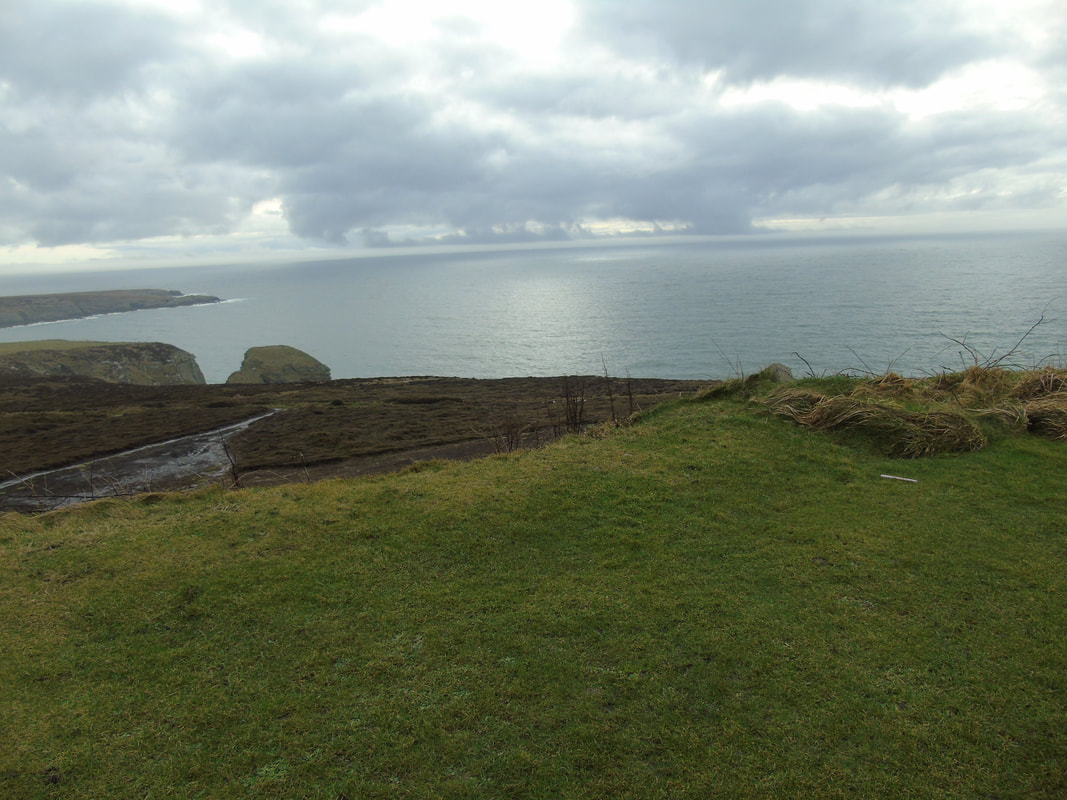
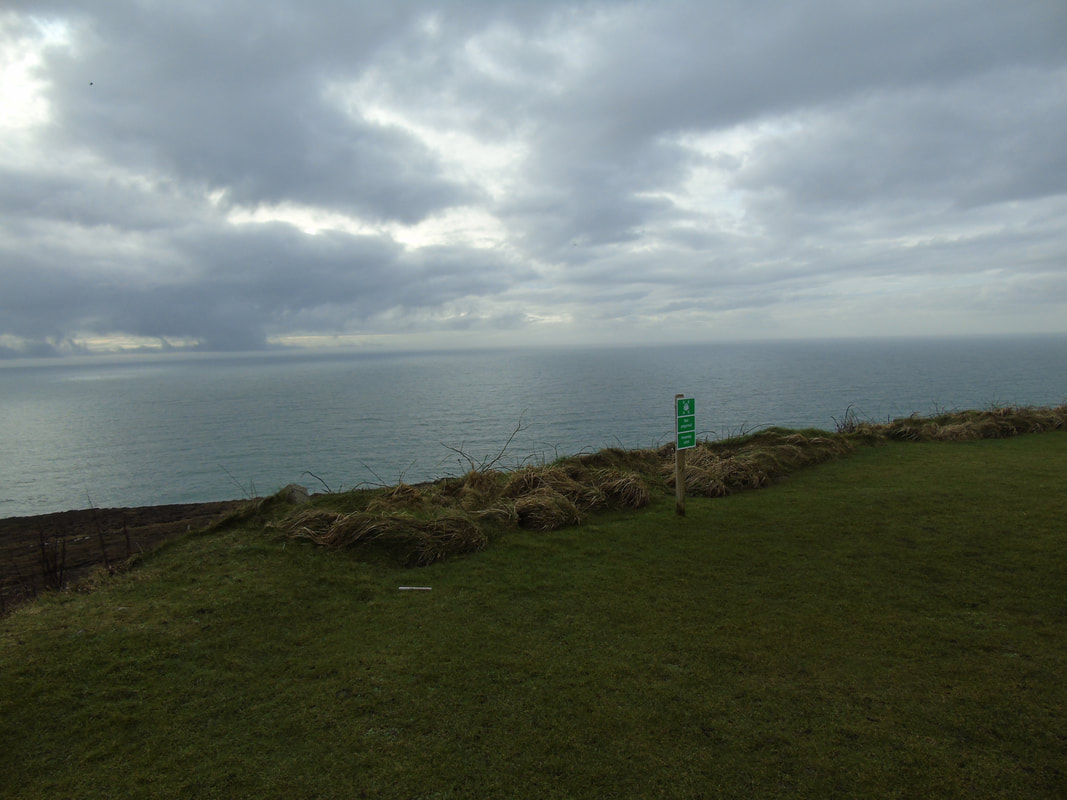
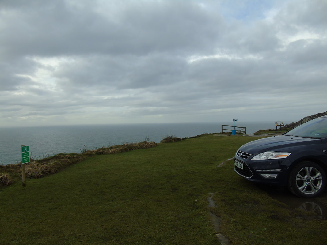
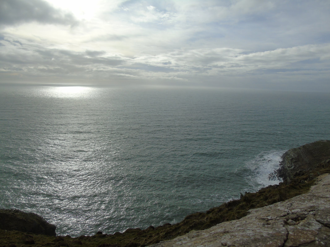
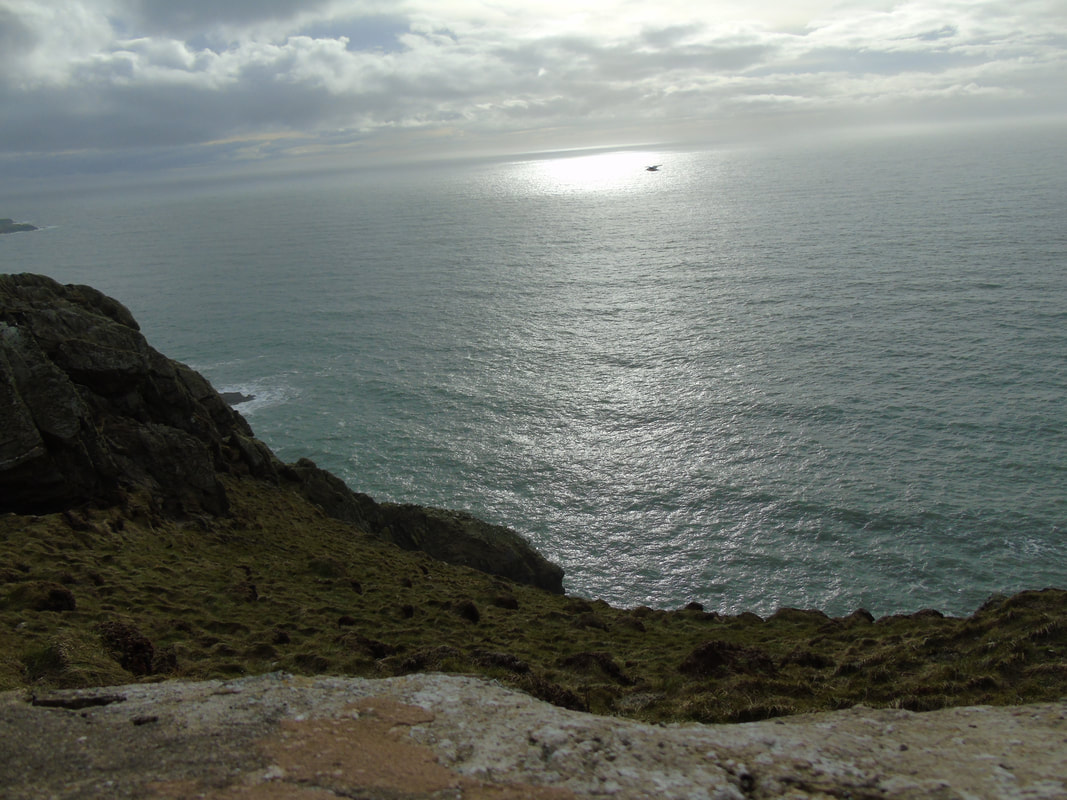
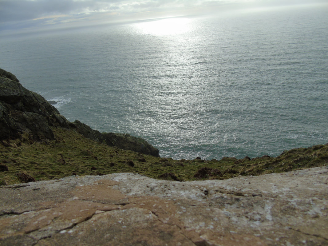
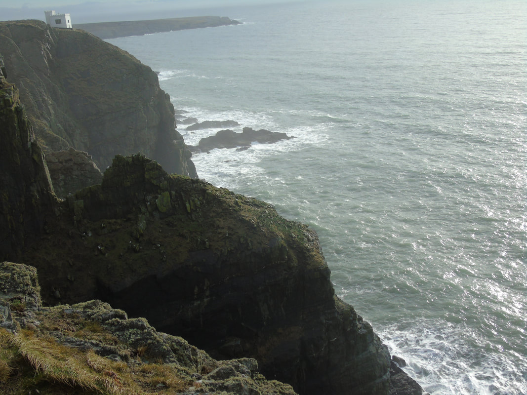
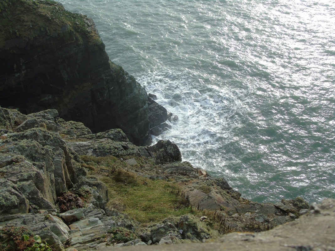
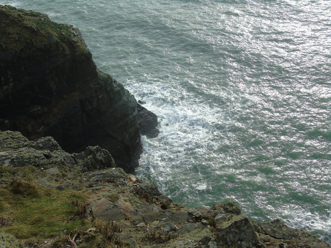
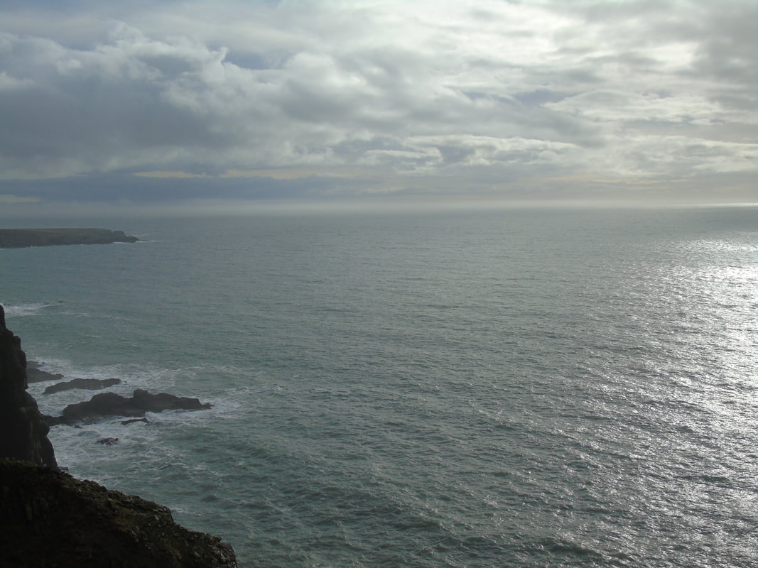
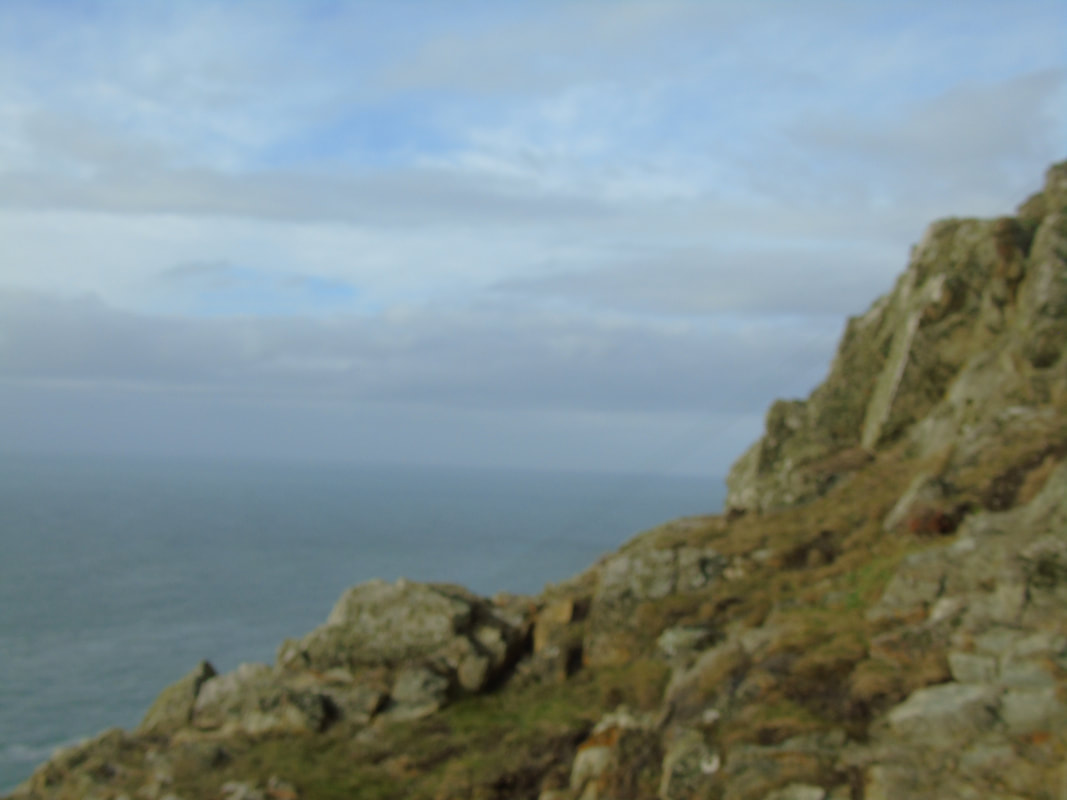
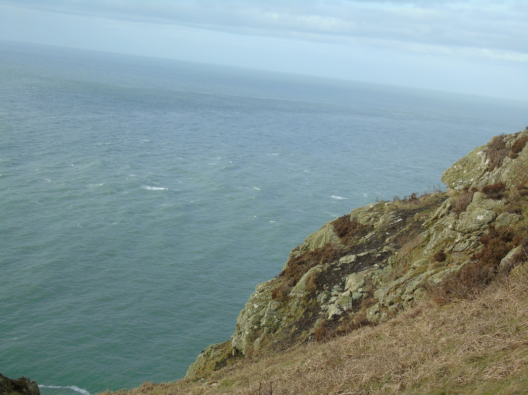
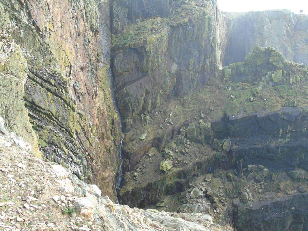
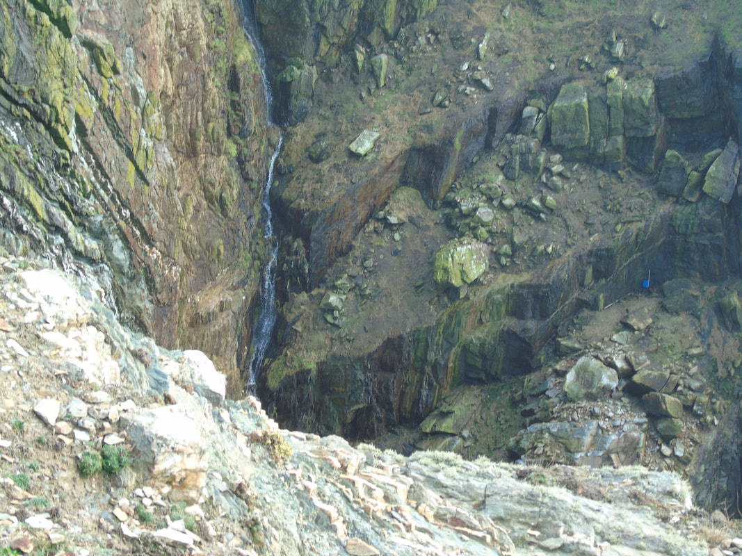
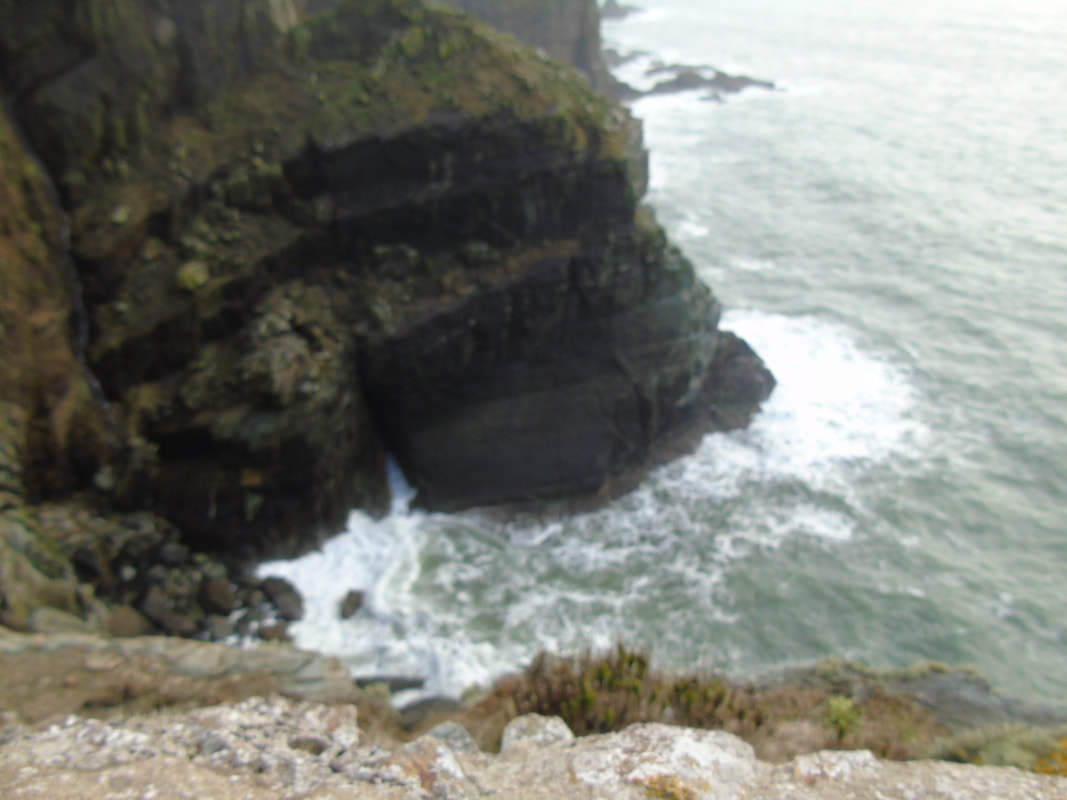
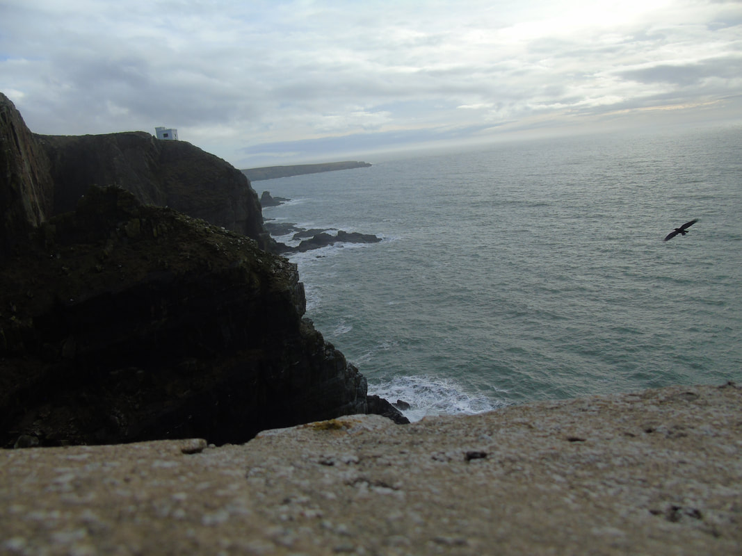
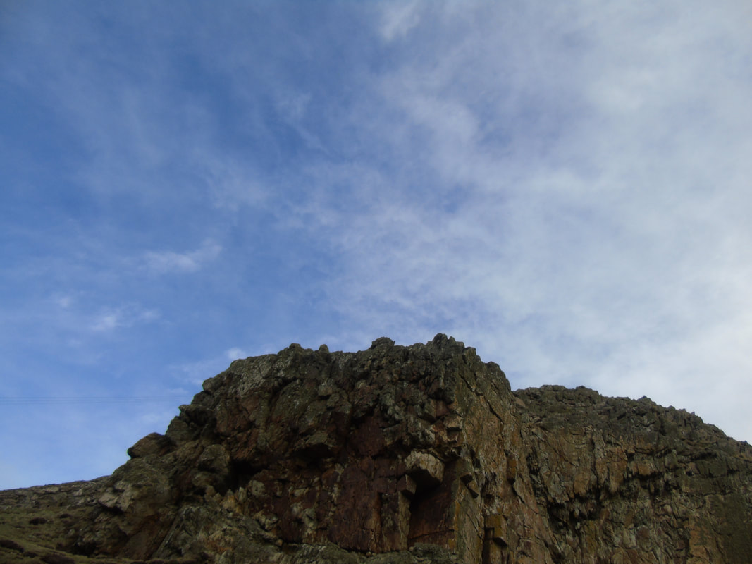
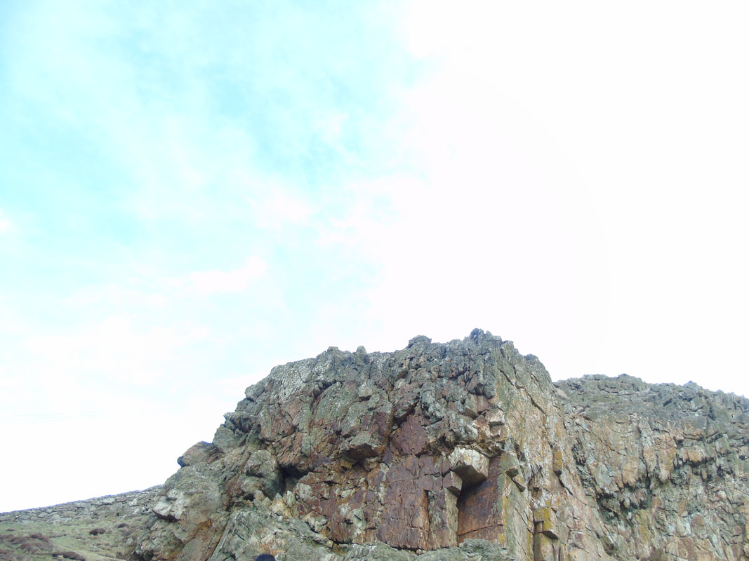
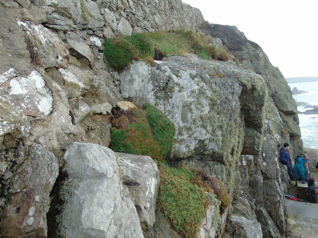
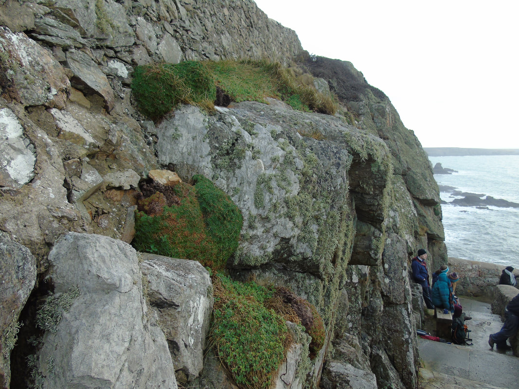
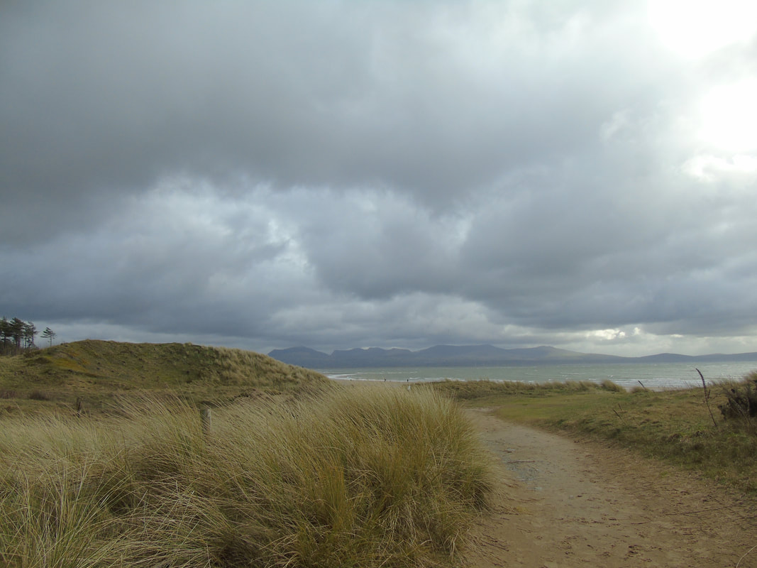
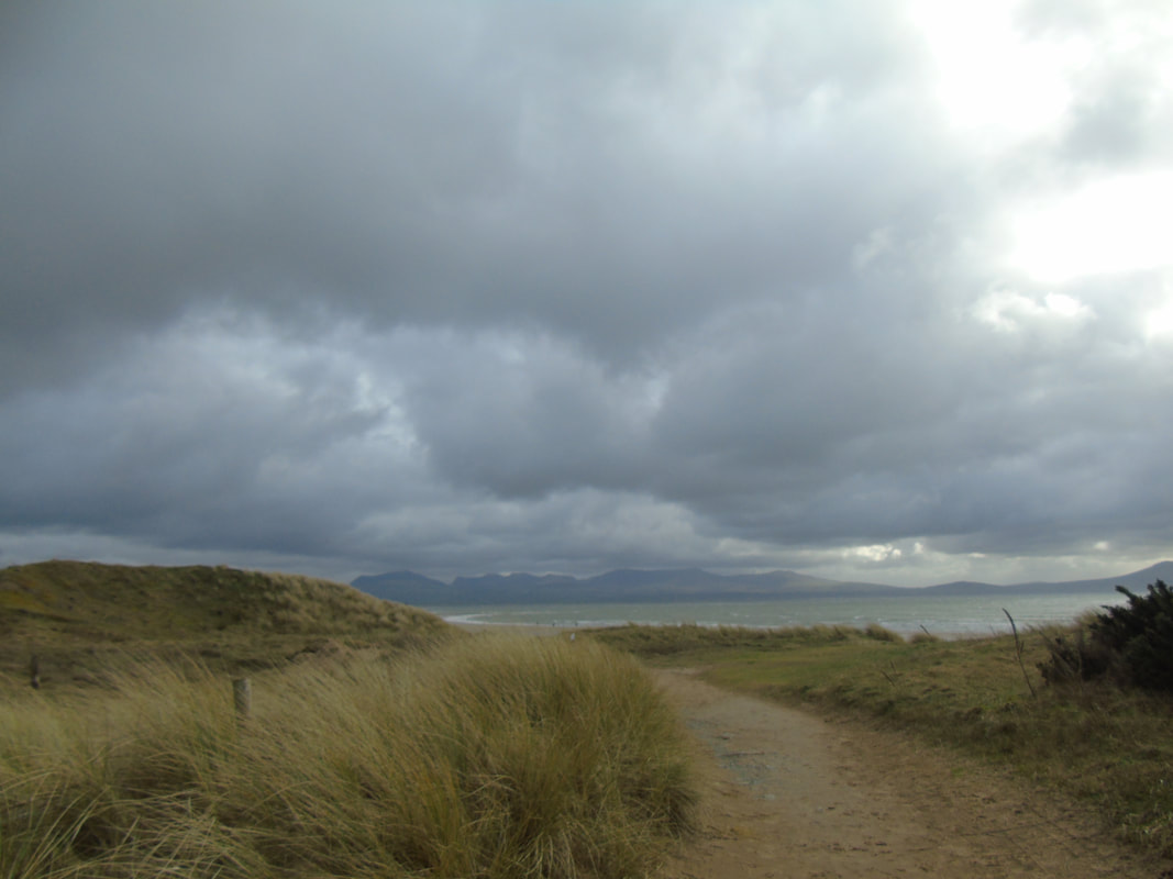
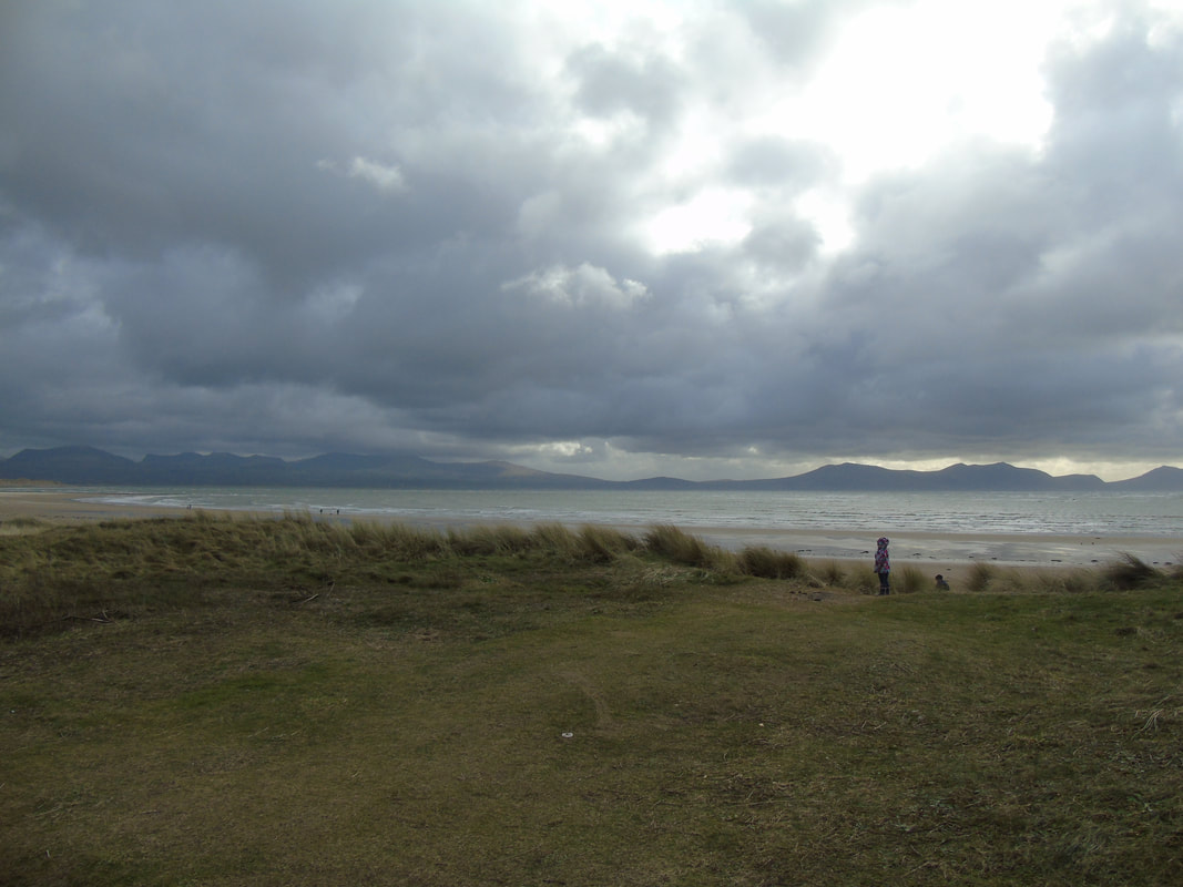
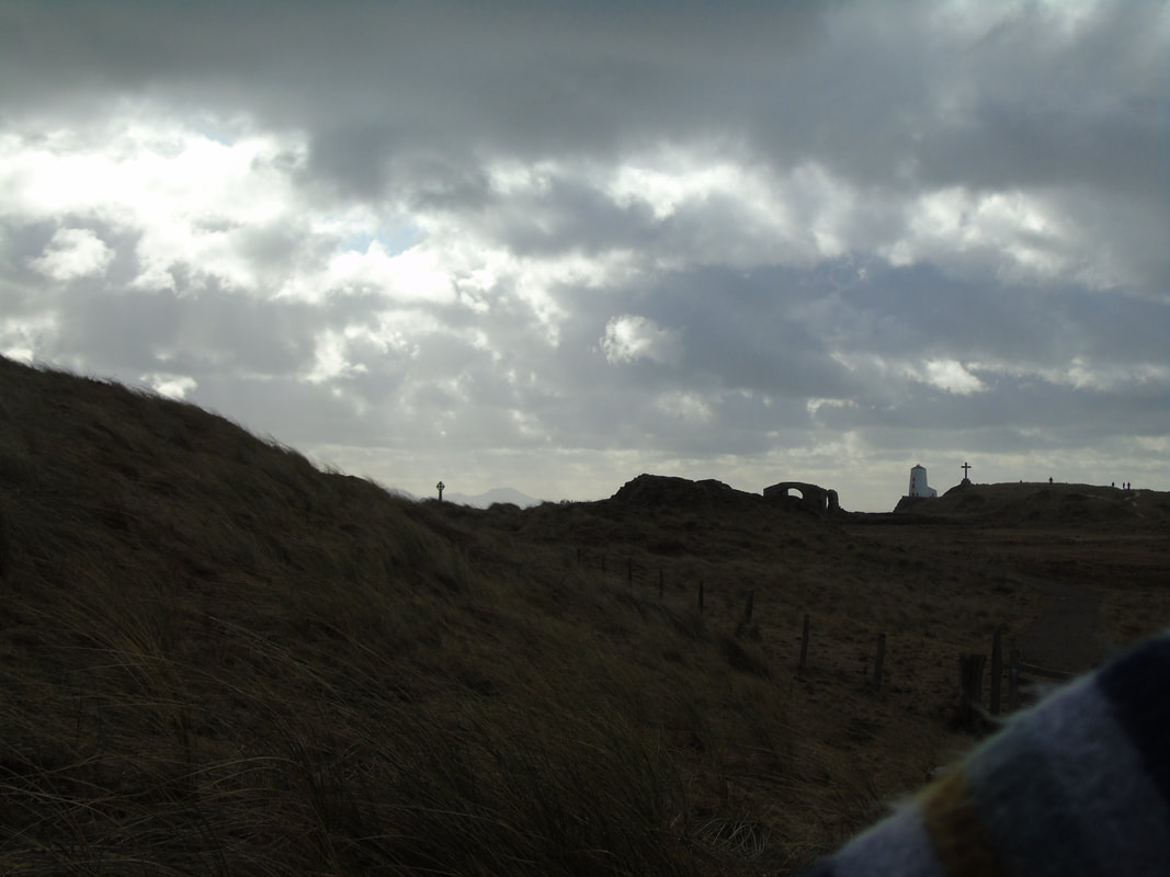
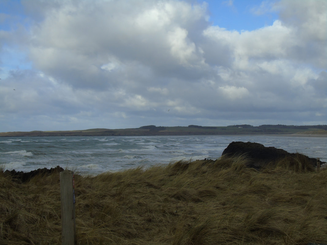
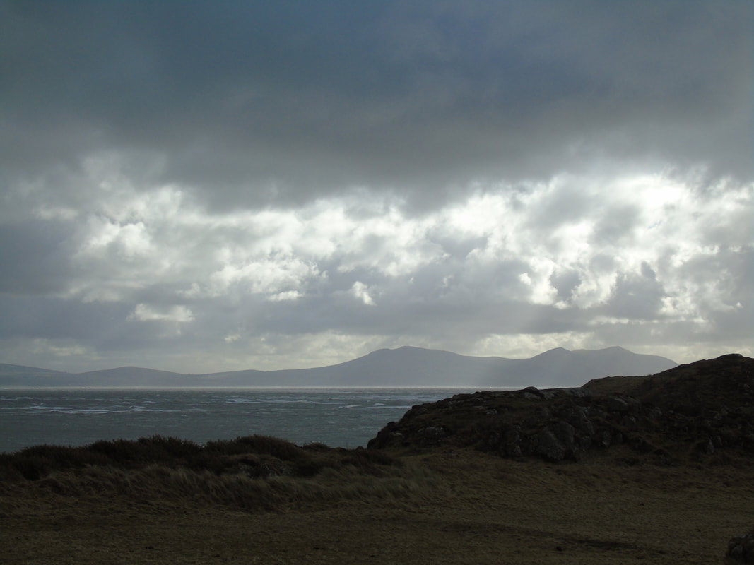
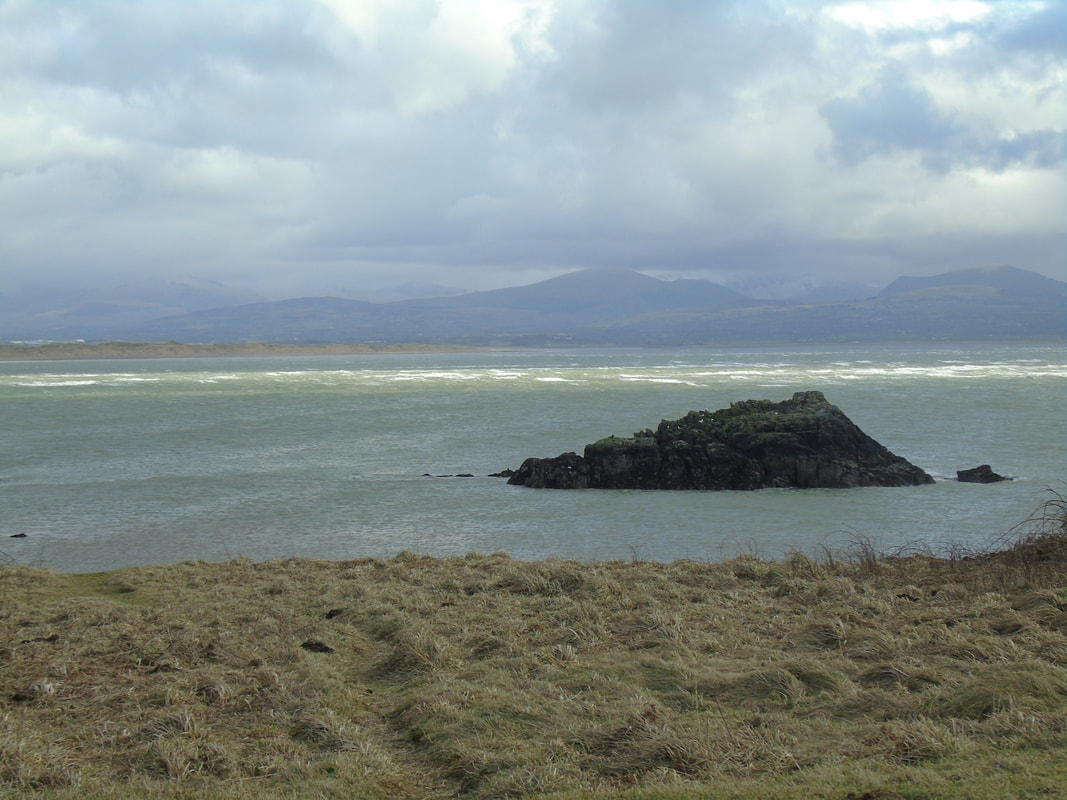
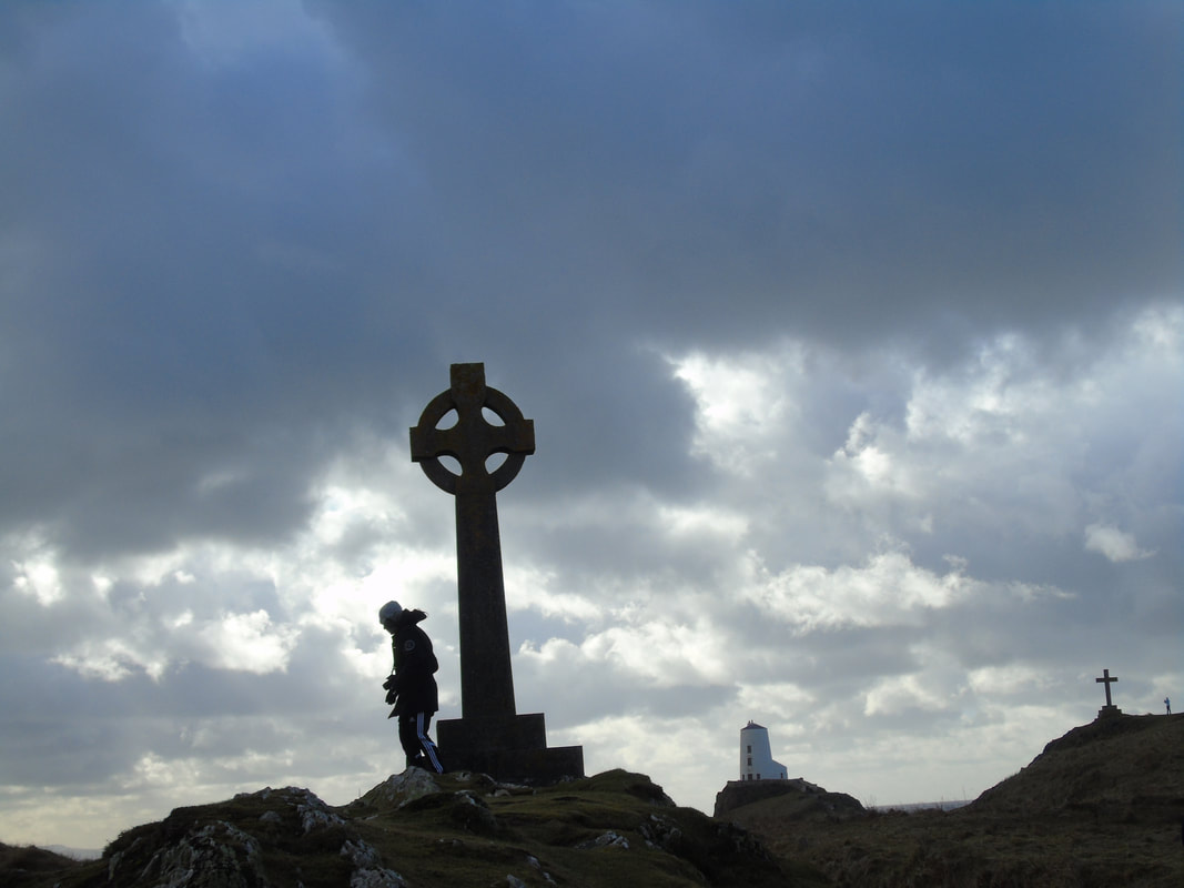
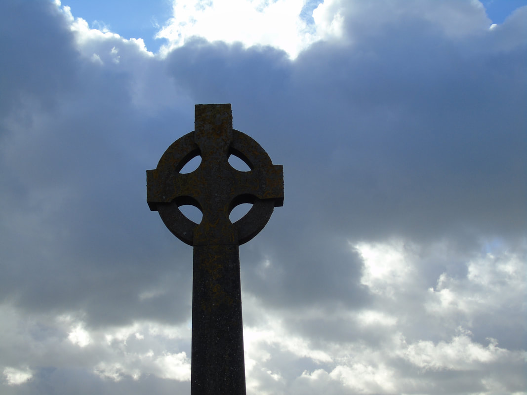
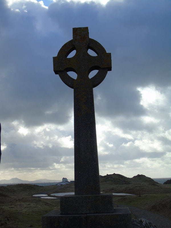
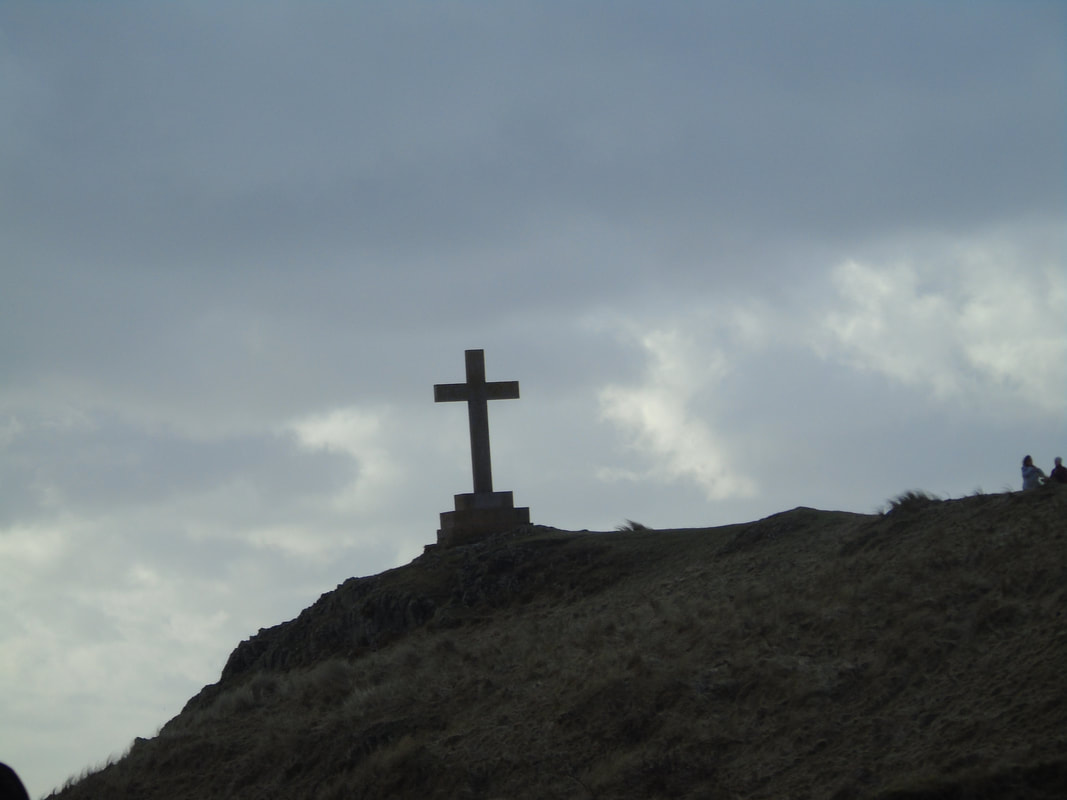
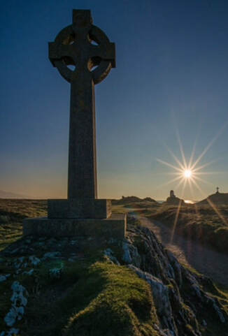
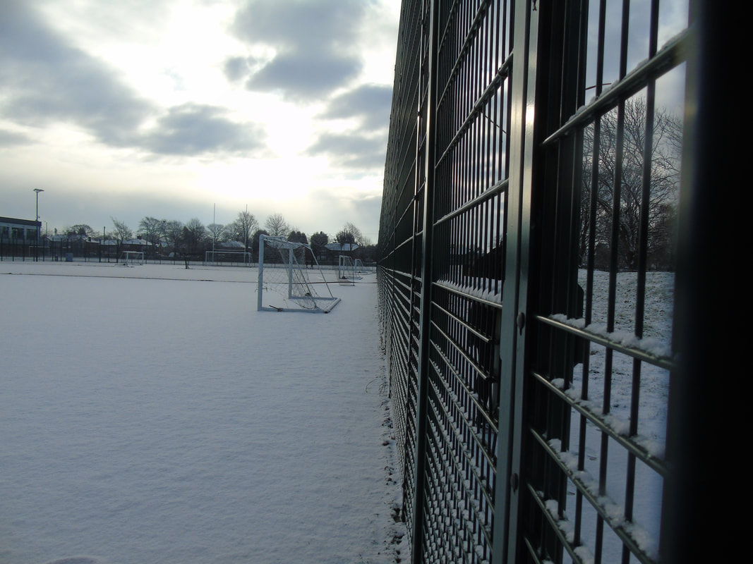
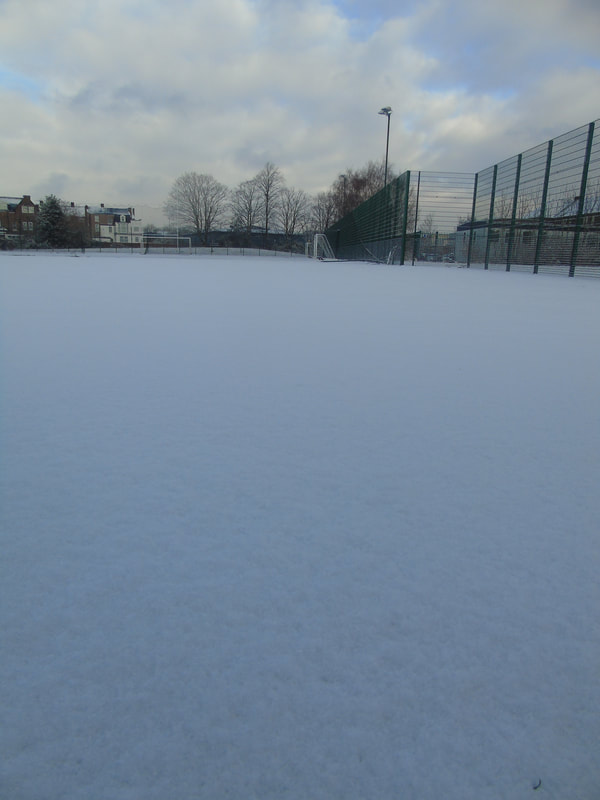
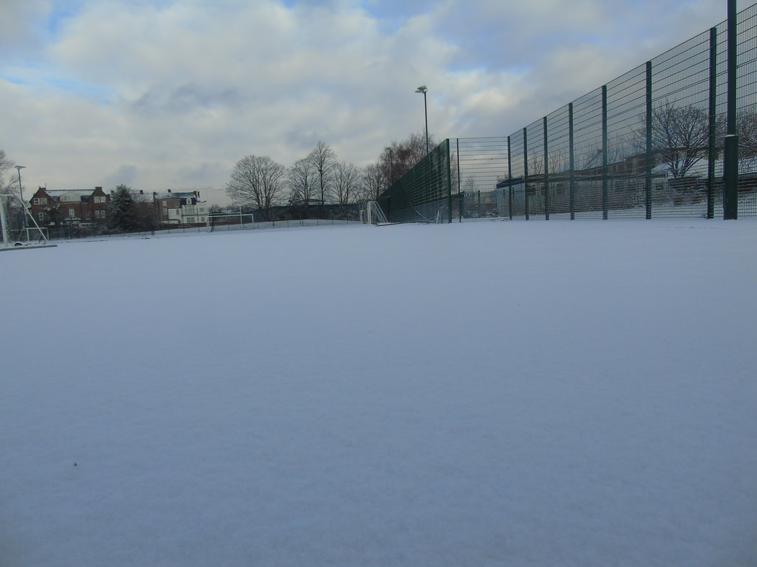
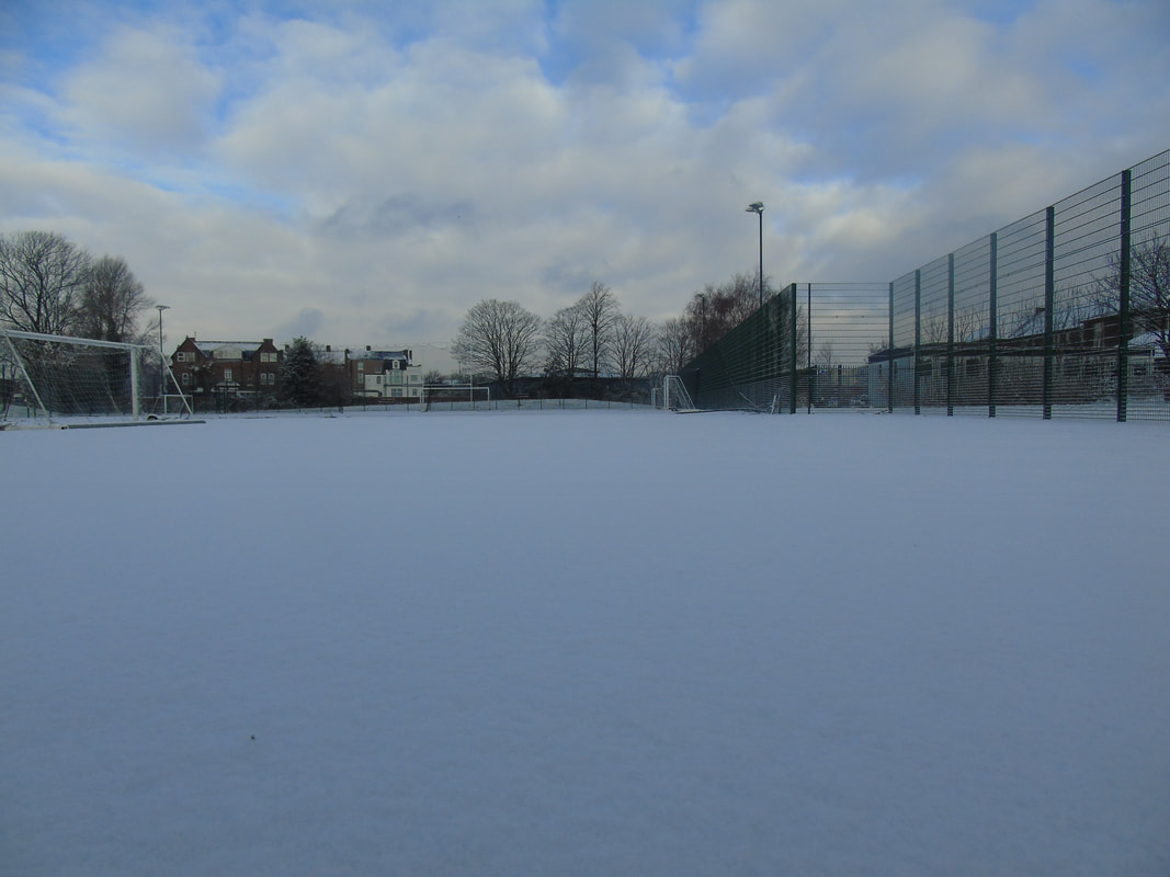
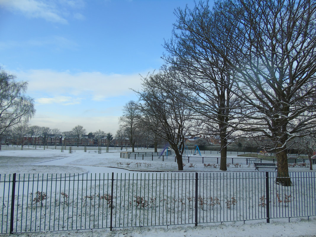
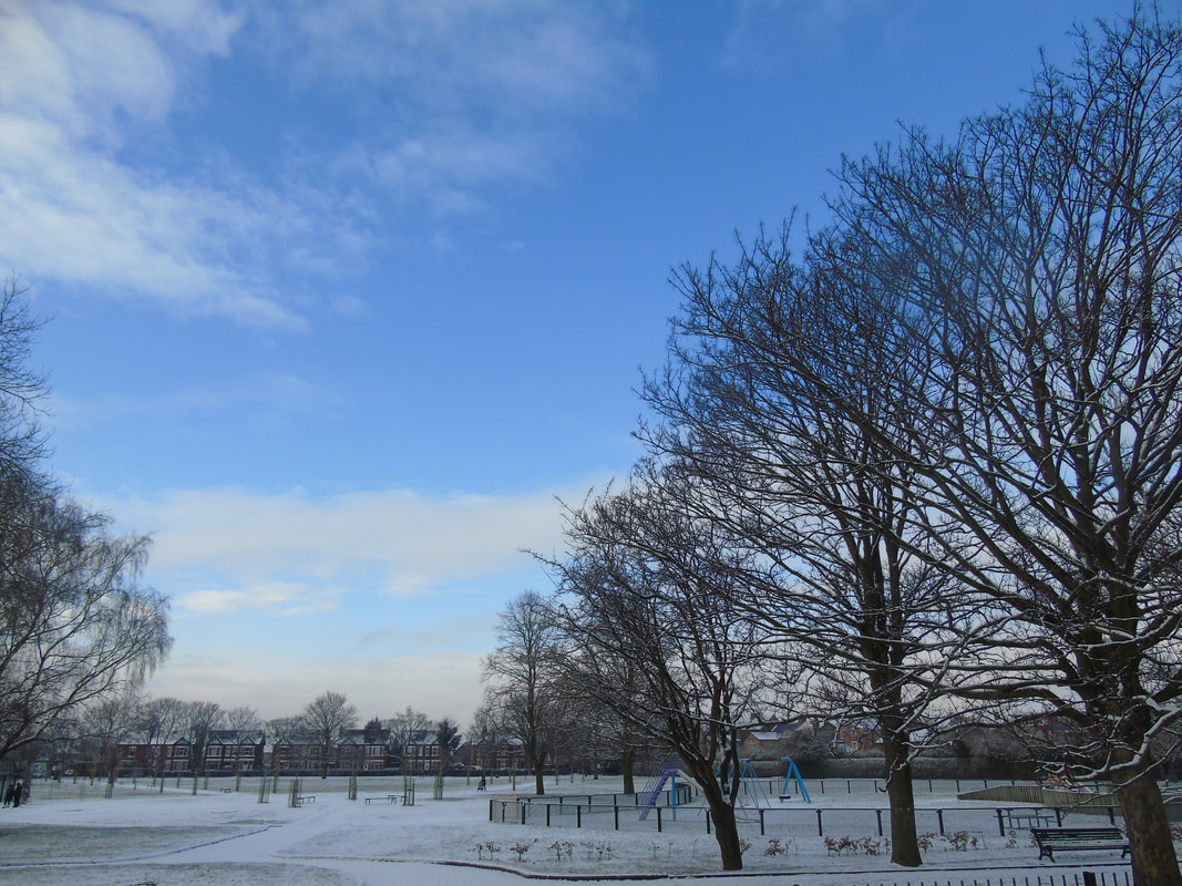
Angelsey
In February 2018, We went on a trip to Anglesey to explore rural landscapes. Throughout our landscape project, we explored rural and urban landscapes. We wen to Angelsey to explore the nature and peace of the countryside. We got really good pictures as we visited many places. Here's our adventure around Anglesey.
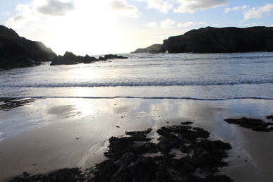
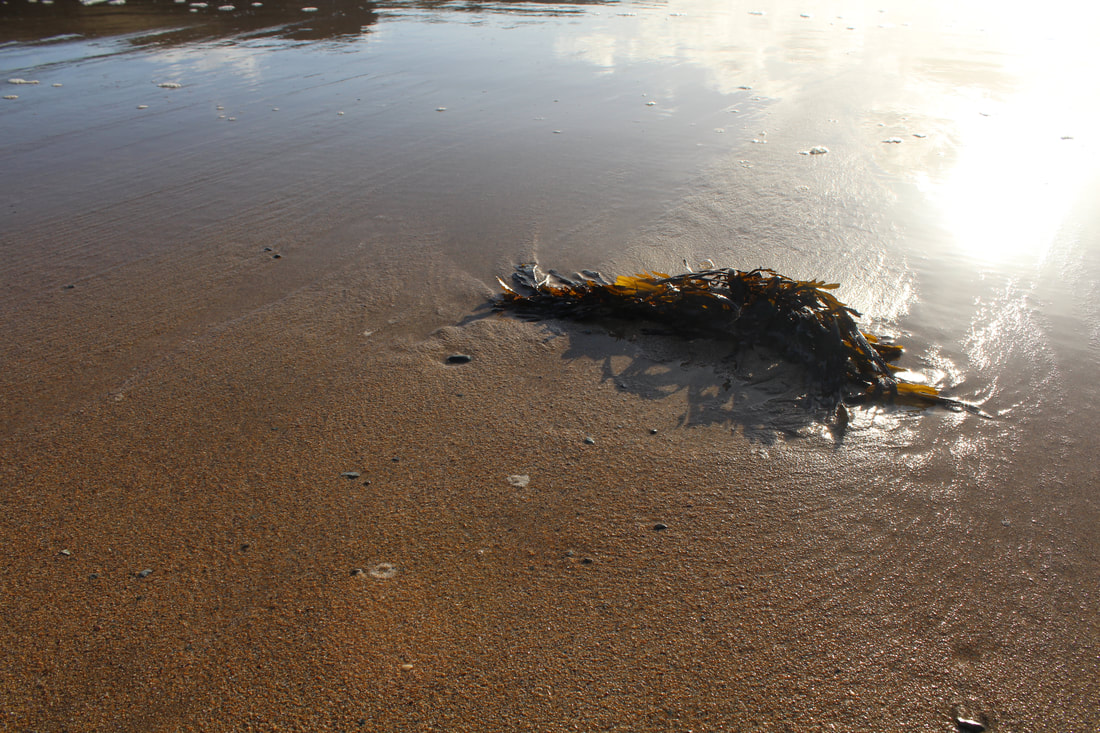
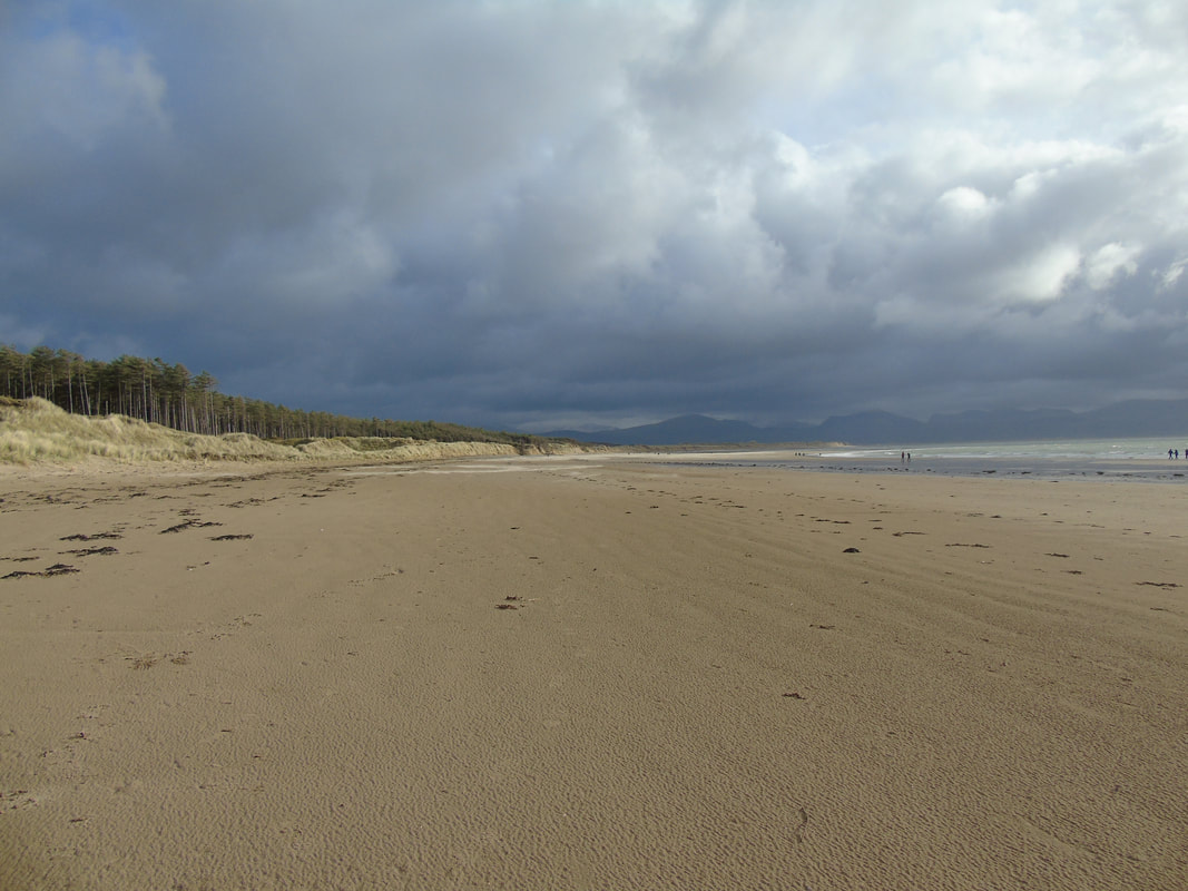
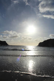
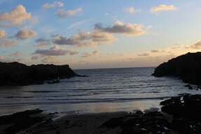
Beach shots
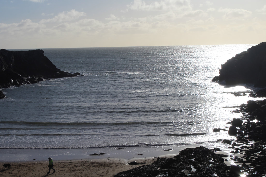
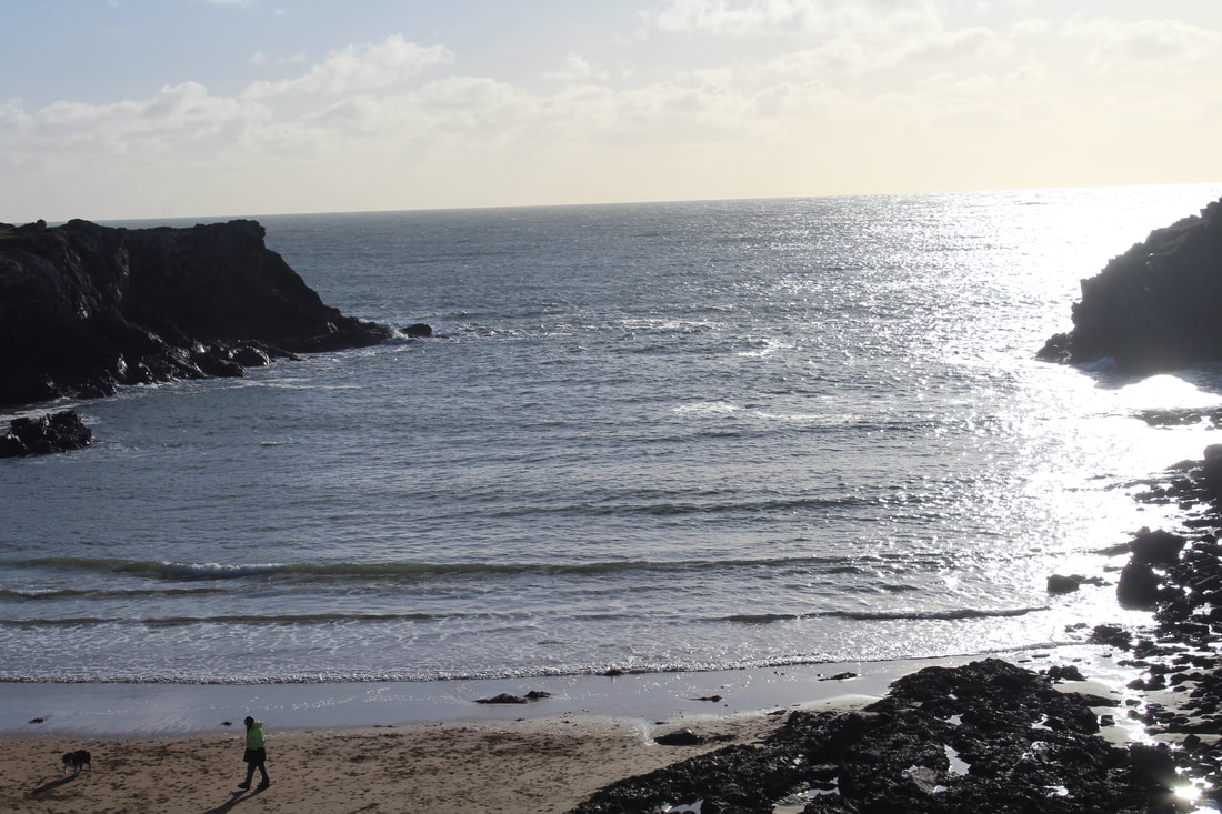
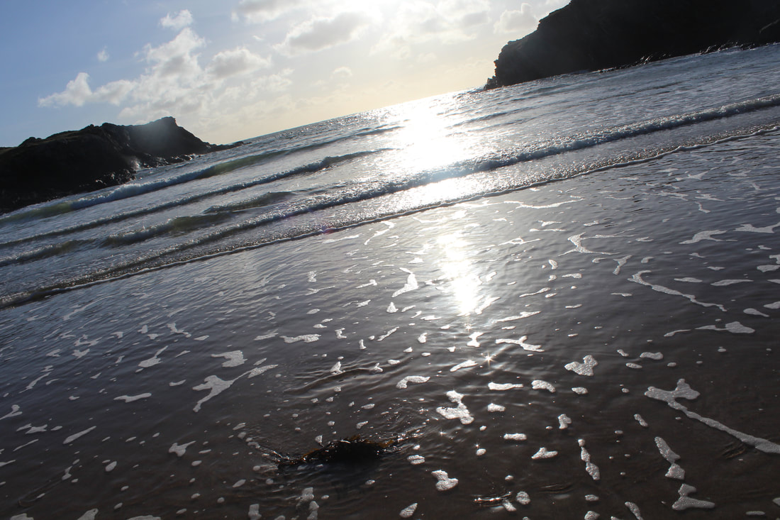
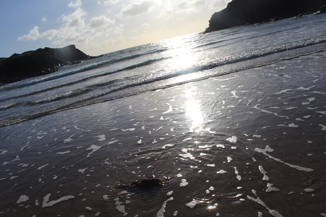
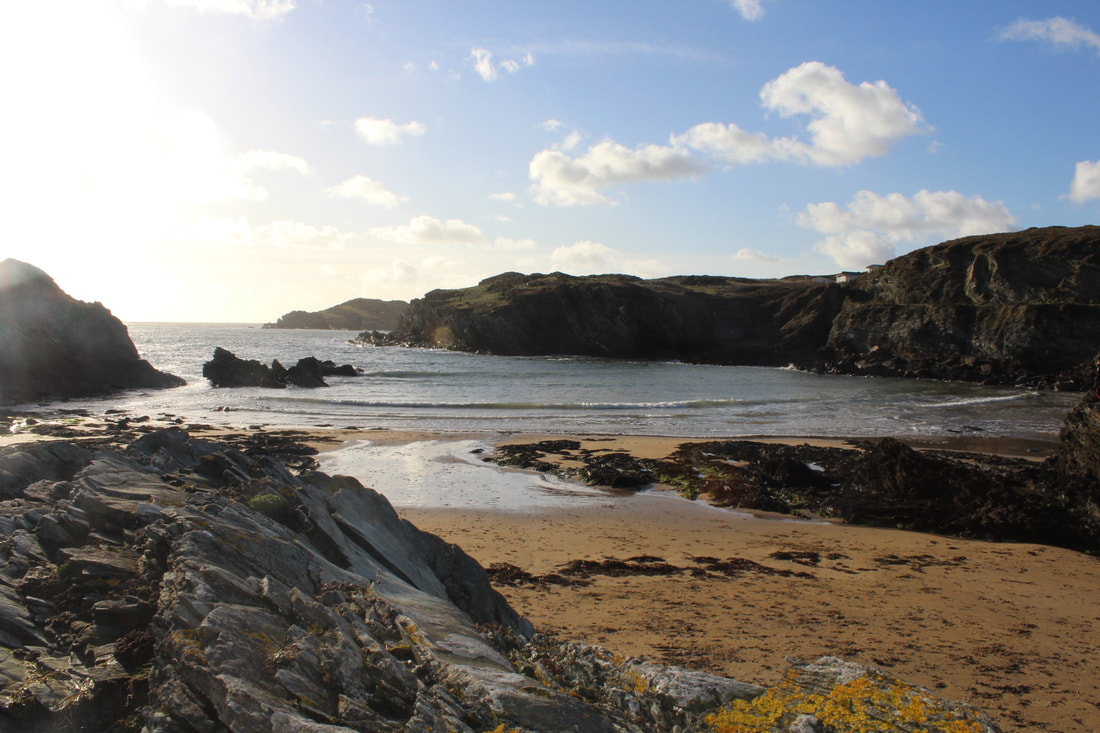
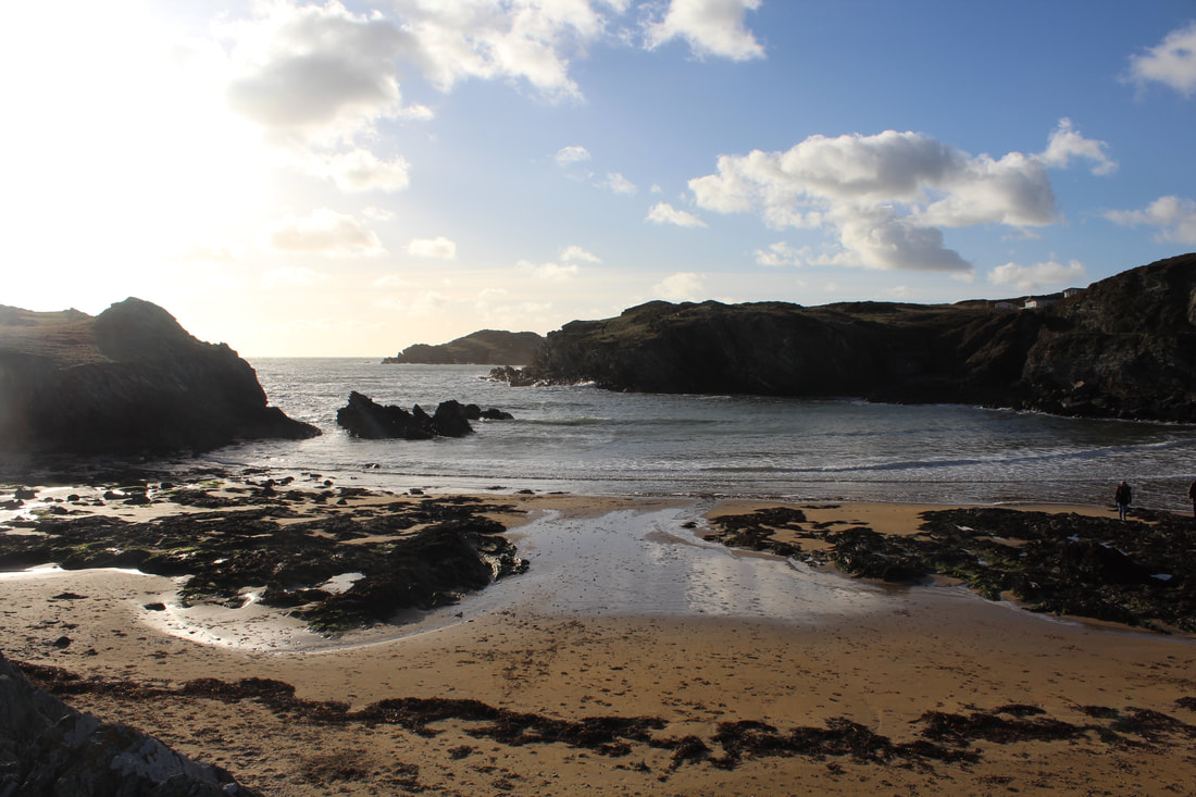

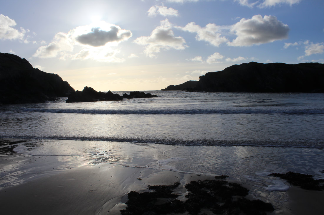
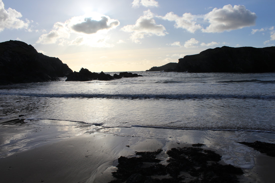
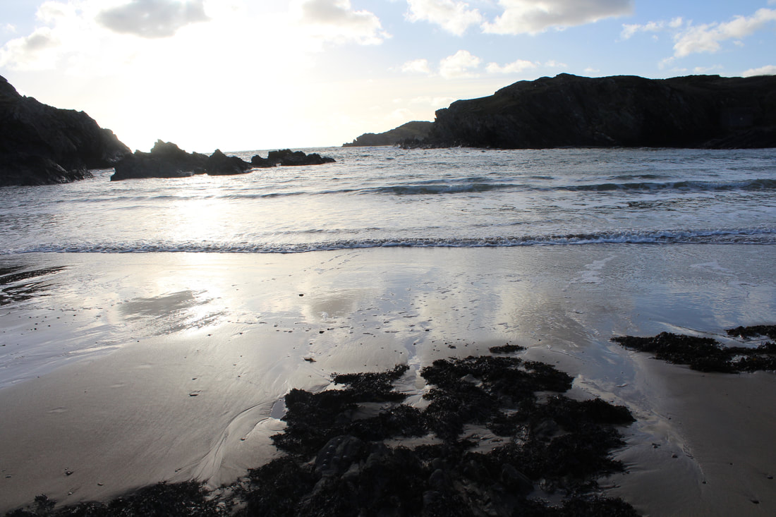
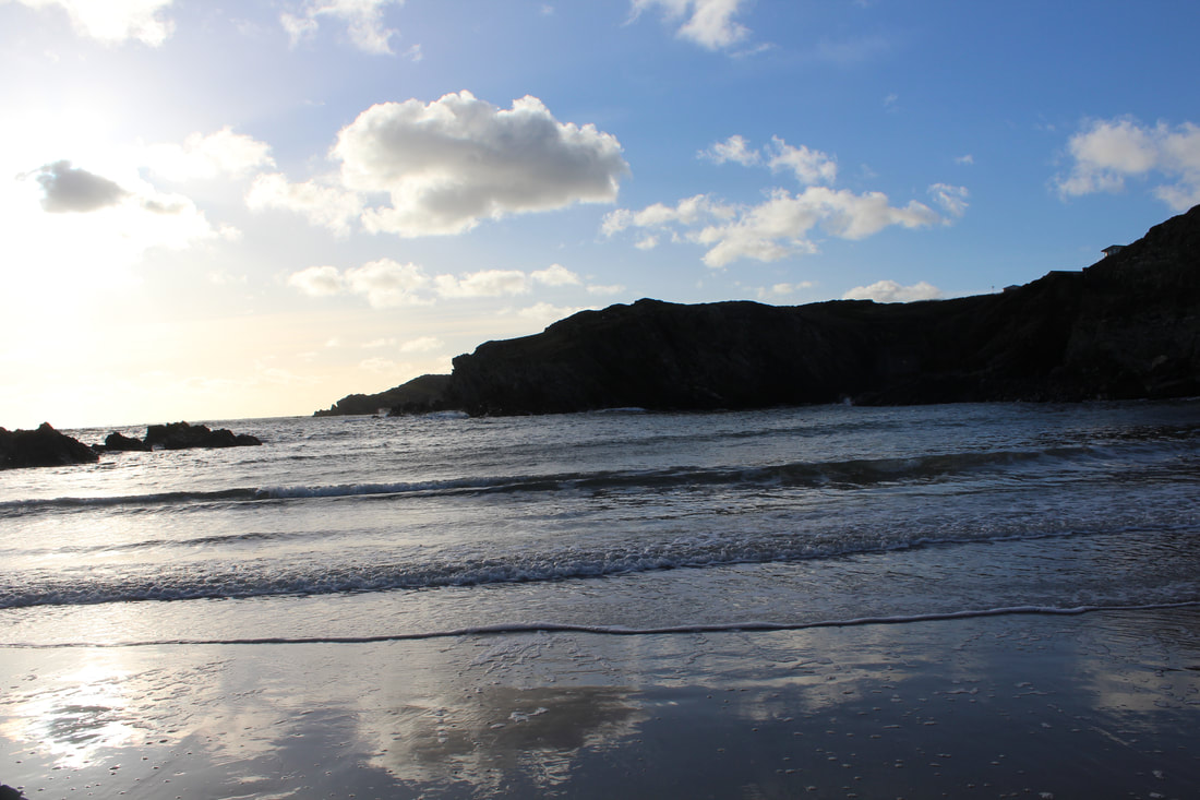
Best |
Worst |
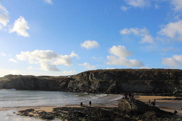
In my opinion, I think this is a good picture because it is not bleached out and I have captured the beach at a good time of the day and you can also see some people having fun at the beach.
|
In my opinion,I dont think this is a good picture as it is quite bleached out because of the aperature and nothing is really in focus.
|
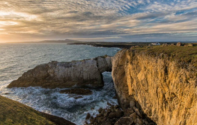
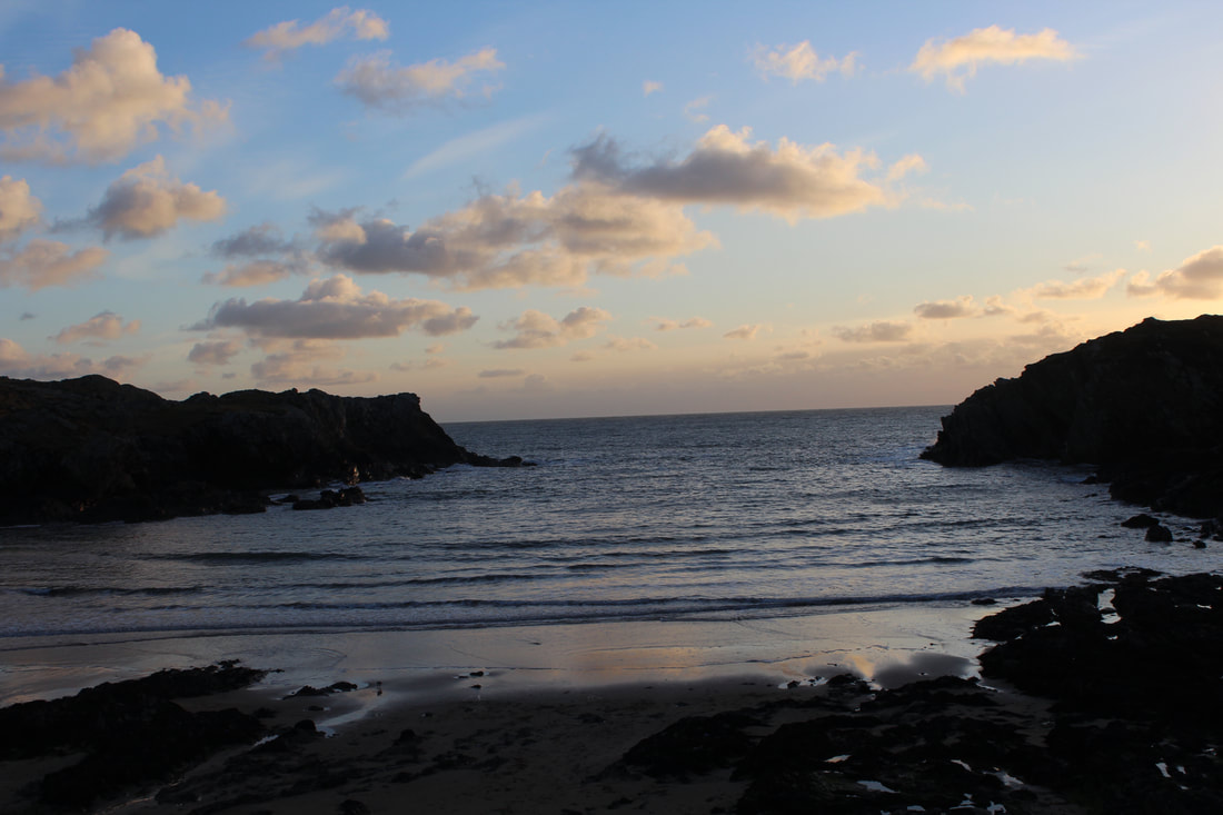
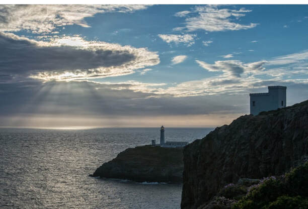
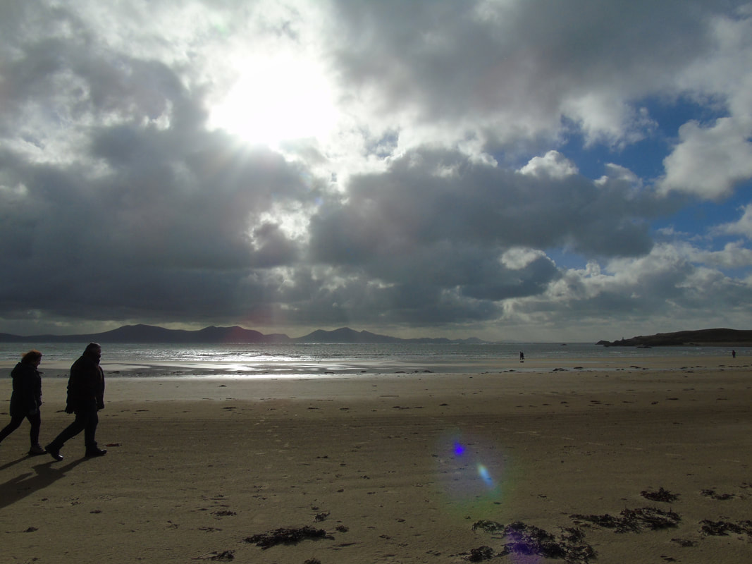
Angelsey beach shots inspiration by Simon Kitchin
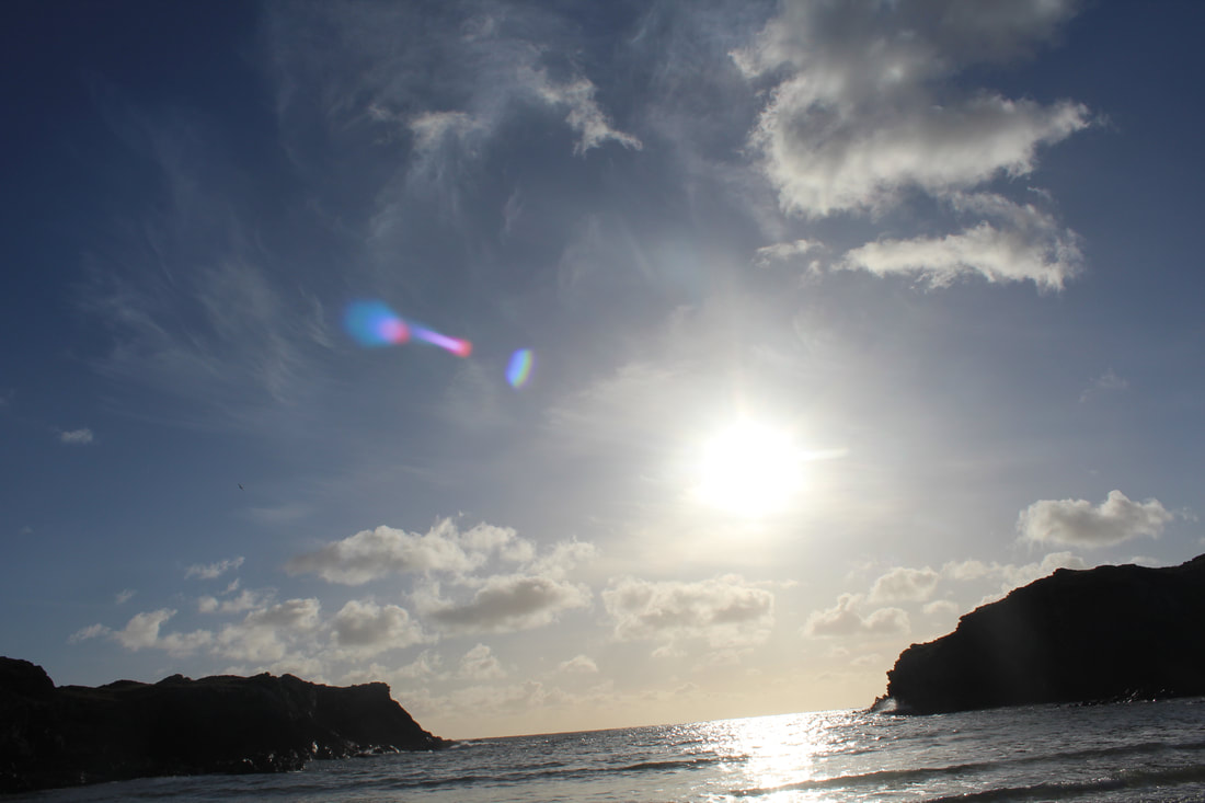
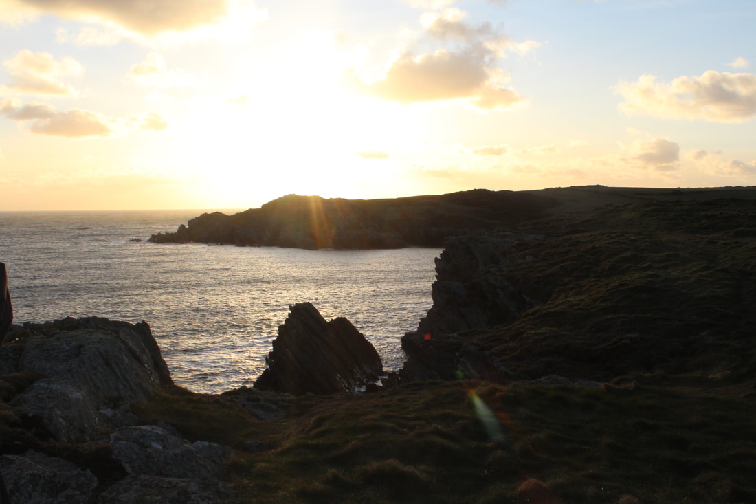
Sun set
Best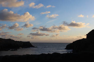
I think this is a really good and effective picture as the sun has started to set and it has shown a really pretty pink colour but also started to capture the water that is everlasting.
|
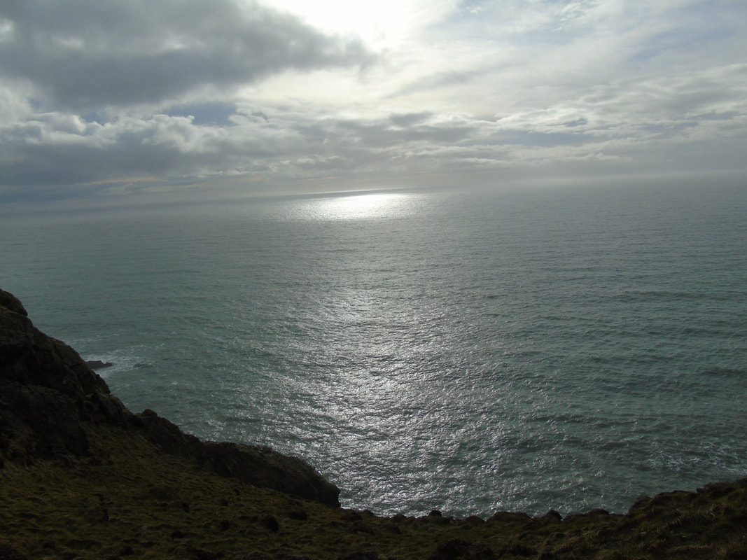
Landscape photography by Simon Kitchin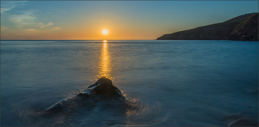
This picture does not exactly replicate my work but looks similar as the cliff has become darker as the sun is beaming on the sea and creating a line of light as everything has become dark and faded out. I picked this photographer because his landscape workshop is based around Angelsey and went to most of the places that we visited which shows the similarities between his work and mine.
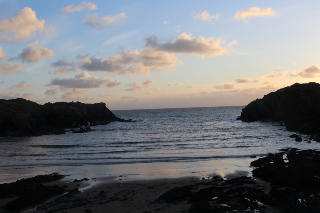
Worst
In my opinion, this is overexposed and you can not see the sun set clearly so that's why I think its not my favourite picture,
|
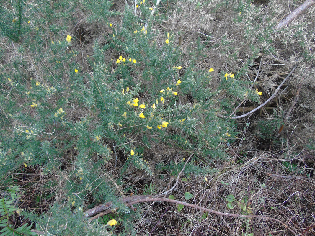
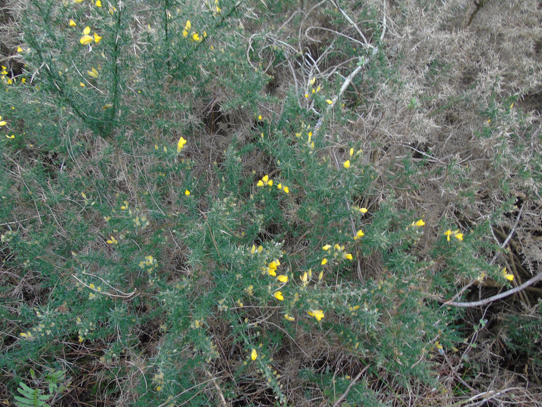
Close ups
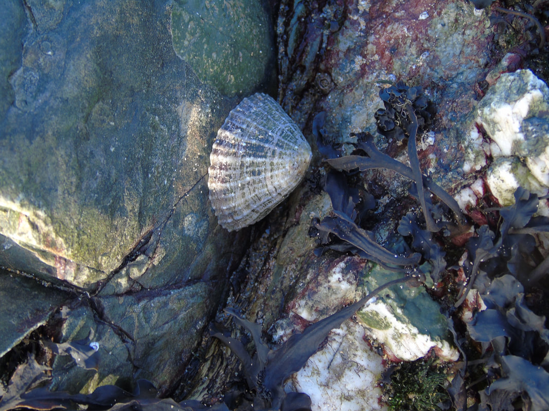
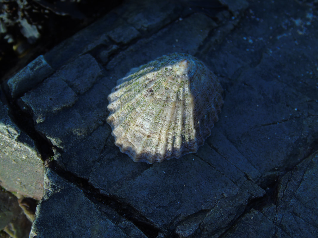
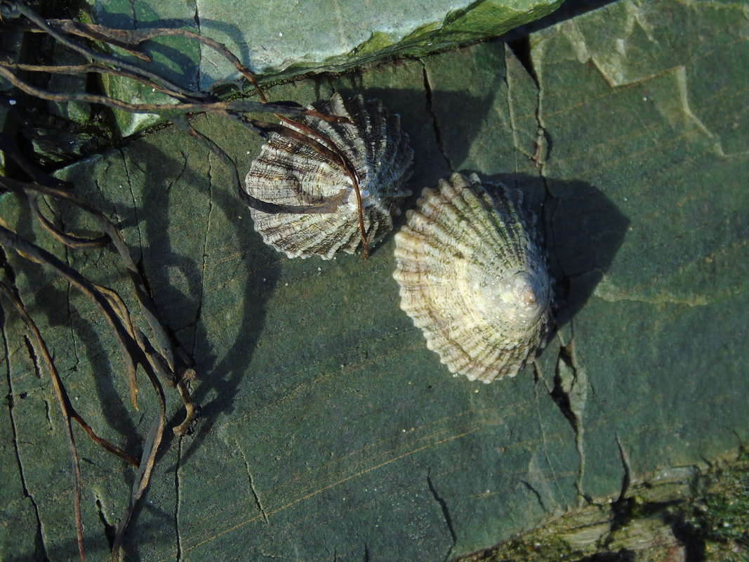
People
|
|
|

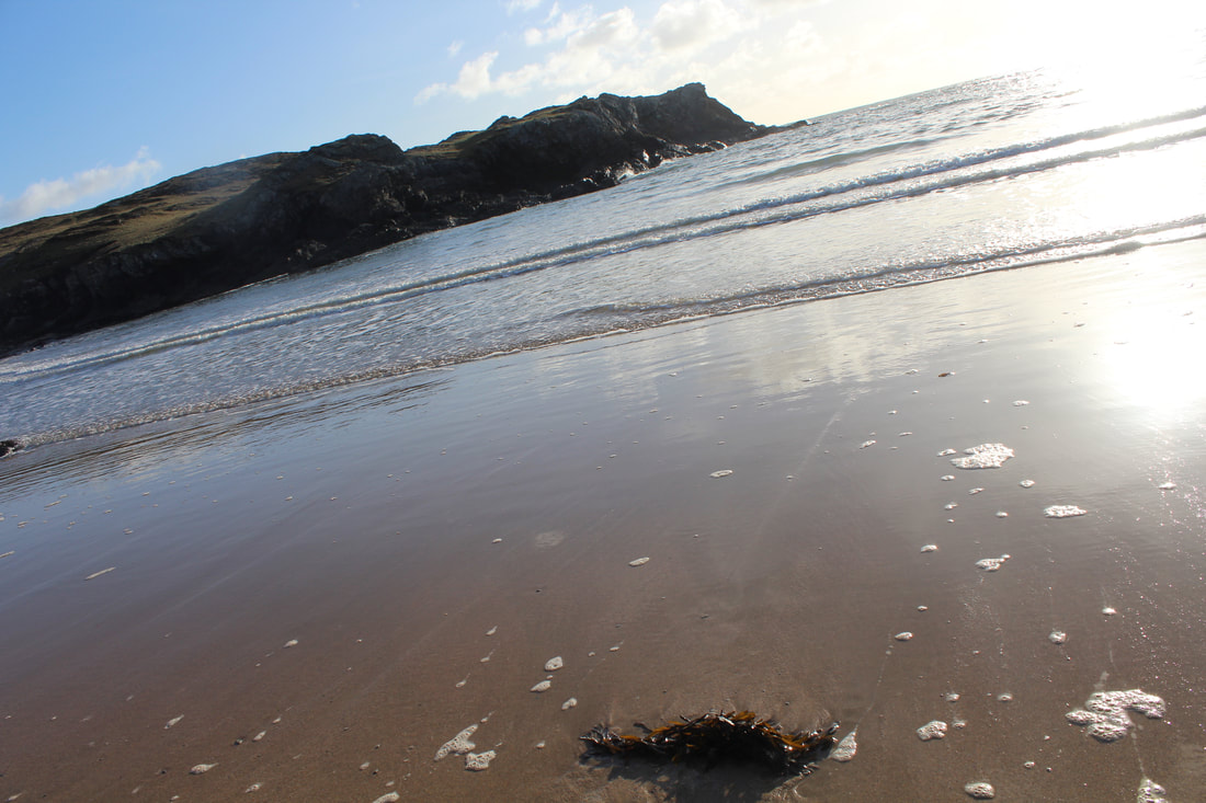
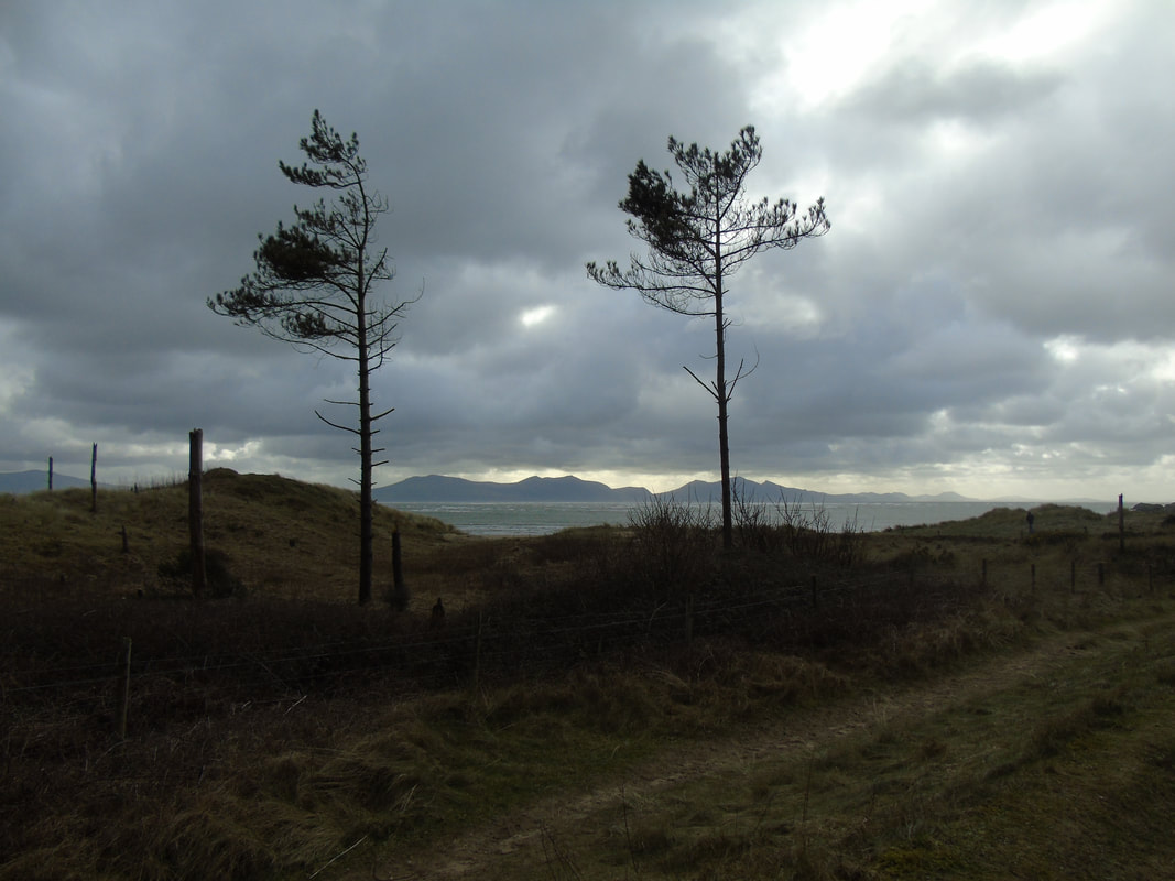
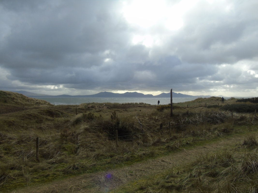
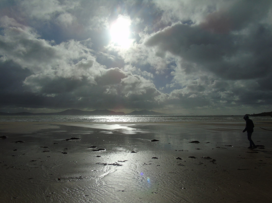
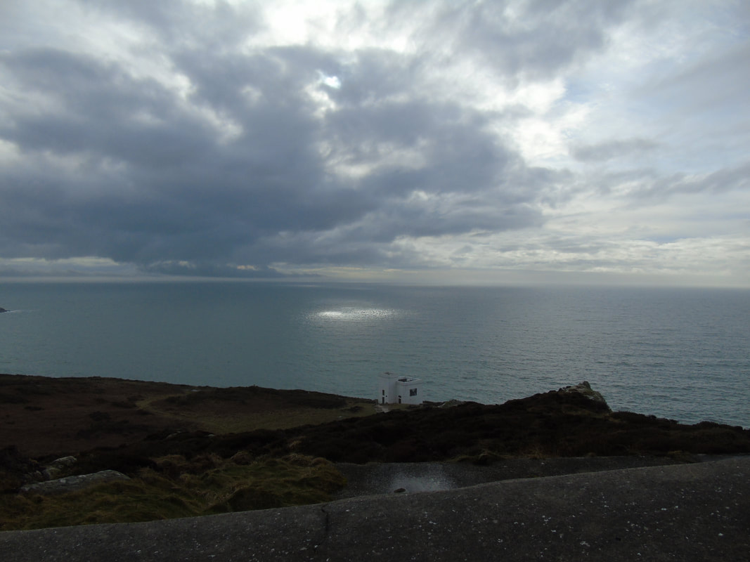
Sky

Best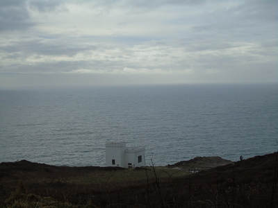
This is a good picture because the composition is thought about well as the house is the centre and eye focus of the picture and has the sea in the background.
|
Worst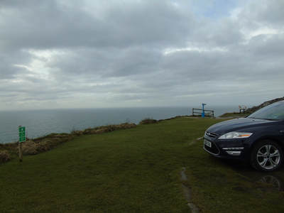
This is not a good picture as it is really not thought about and the car is in the way which ruins the picture.
|
Inspiration by Simon Kitchin
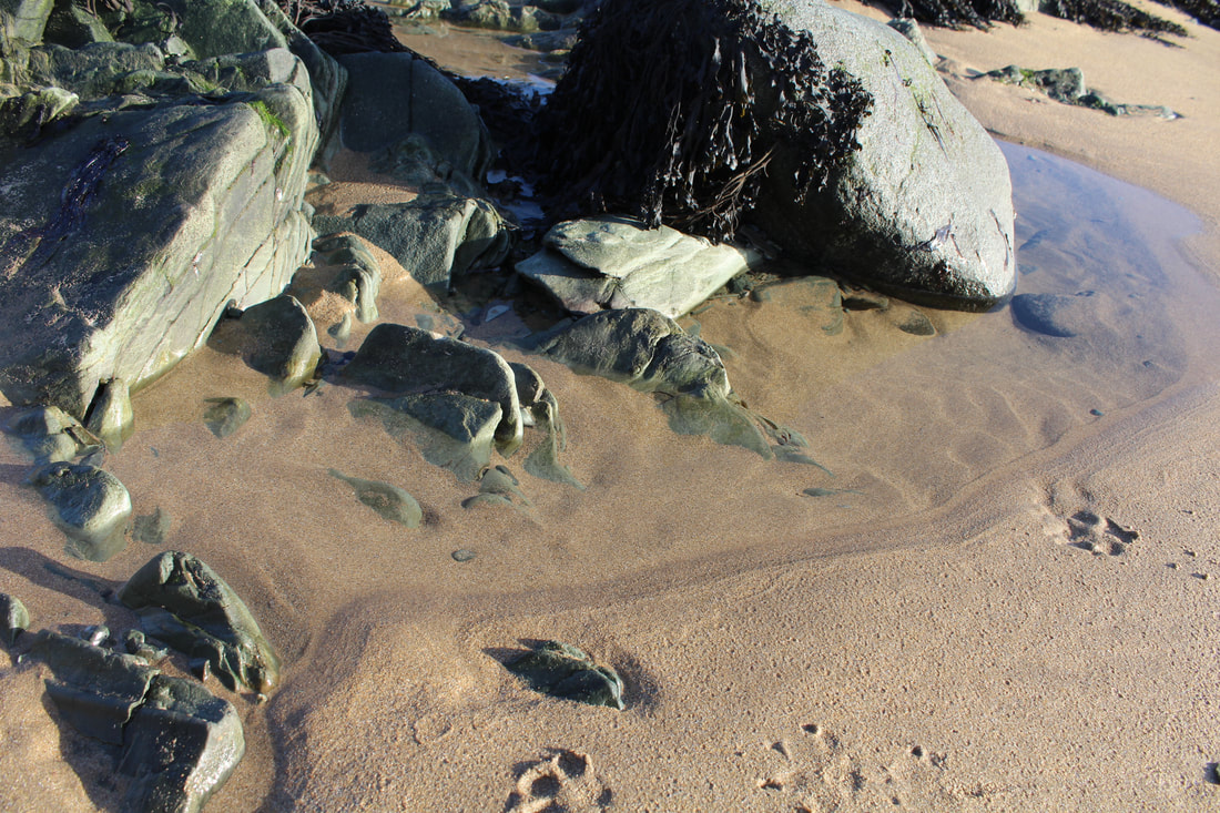
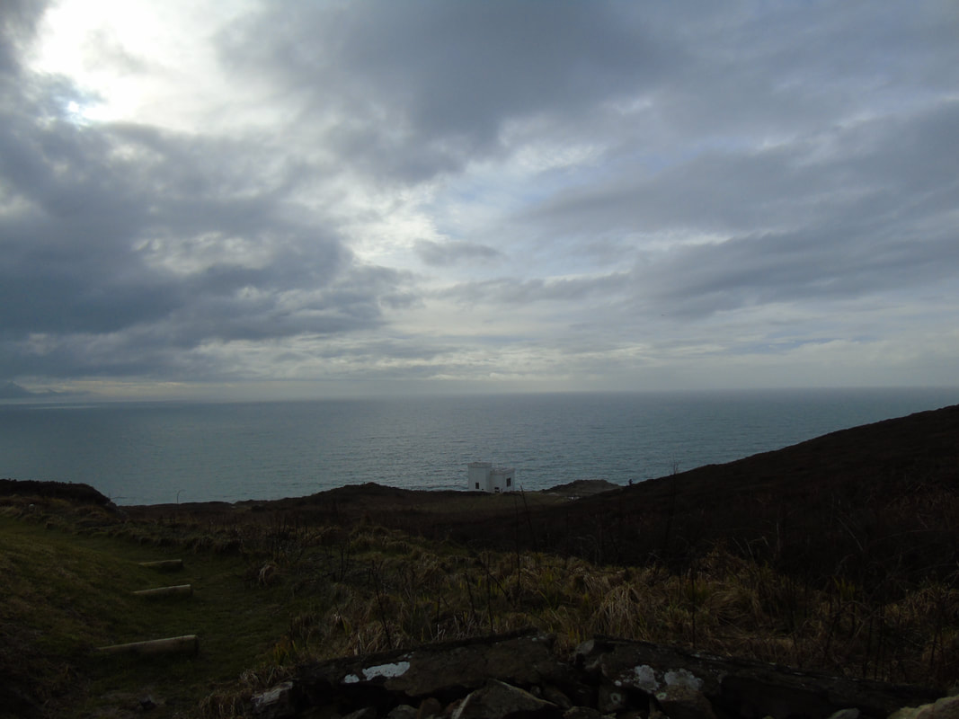
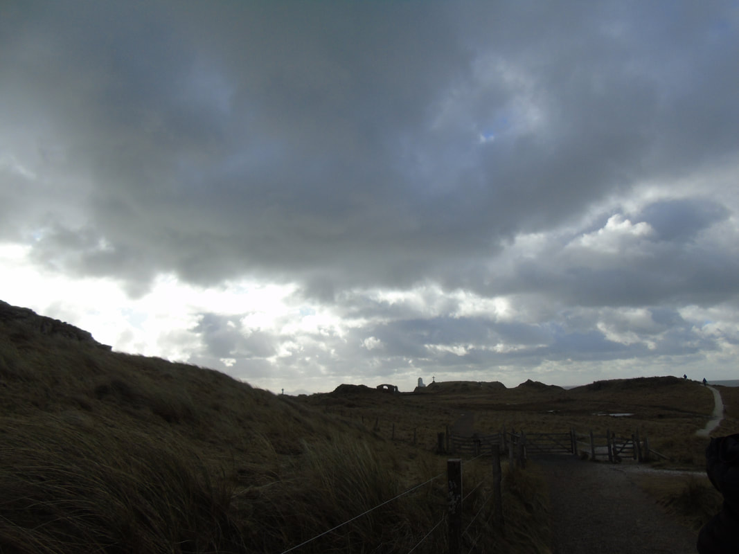
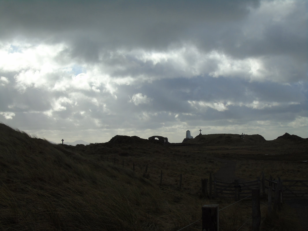
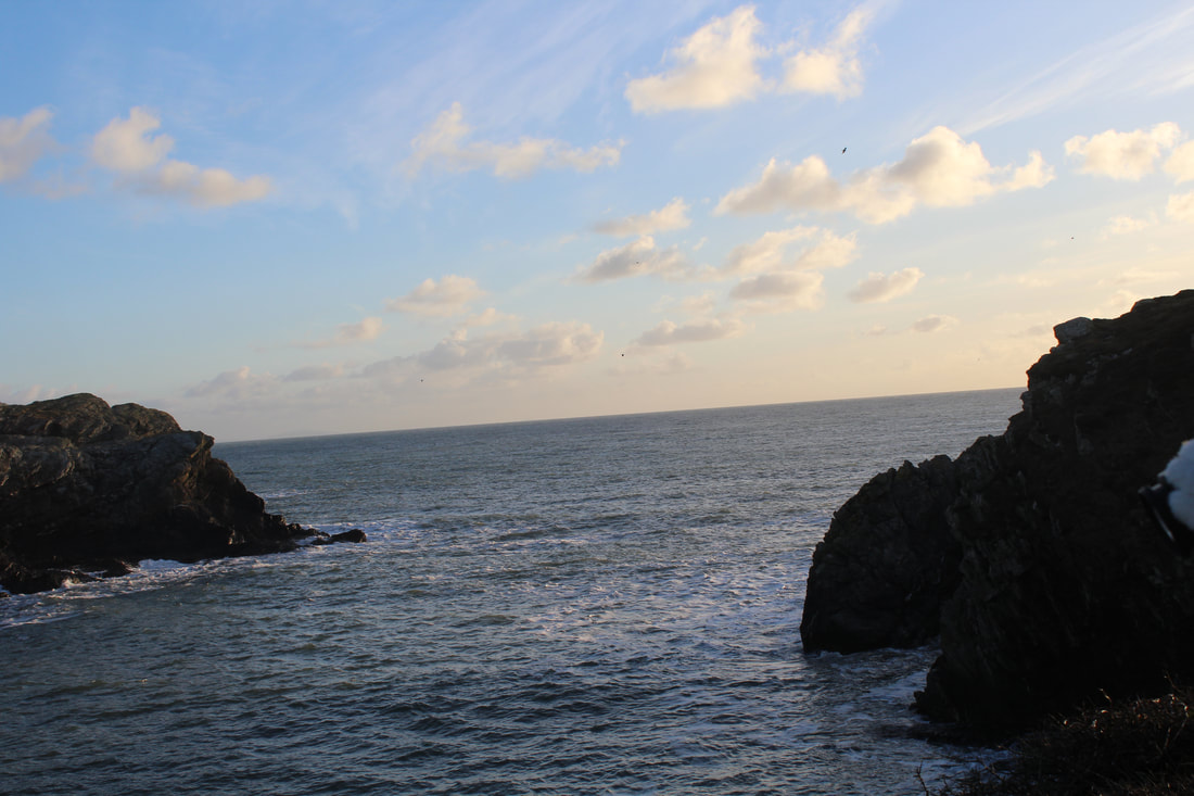
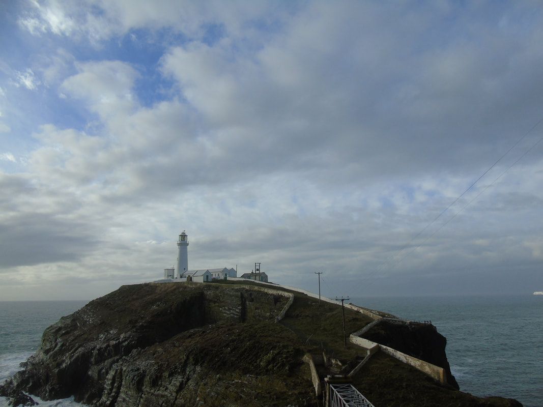
Walking down to the light house
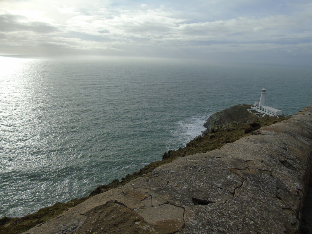
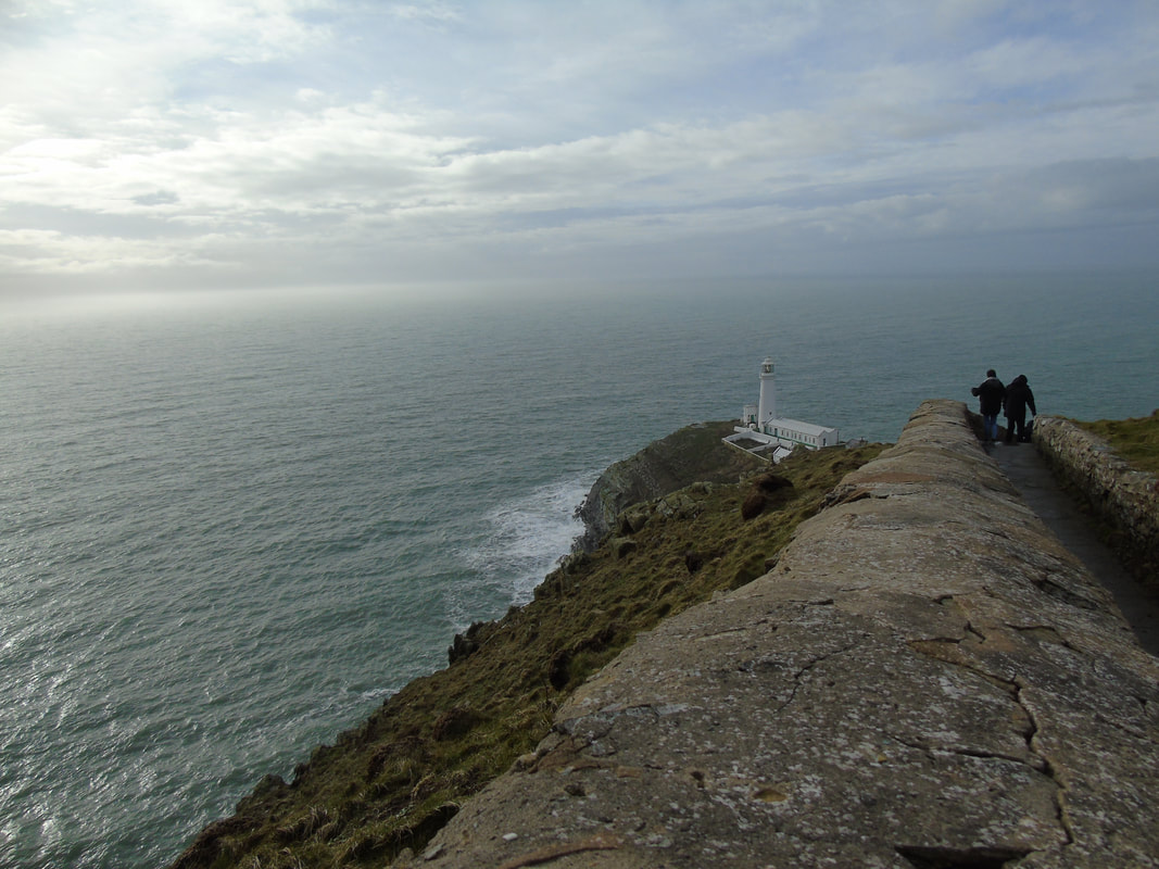
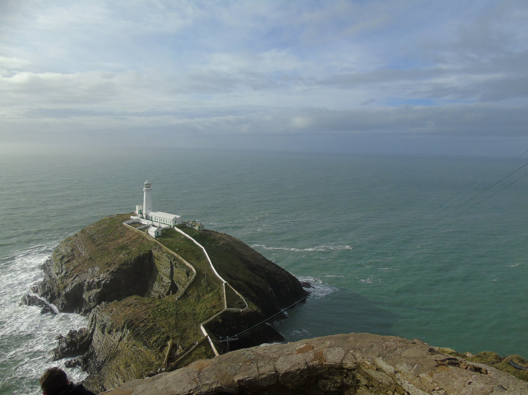
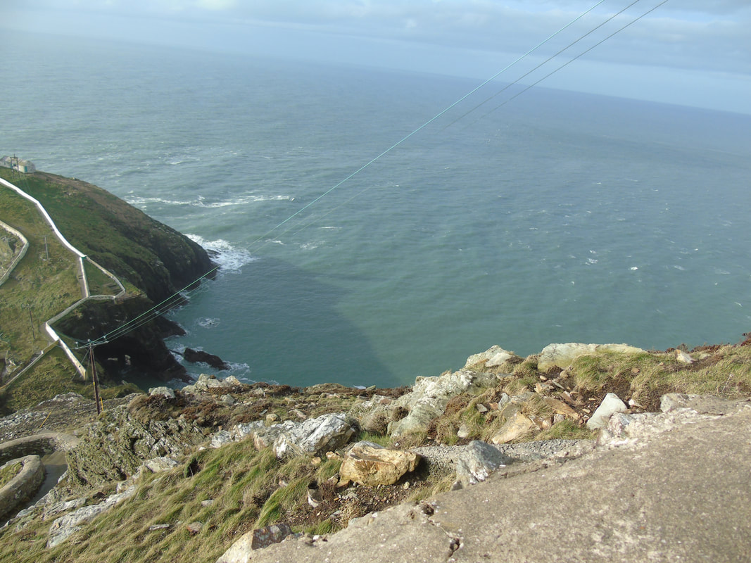
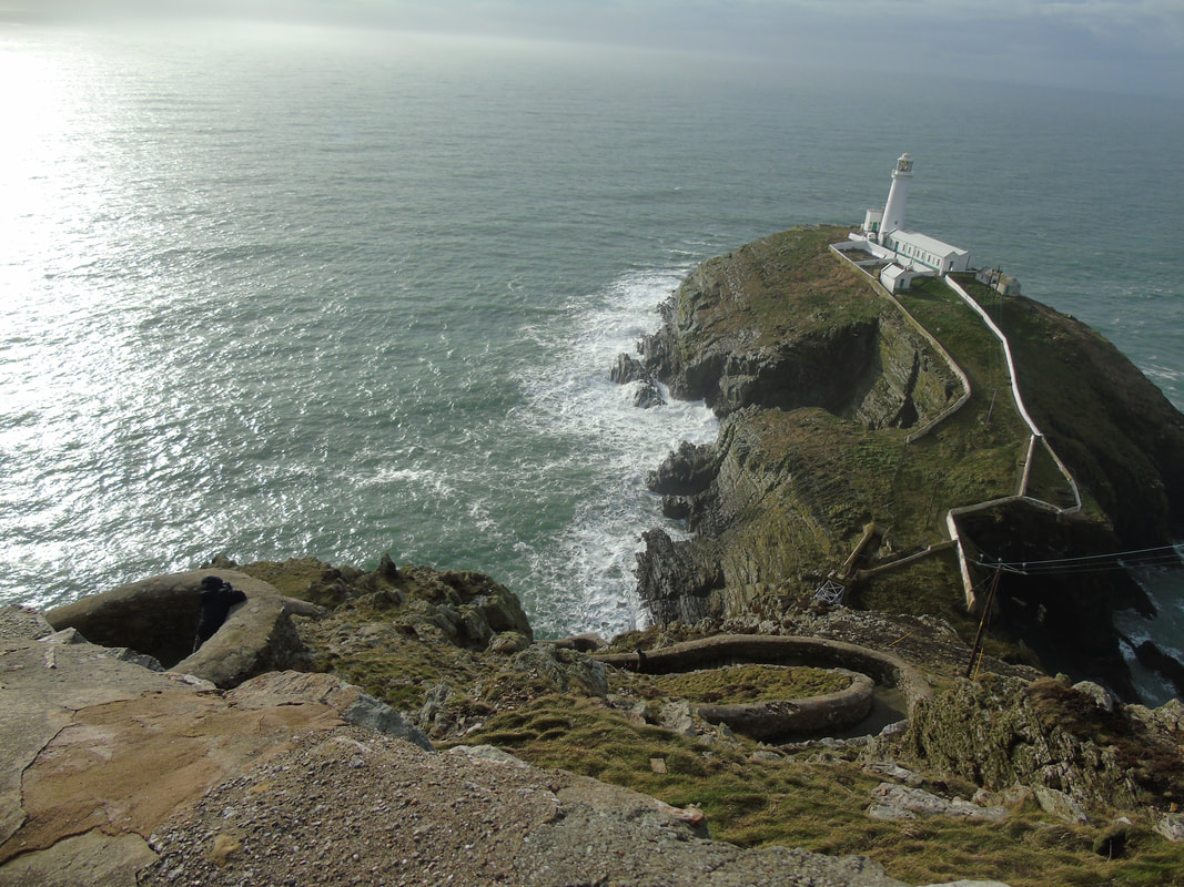
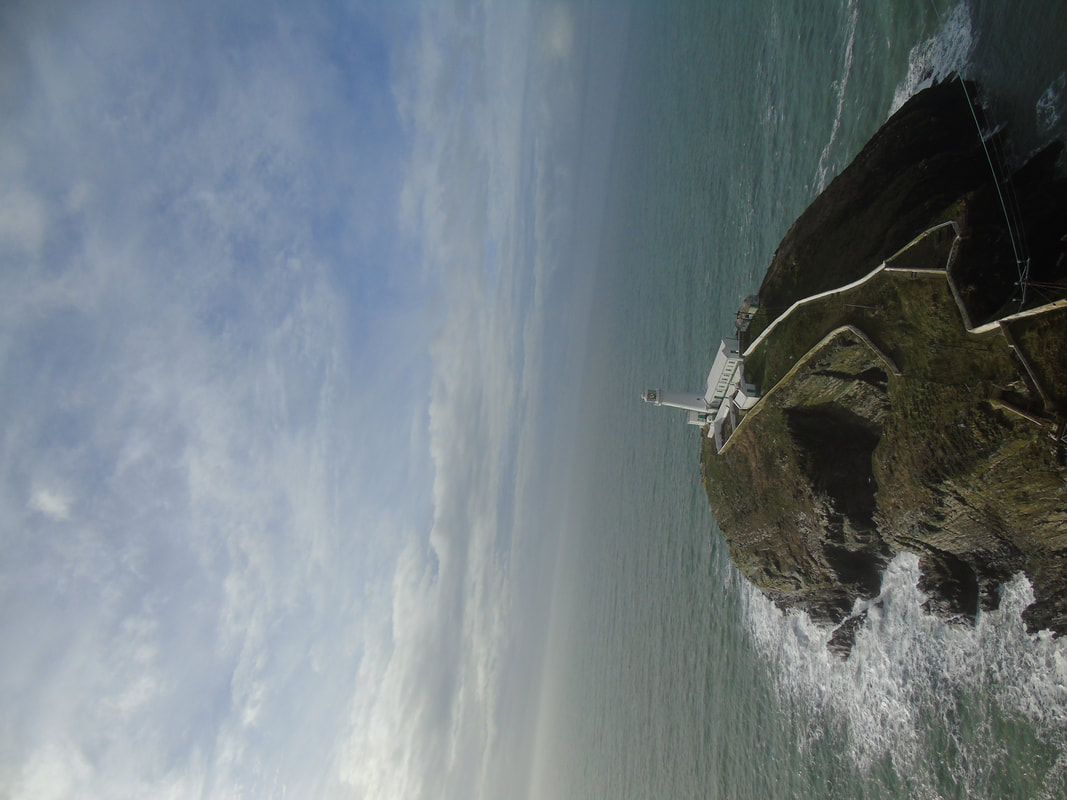

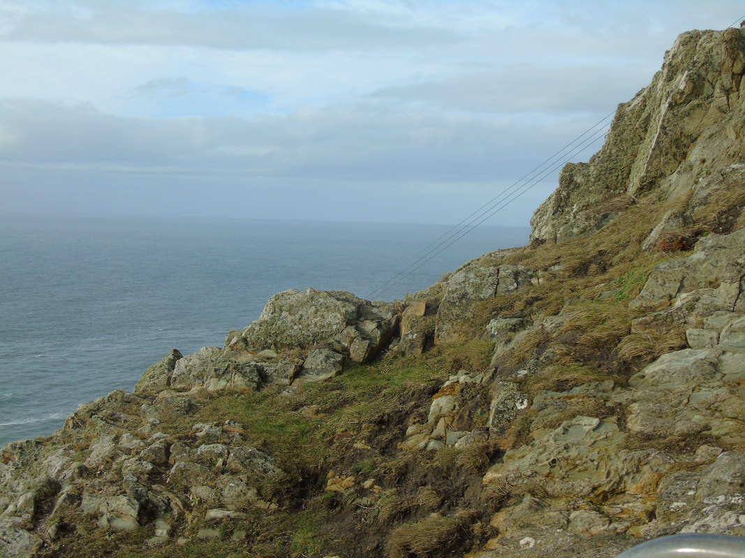
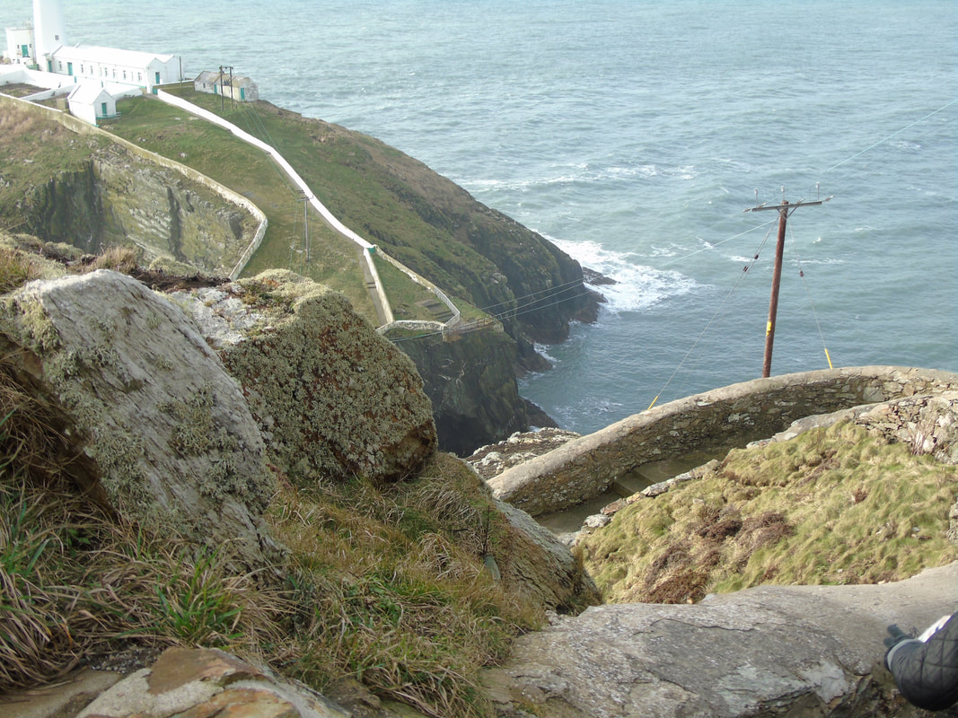
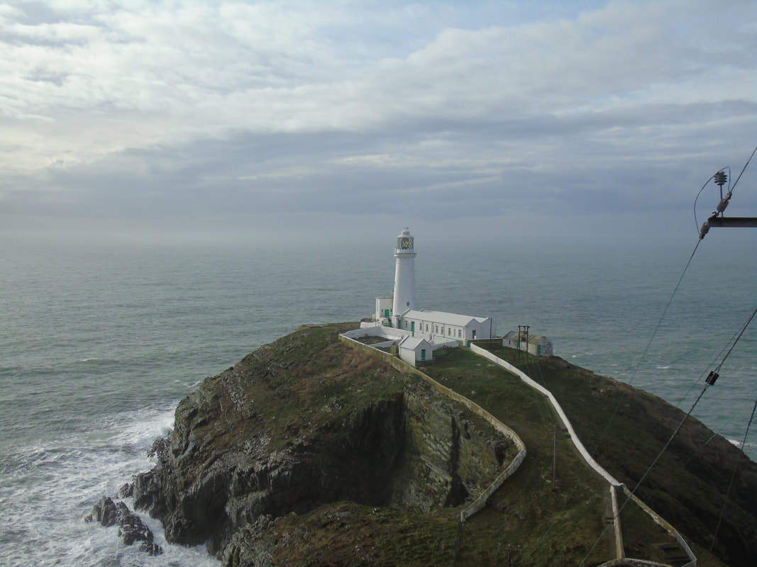
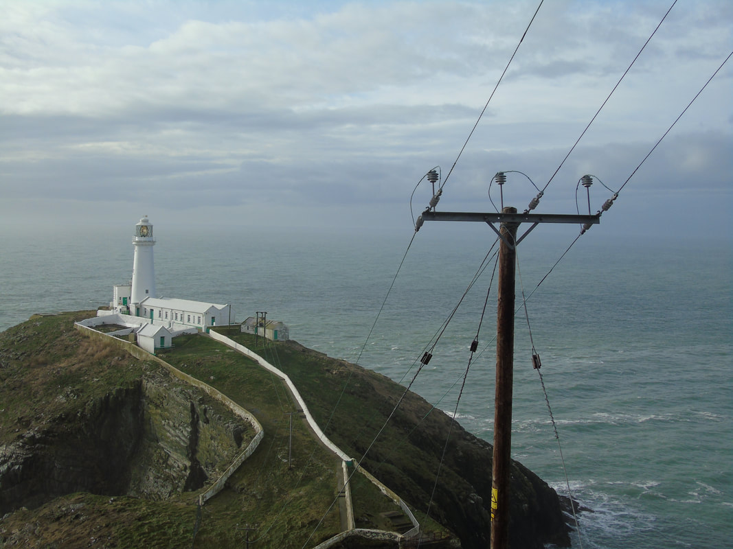
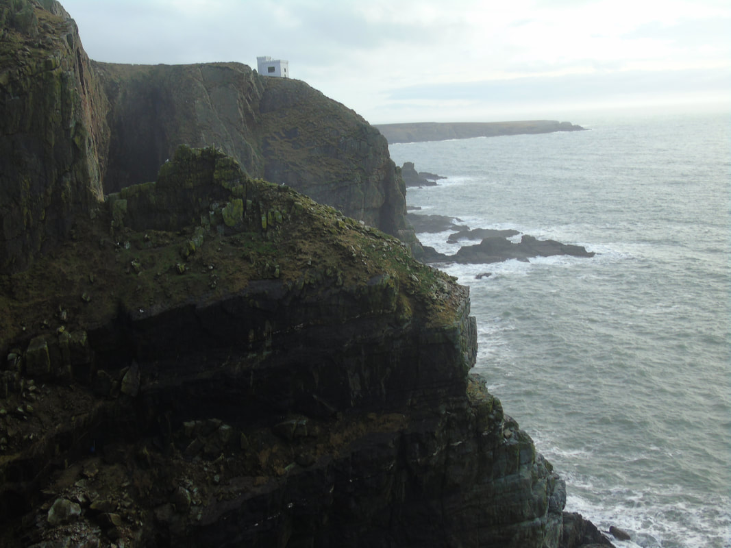
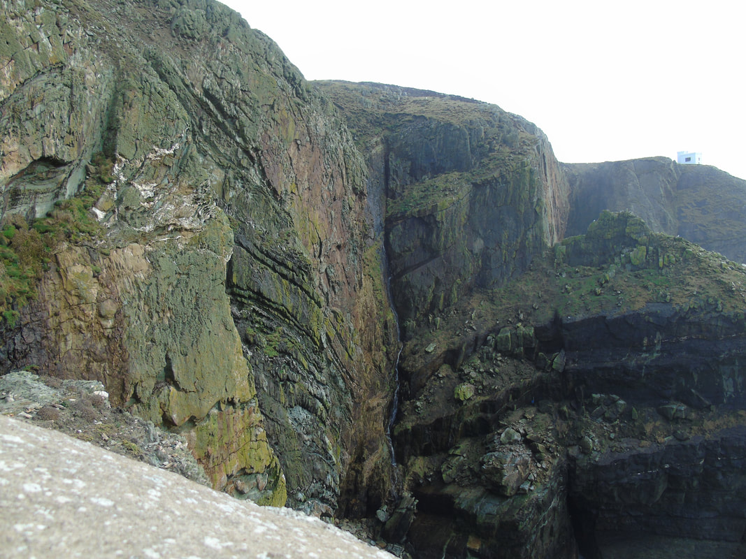
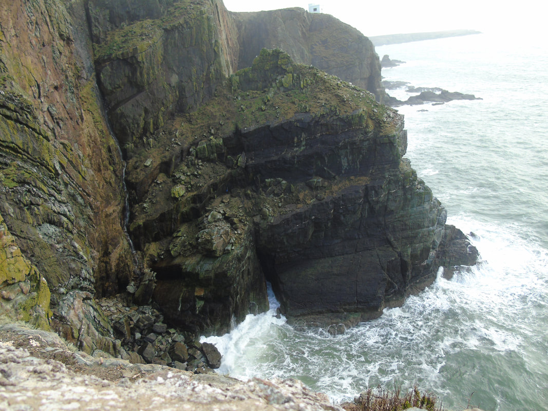
best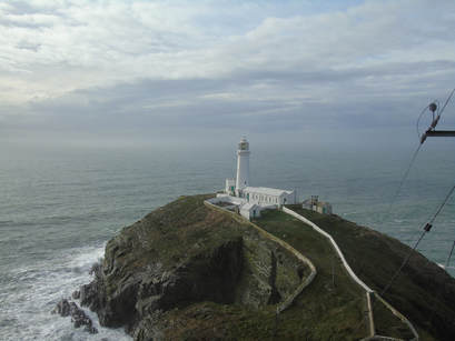
I think this is quite a good and effective picture as I have captured the lighthouse in the centre and at eye focus but also have captured the waves crashing against the lighthouse.
|
worst
This is not a good picture as it is the wrong way and does not even show the lighthouse, it only shows the water.
|
Inspiration by Simon Kitchin
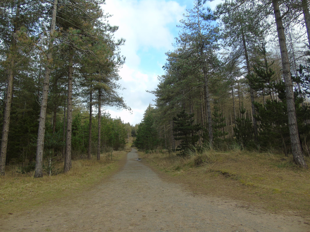
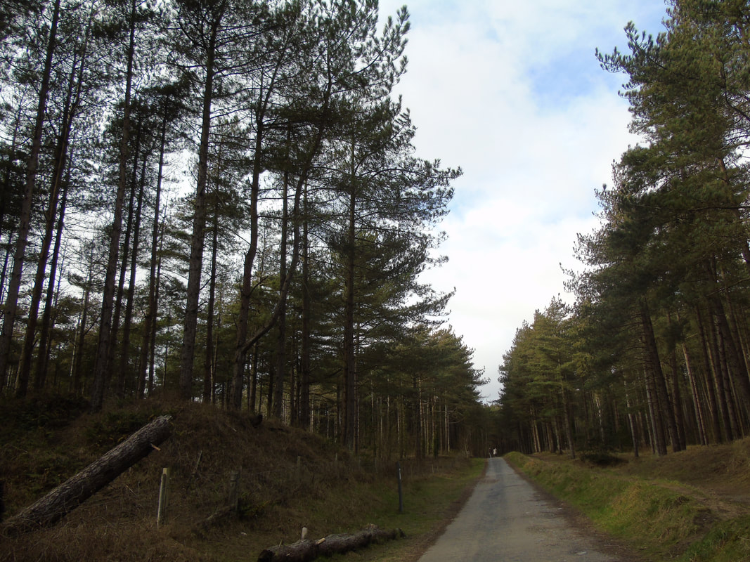
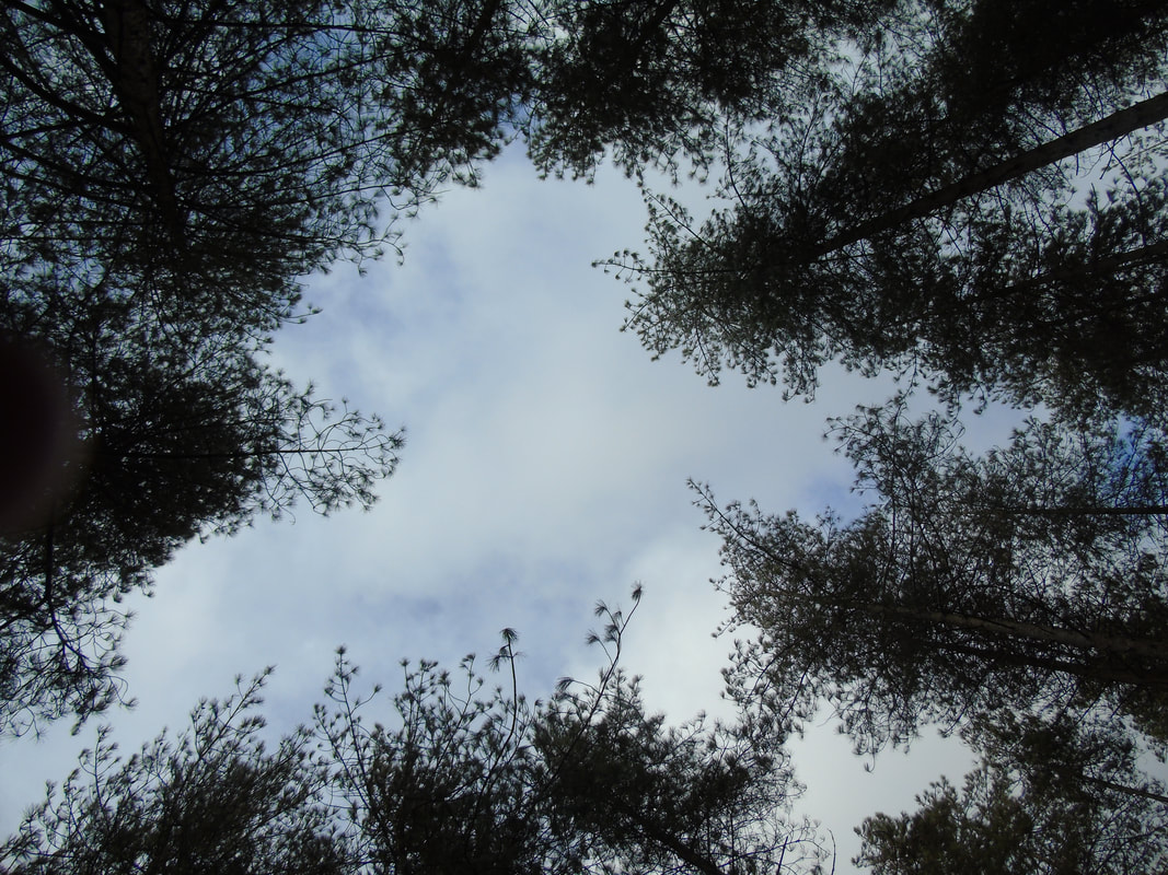
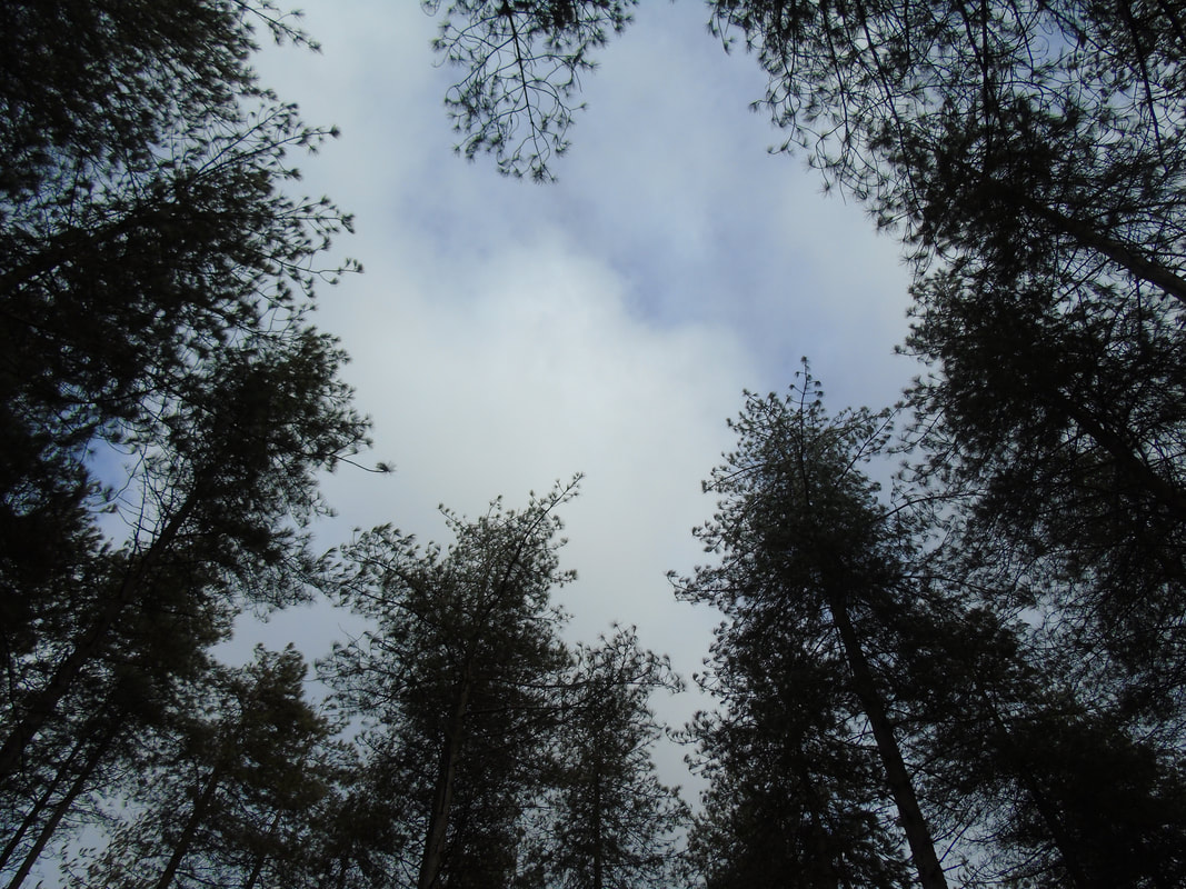
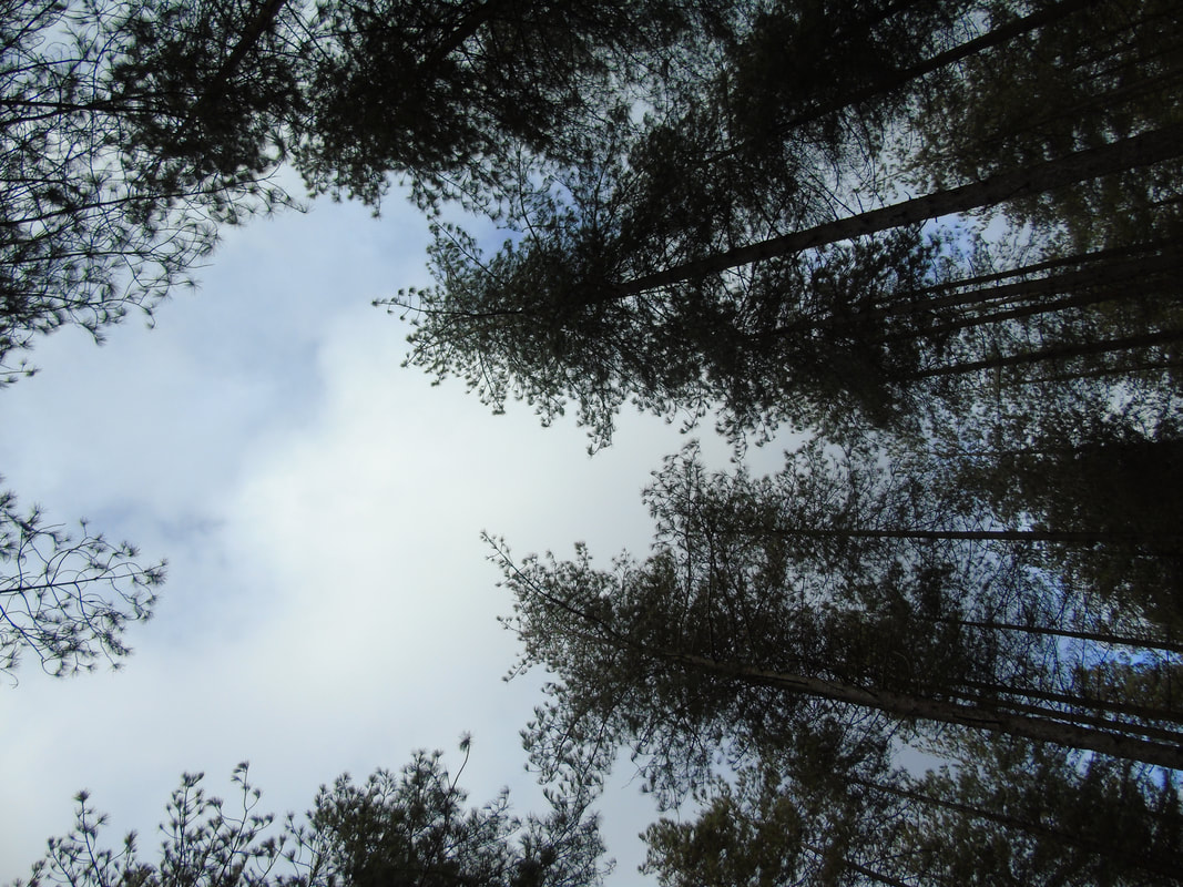
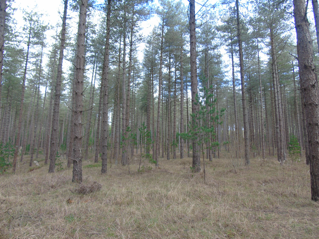
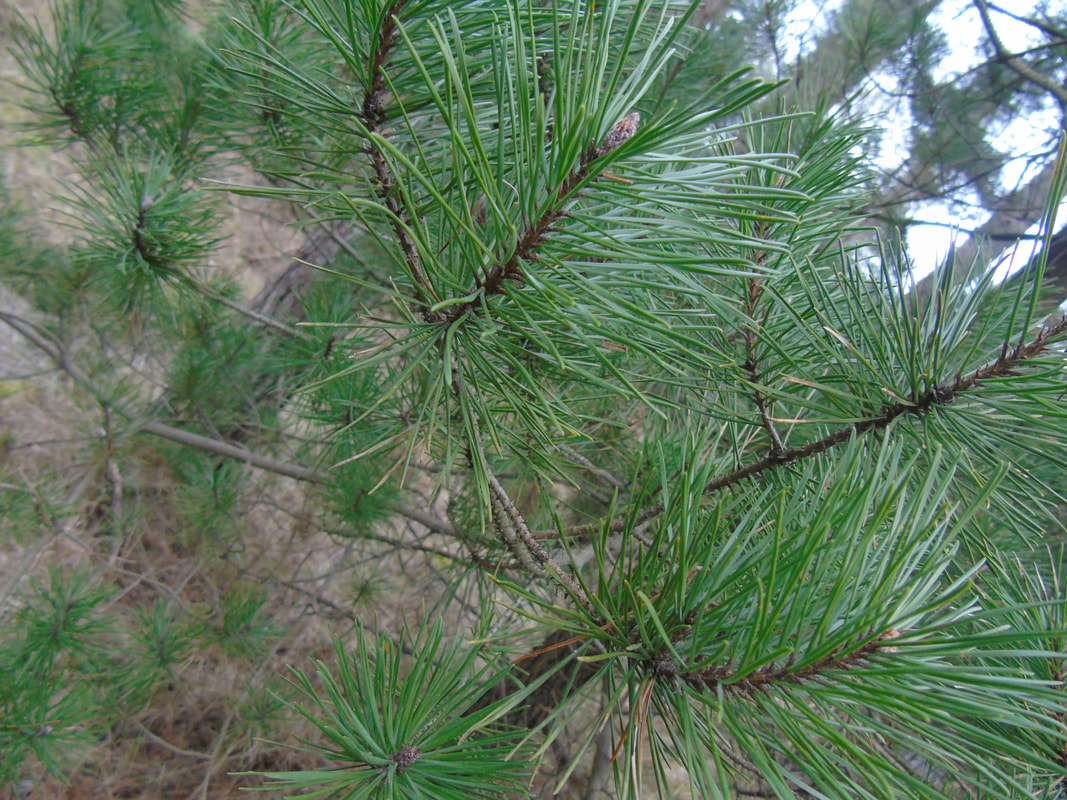
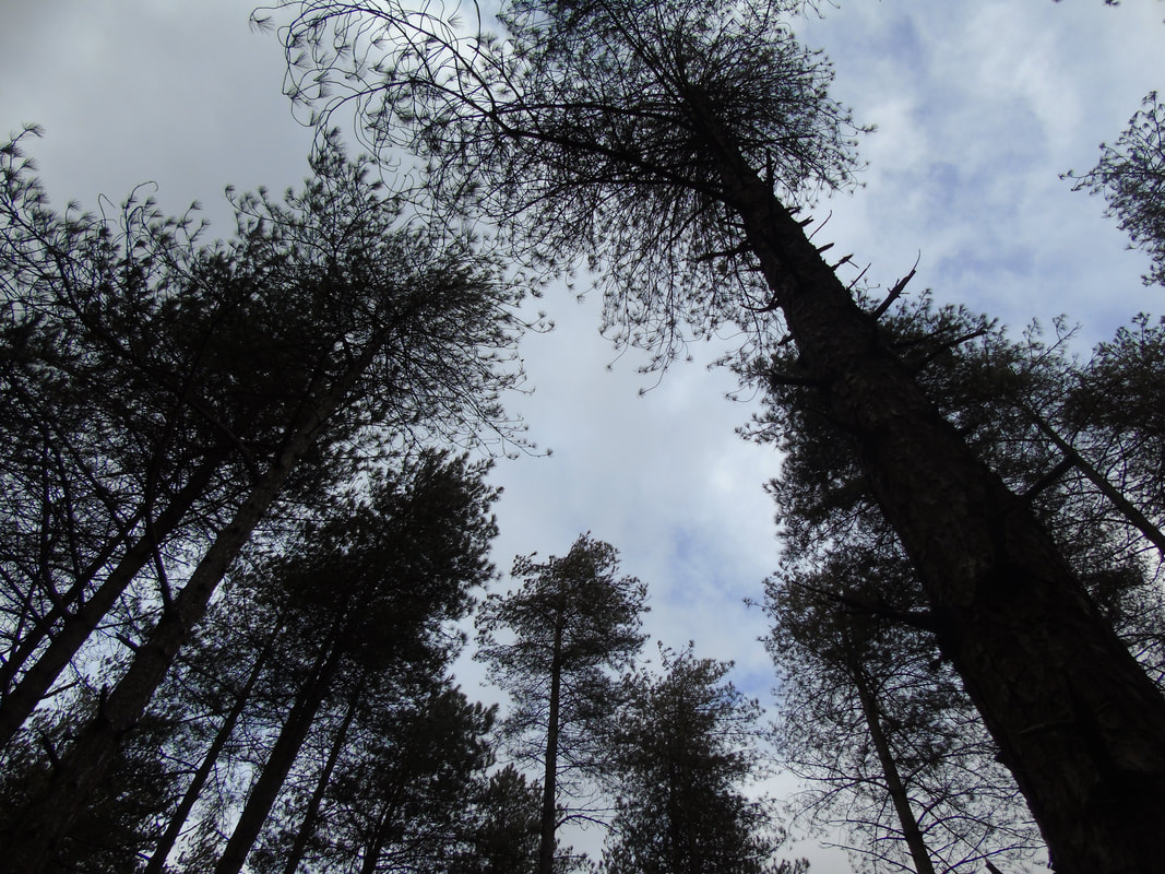
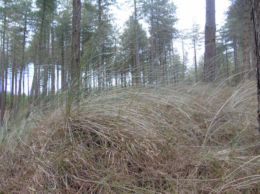
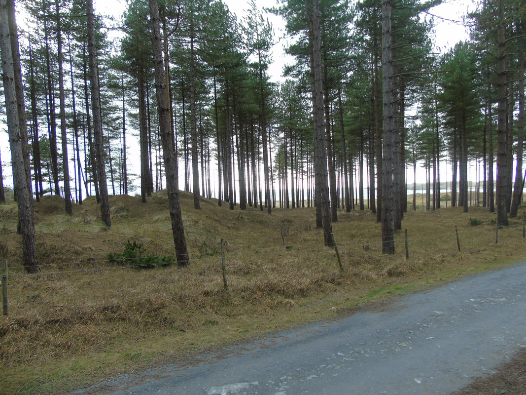
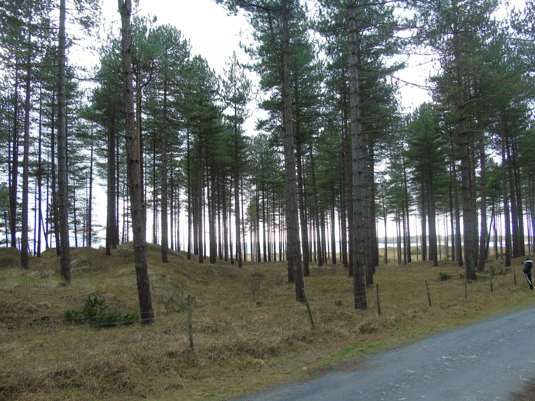
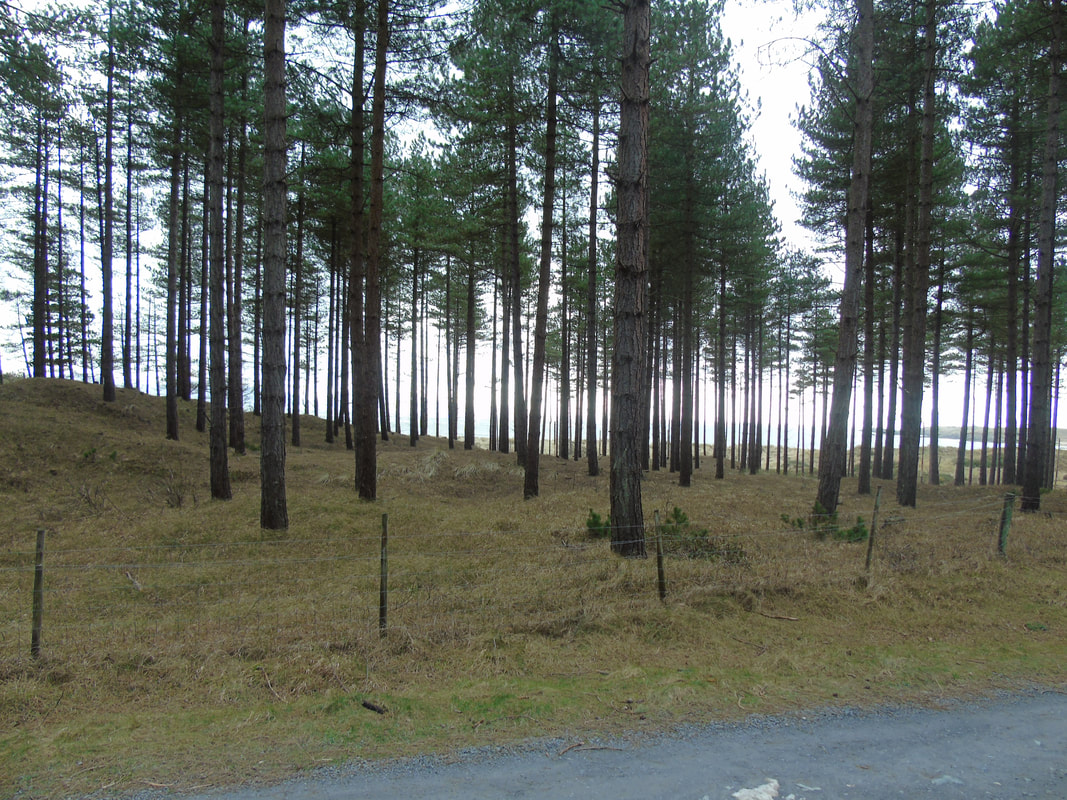
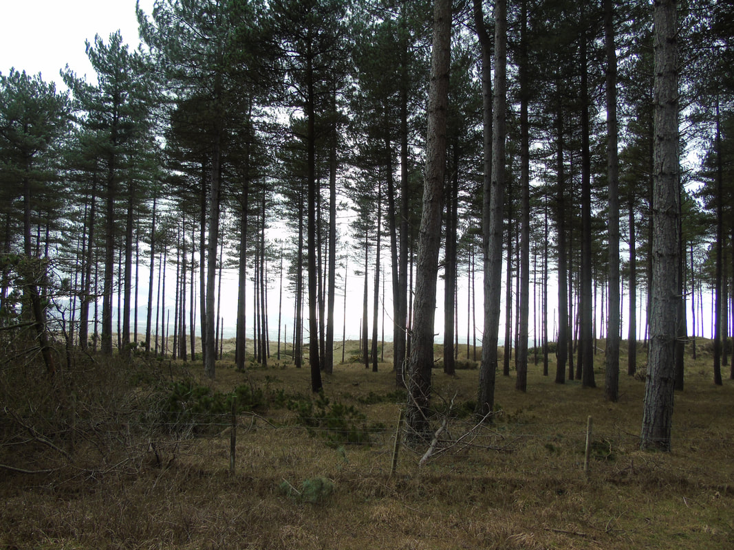
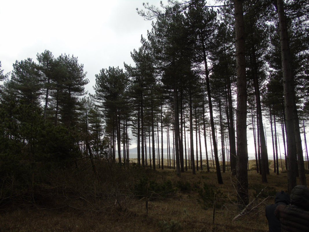
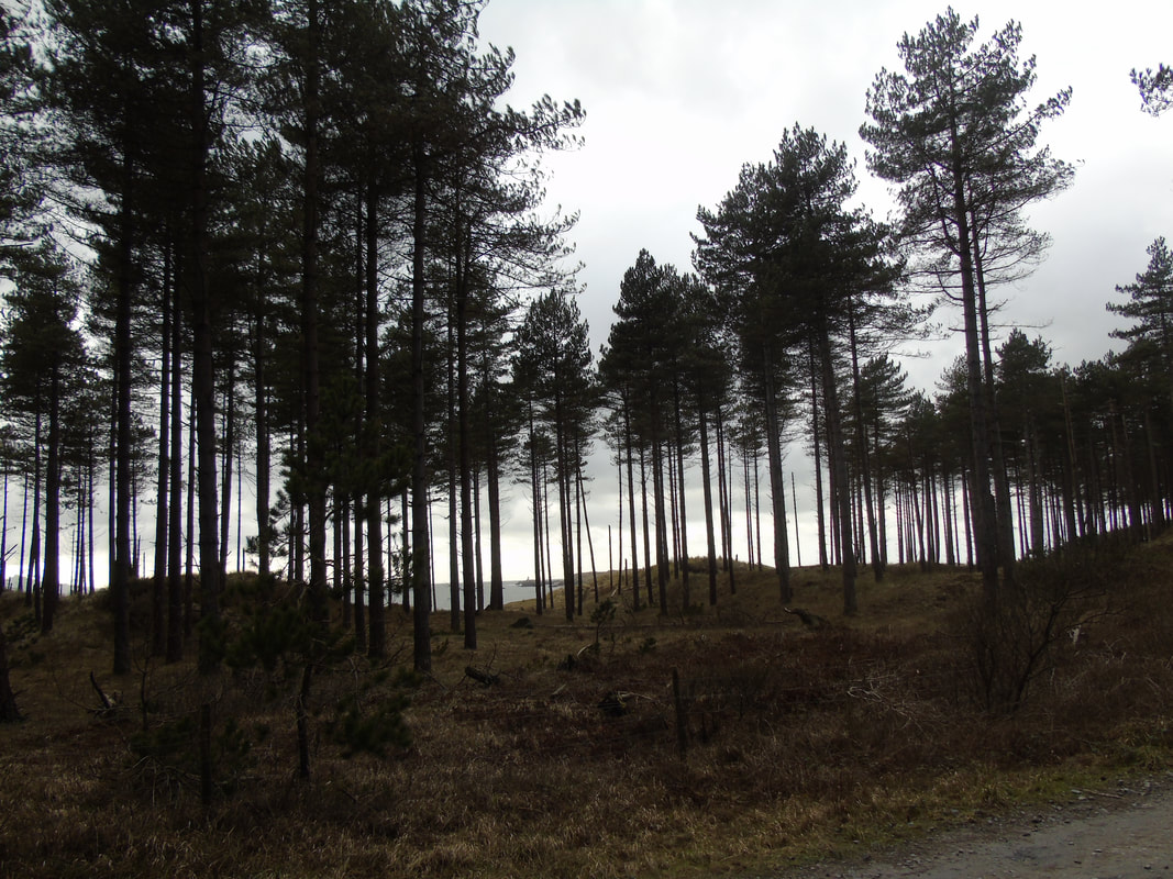
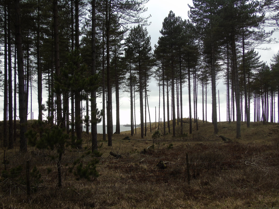
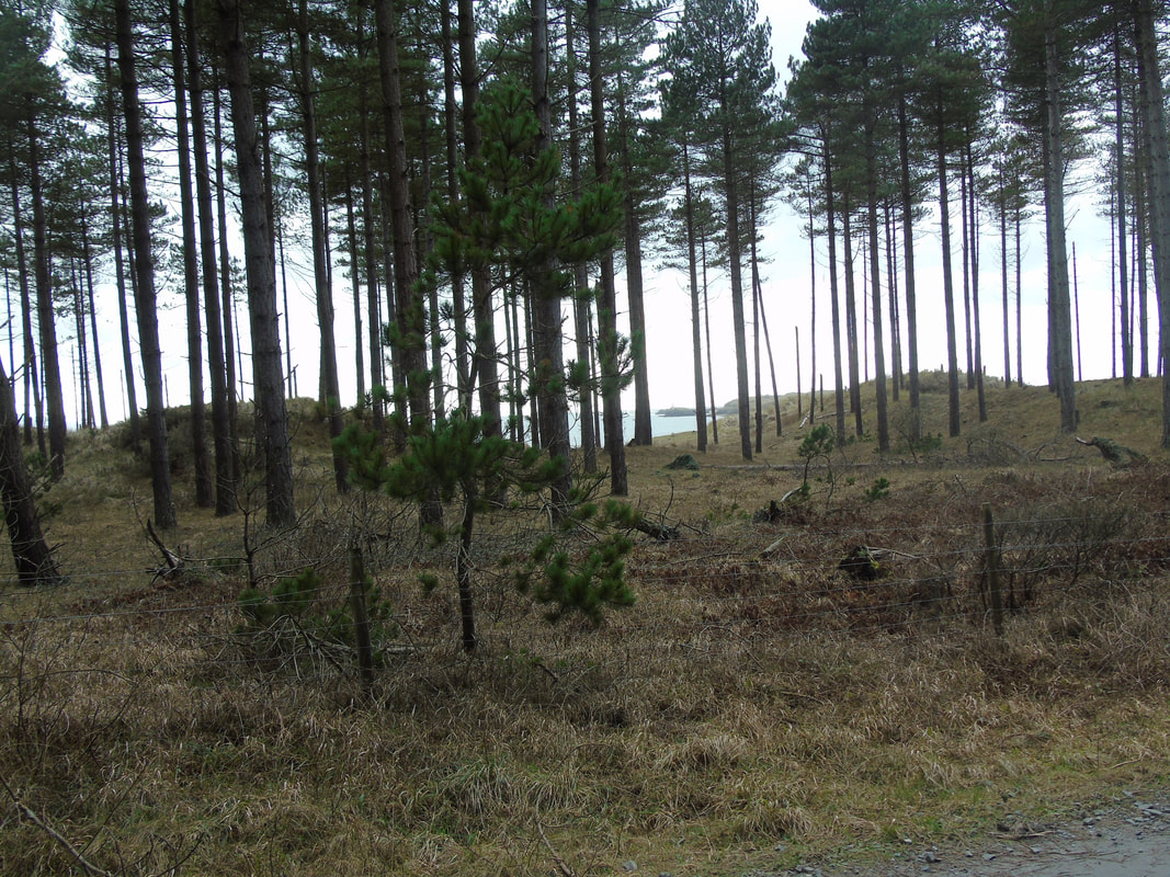
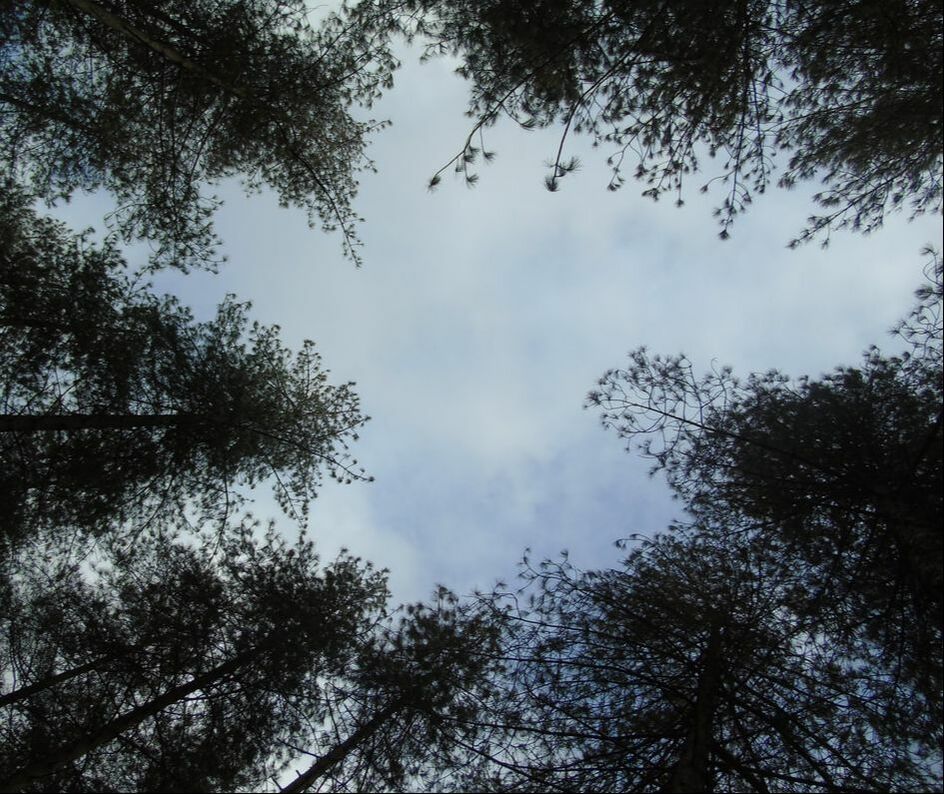
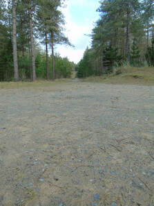
Pine Forest
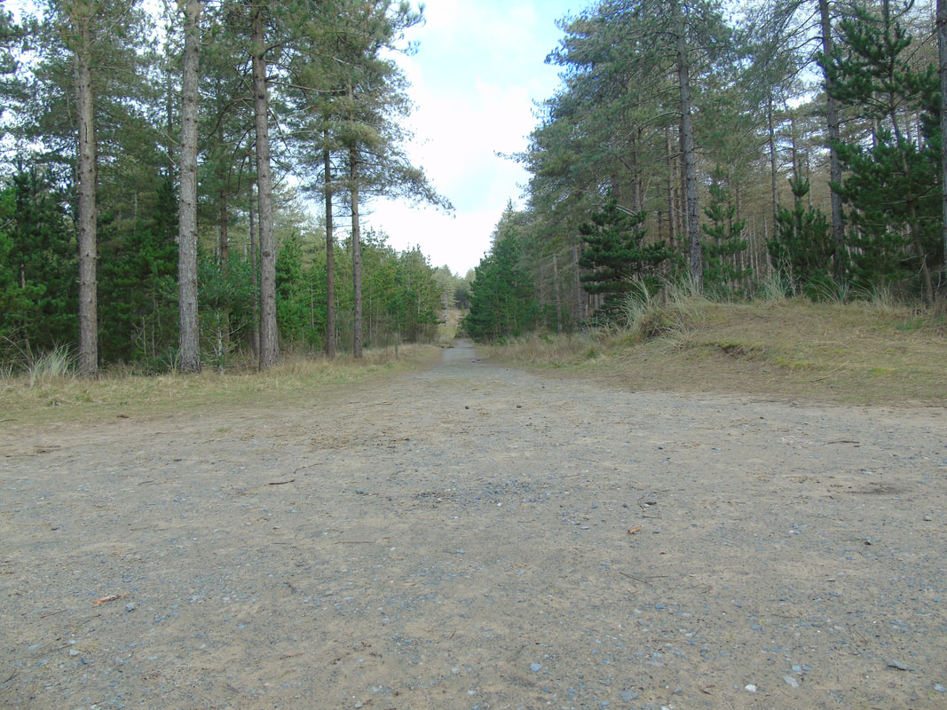
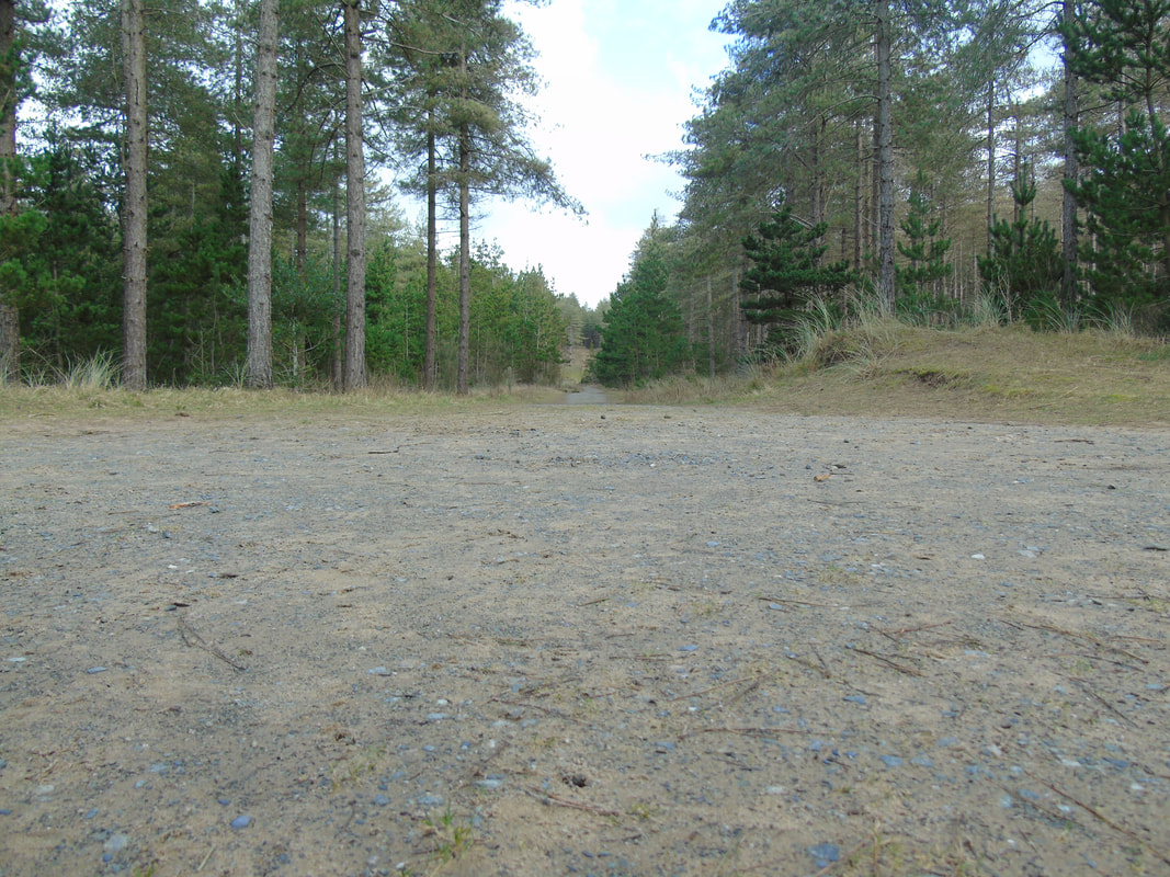
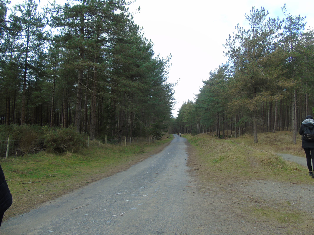
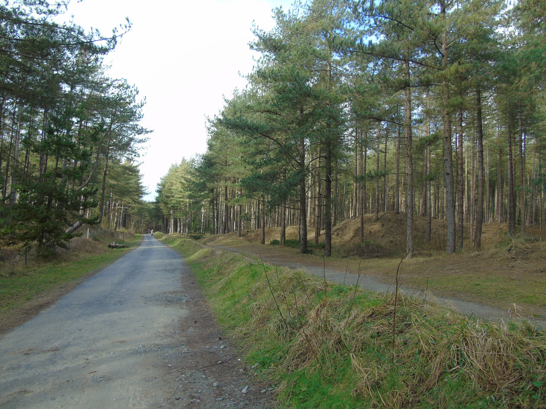
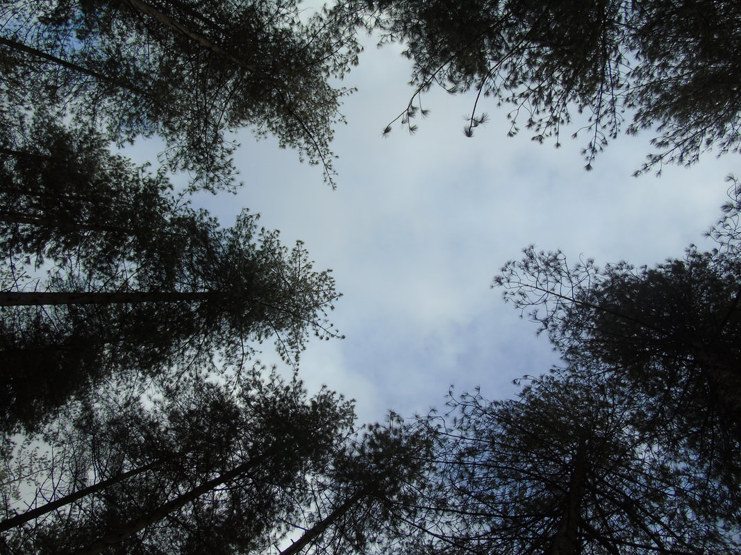
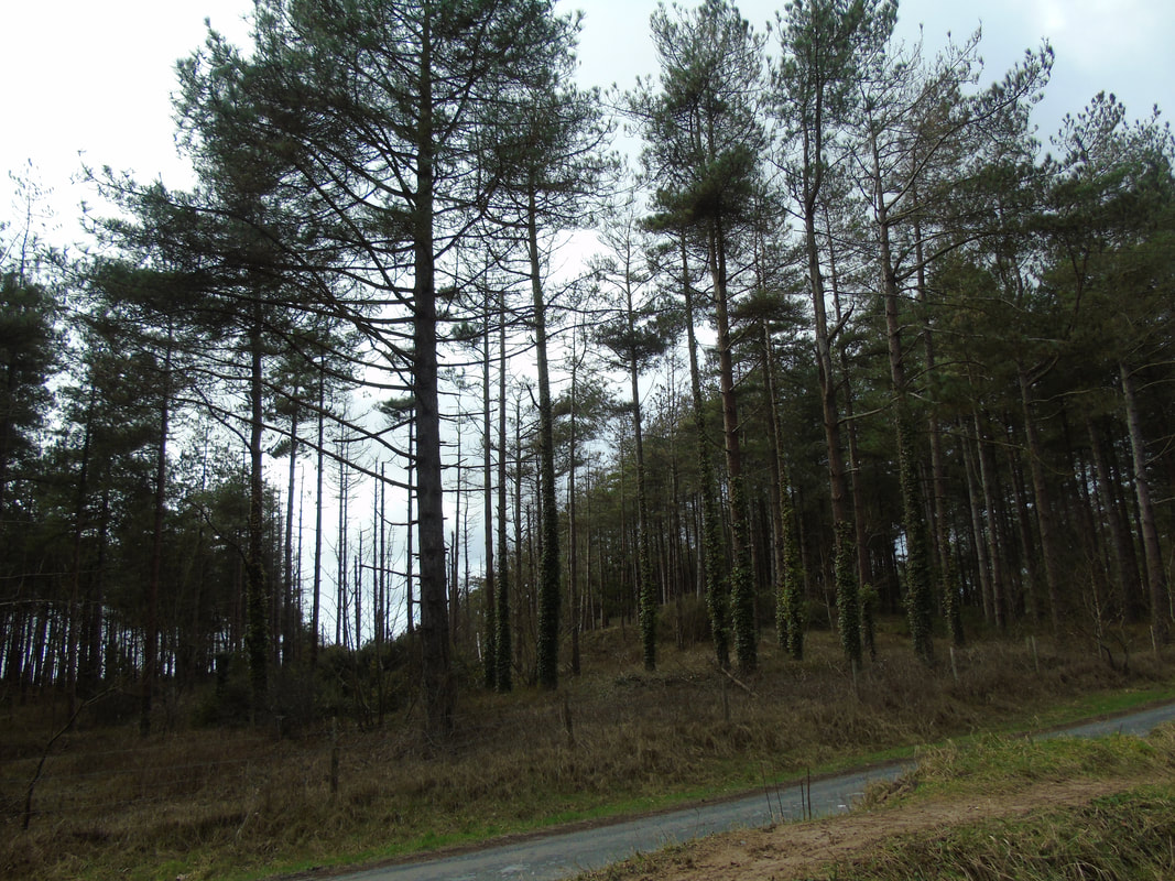
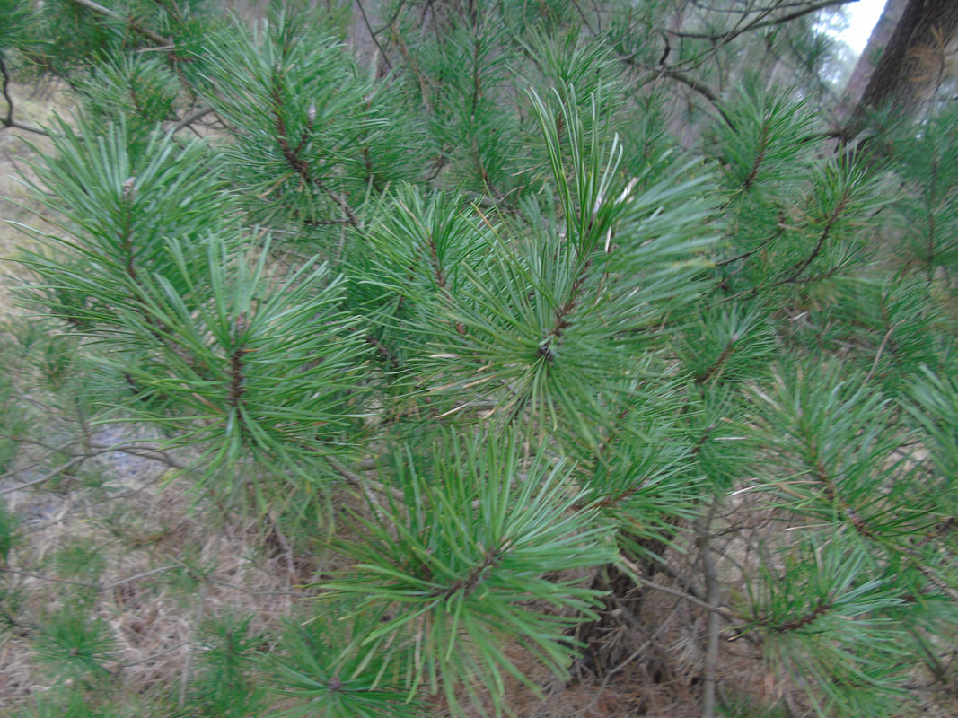
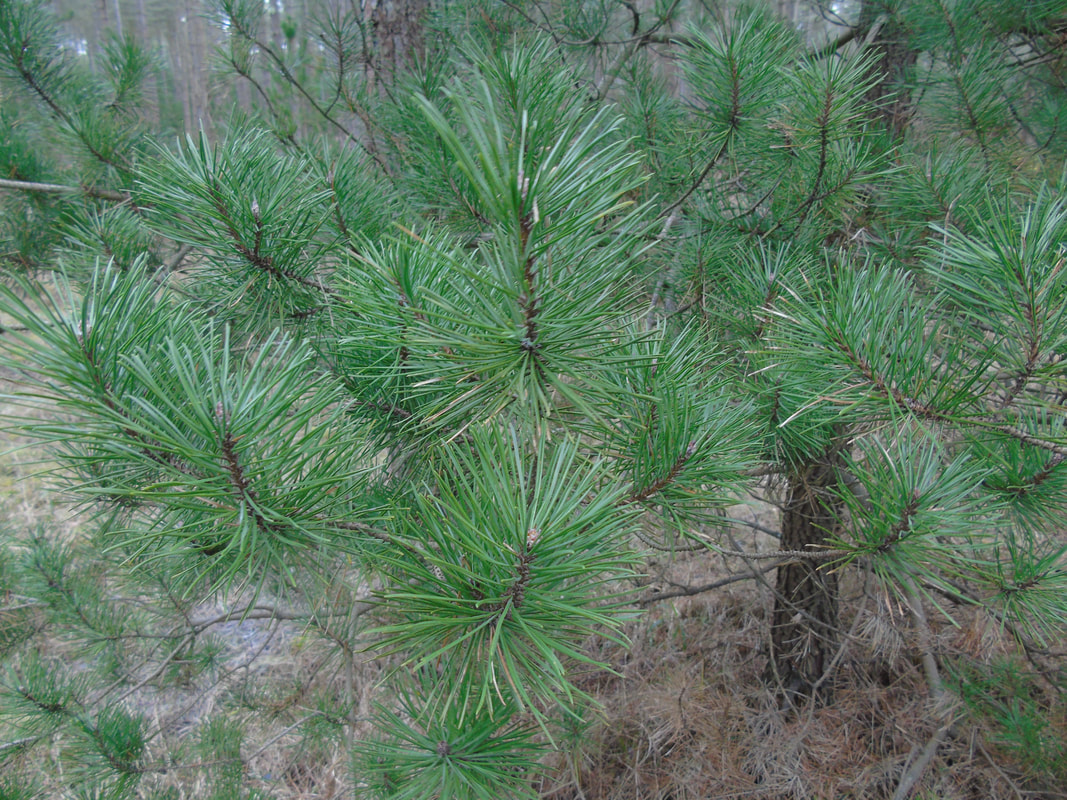
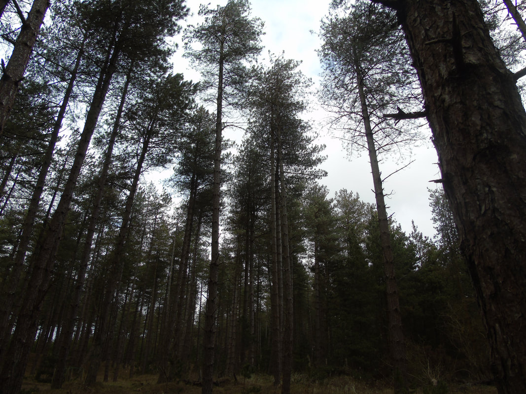
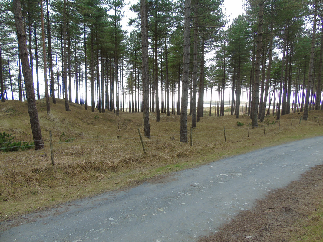
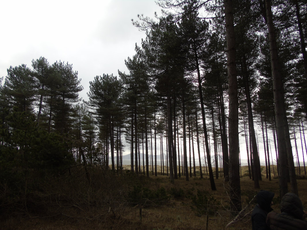
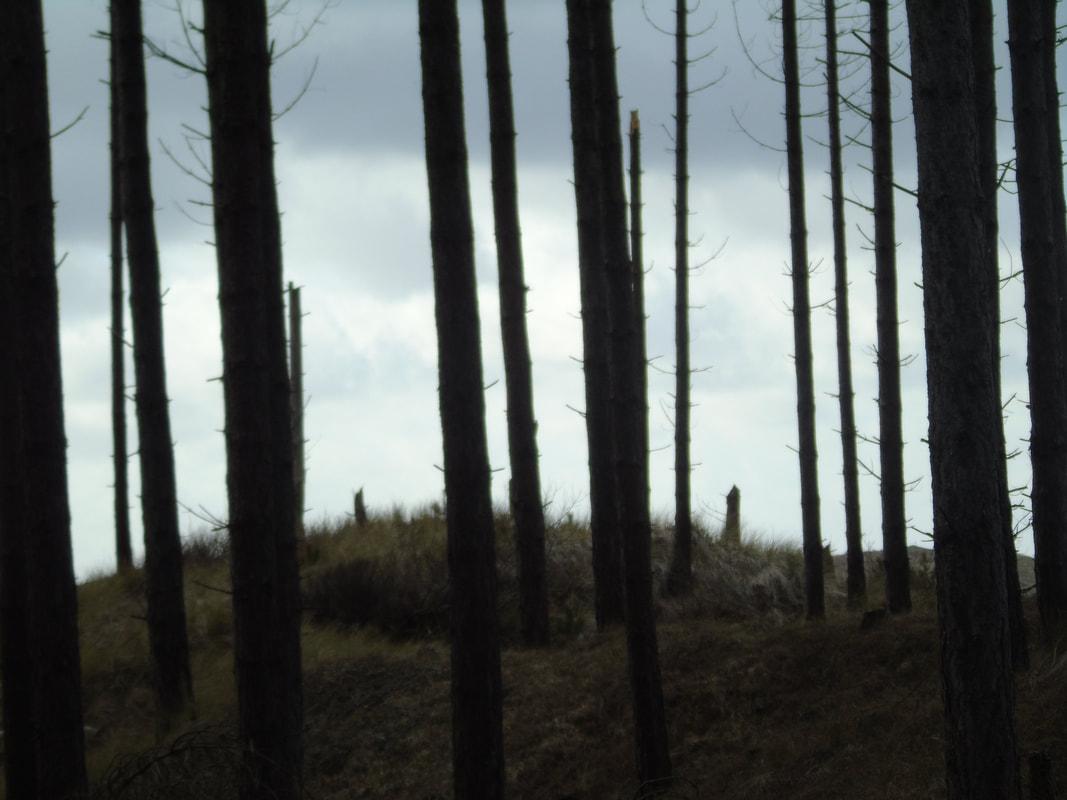
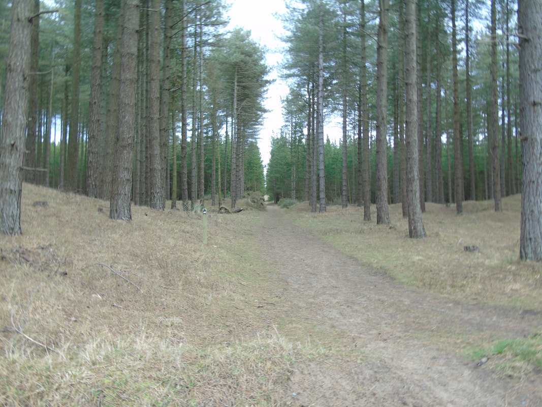
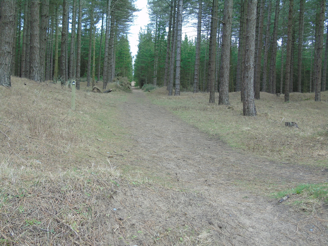
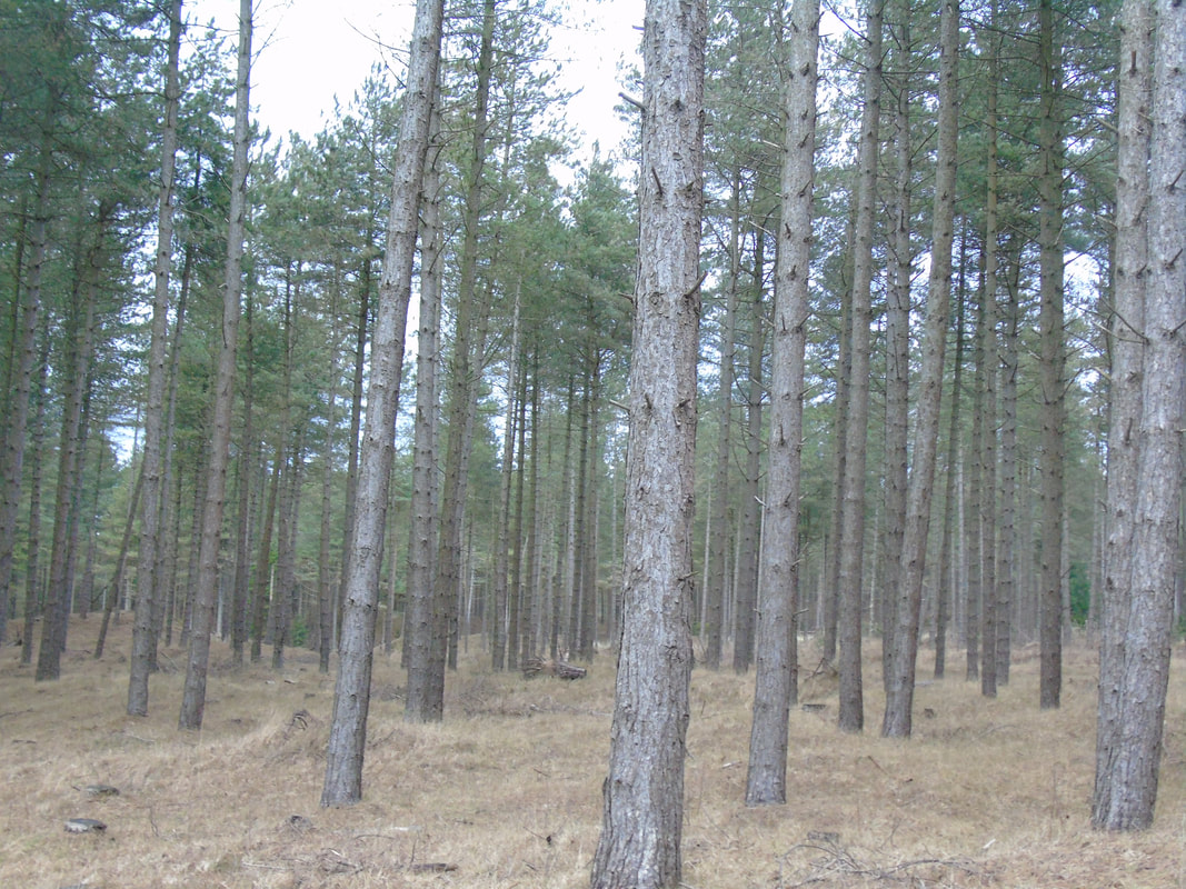
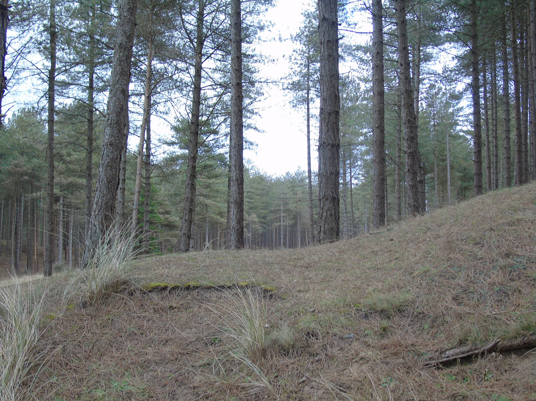
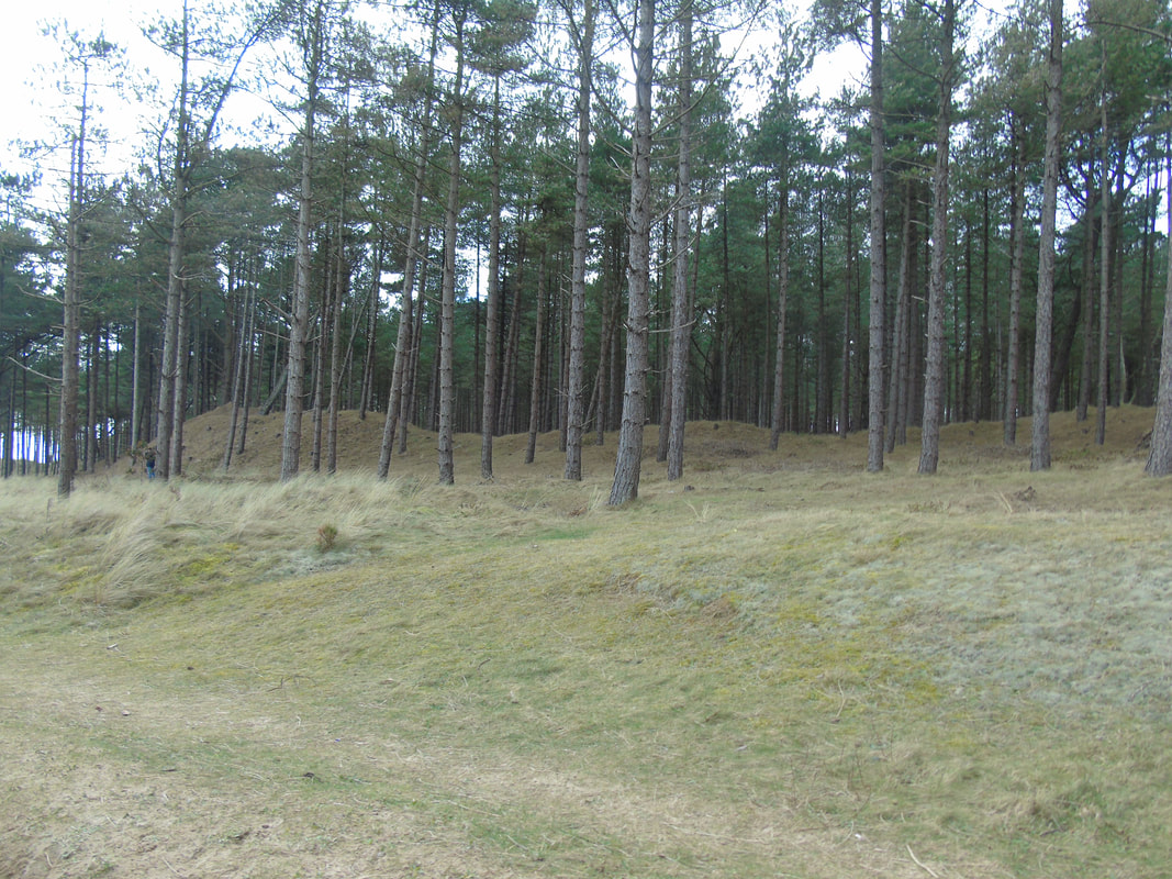

Best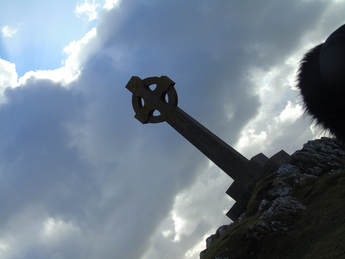
In my opinion, I think this is a good picture as the composition of the picture is good and the background is not bleached out.
|
Worst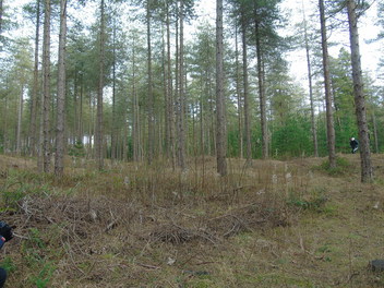
In my opinion, I don't think this is a good picture because it is not portraying anything and just looks all over the place.
|
Simon Kitchin
|
|
Faviourte pictures of Angelsey
|
|

|
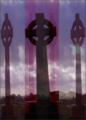
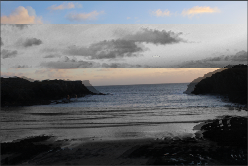
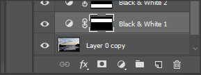
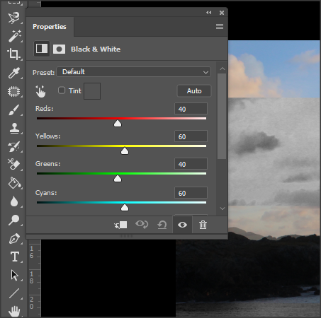
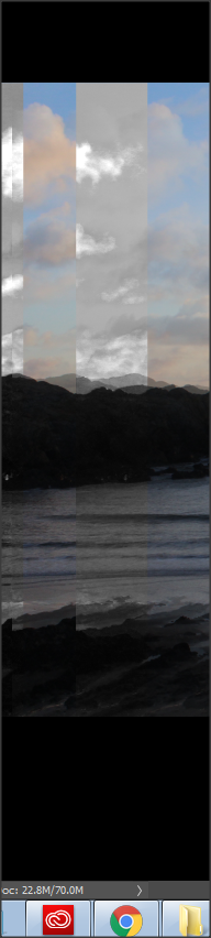
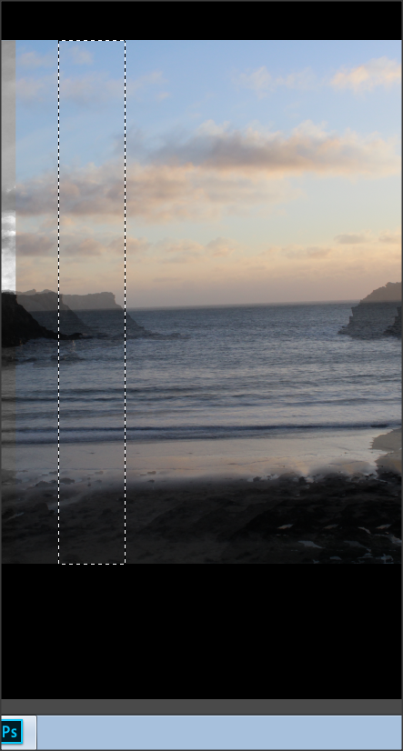
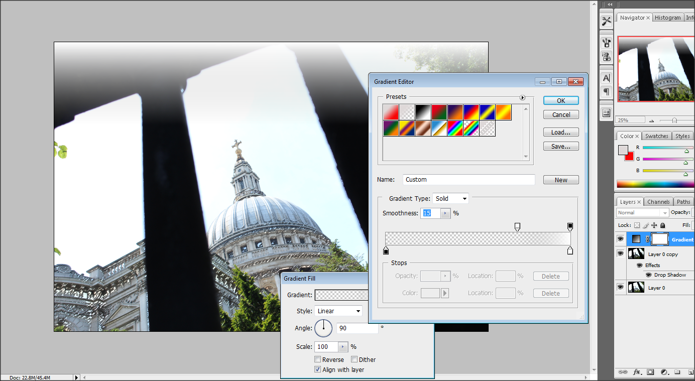
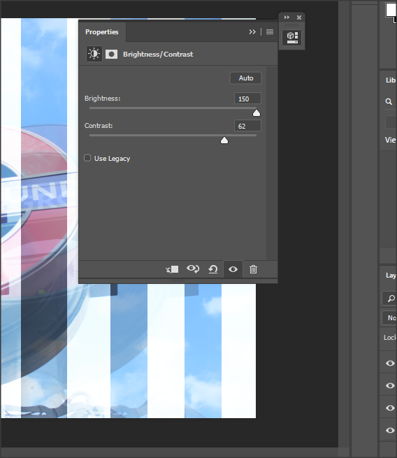
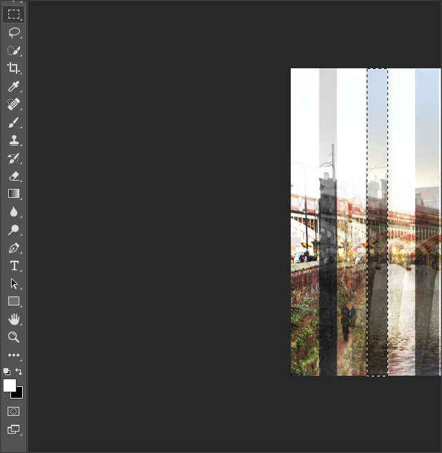
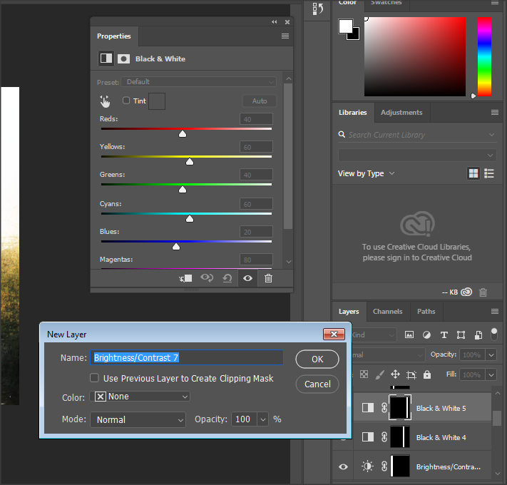
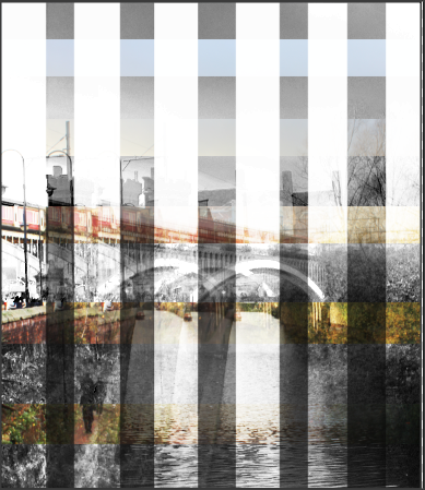
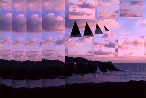
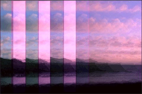
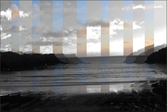
Refining my ideas in Photoshop
Process
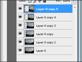
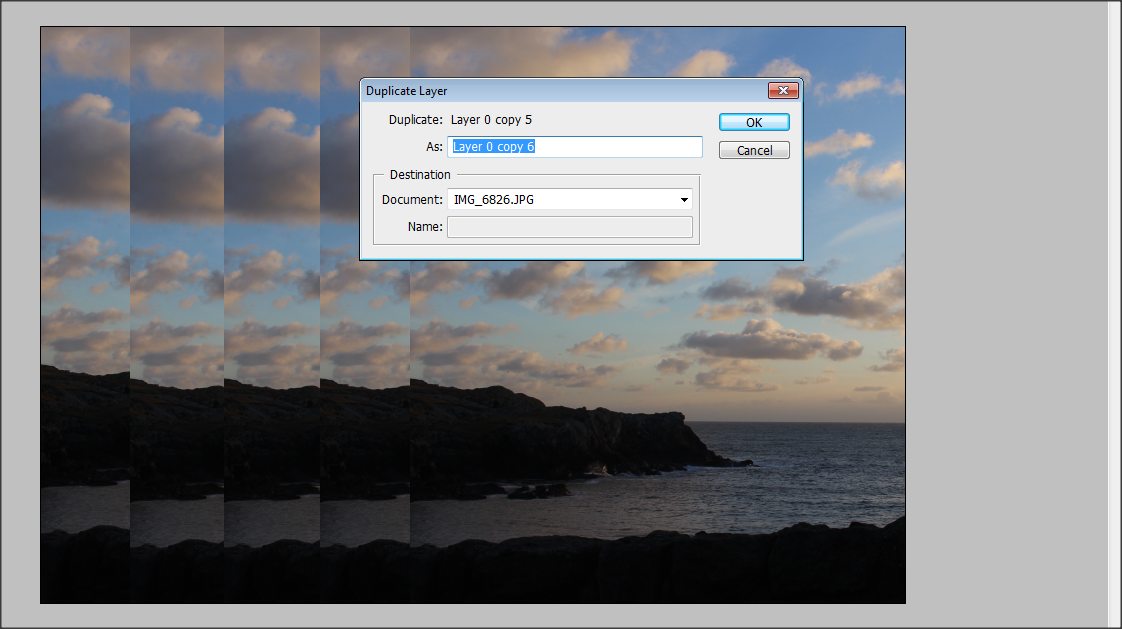
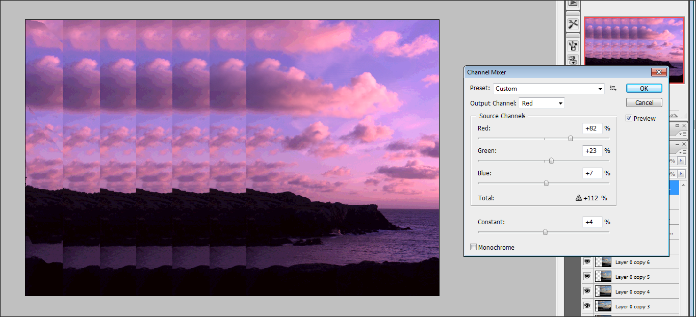
Final outcome
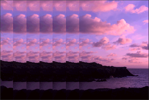

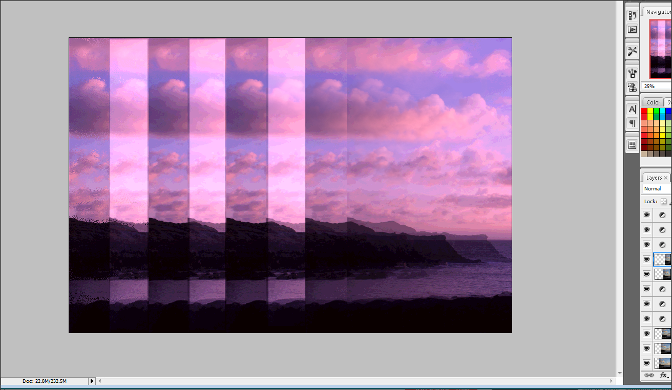
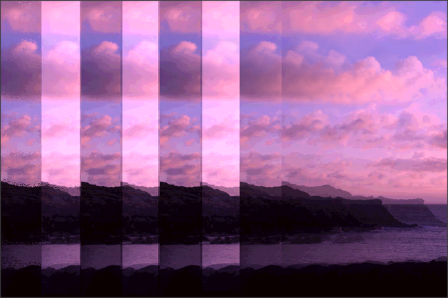
Final Outcome
|
|
|


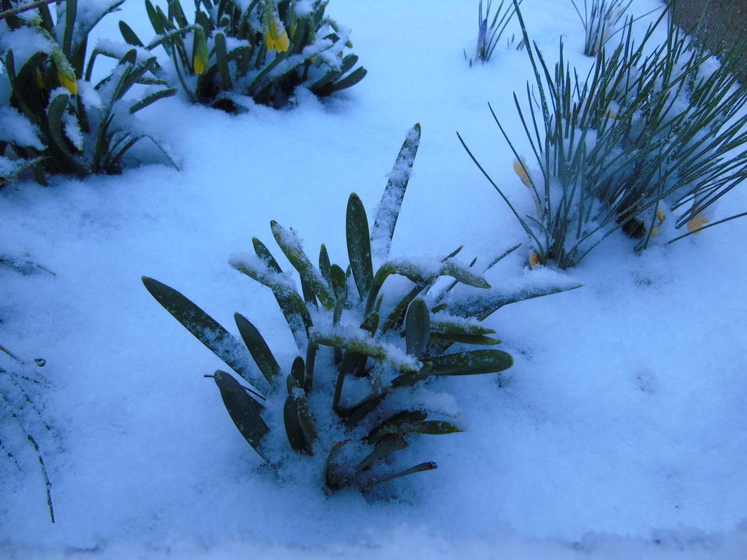
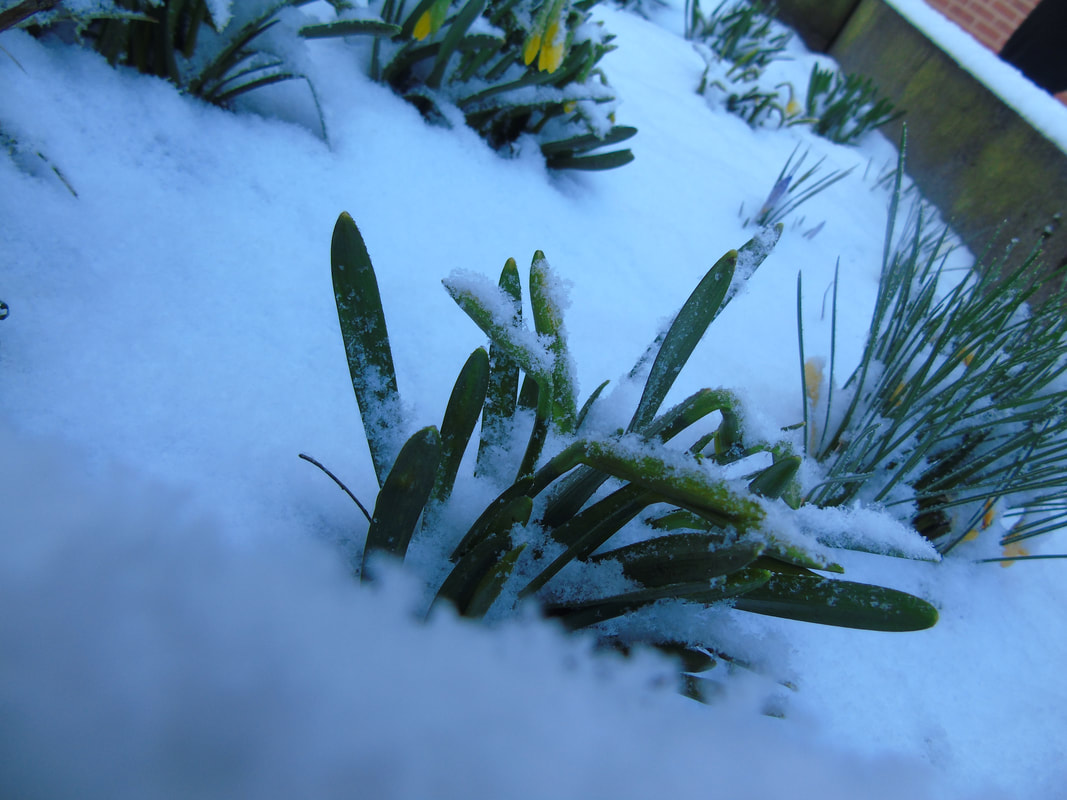
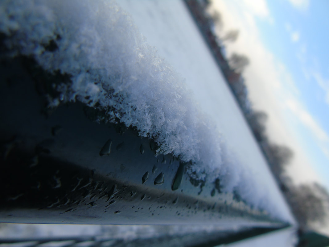
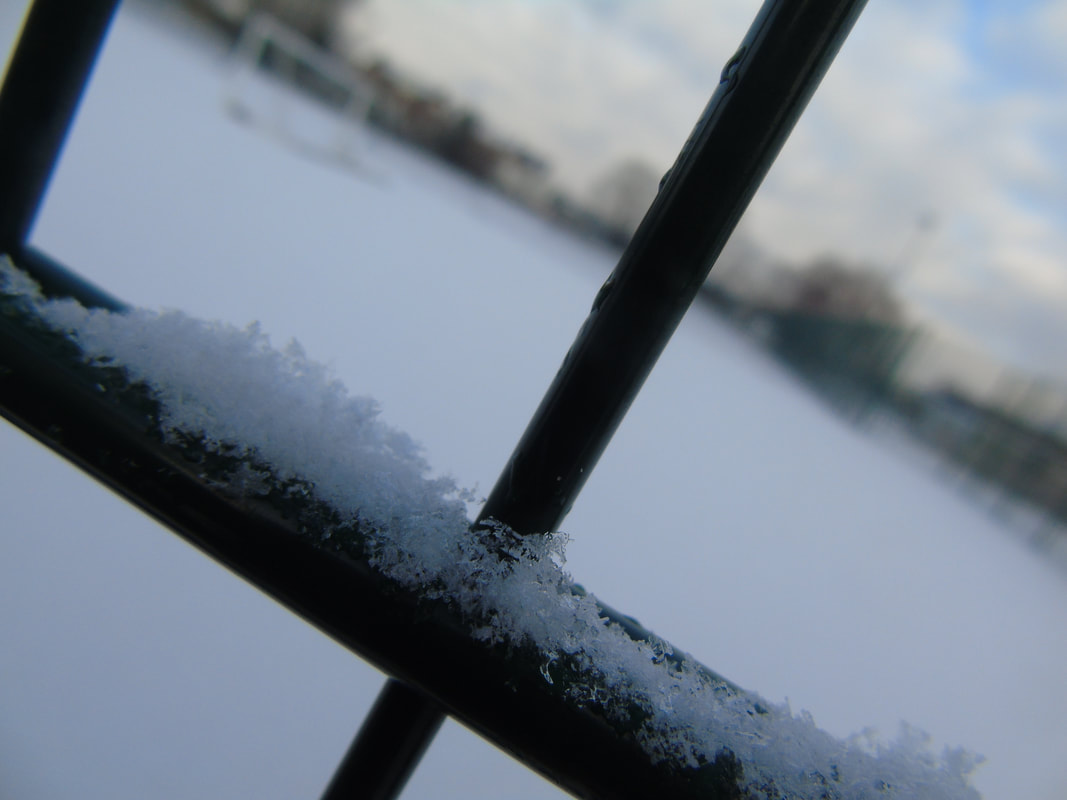
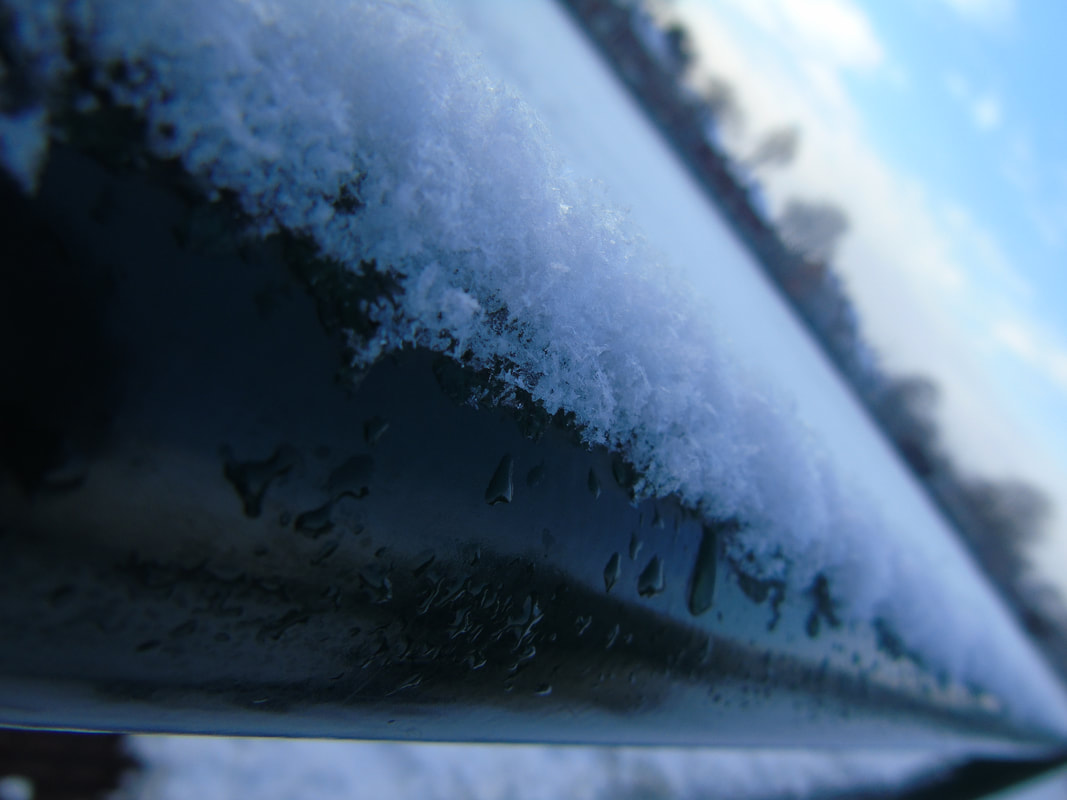
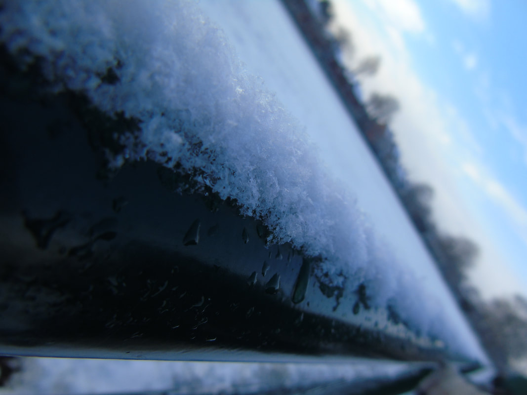
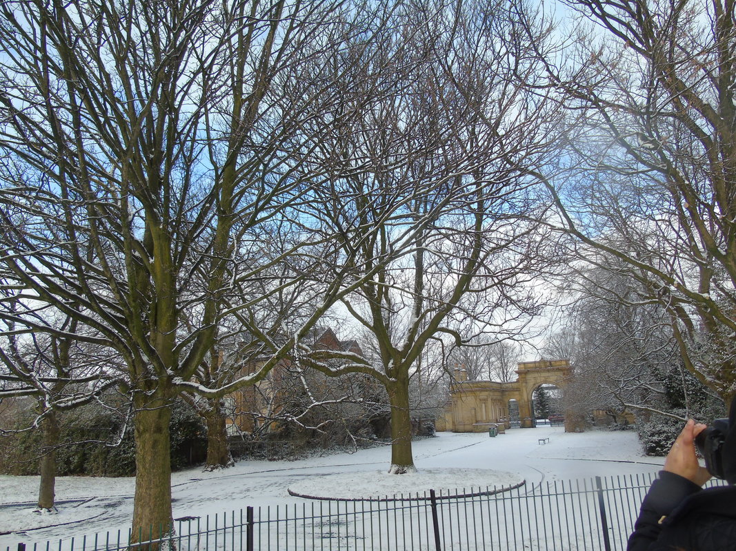
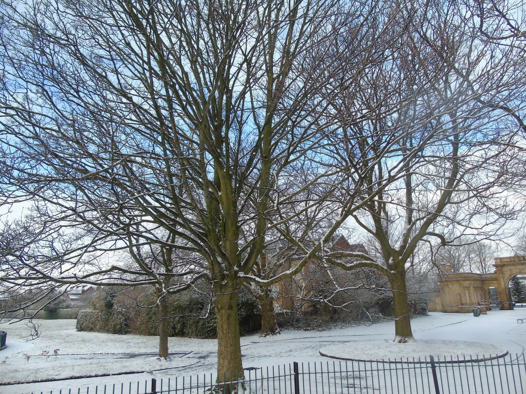
Winter landscapes
Close ups
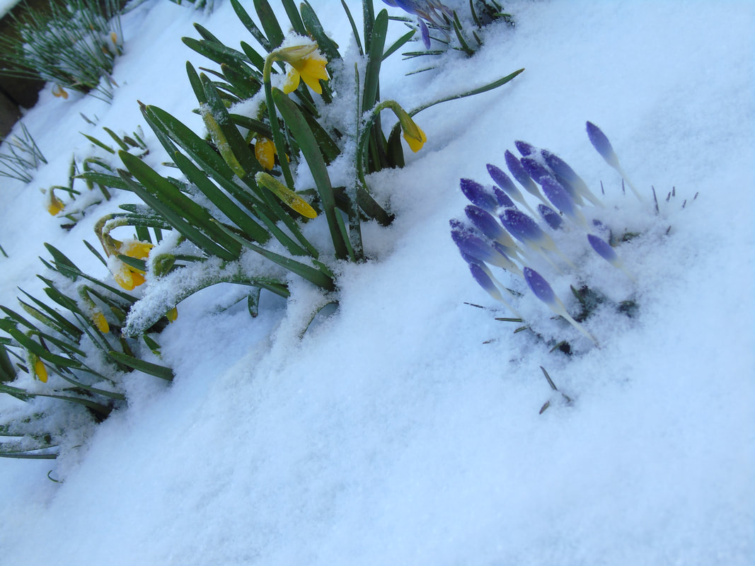
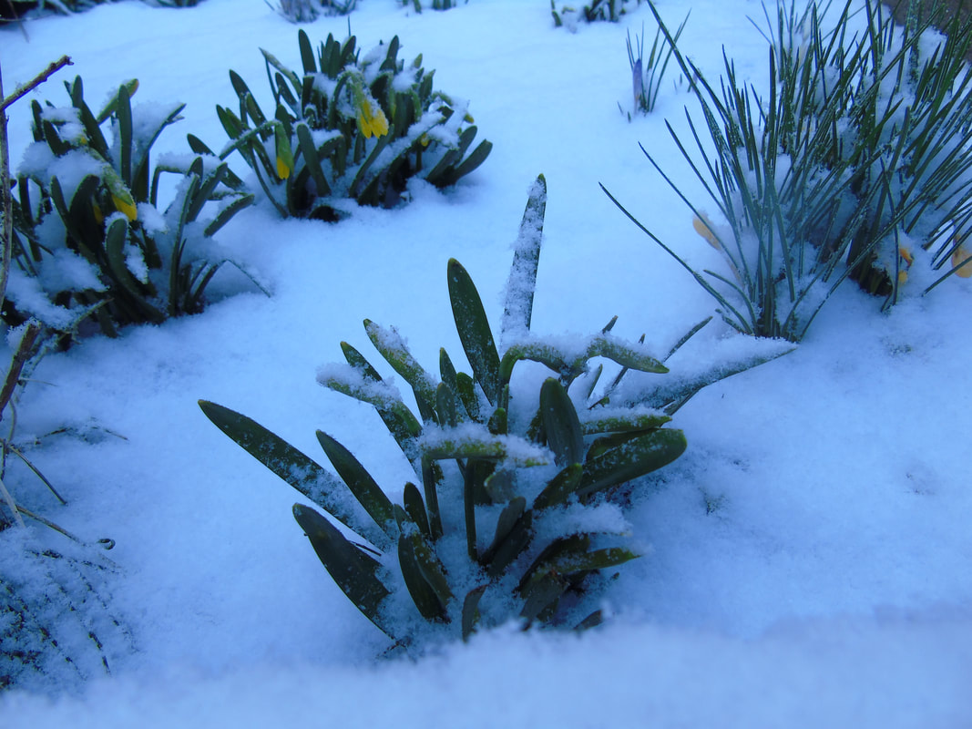
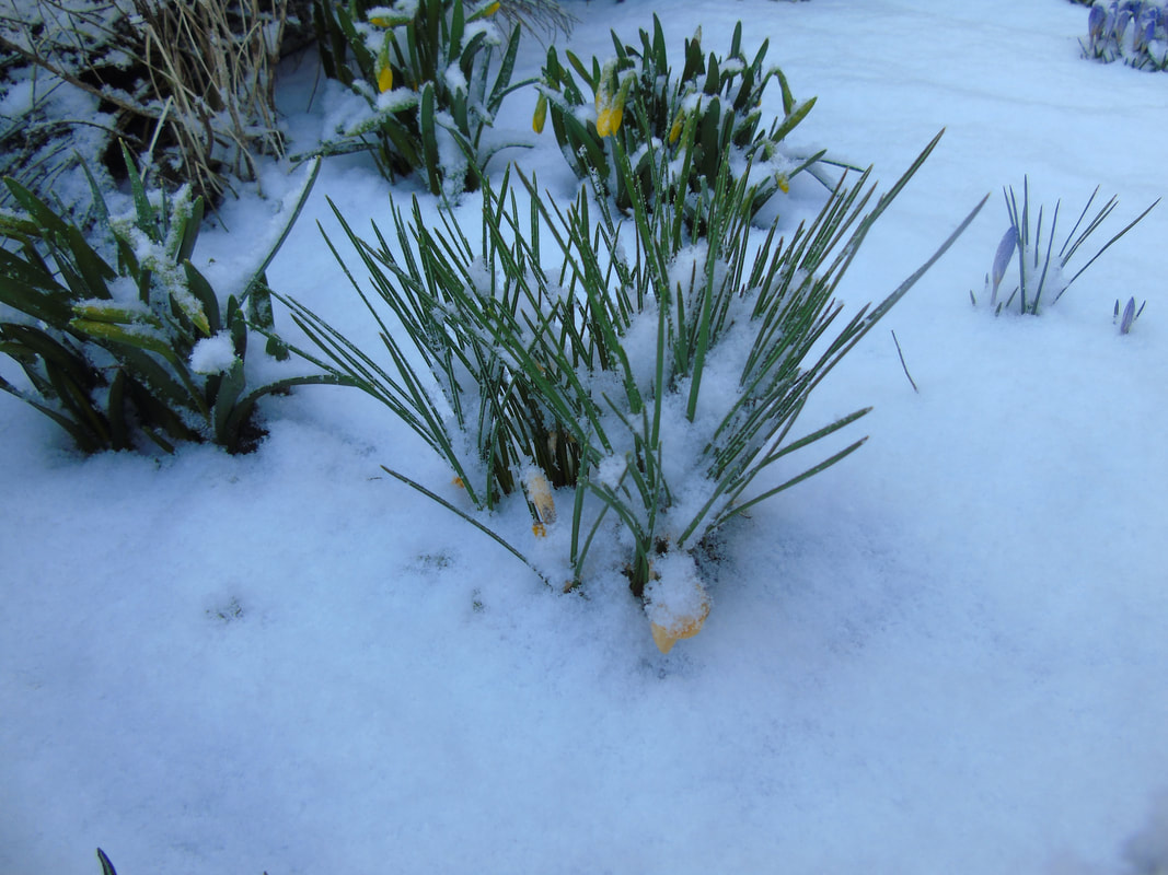
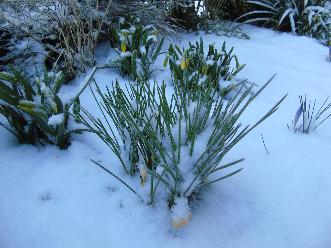
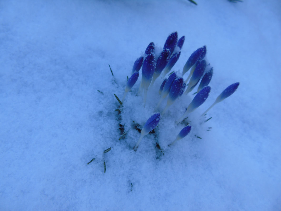
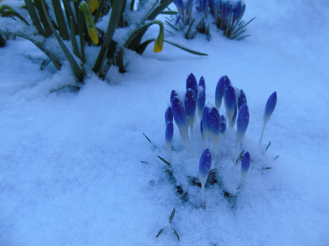
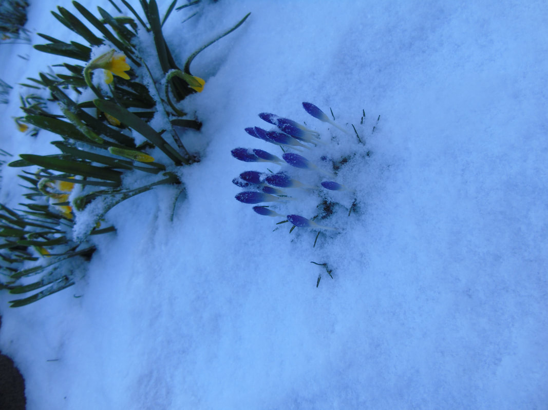
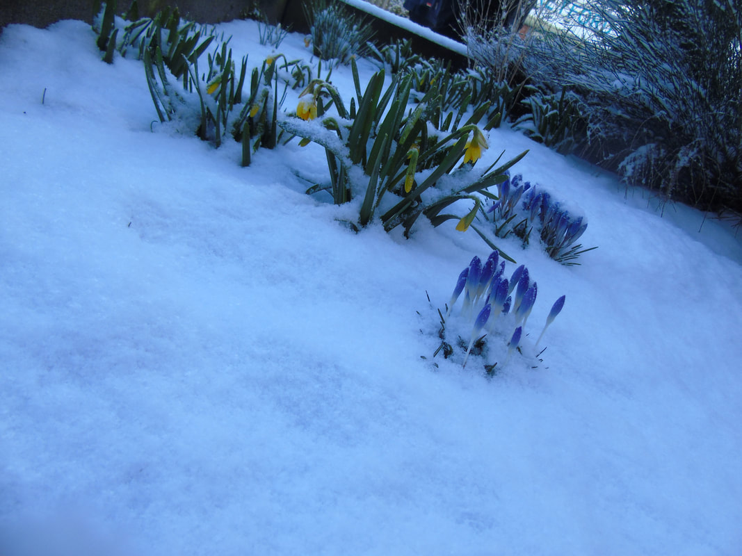
Depth of field
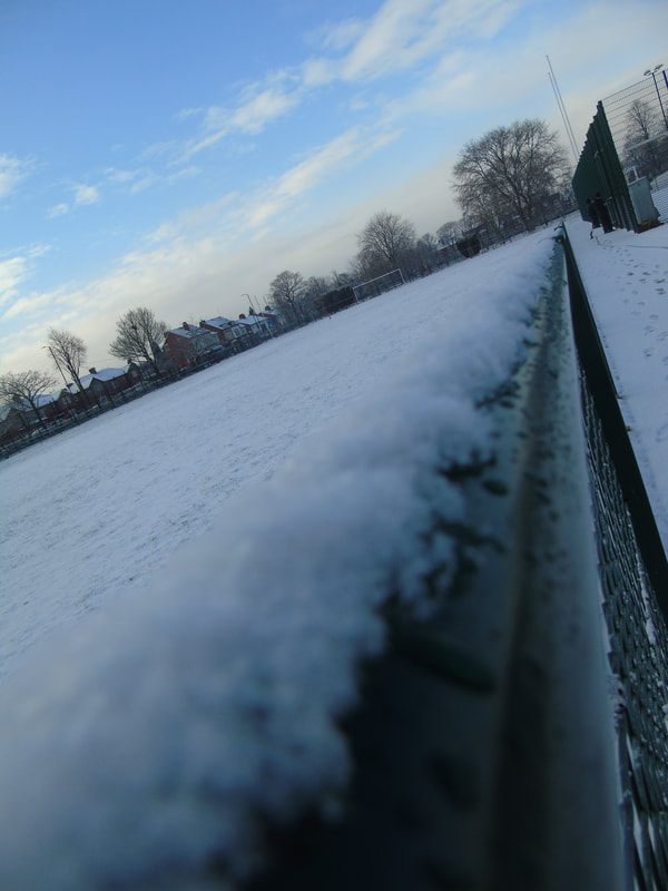
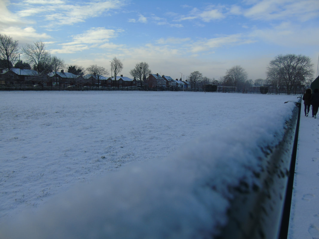
Distance Picture
Linking Paragraphs
In winter we went to Anglesey to capture nature surrounded pictures in rural areas for our landscape project, whereas in summer we went to London to capture central London and the man made buildings for our urban landscape.
Anglesey was in winter so it got dark really quick so we had to change the aperture throughout the day and as we were at the beach we had to change the shutter speed as well as we had to capture many things like the sunset and the waves coming in. We stayed in Holyhead for 3 days and went to several beaches and ended the trip by walking through a forest and visiting a lighthouse. Overall I think this trip was great and beneficial for my work as it will boost my grade and has taught me more techniques on how to use the camera. Also because we were not in a rush as we were there for 3 days and we were out for most of the day so we had a good set of pictures and really built our portfolio up.
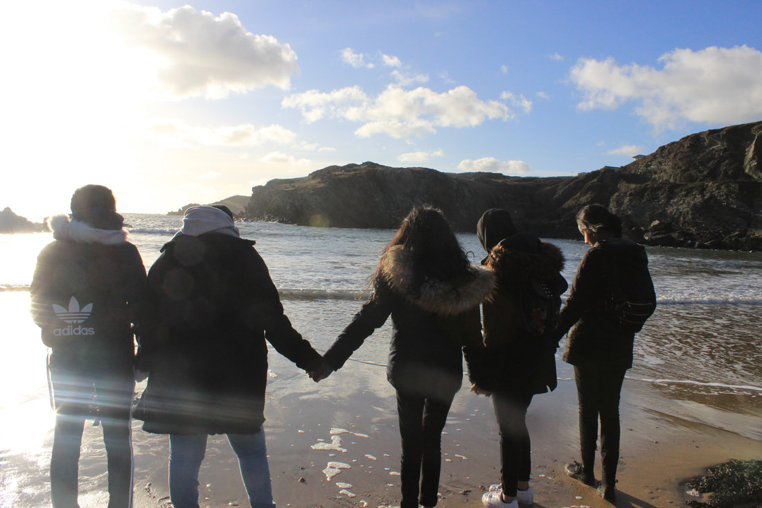
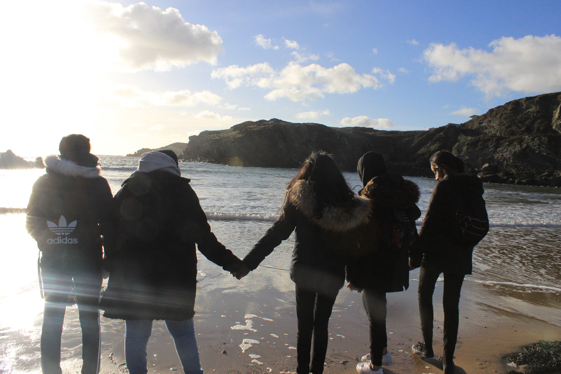
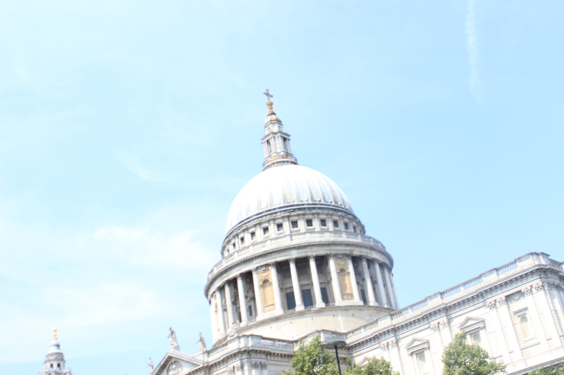
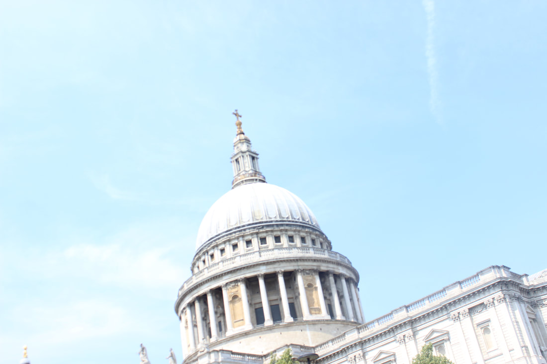
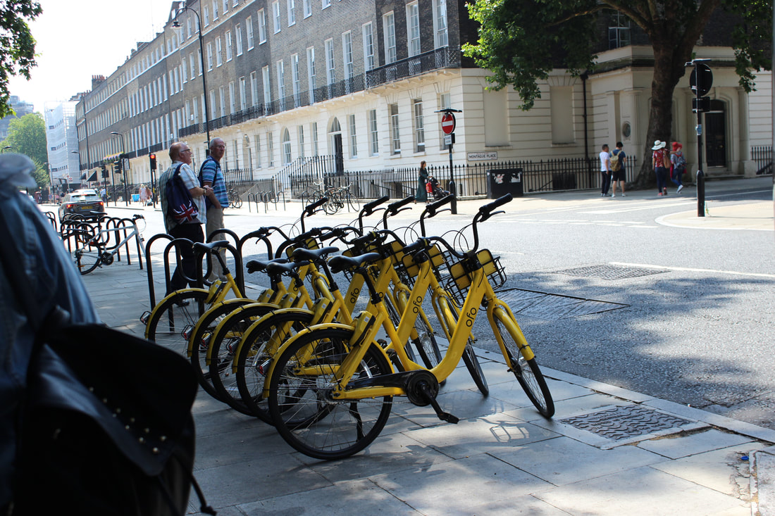
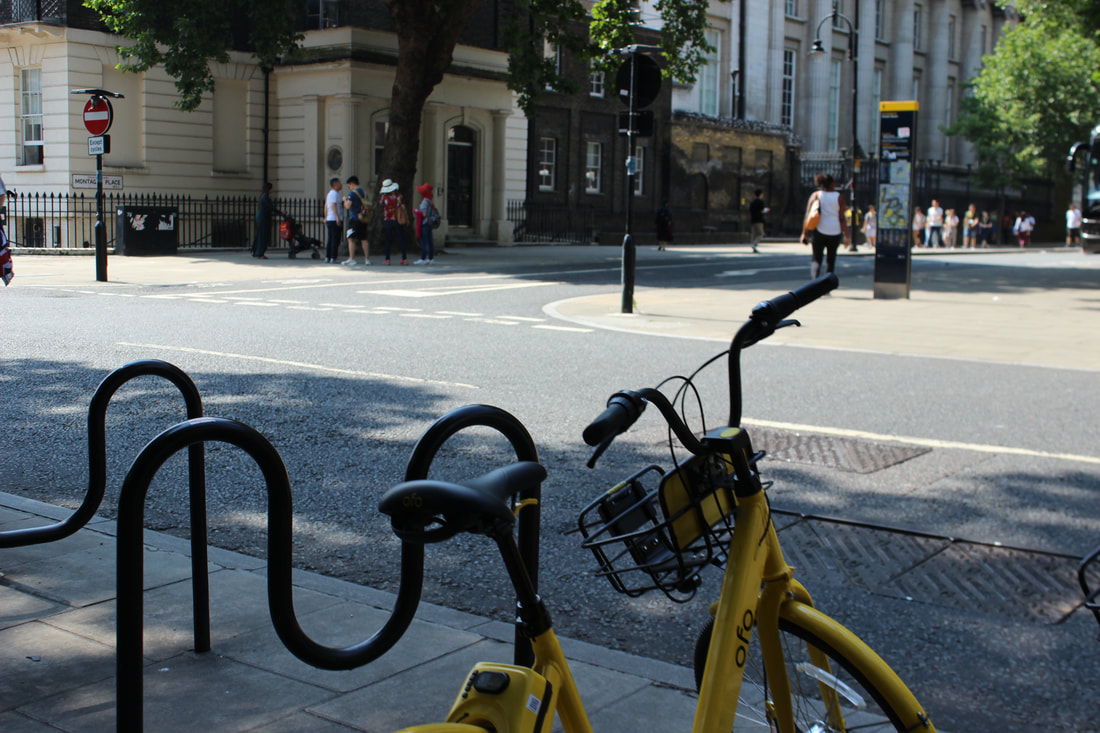
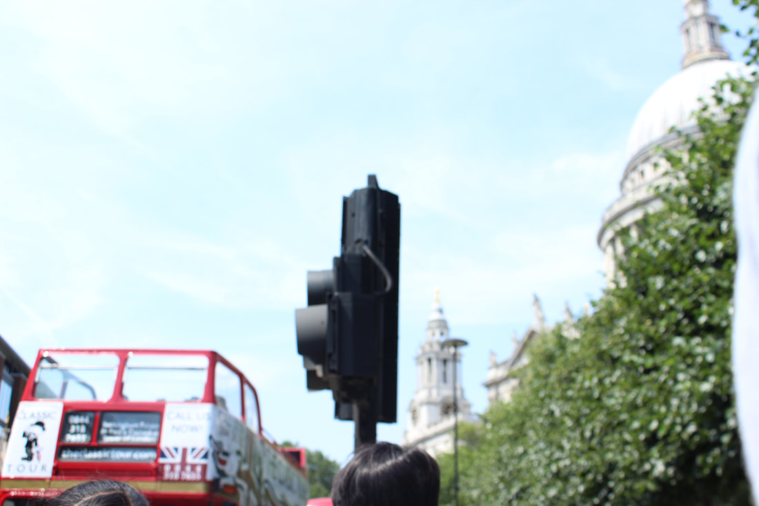
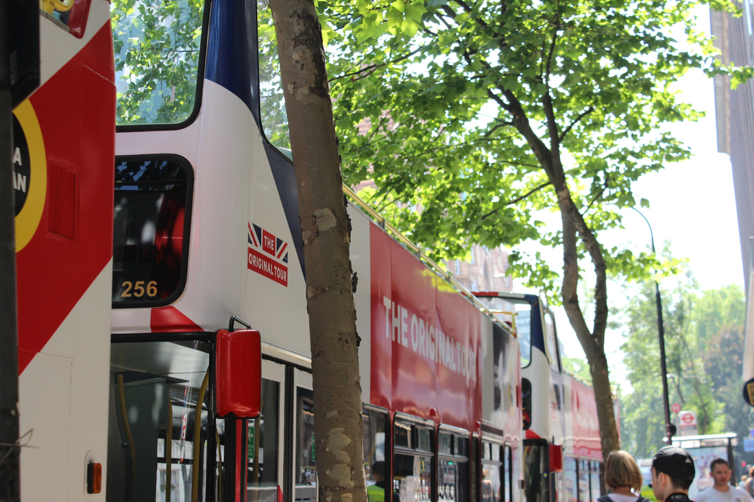
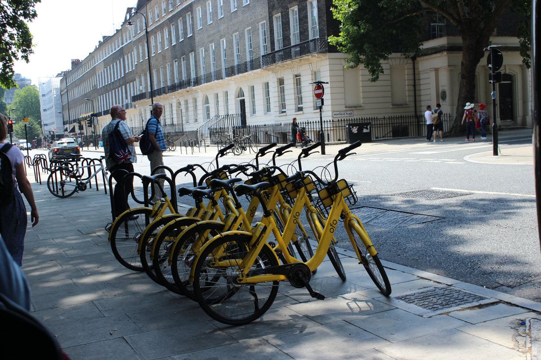
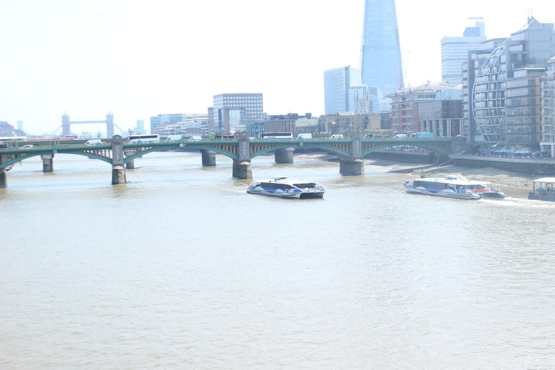
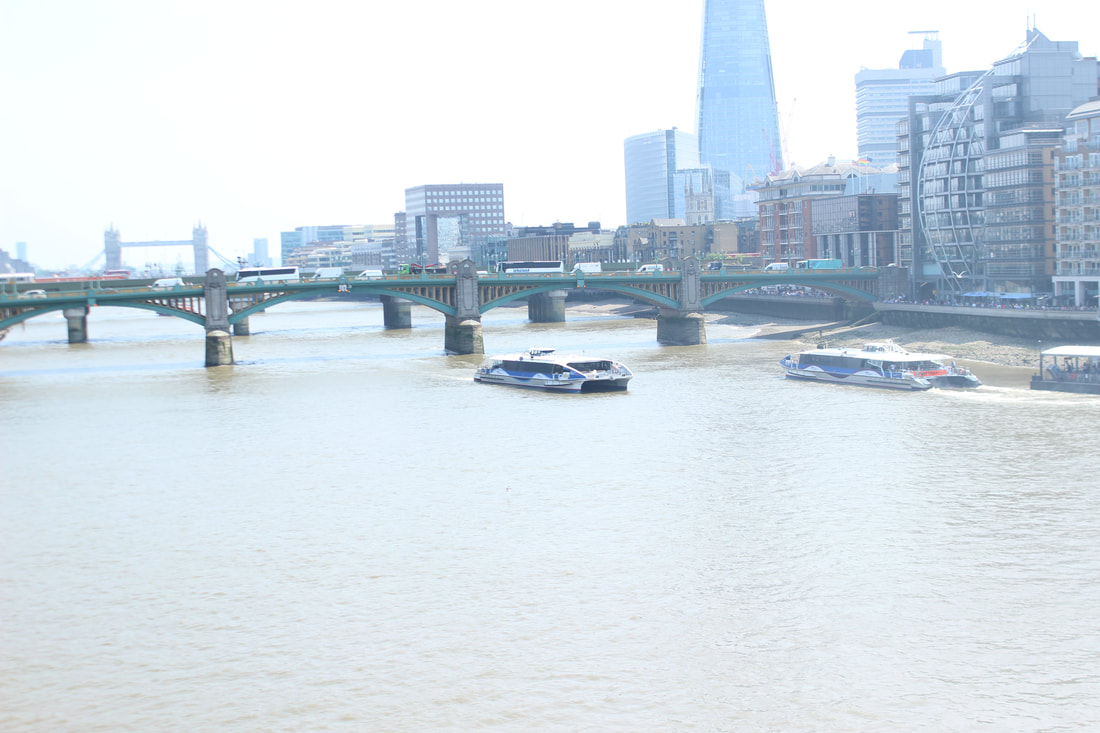
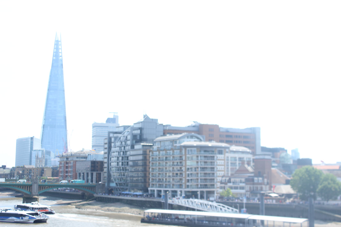
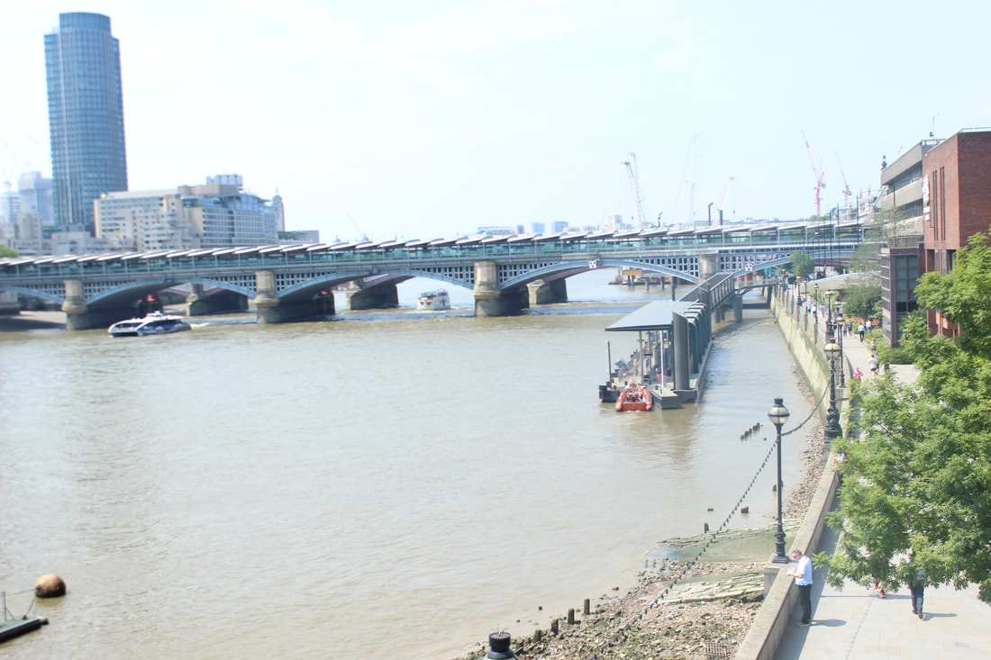
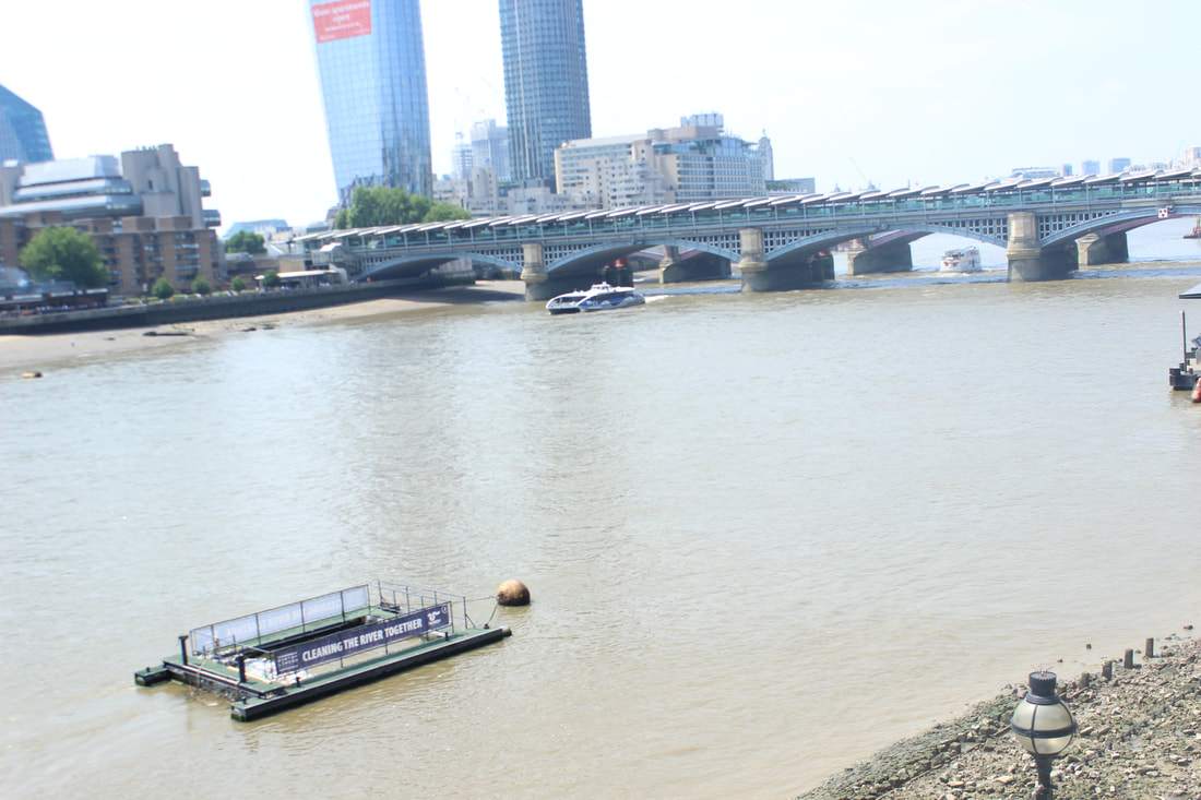
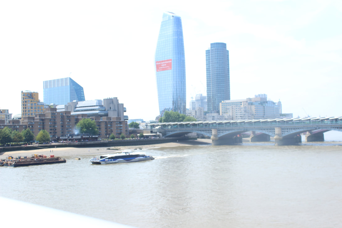
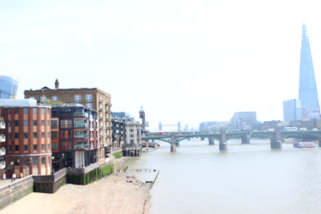
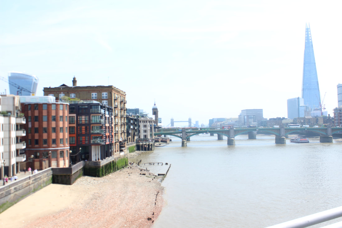
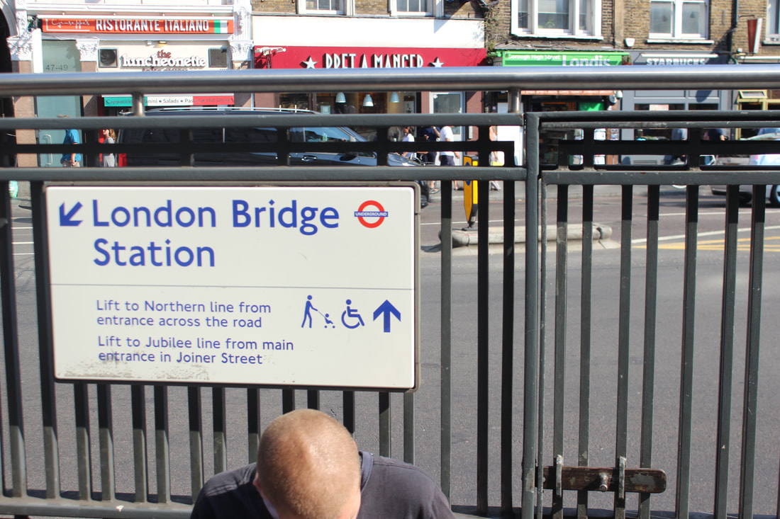
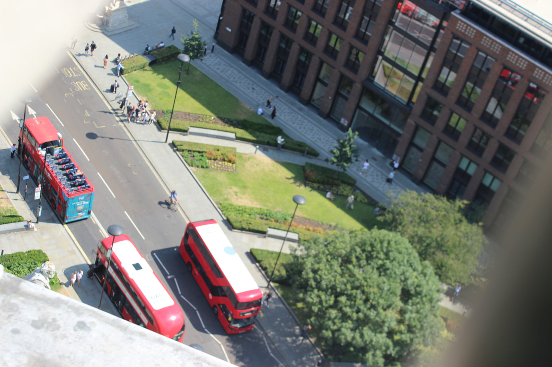
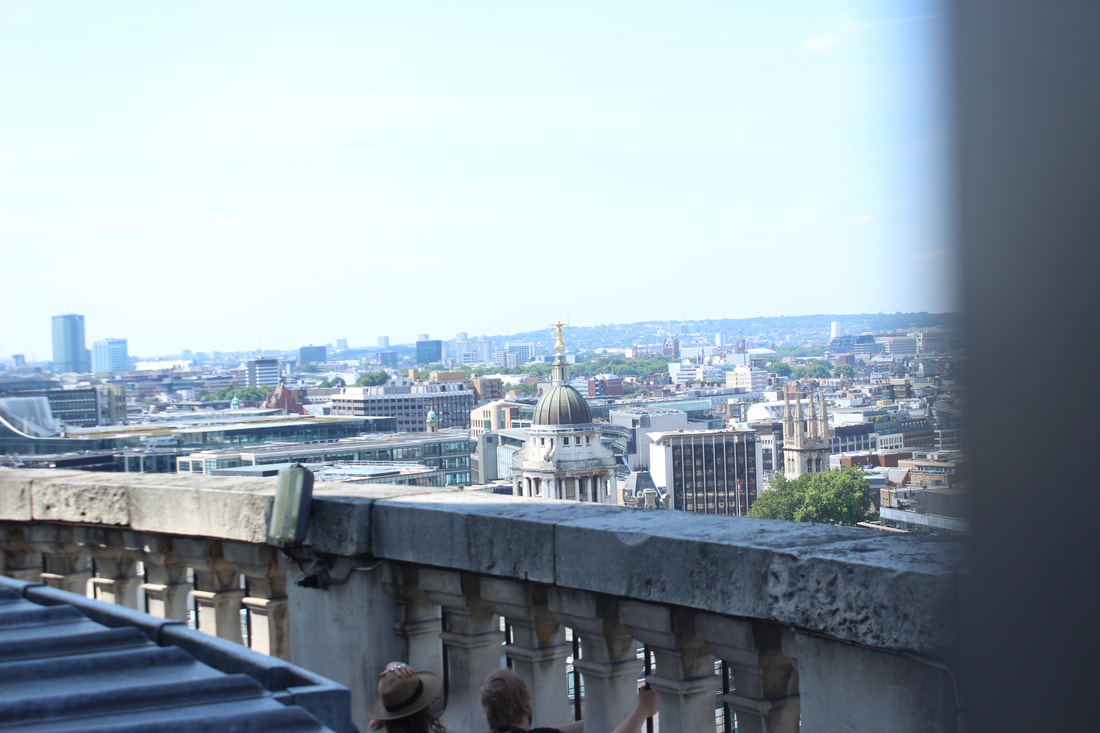
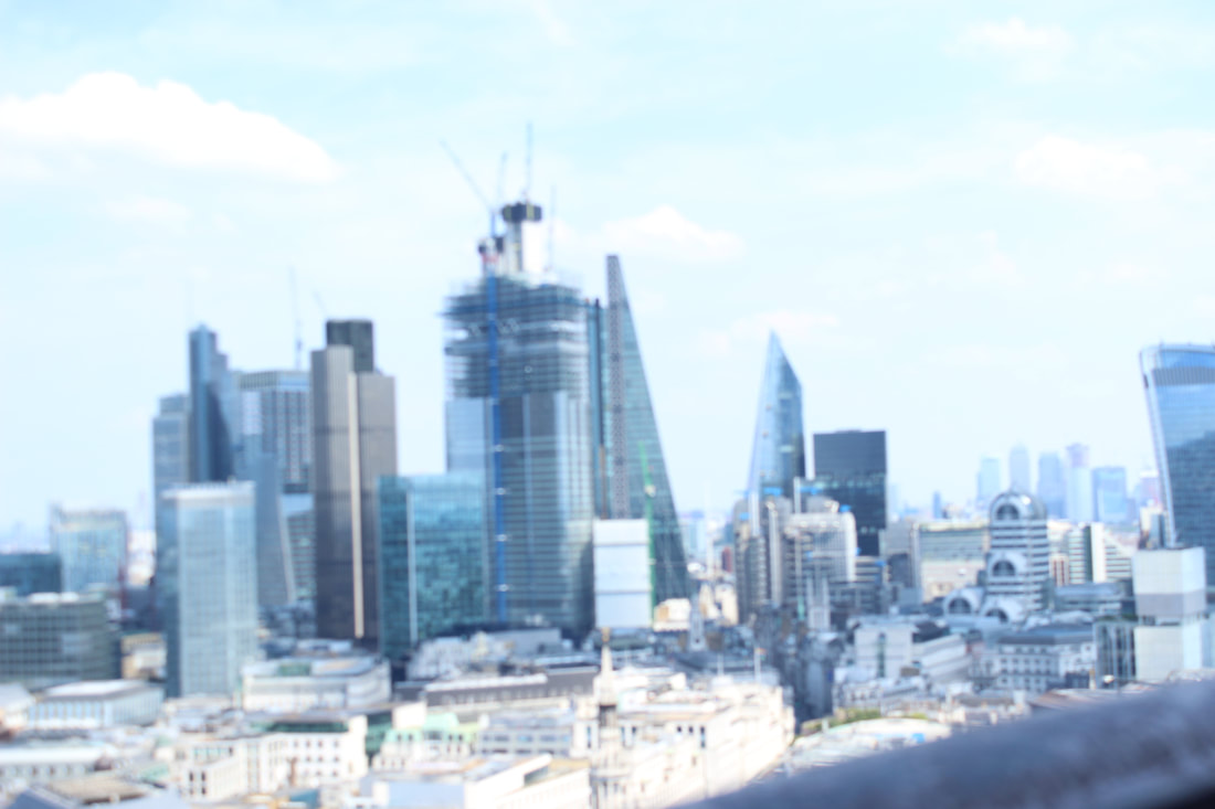
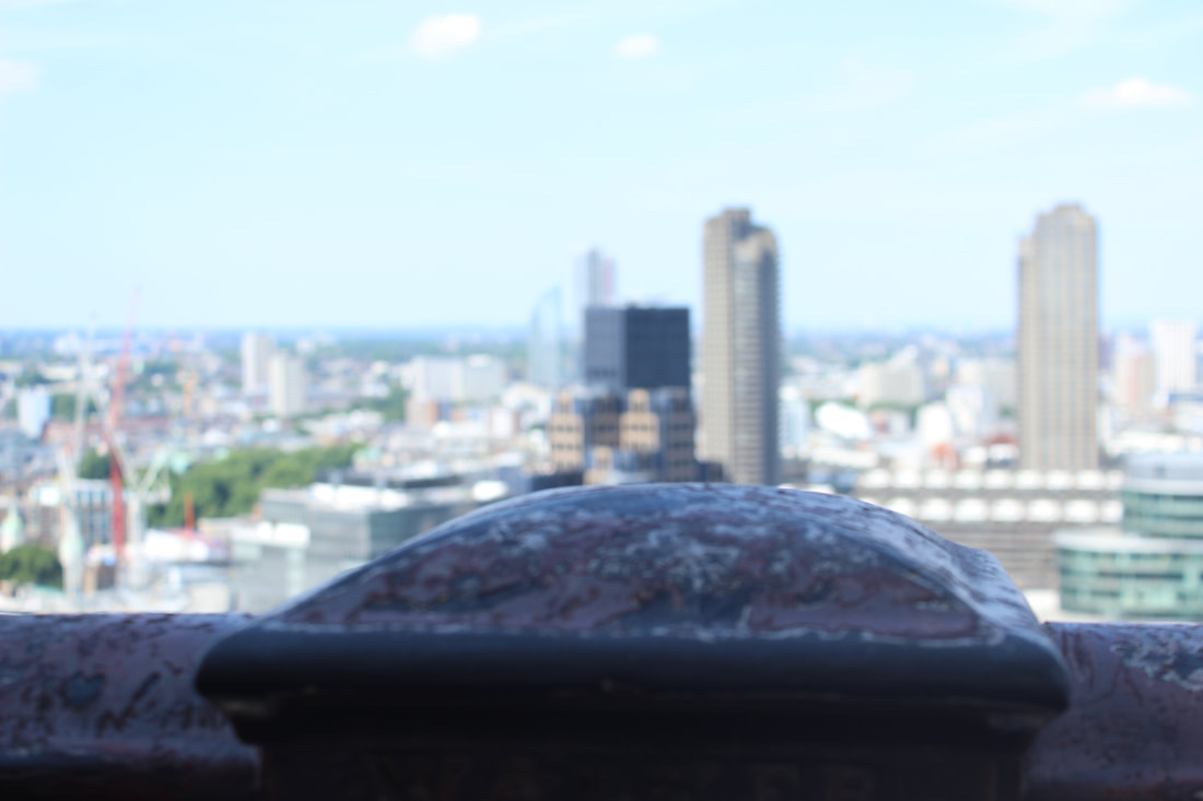
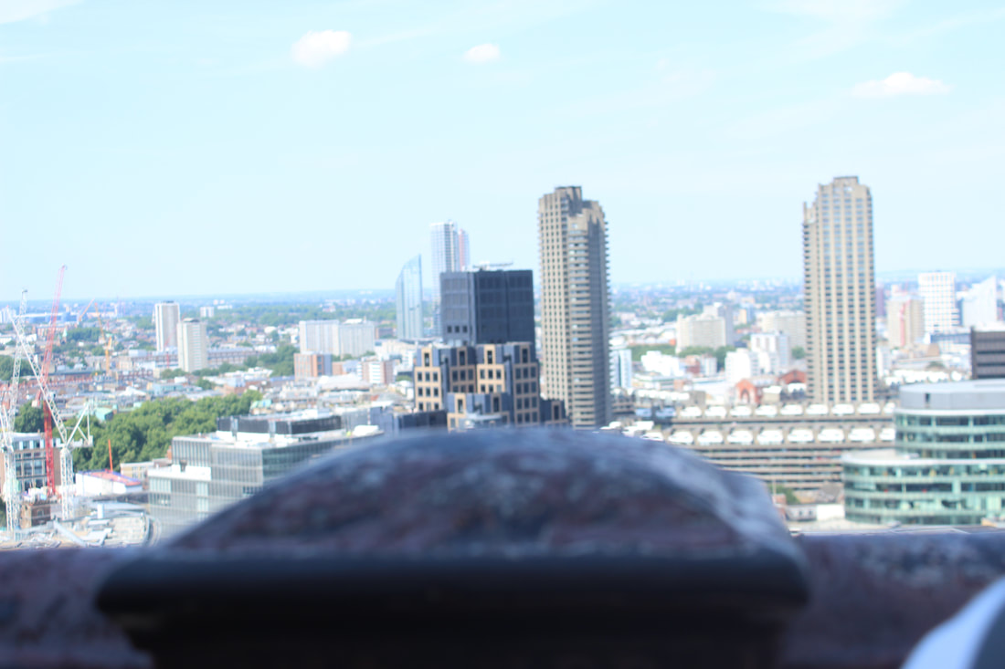
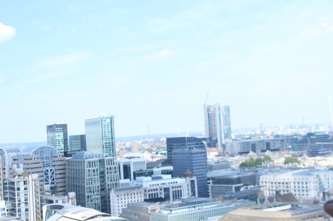
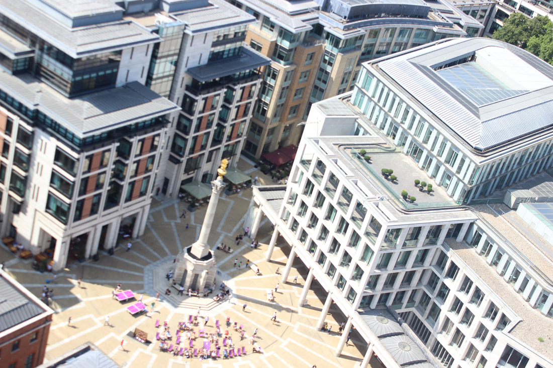
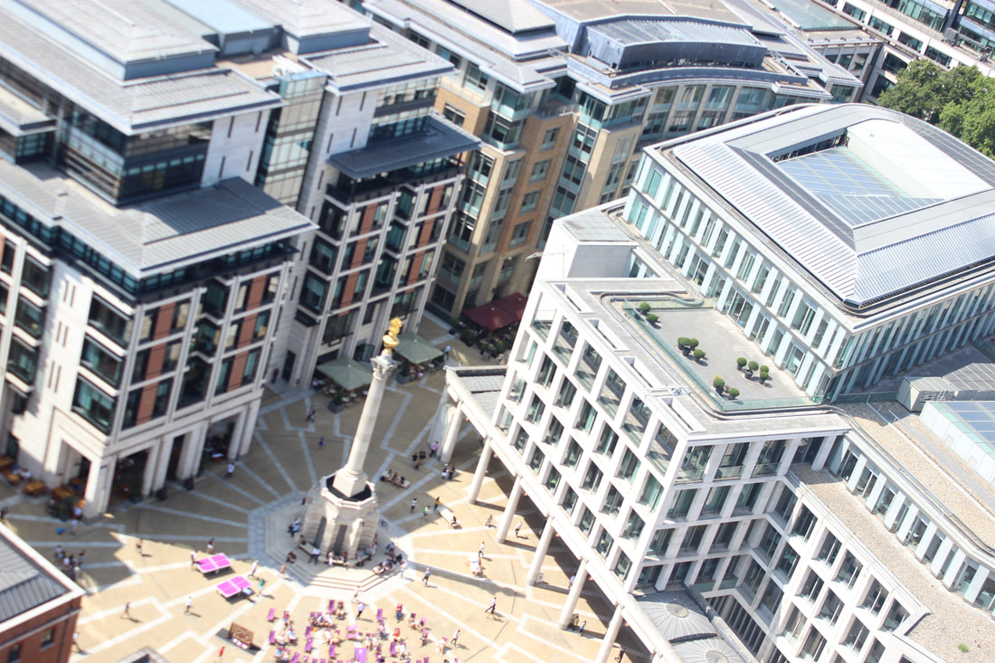
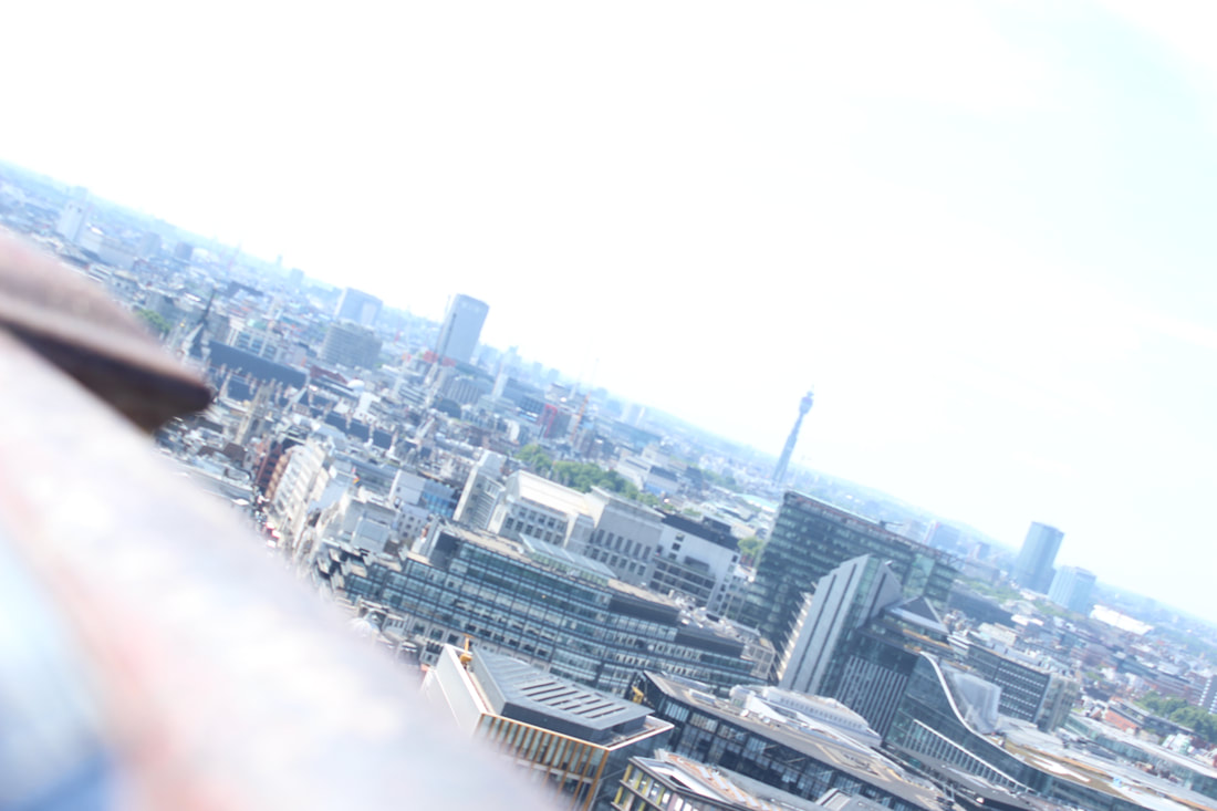
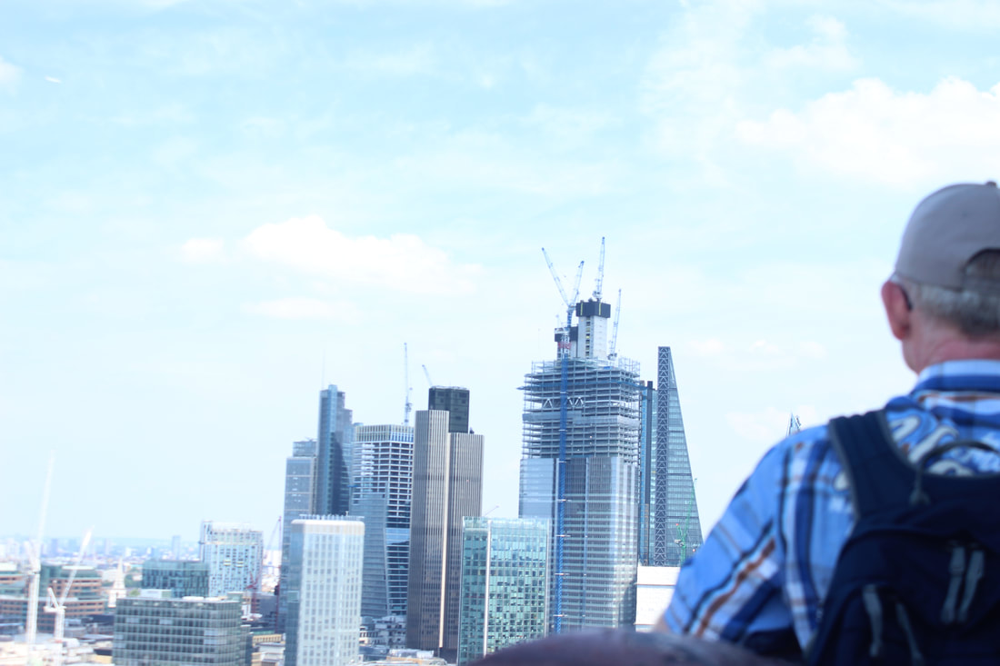
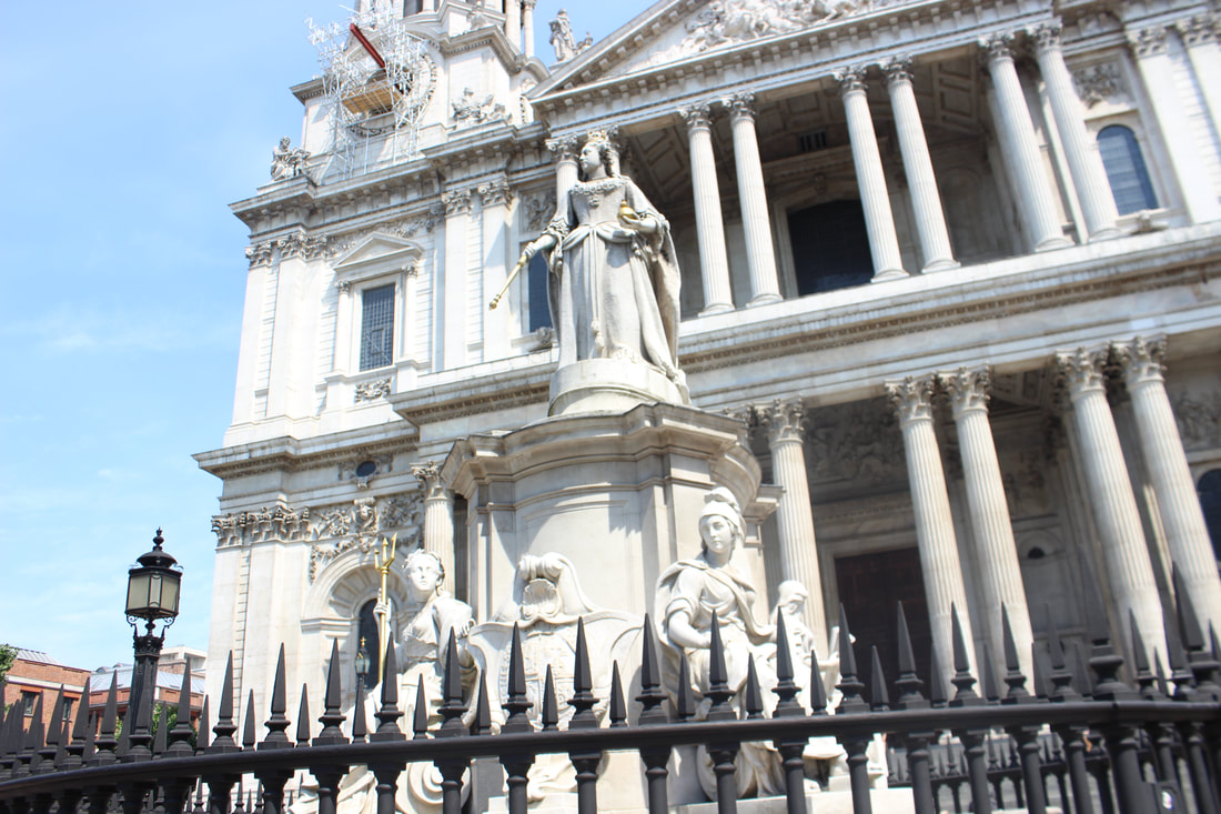
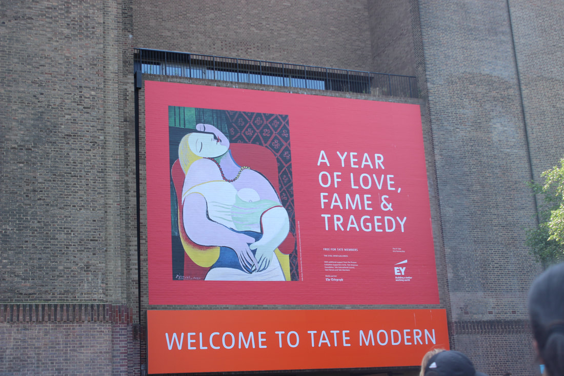
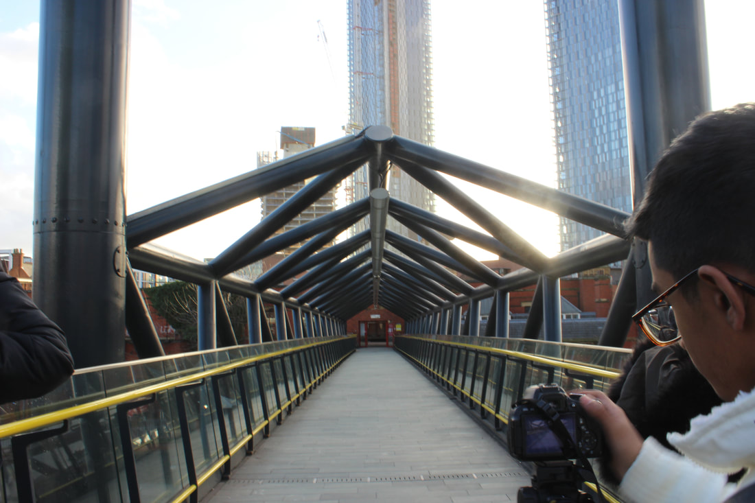
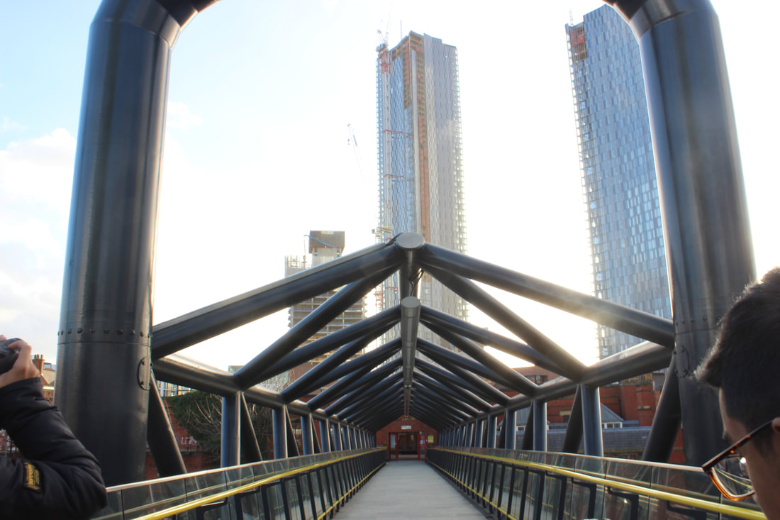
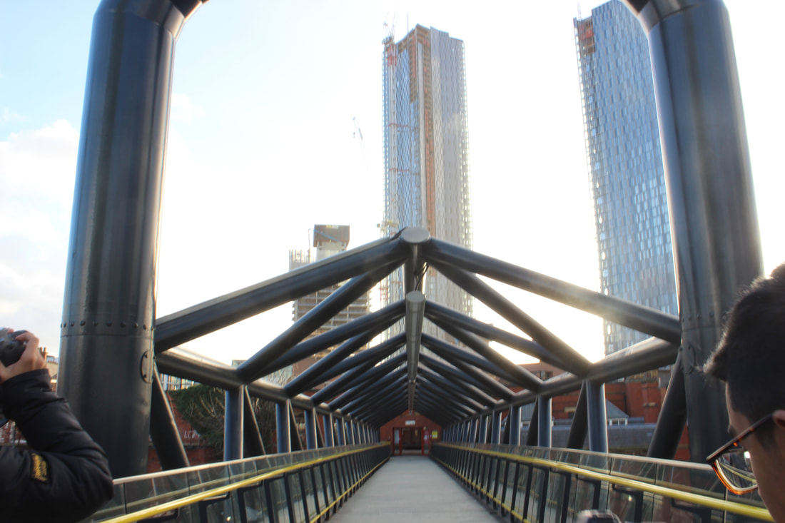
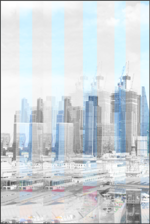
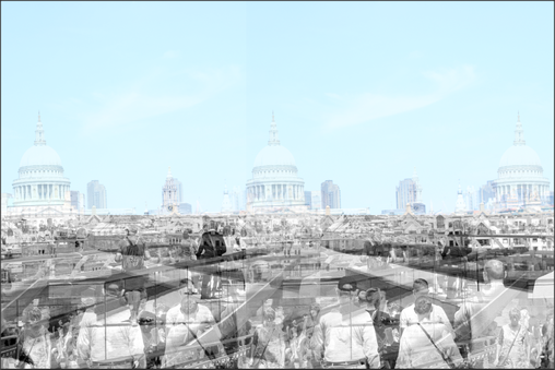
On the 6th of July 2018, we went to London,Euston to take pictures of the urban landscape. This was in the summer so we were hit with some harsh lightning and heat so throughout the day we had to change the apertature more than the shutter speed as the lightning needed to be perfect. In Anglesey we focused more on the beauty of nature whereas in London we focused more on the beauty of the busy streets, the man made buildings and the famous places in London. We visited the british museum, tate modern and st Paul's cathedral church. We also walked over the Millenium bridge and the underground to get to our destinations. The experience was amazing for me as i have never been London before but also faced my fears of heights as we walked up 400 steps to get to the skyview of London, this was an mesmerising view and absolutely loved it. We also got some good pictures of the skyline as we could see all of Euston.
Overall I think these trips which show the comparison between the urban and rural pictures will boost my grade and the trip i prefered was anglesey as we had more time to explore and take pictures. I really liked this residential because it showed me different techniques and how to use the camera effectively. It also was great fun as we tried a lot of different stuff like making and flying kites and exploring new and different places .
Anglesey was in winter so it got dark really quick so we had to change the aperture throughout the day and as we were at the beach we had to change the shutter speed as well as we had to capture many things like the sunset and the waves coming in. We stayed in Holyhead for 3 days and went to several beaches and ended the trip by walking through a forest and visiting a lighthouse. Overall I think this trip was great and beneficial for my work as it will boost my grade and has taught me more techniques on how to use the camera. Also because we were not in a rush as we were there for 3 days and we were out for most of the day so we had a good set of pictures and really built our portfolio up.
On the 6th of July 2018, we went to London,Euston to take pictures of the urban landscape. This was in the summer so we were hit with some harsh lightning and heat so throughout the day we had to change the apertature more than the shutter speed as the lightning needed to be perfect. In Anglesey we focused more on the beauty of nature whereas in London we focused more on the beauty of the busy streets, the man made buildings and the famous places in London. We visited the british museum, tate modern and st Paul's cathedral church. We also walked over the Millenium bridge and the underground to get to our destinations. The experience was amazing for me as i have never been London before but also faced my fears of heights as we walked up 400 steps to get to the skyview of London, this was an mesmerising view and absolutely loved it. We also got some good pictures of the skyline as we could see all of Euston.
Overall I think these trips which show the comparison between the urban and rural pictures will boost my grade and the trip i prefered was anglesey as we had more time to explore and take pictures. I really liked this residential because it showed me different techniques and how to use the camera effectively. It also was great fun as we tried a lot of different stuff like making and flying kites and exploring new and different places .
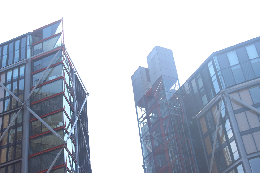
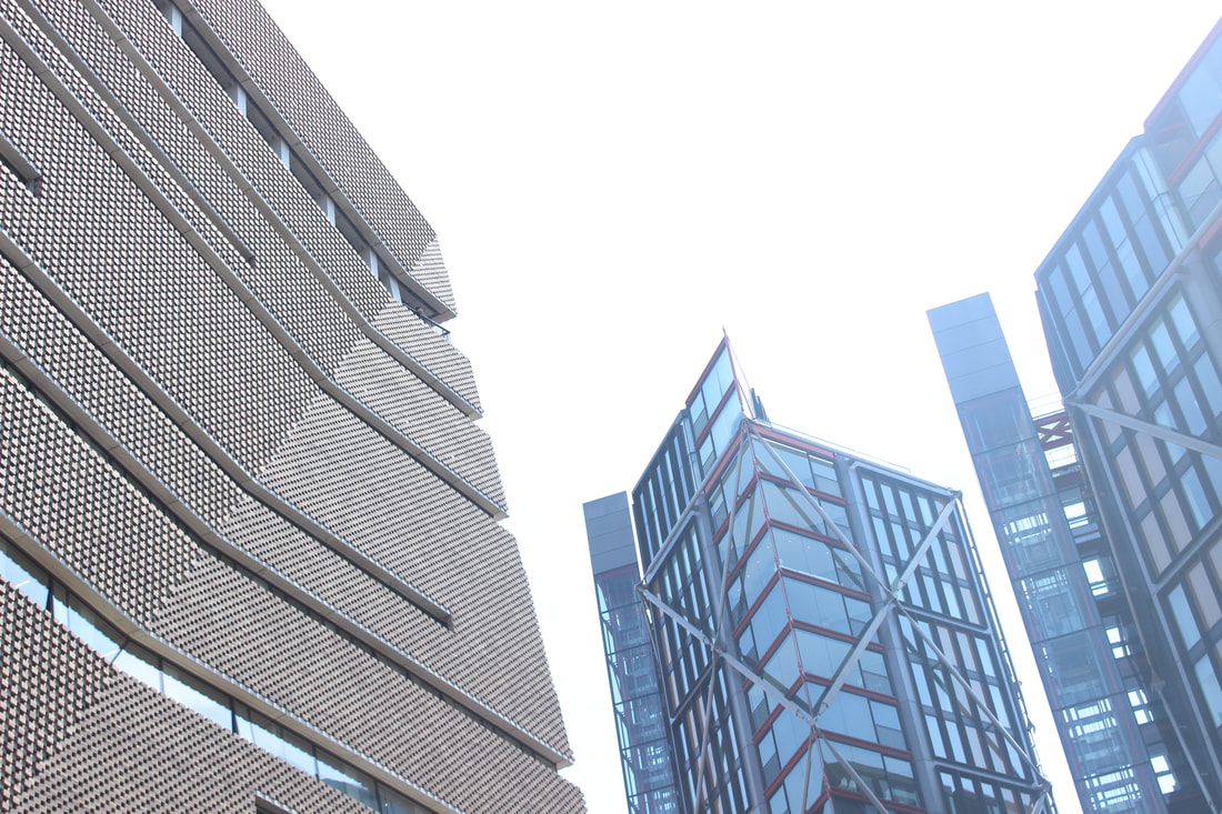
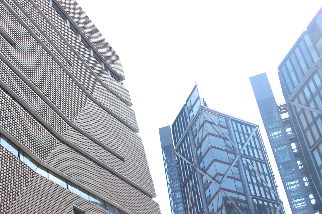
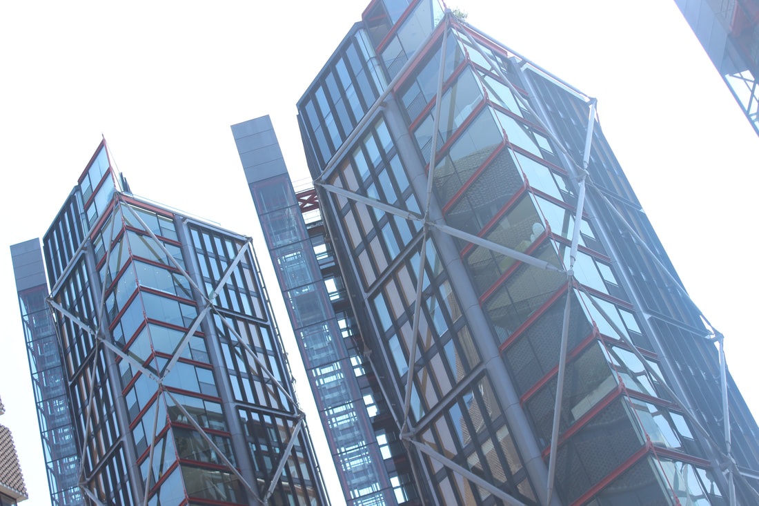
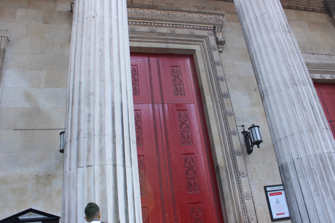
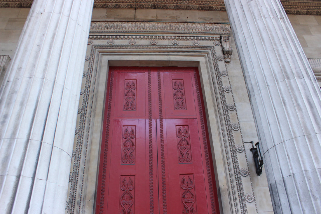
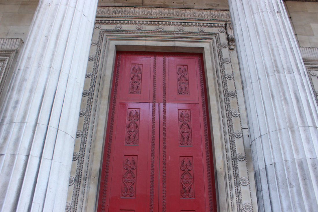
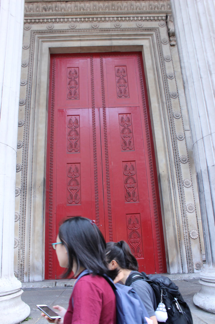
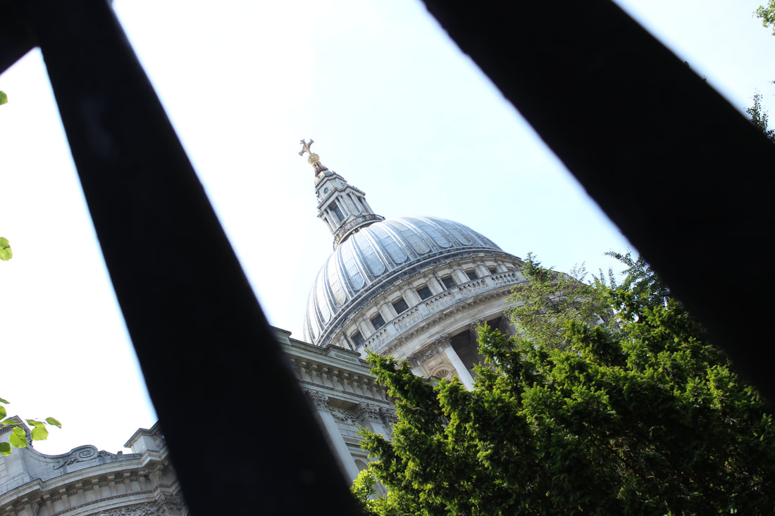
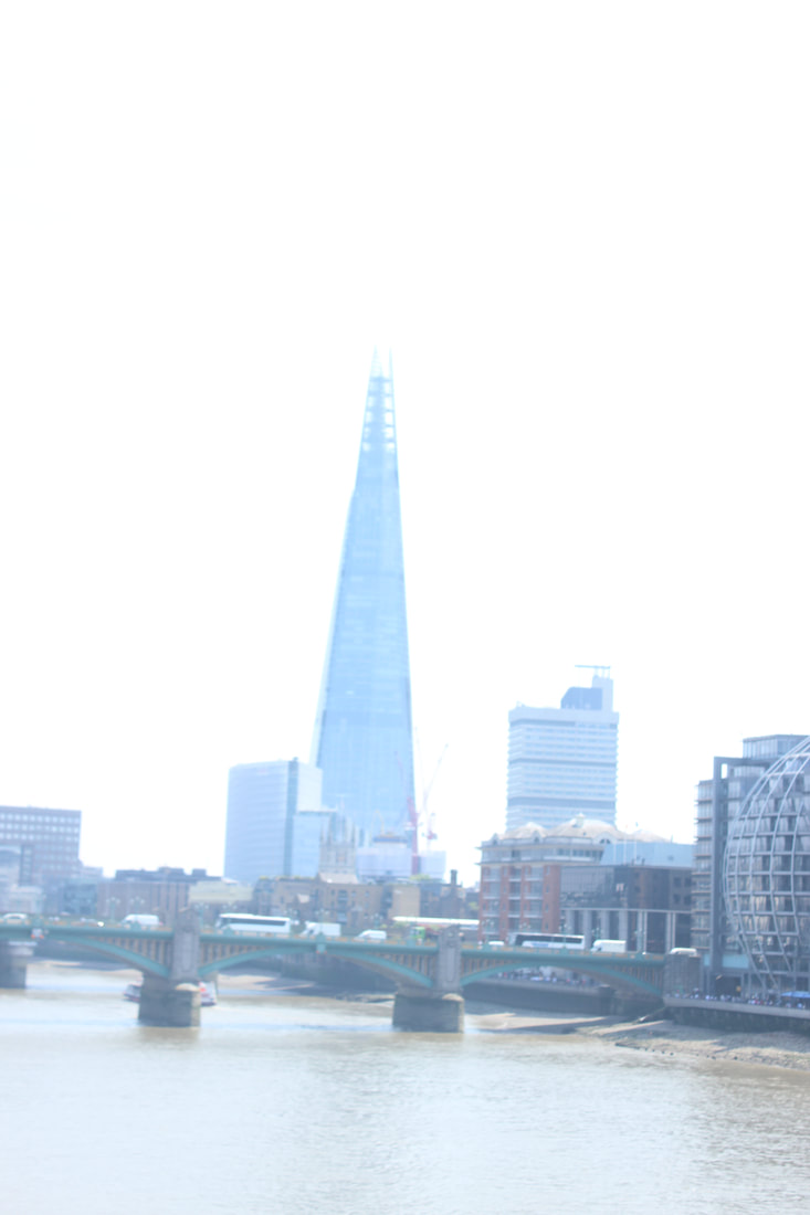
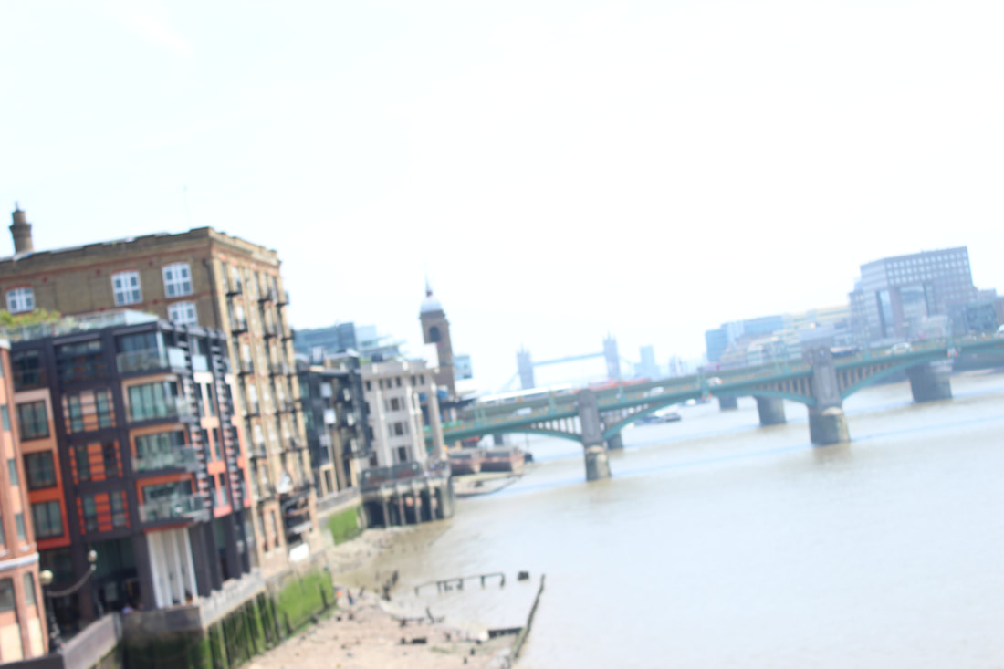
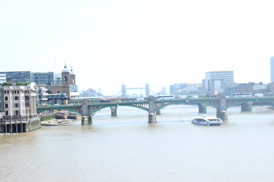
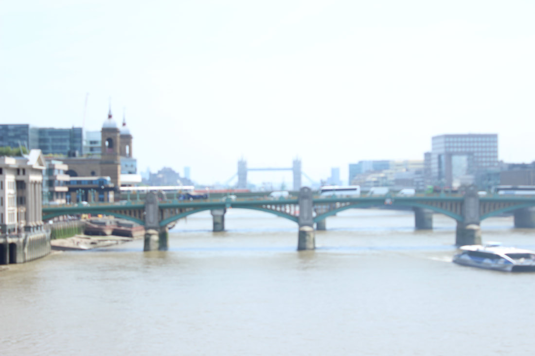
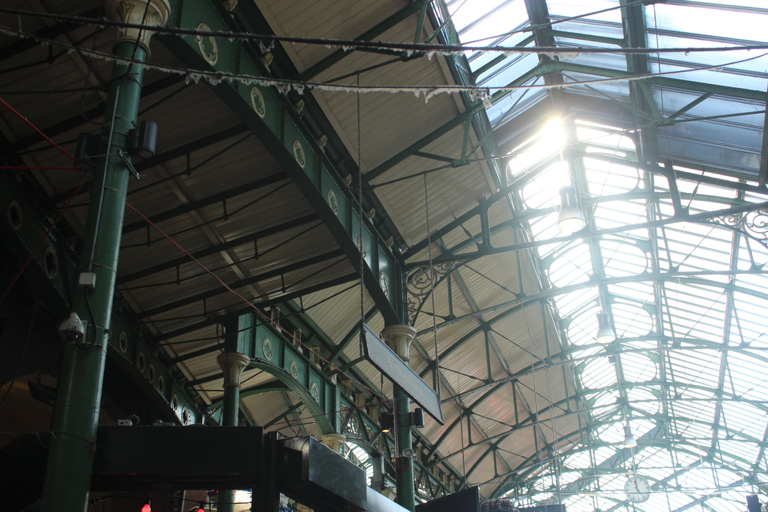
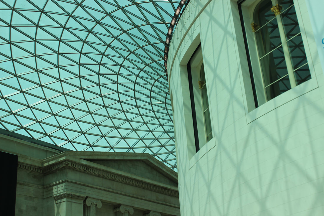
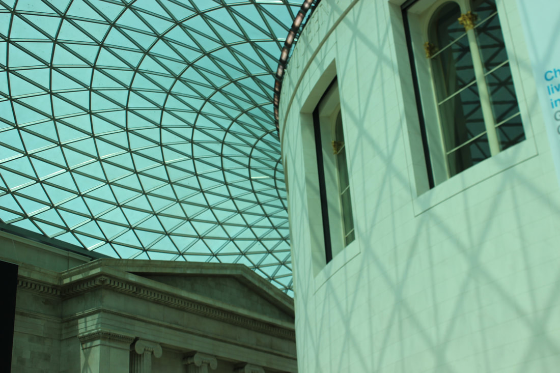
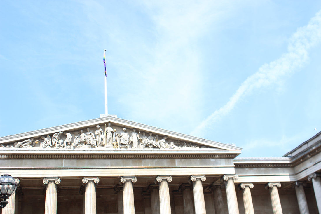
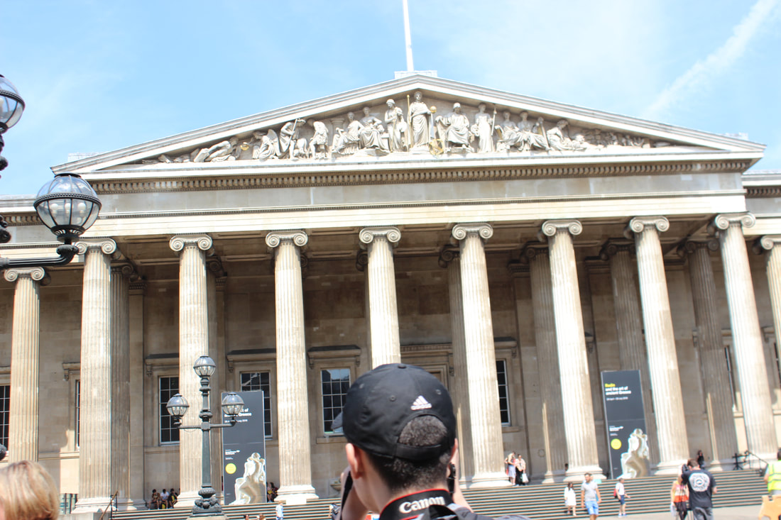
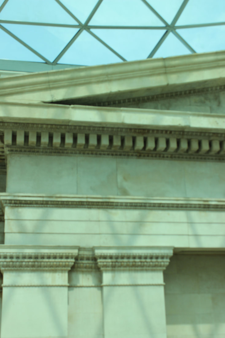
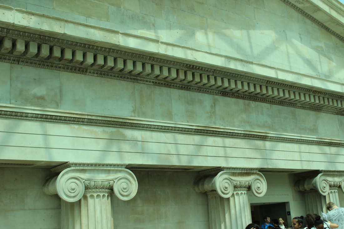
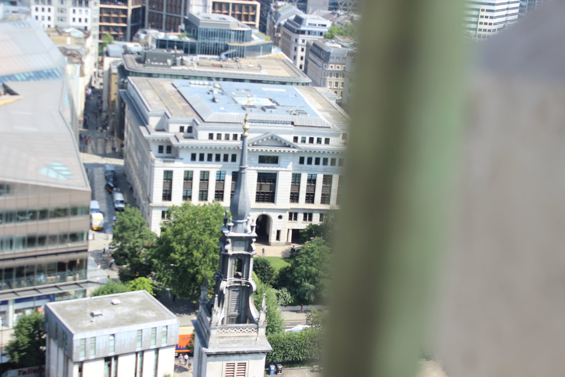
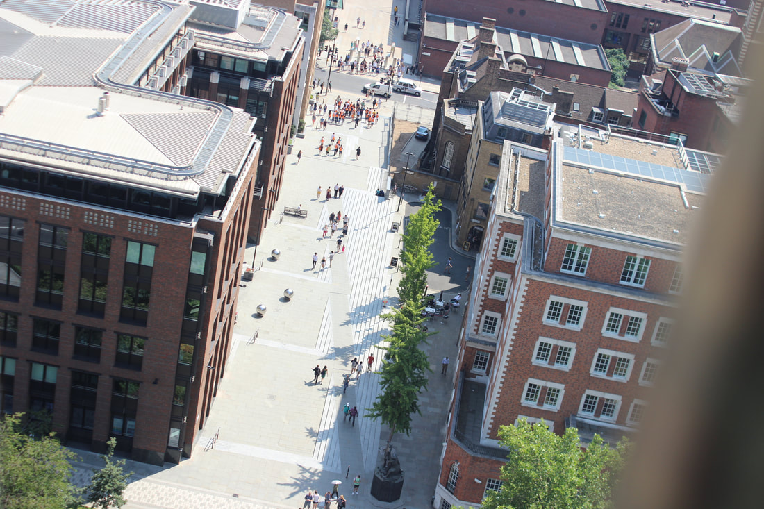
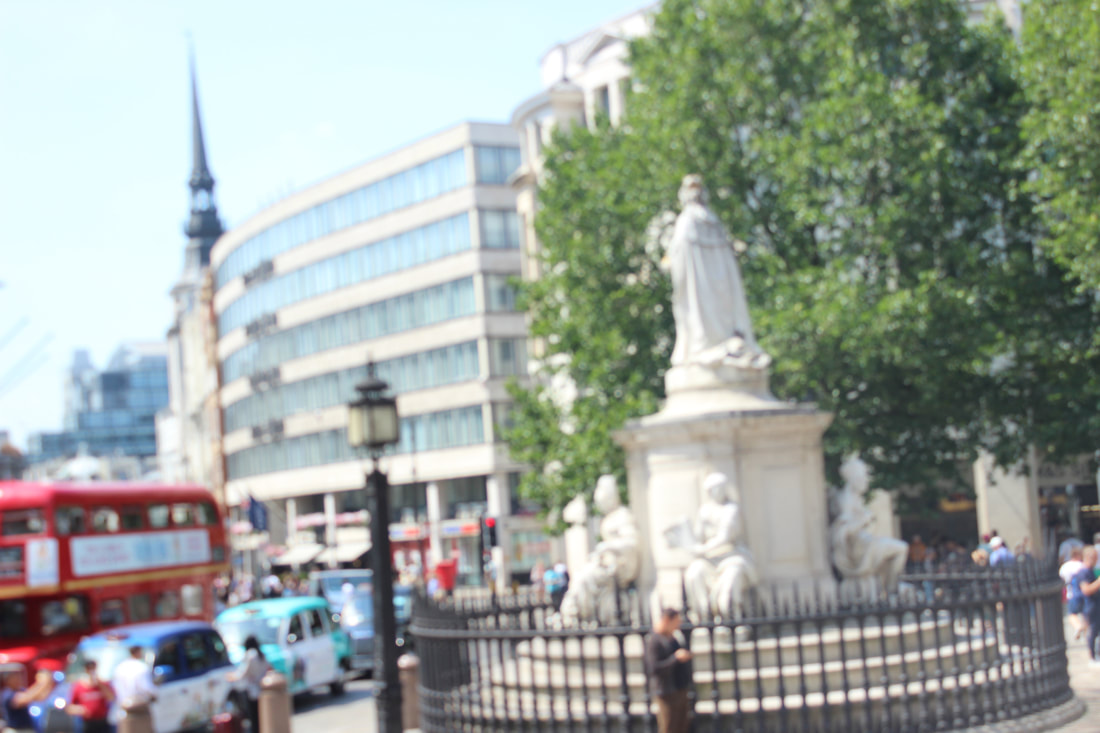
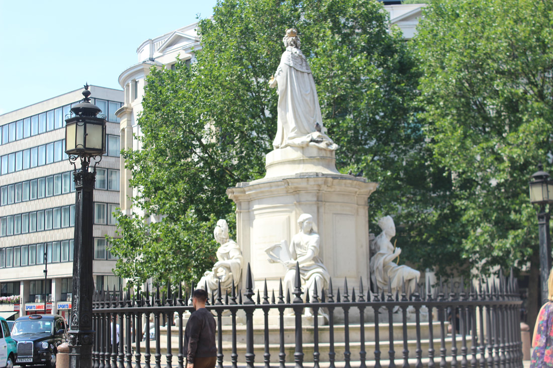
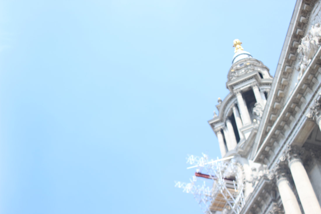
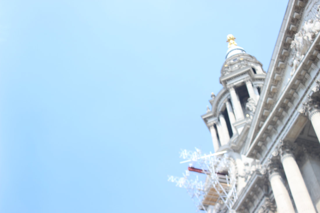
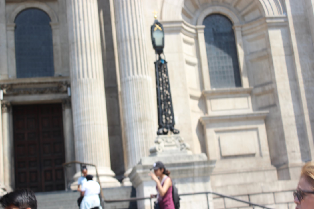
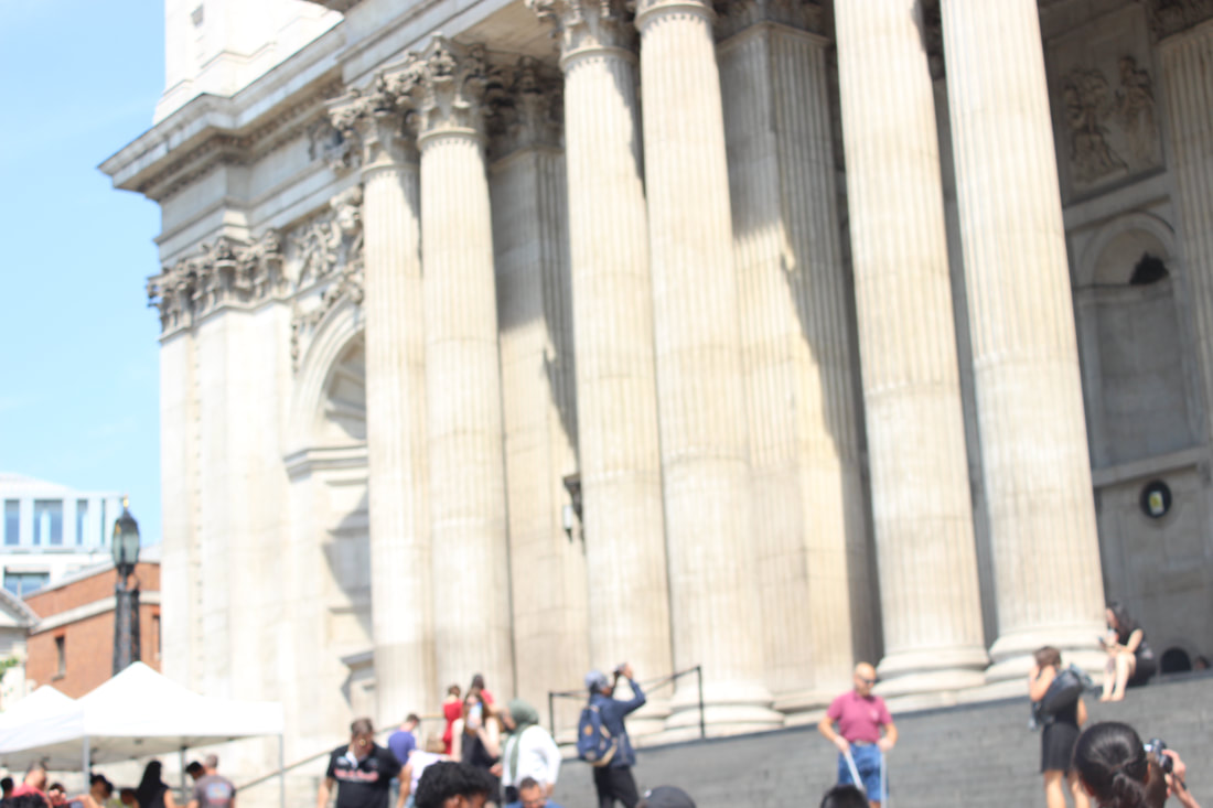
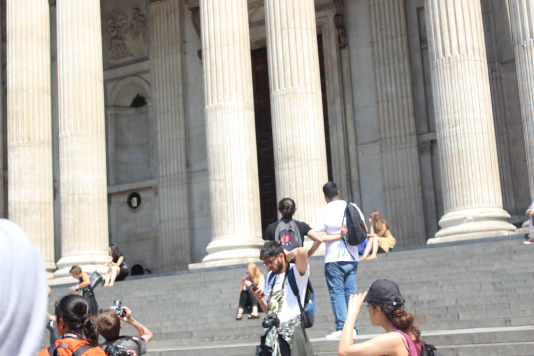
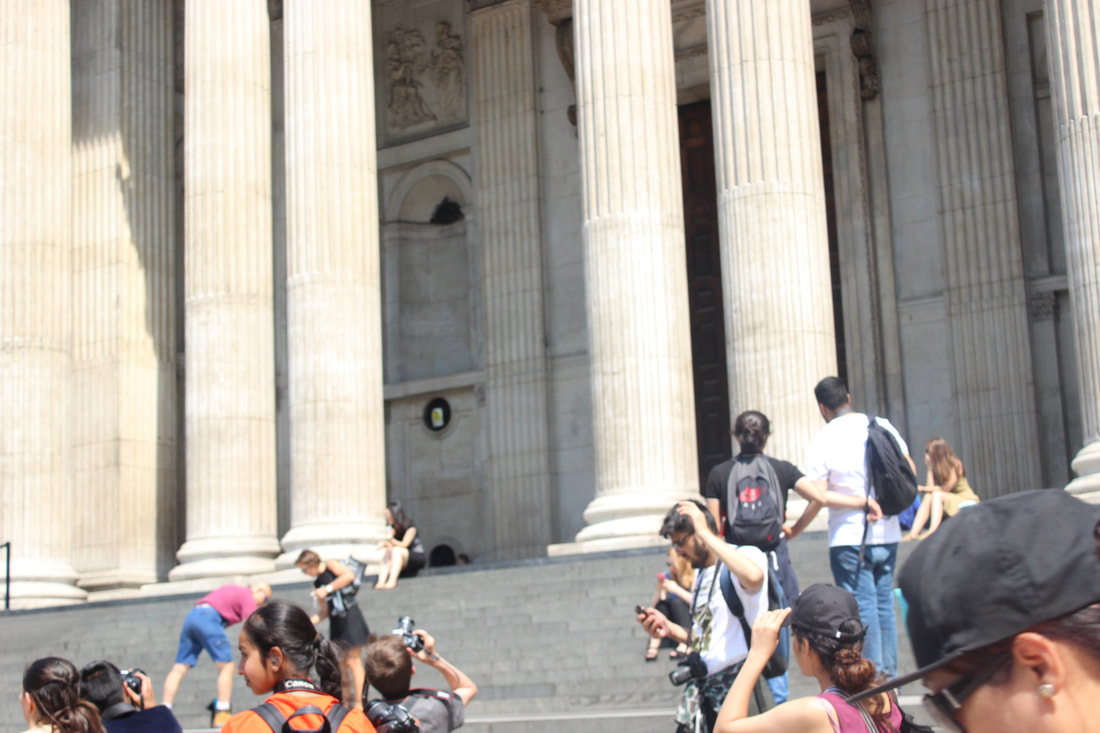
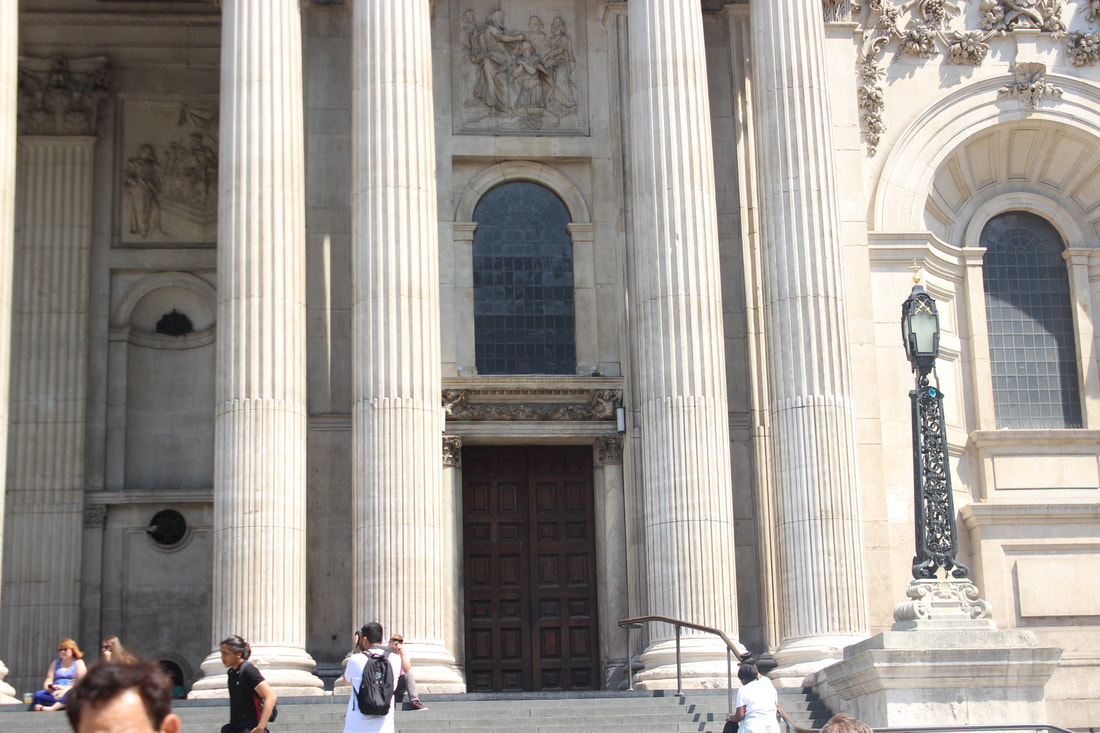
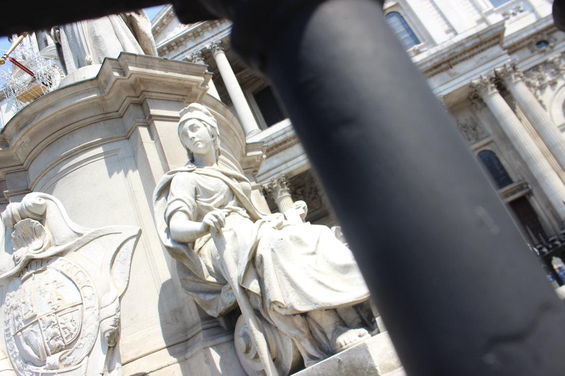
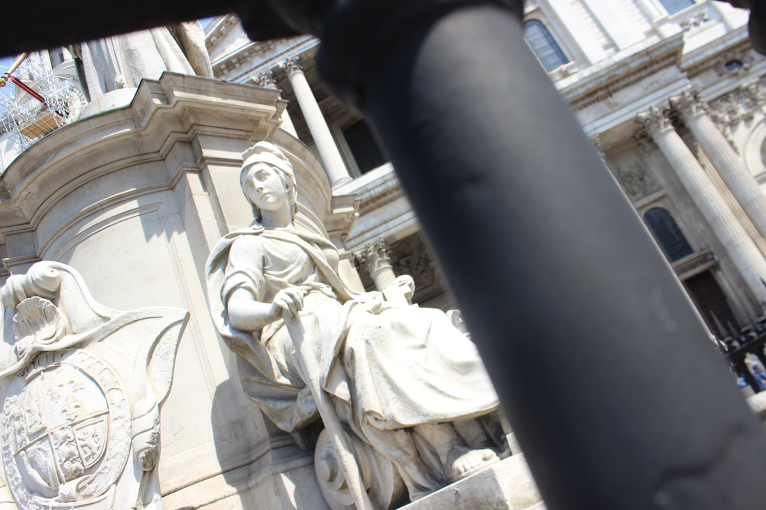
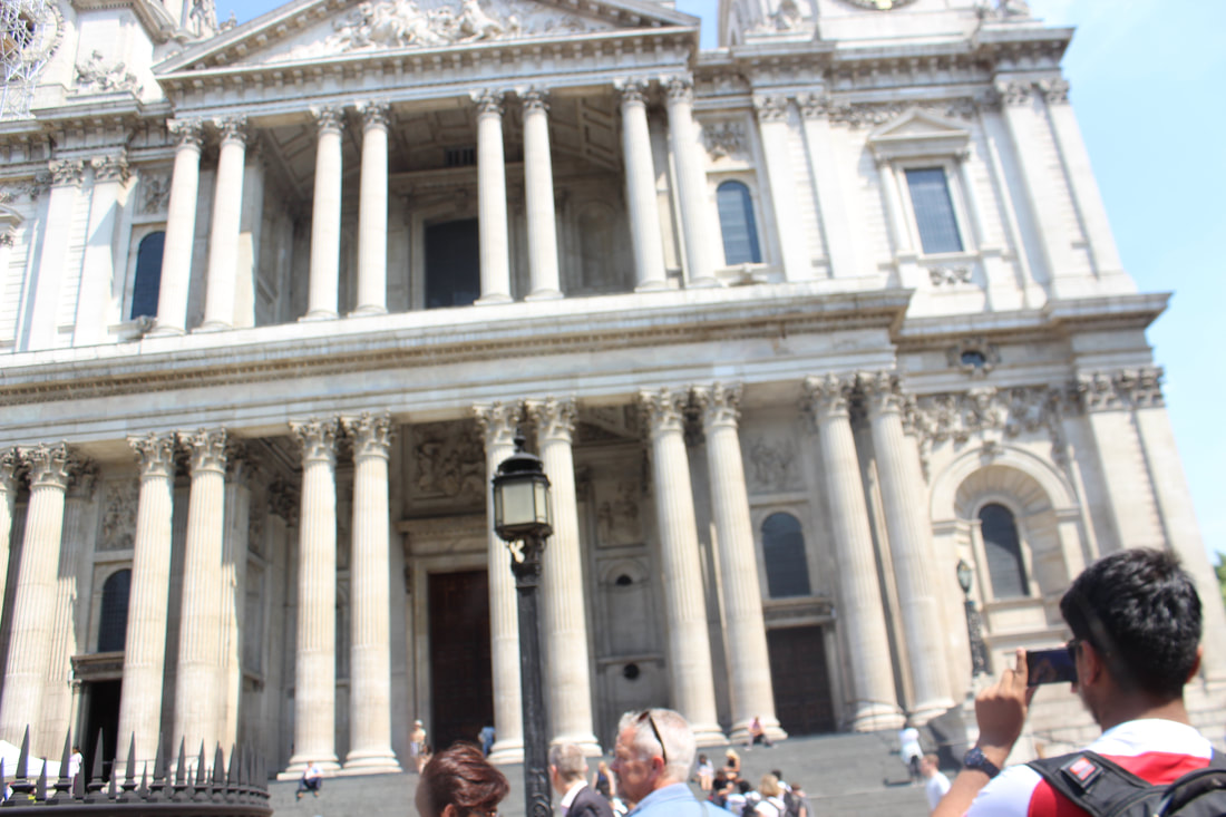
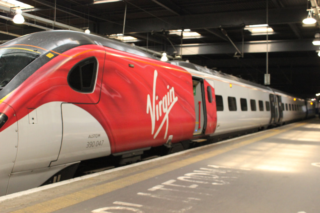
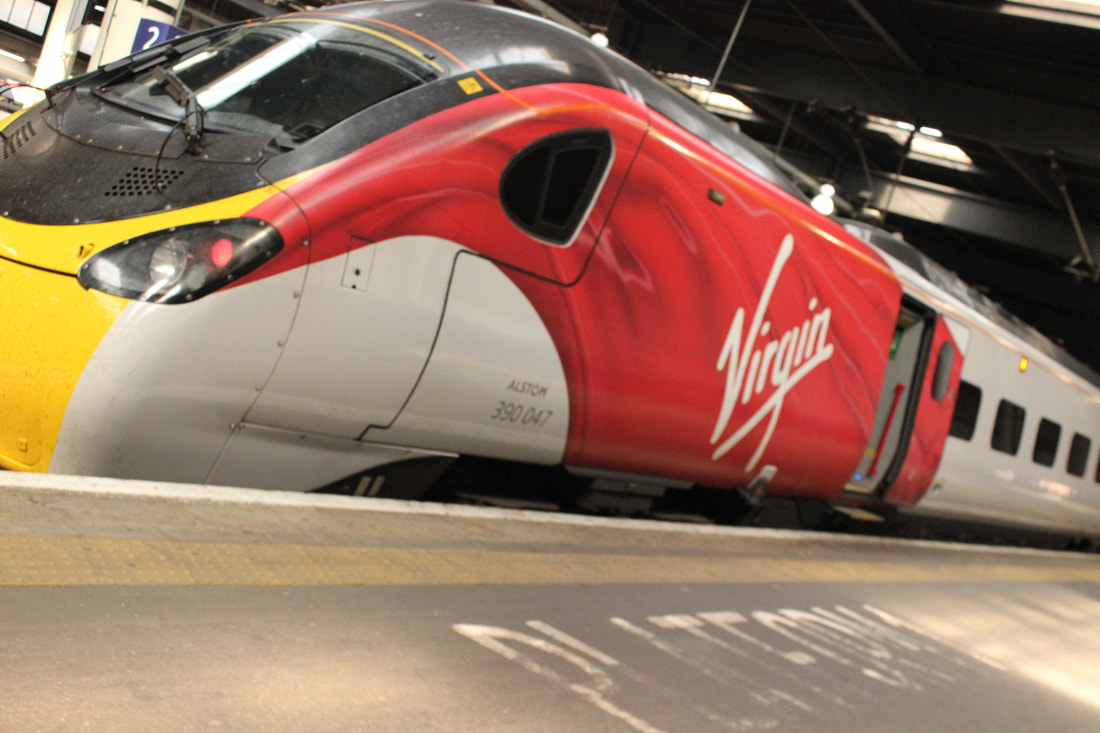
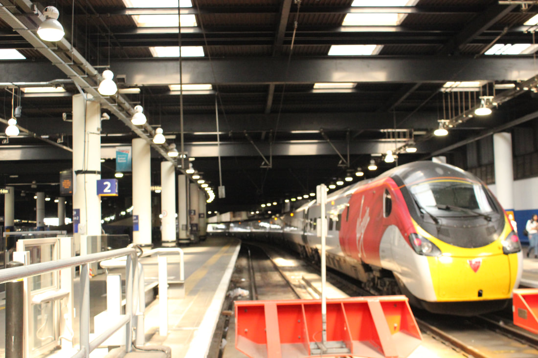
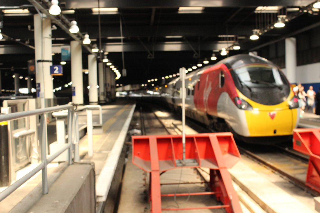
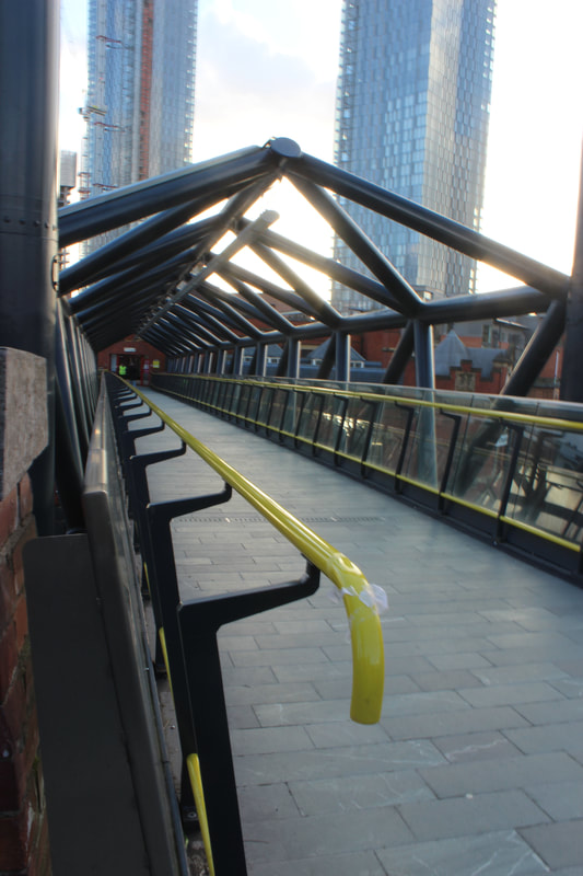
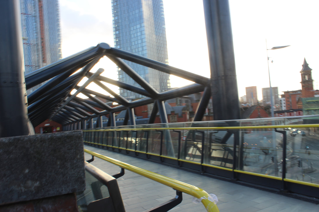
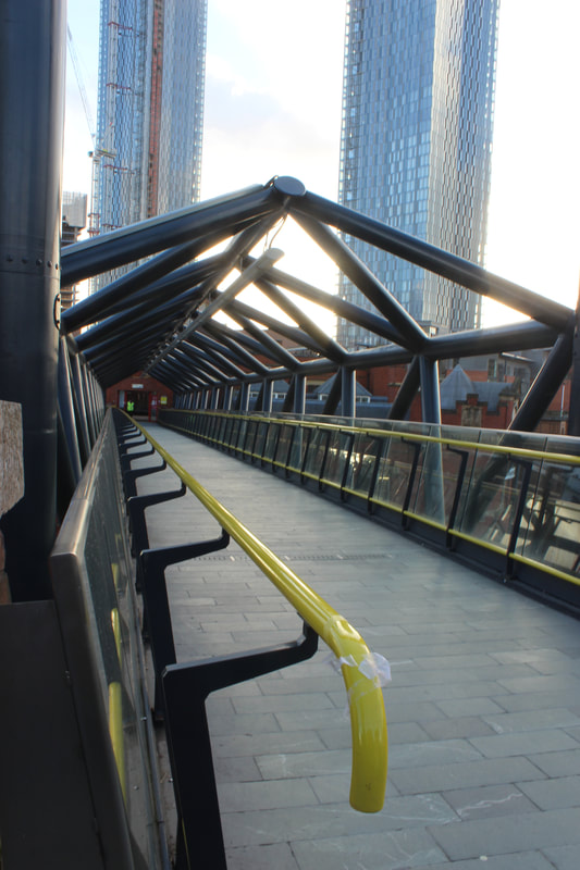
London
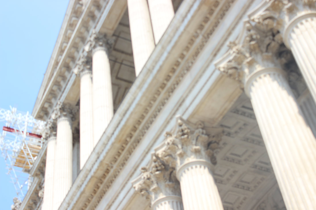
Architecture

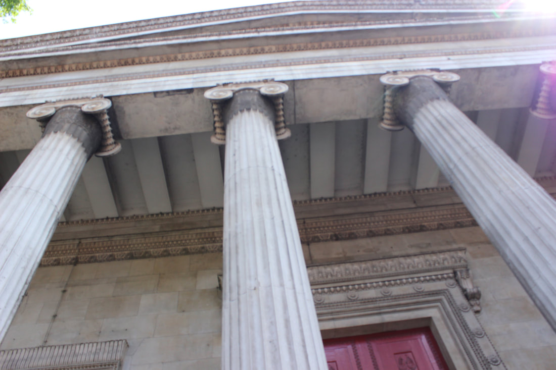
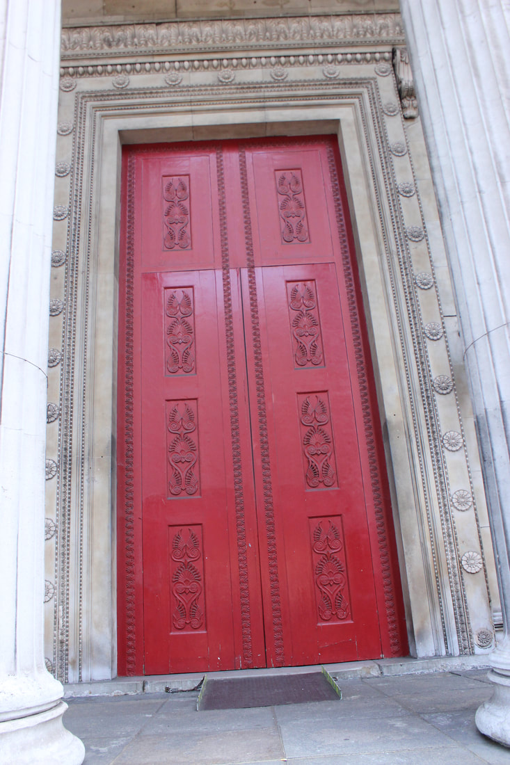
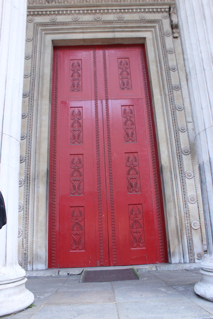
Best
I think this is a good picture because it was taken at a good angle and shows the cathedral but also shows what you can see when you walk around central London.
|
Worst
The door frame is not all in the picture and the people walking past have ruined the picture so thats why it is my worst.
|
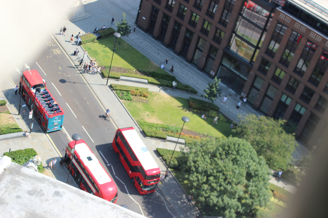
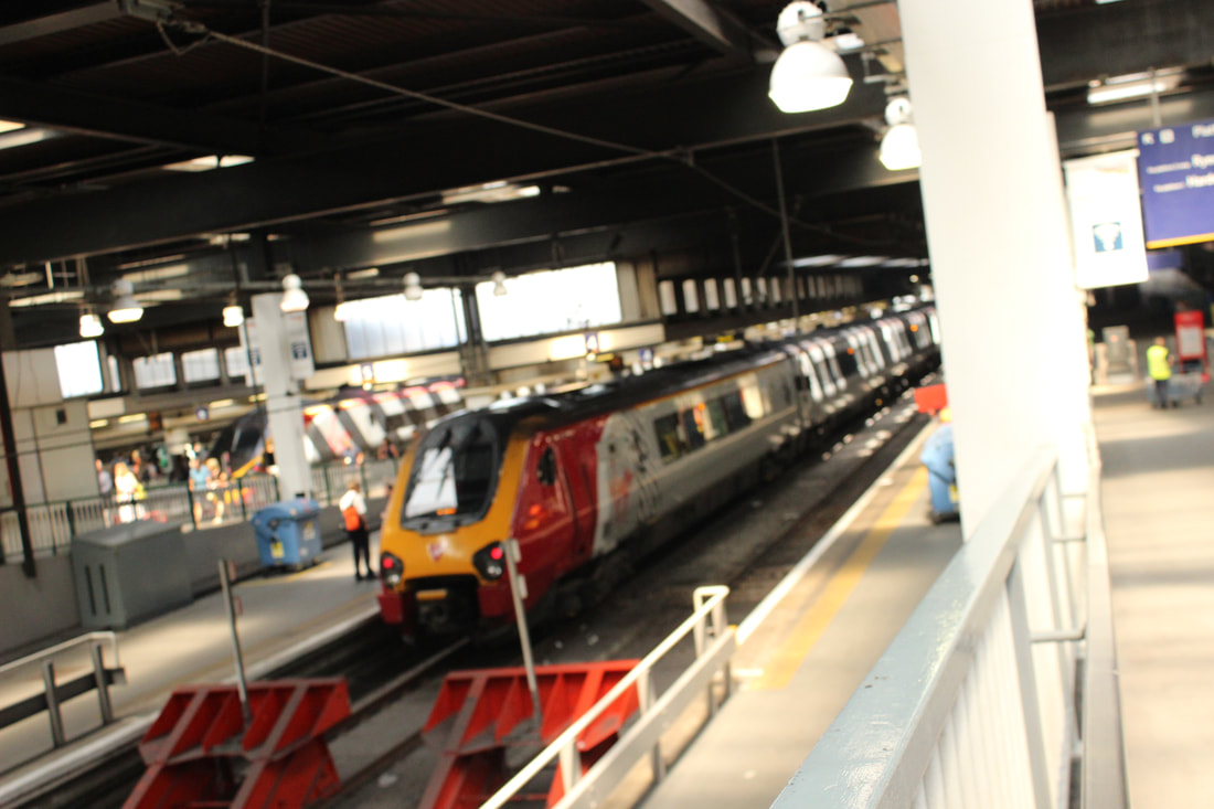
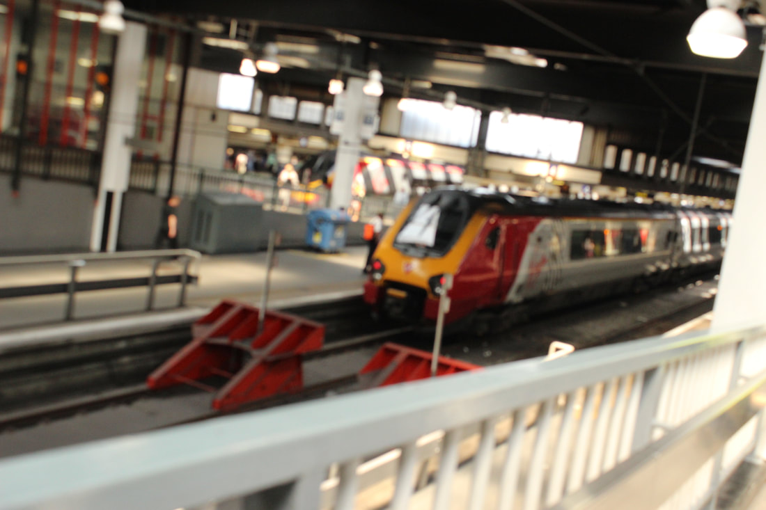
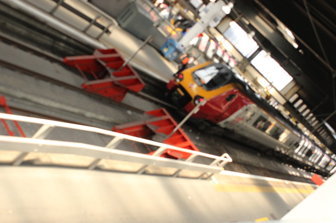
Transport around central London
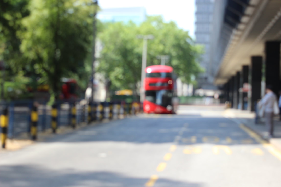
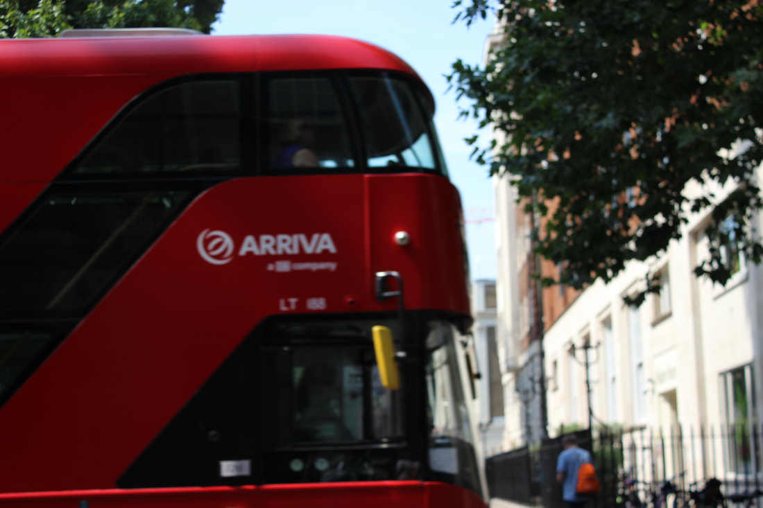
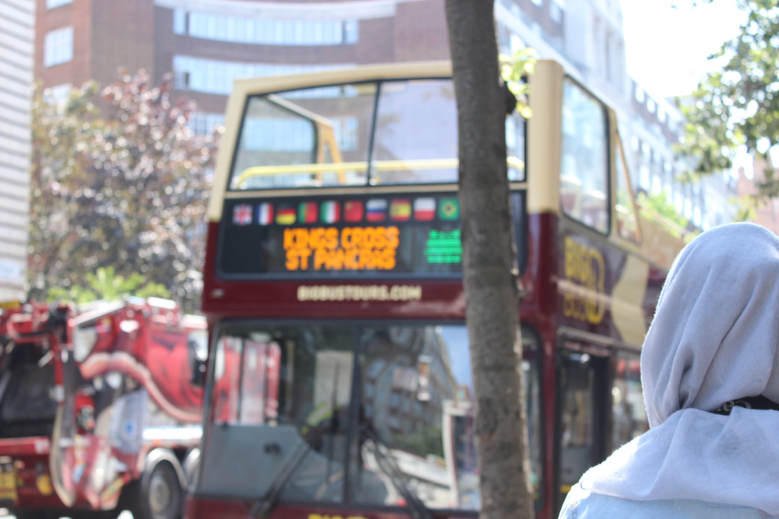
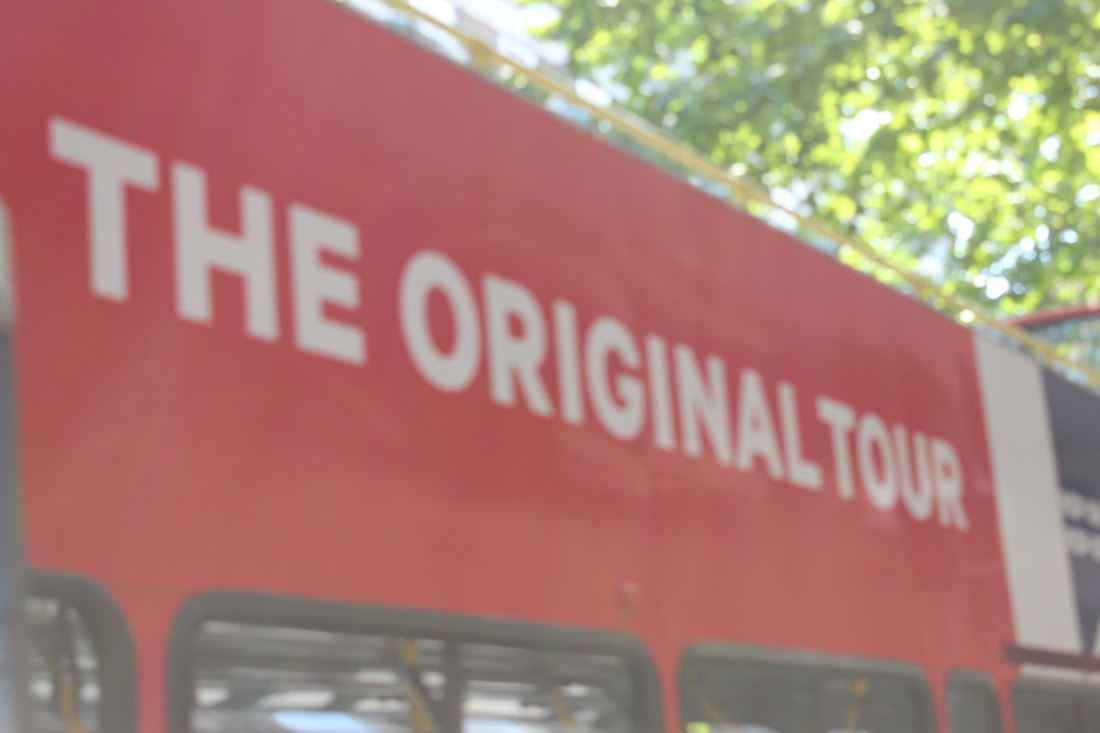
Best |
Worst |

|
|
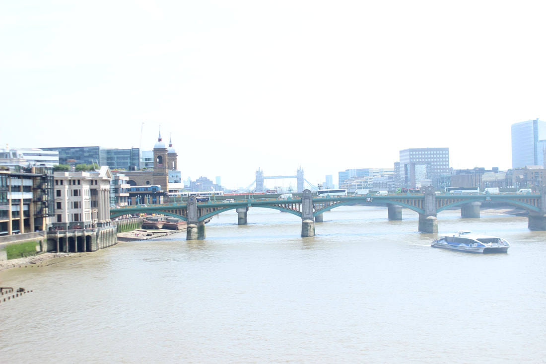
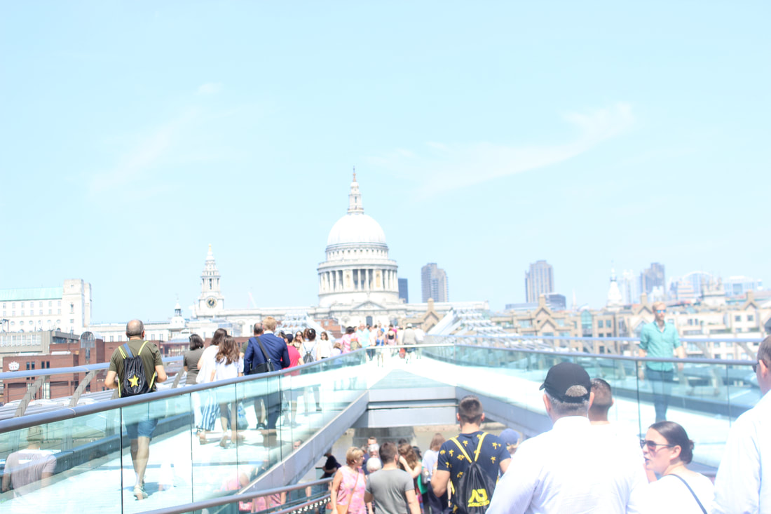
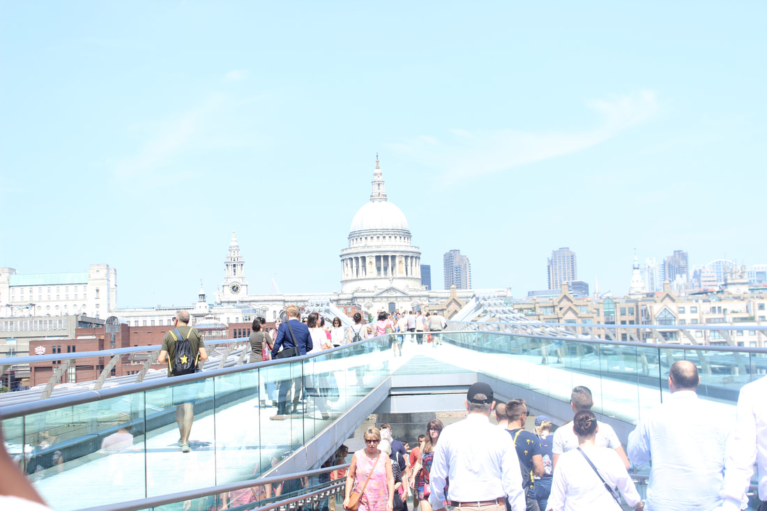
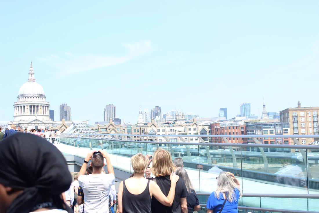
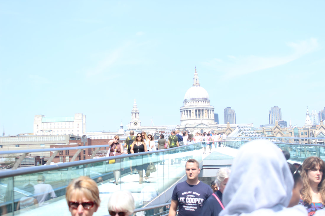
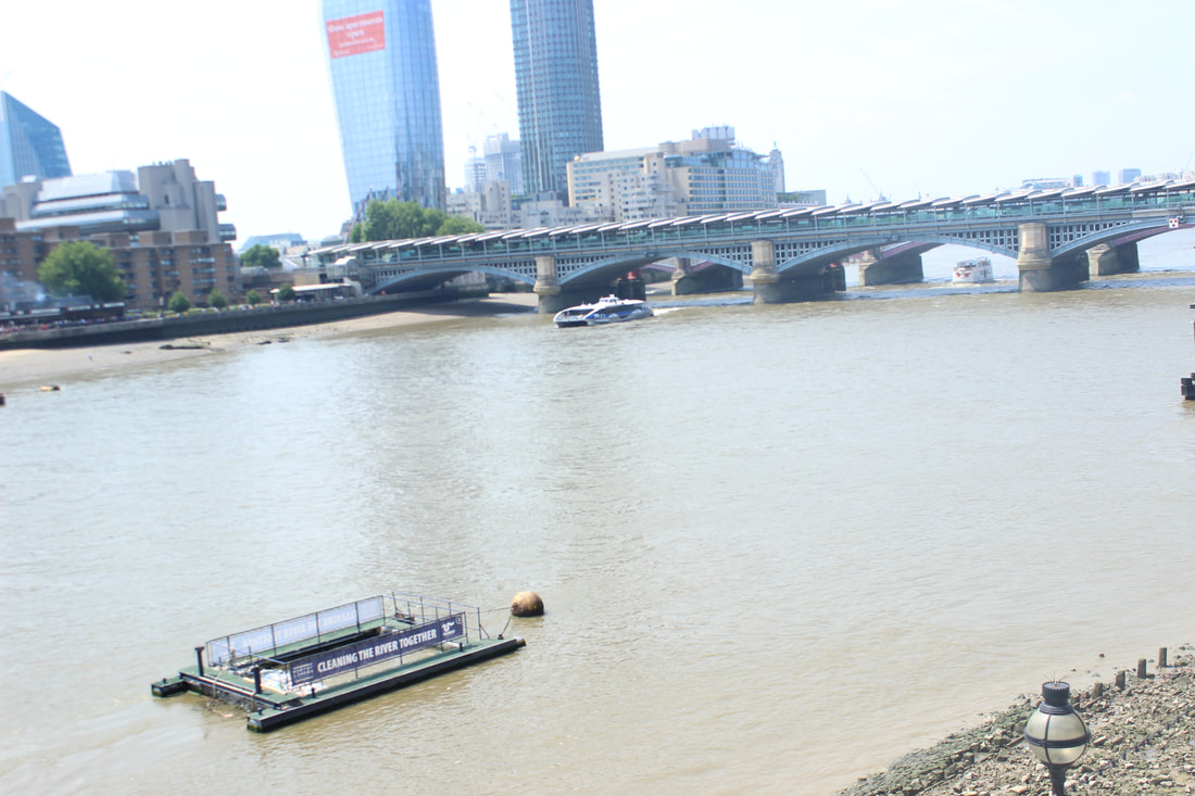
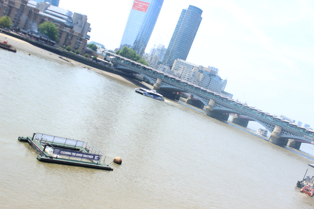
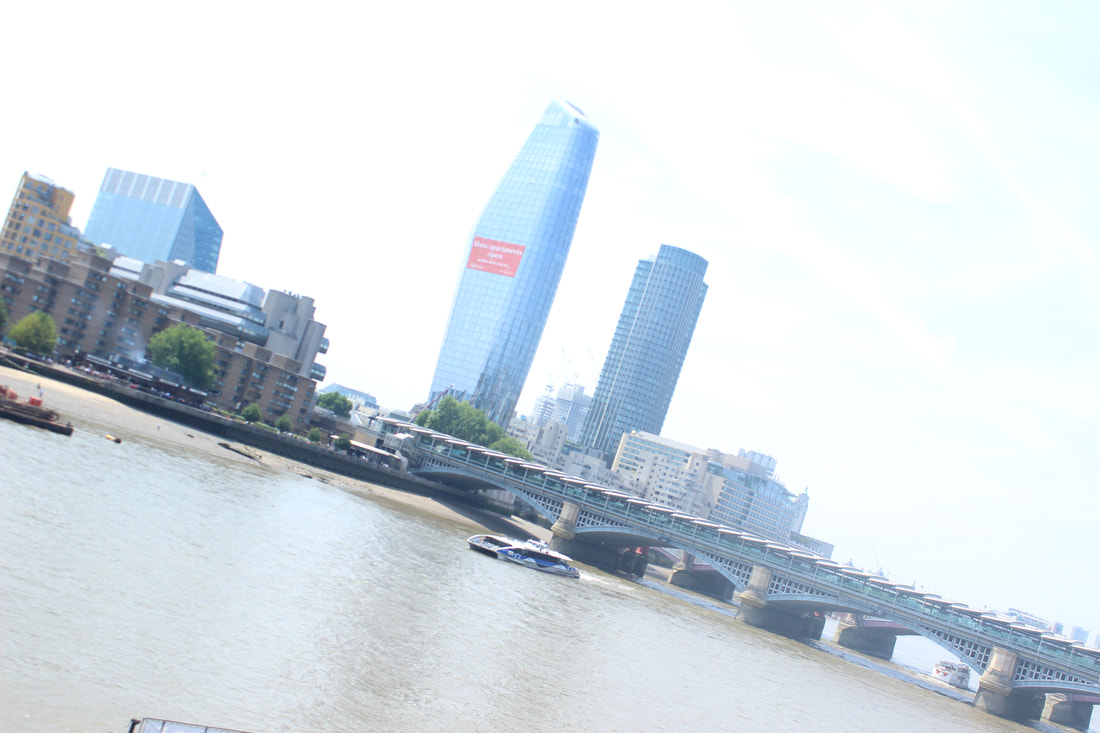
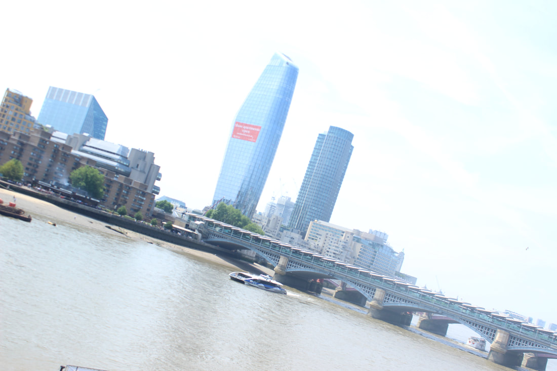
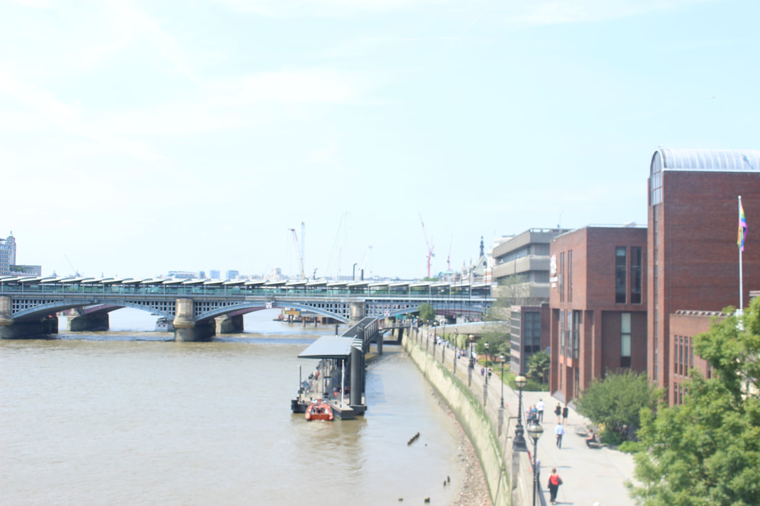
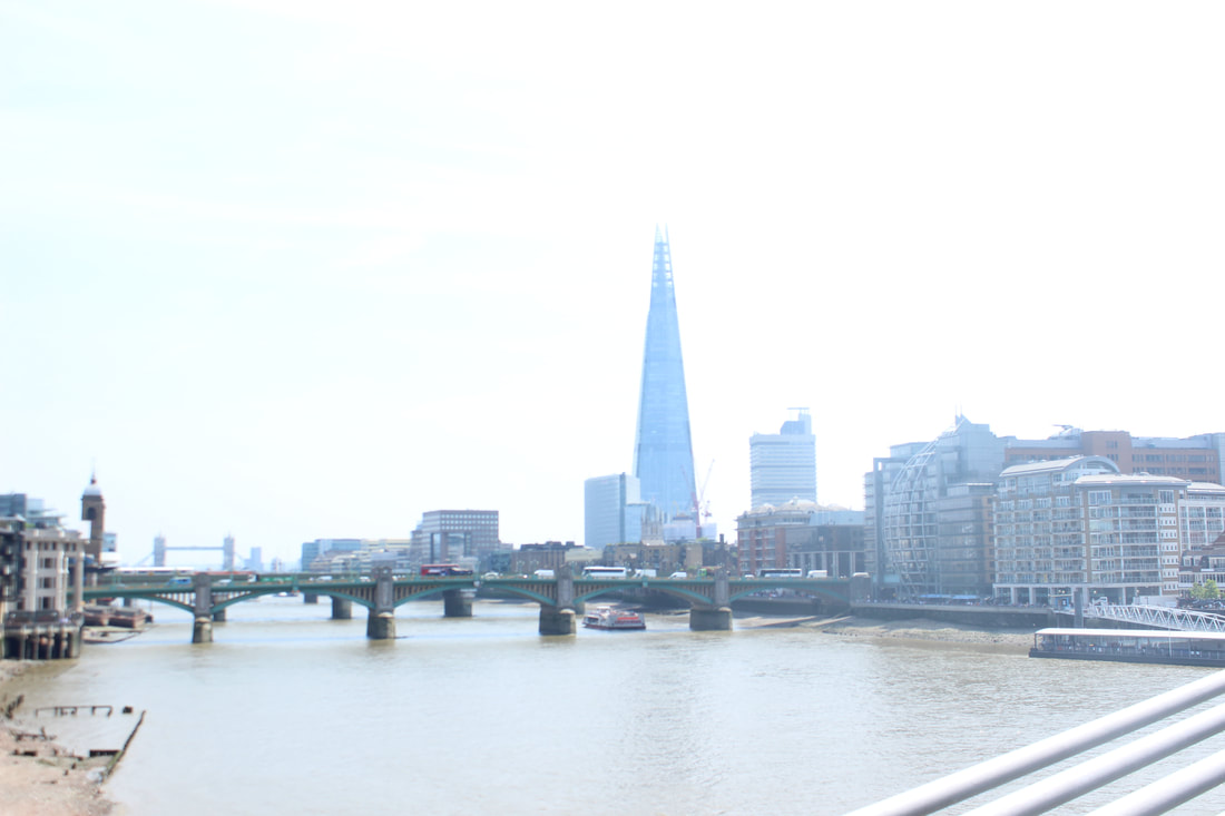
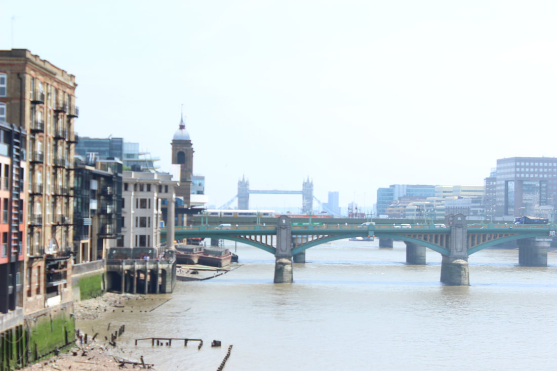
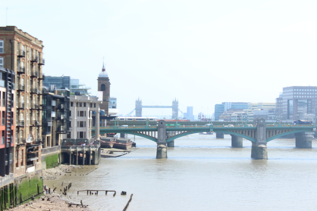
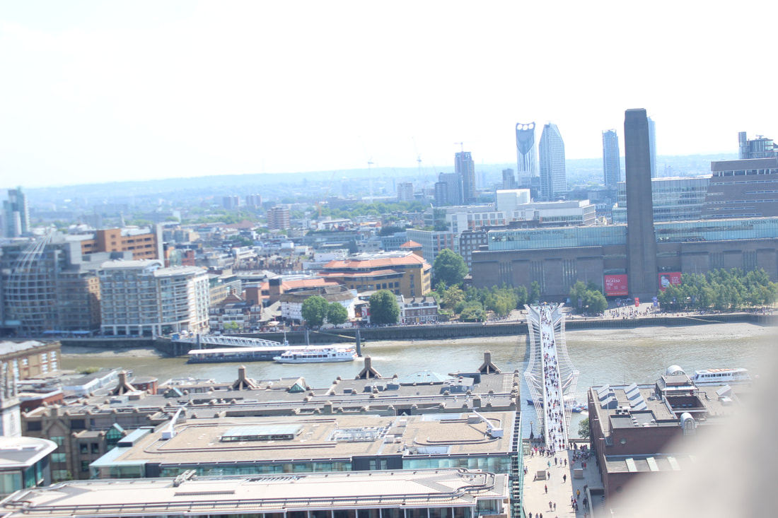
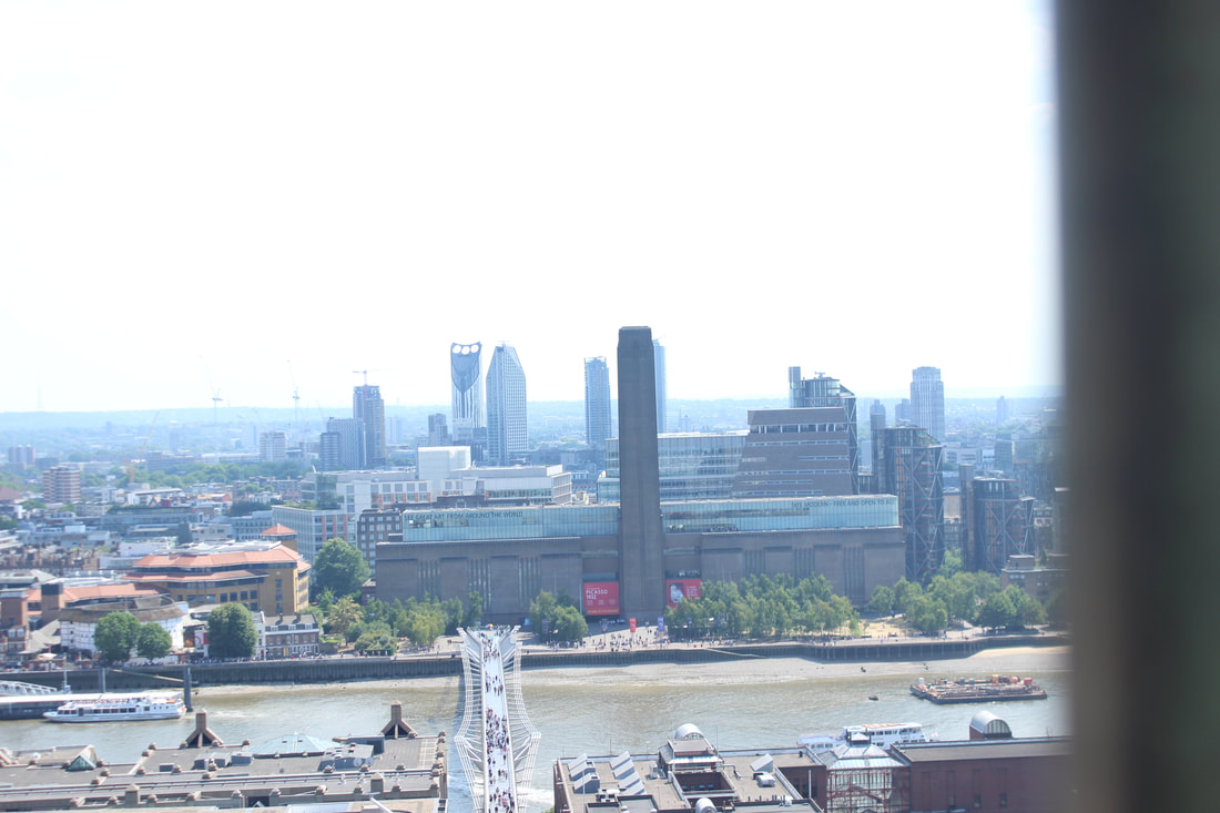
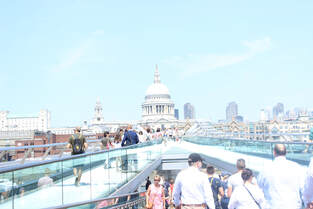
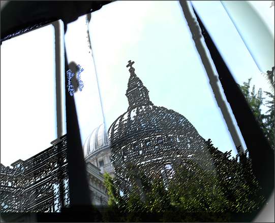
Millennium bridge
|
|
5c's analysis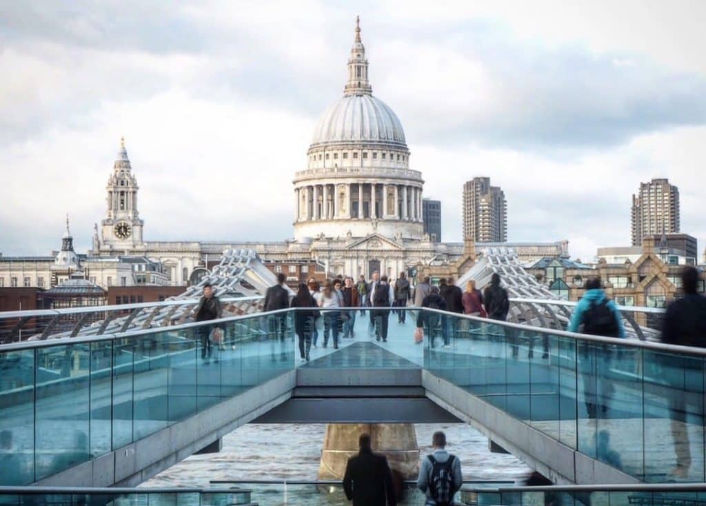
Content: The picture is a picture of the Millenium bridge in London with St Paul's cathedral church in the background and people walking on the bridge. You can also see River Thames at the bottom of the bridge. There are also many buildings in the back and one also with a clock. The clock is telling us it's about 5 o'clock so maybe people are going home from work.
Composition: The photographer has used many techniques to make it look powerful. A cloudy/flash white balance had to be used as it seems very cloudy by looking at the grey clouds but the photo seems to be having a glow but very bright affect. The aperture must be average as a lot of light will be needed. The shutter speed has to be fast because people are walking by at a constant speed so you would want to catch them in the action and make sure they are not blurry. It is a deep depth of field as we want all the buildings in the back and not the one so we use the deep depth of field instead of the shallow depth of field. The composition has been well thought about because this picture has St Paul's cathedral church right at eye view point. The photographer might have used a tripod because the picture seems very steady and very well planned. This is a portrait picture wanting to catch the cathedral in it and the other buildings surrounding it. The photo looks like it has got a filter on it or has been edited because the glass on the side of the bridge has got a blue looking effect and is not looking clear. Context: A photographer called Katie, a London history blogger took this to show everyone the real London, she posted this picture on February 27 2017, showing what the Millenium bridge looks like and wrote about how it feels like walking on it and if we ever walked on the bridge what we should look out for. Connection: This connected to my work as on the 6th of July we went to London for our landscape project and I took an exact picture like that so it's a comparison of how well you can capture the same picture and see the differences. Comment: In my opinion, I think this picture is more effective and standing out more than mine as it has been taken quite steadily and thought about whereas my was really rushed and not thought about. I think it is a really good picture and I am a fan of it. |


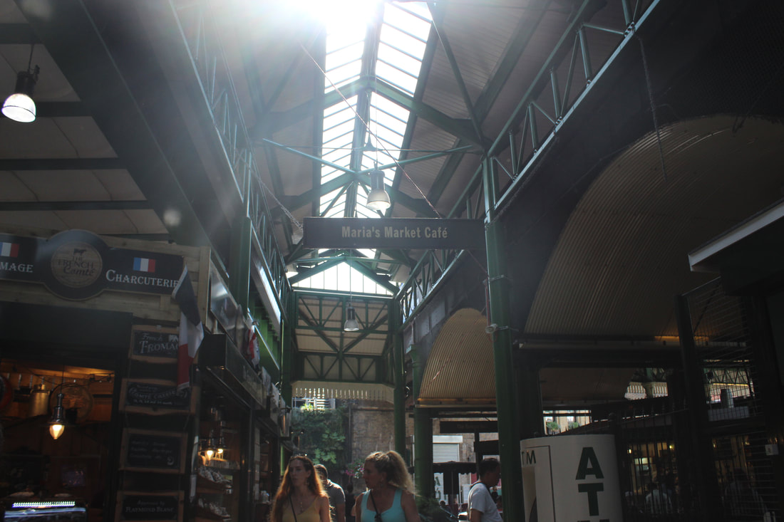
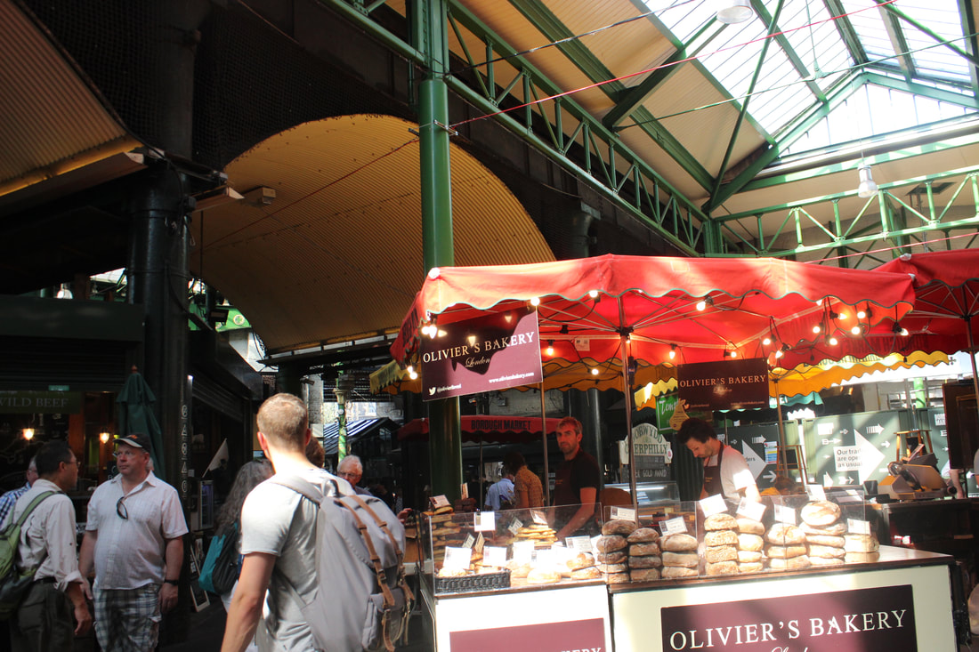
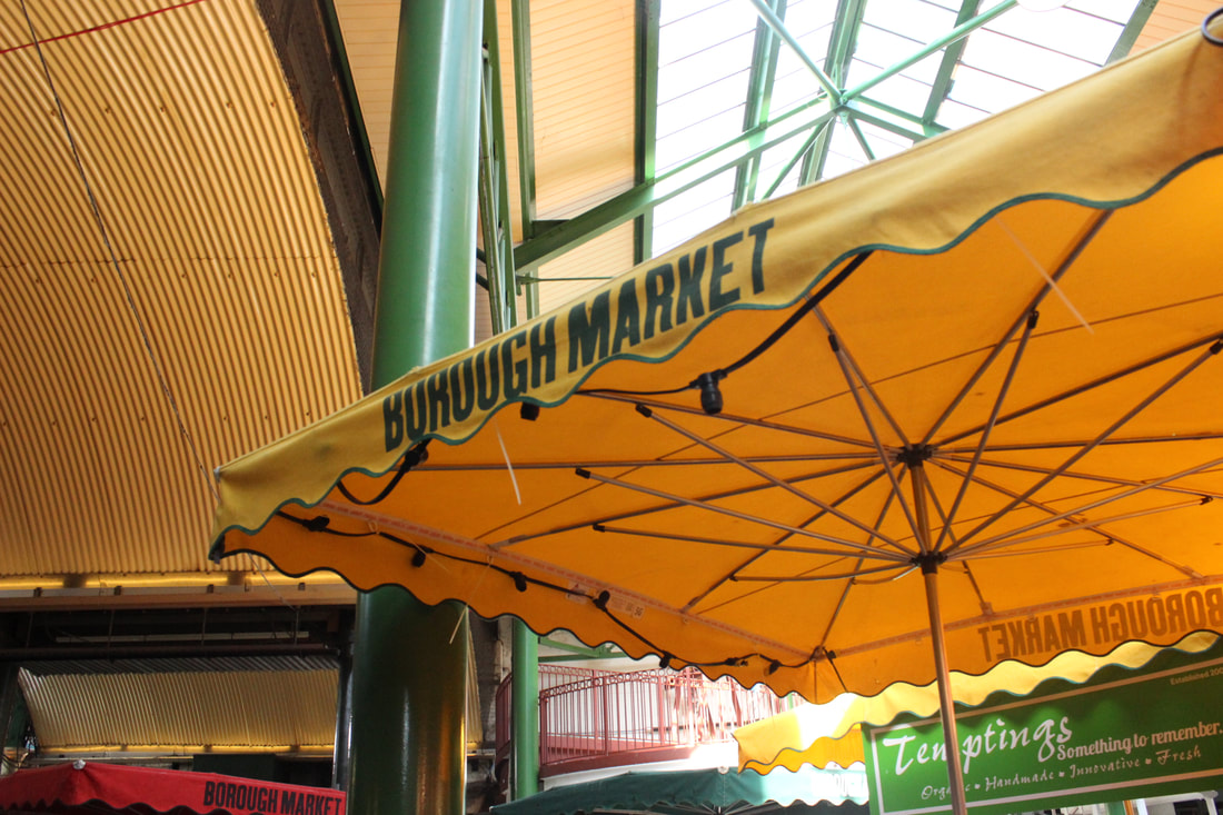
Borough Market
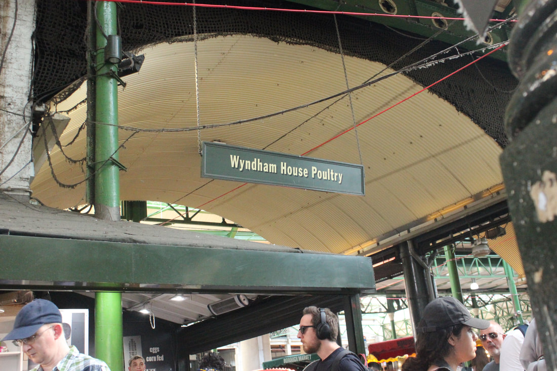
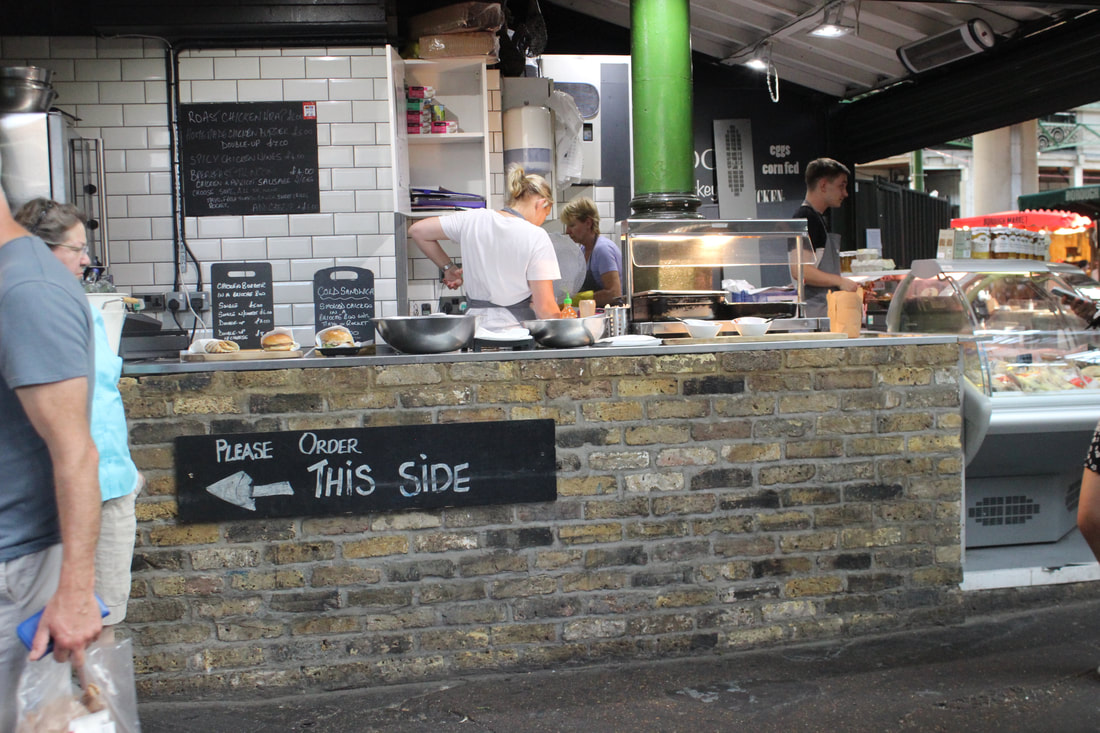
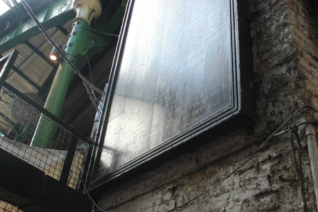
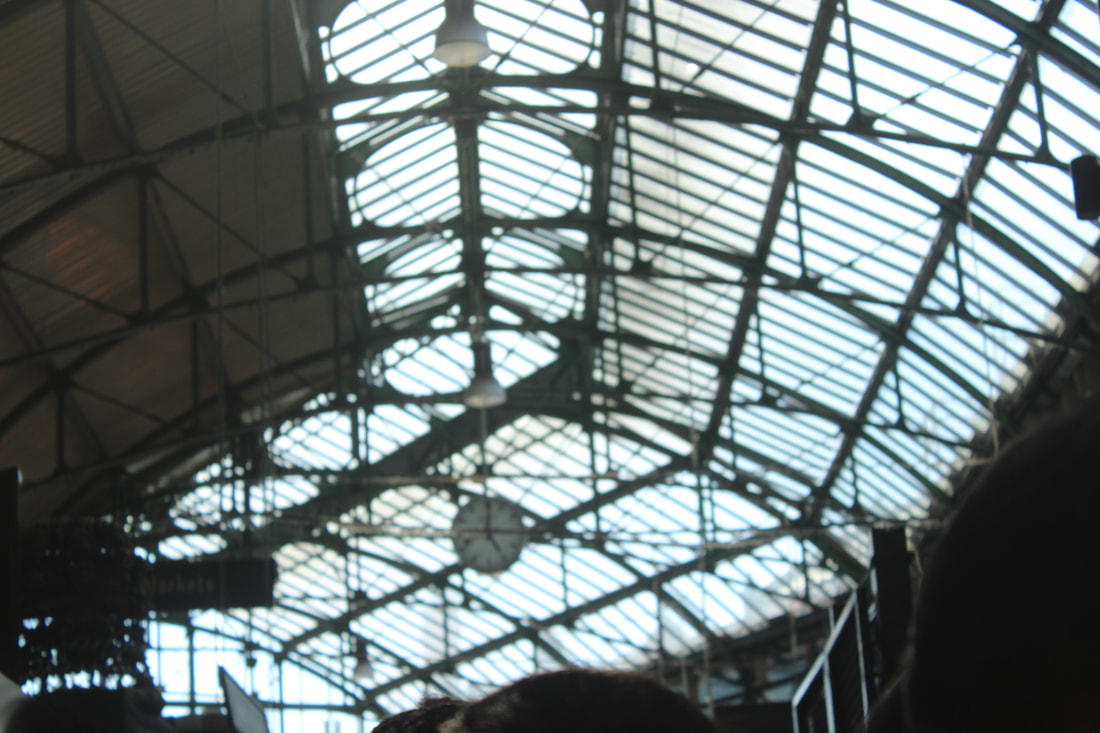
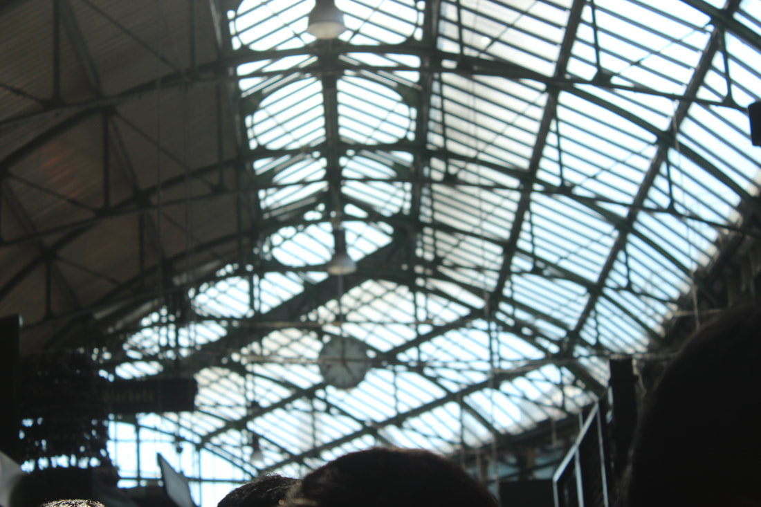
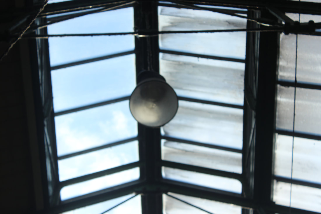
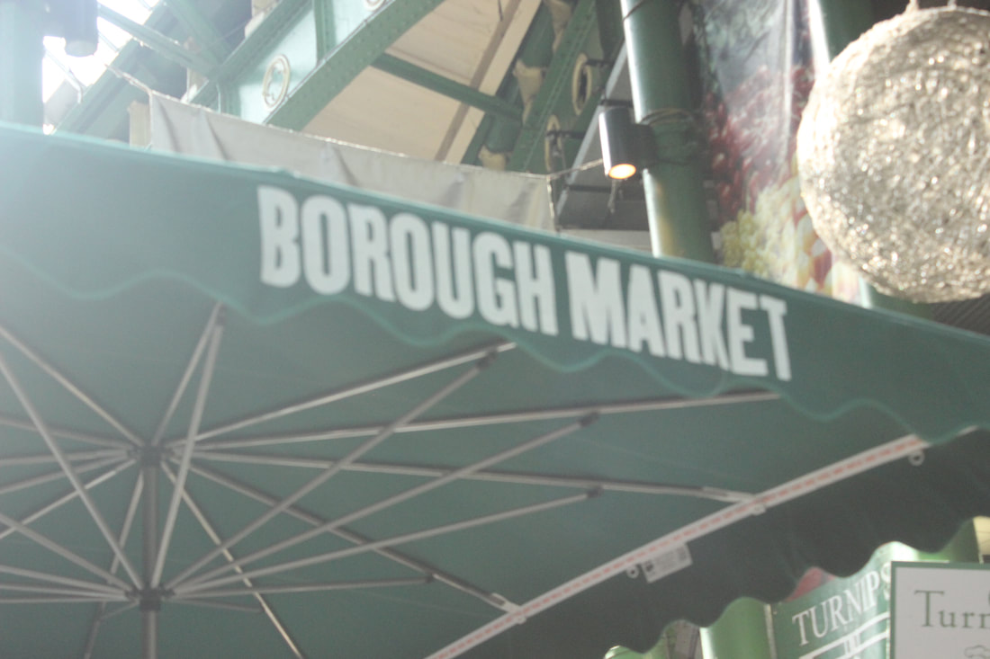
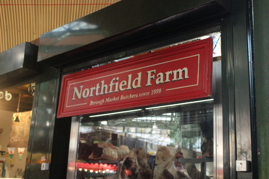

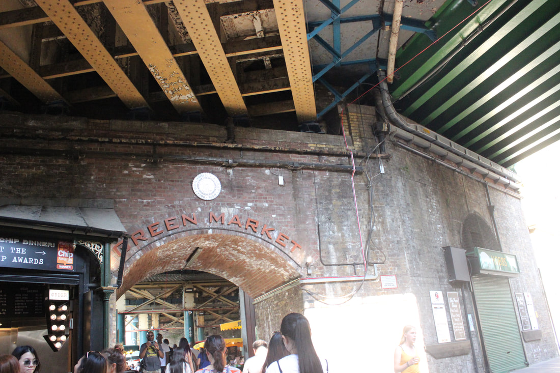
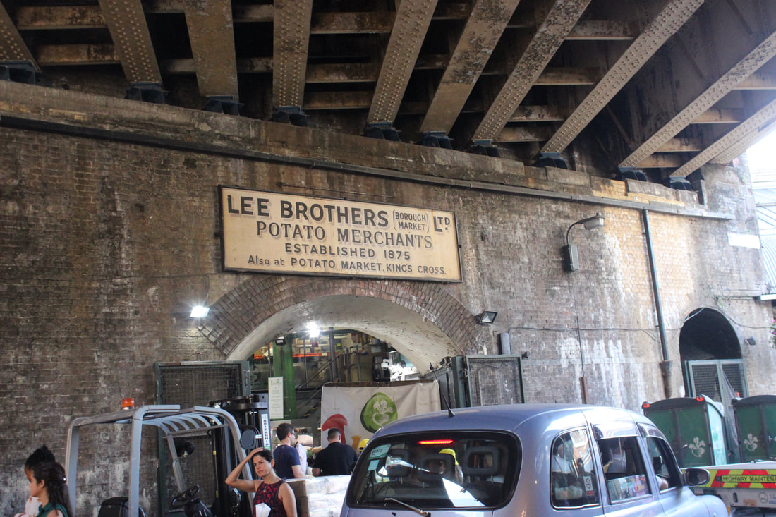
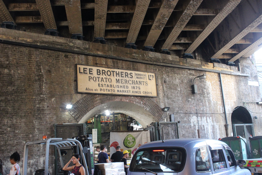
Best |
Worst |

This is my best picture because I think it was taken at a good angle and shows the how the market is structured. Also I think the white balance and aperature were at a good setting.
|
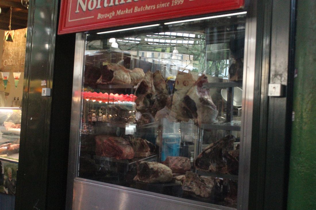
I think this is my worst picture because it was not taken at a right angle and that is reflecting other thing and the meat is not looking clear.
|
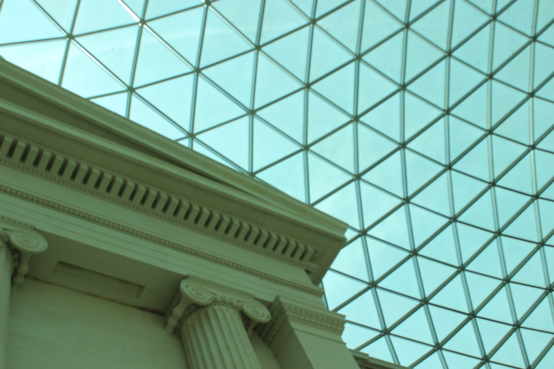
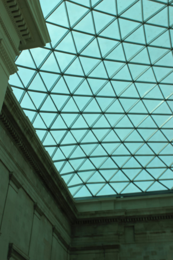
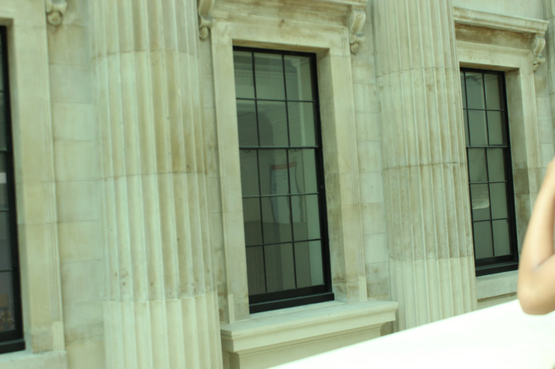
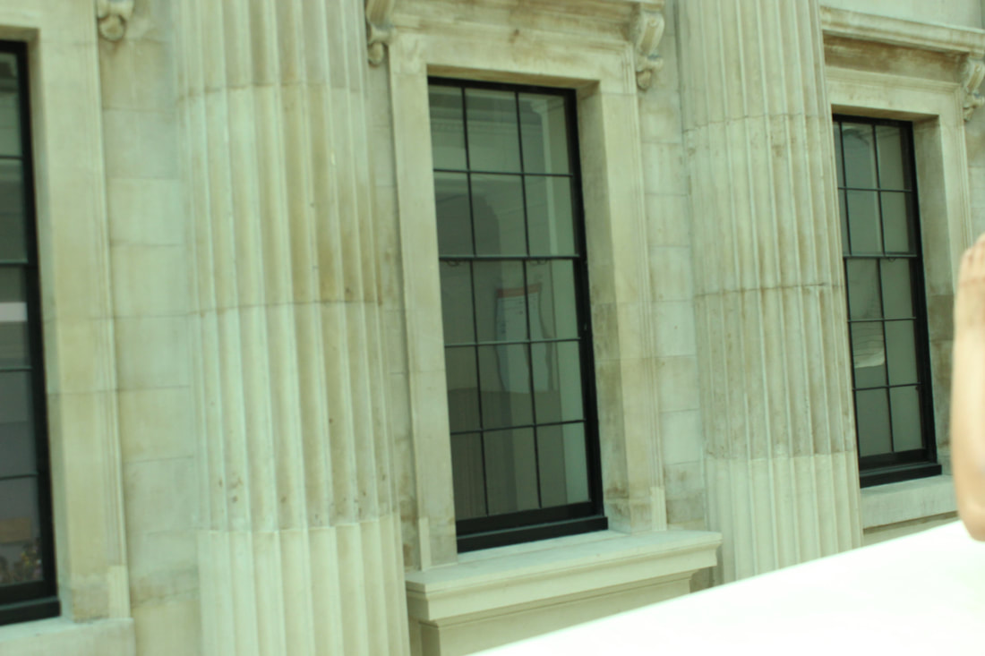
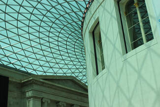
British Museum
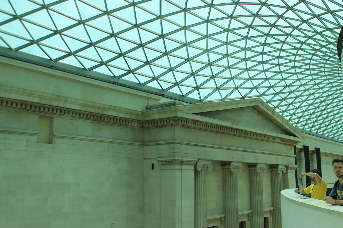
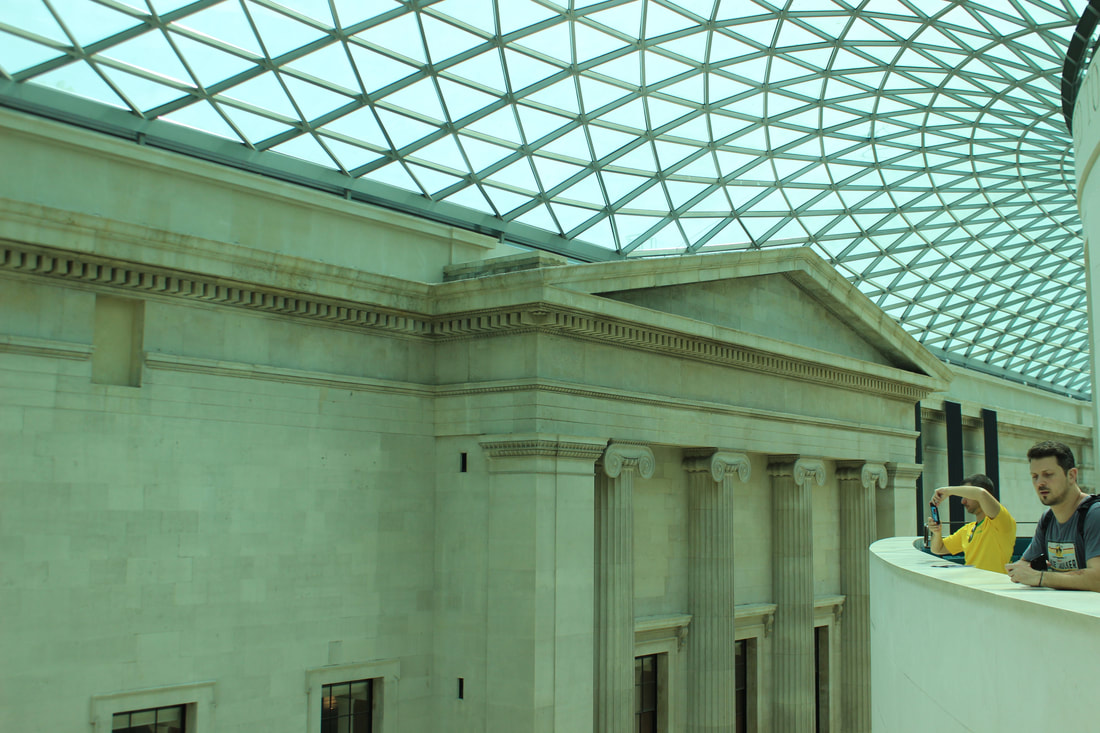
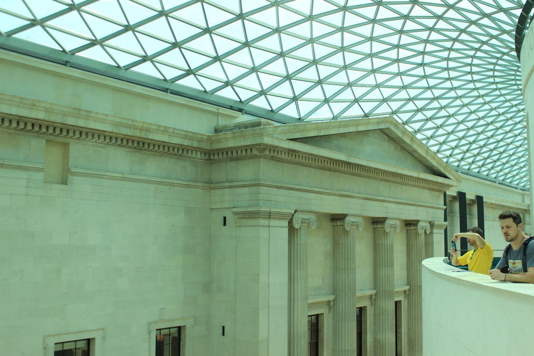
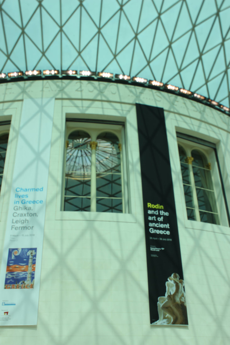
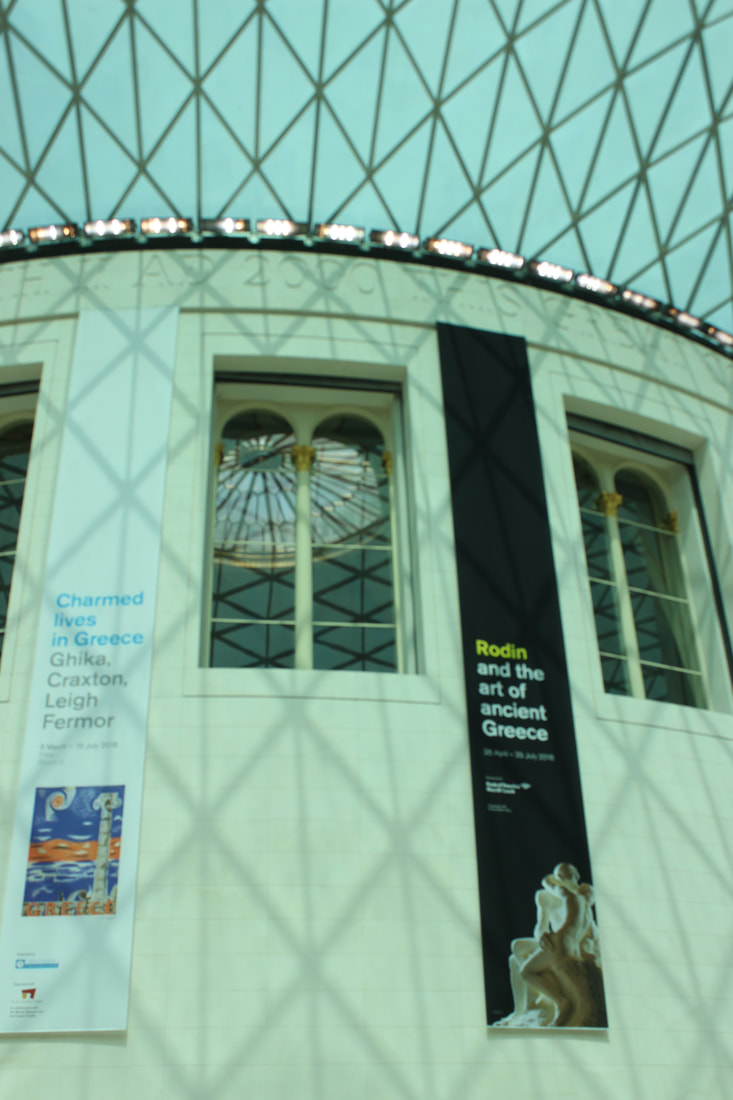
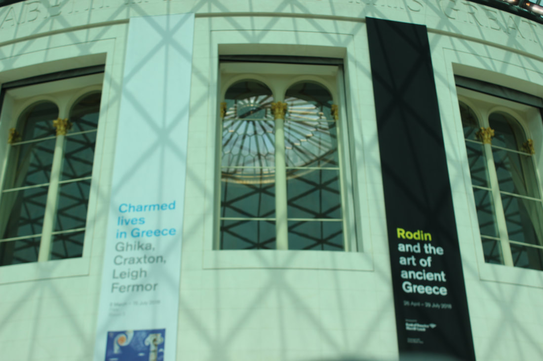
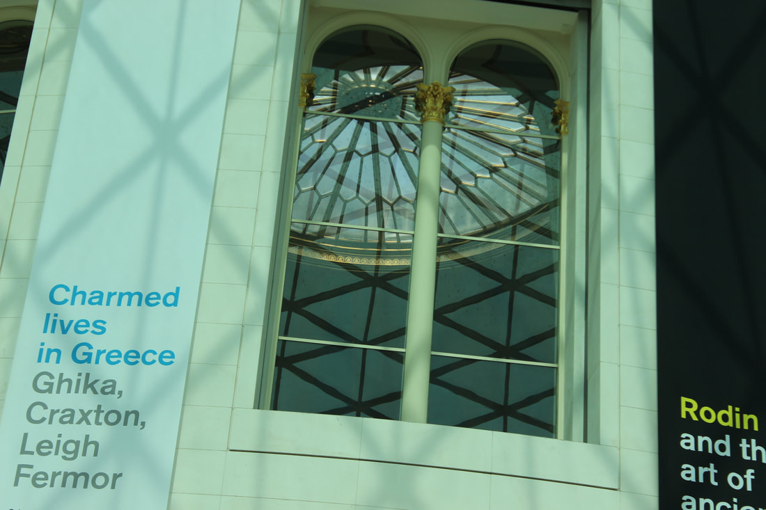

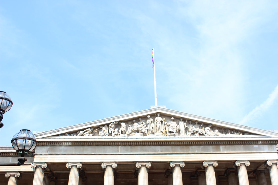
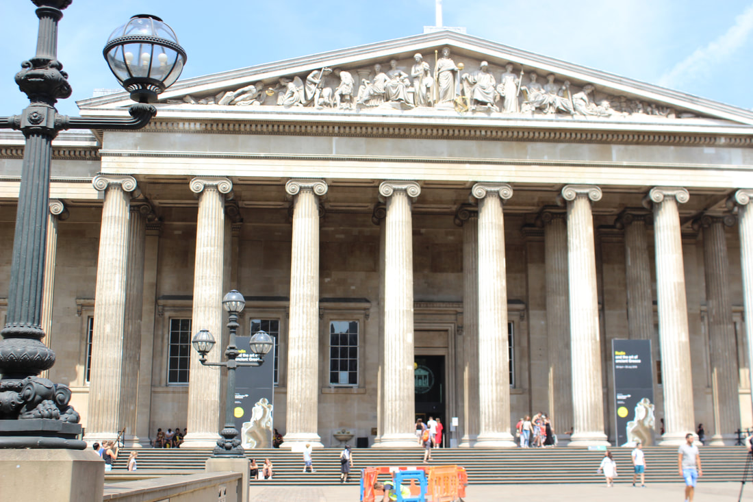
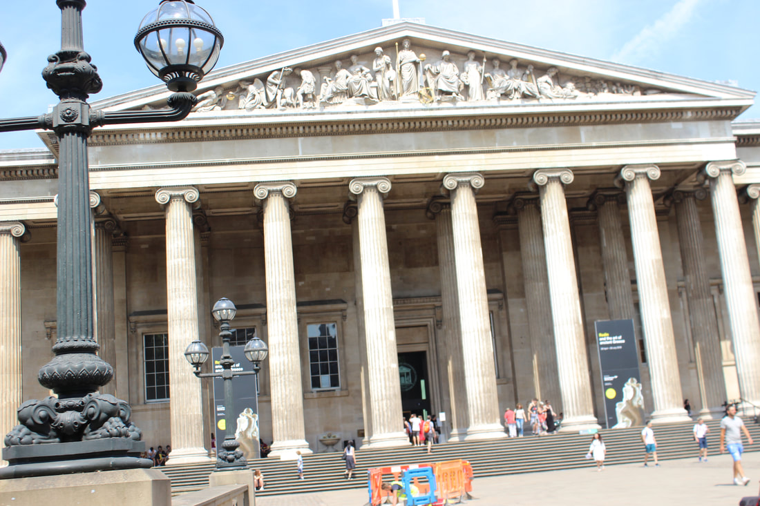
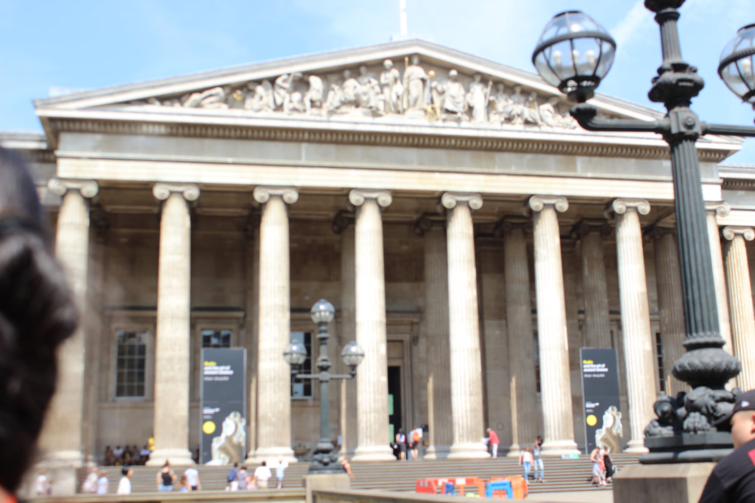
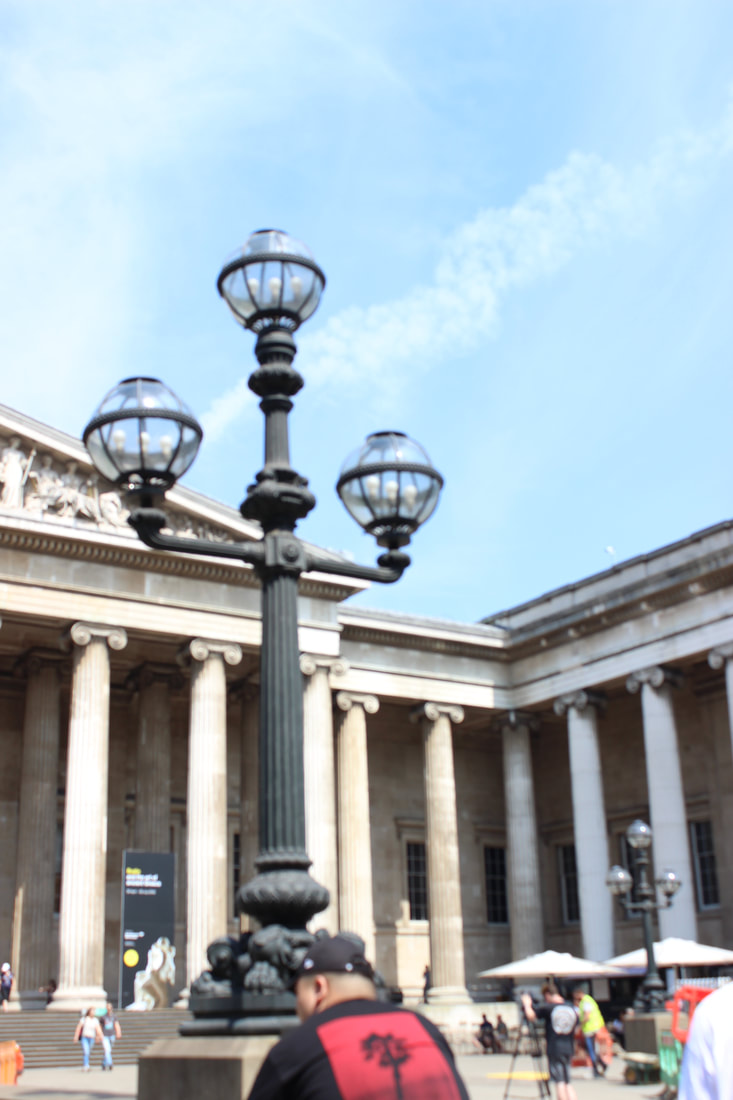
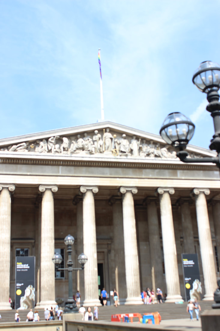
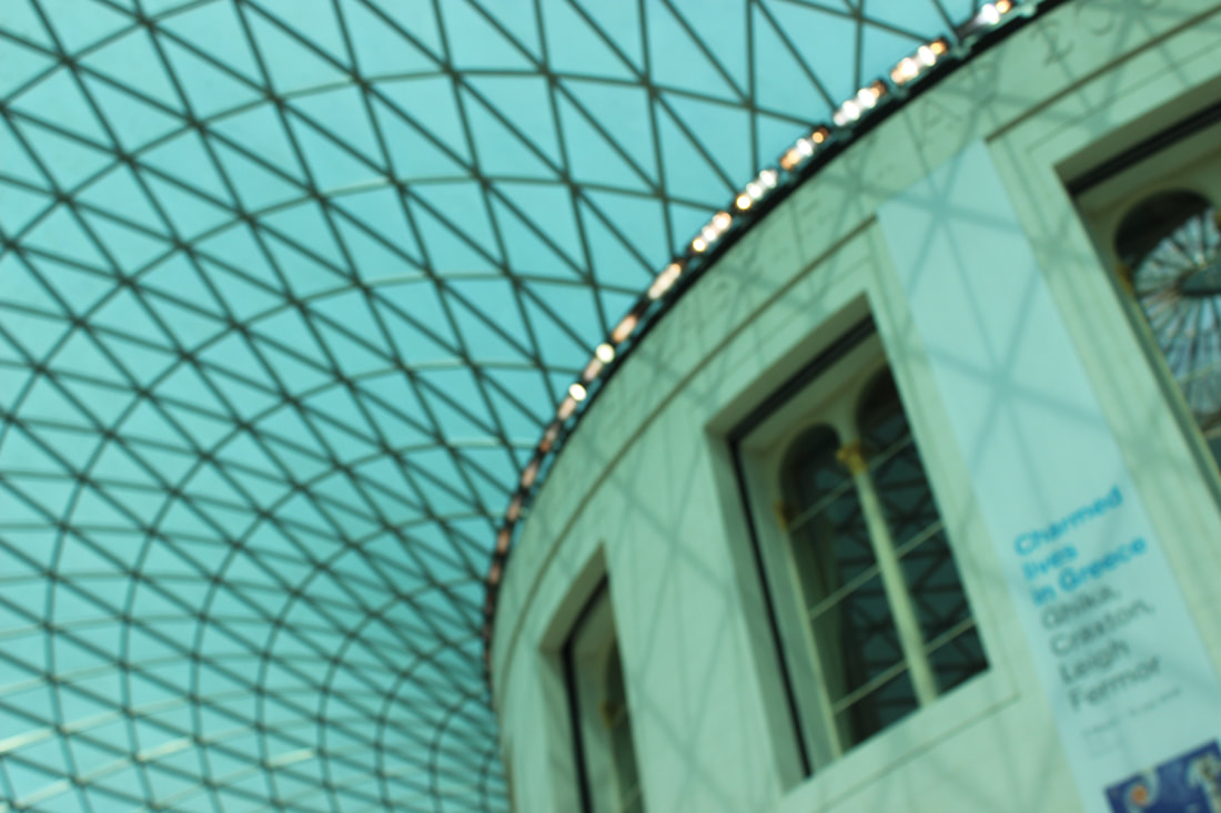
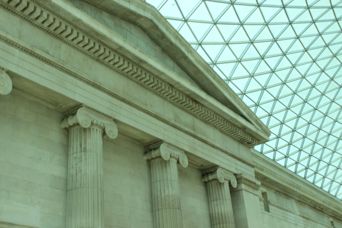
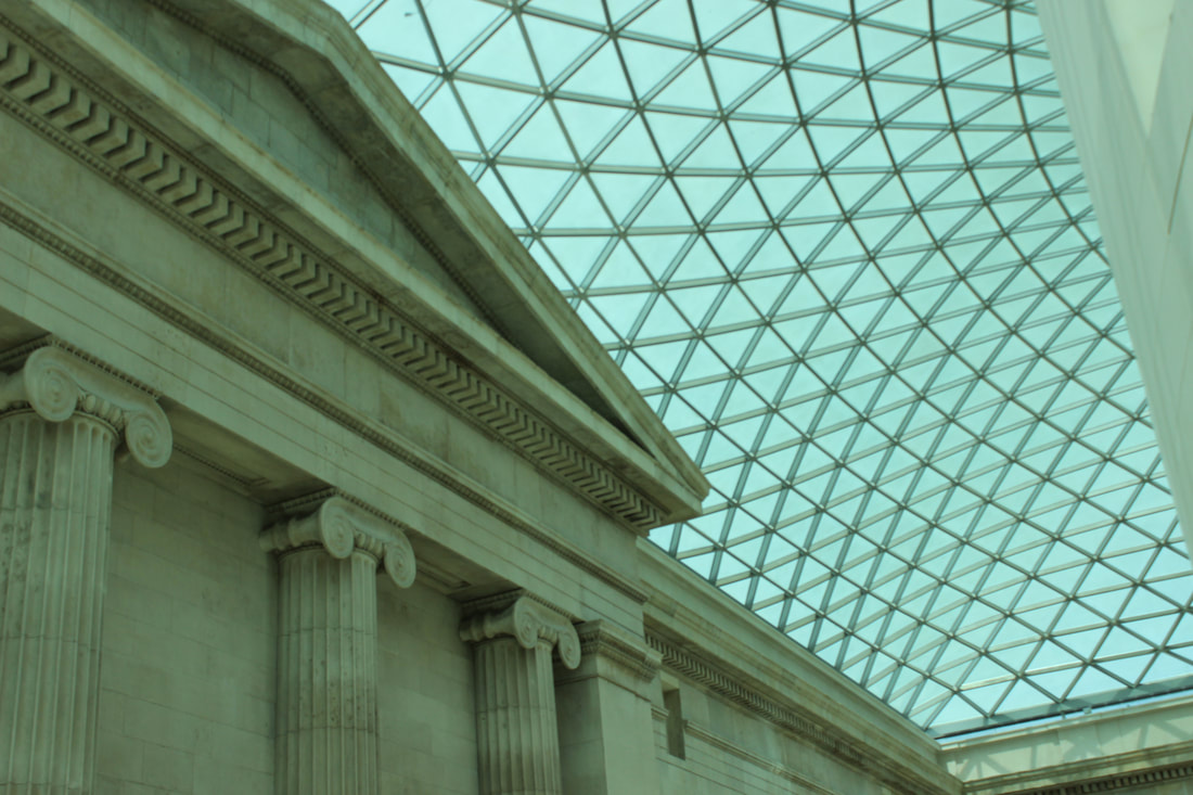
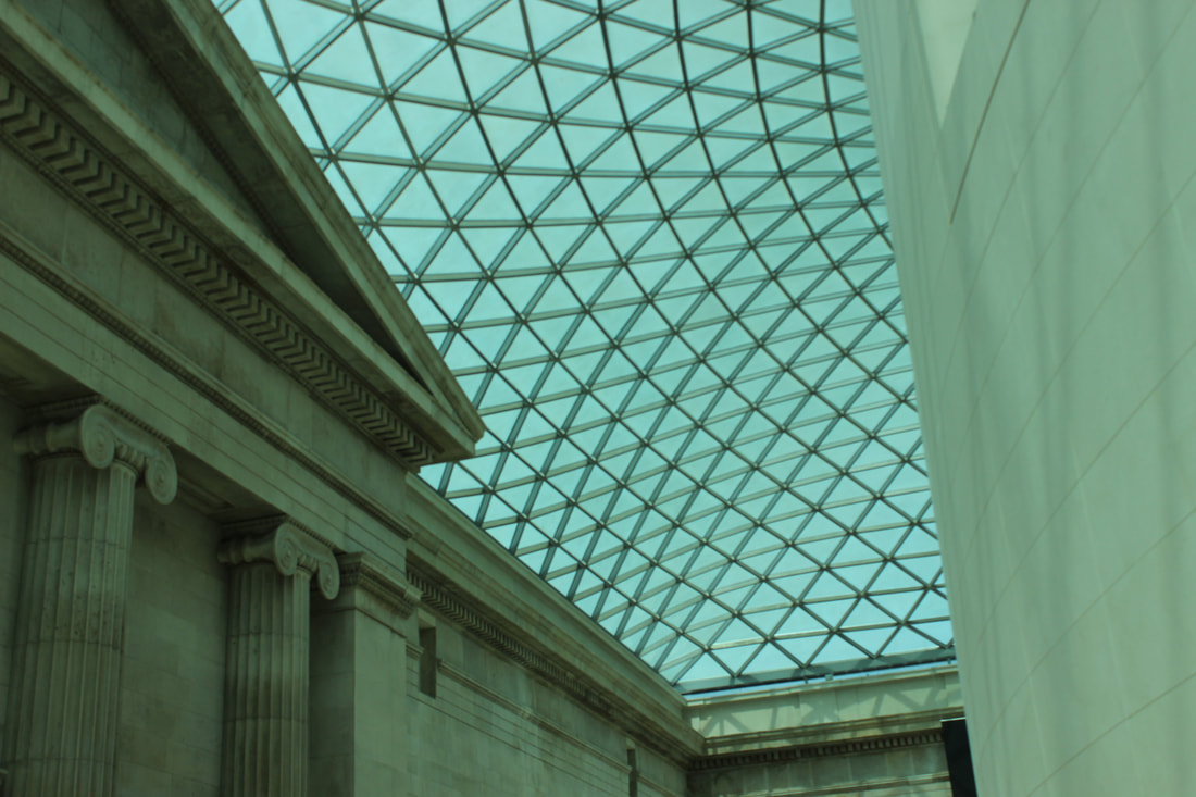
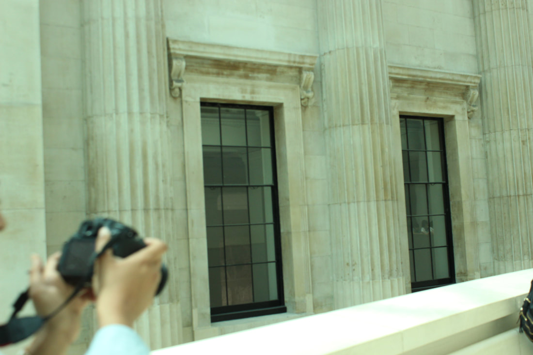
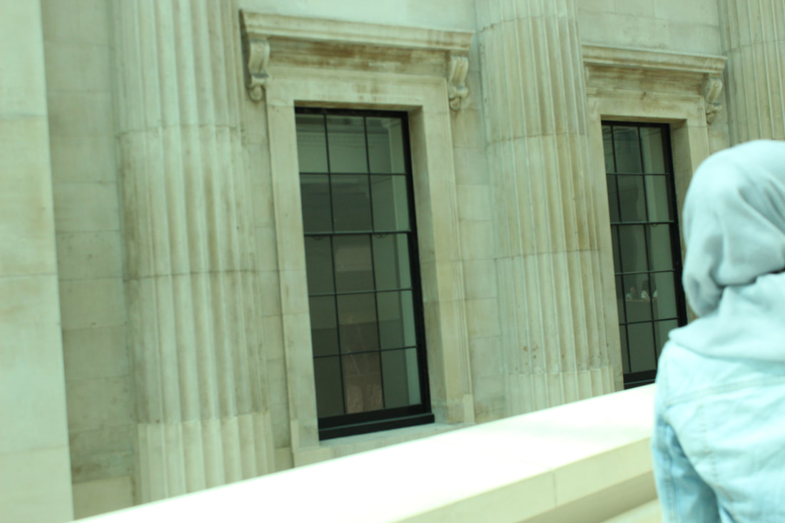
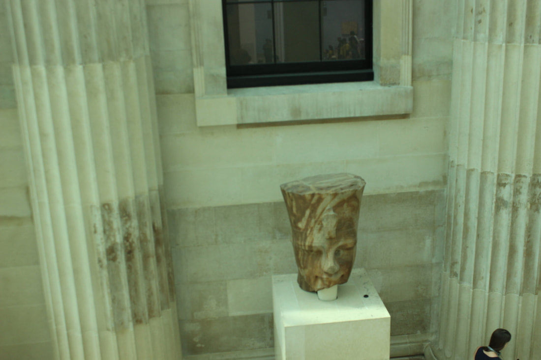
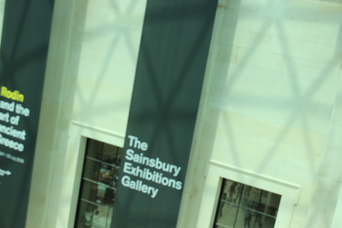
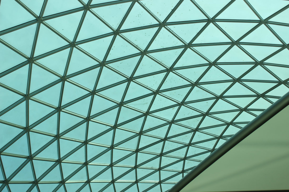
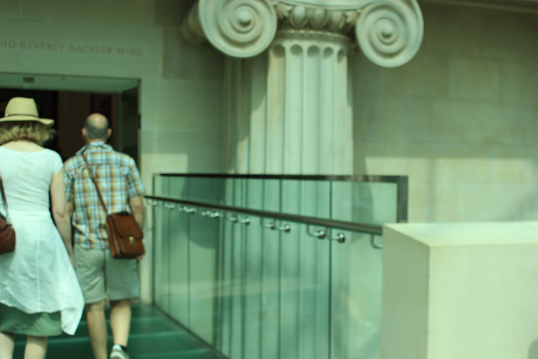

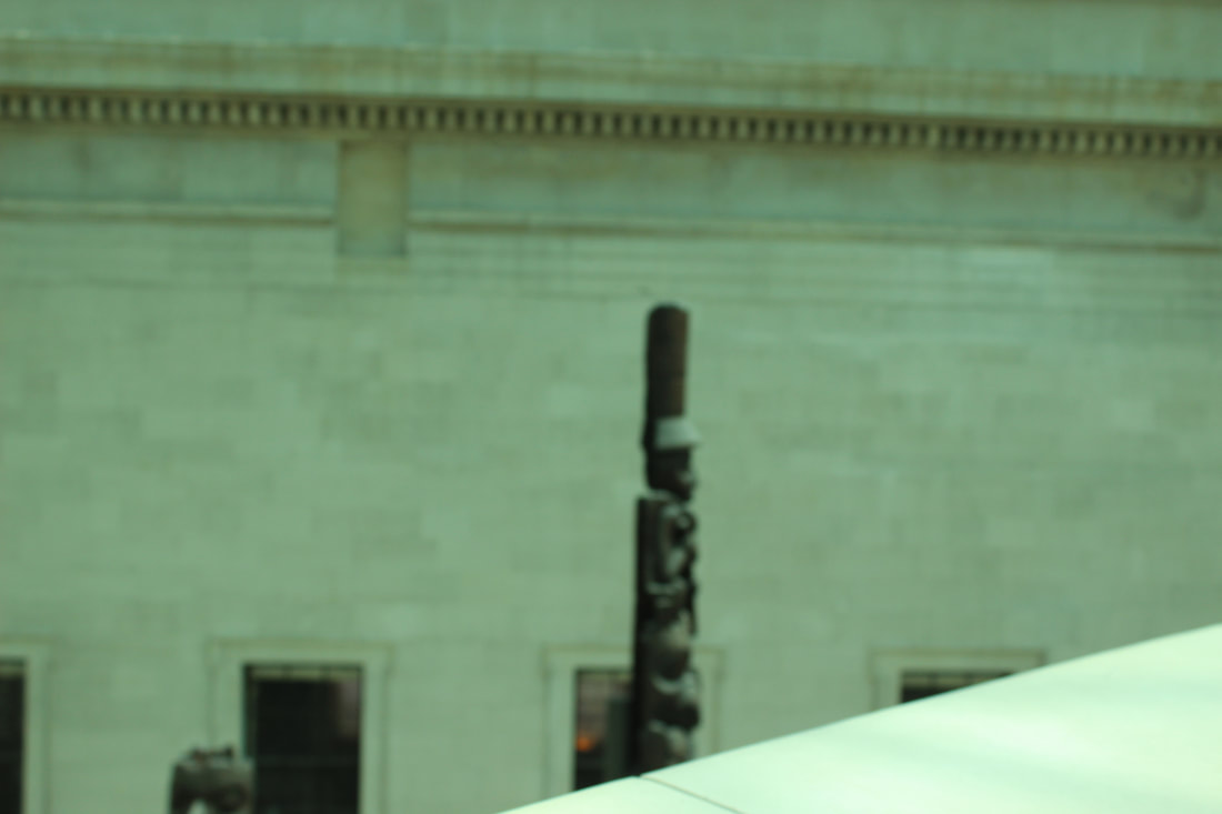
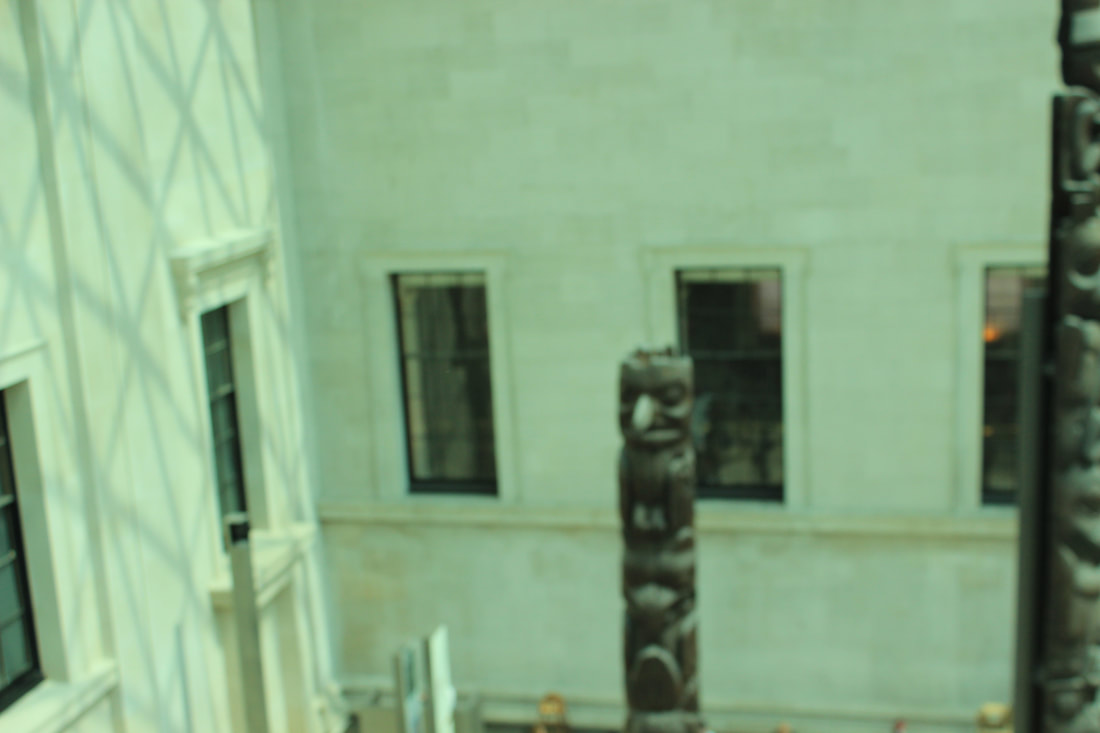
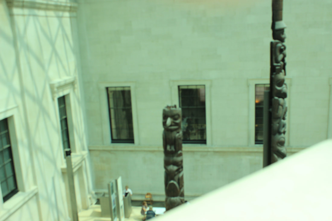
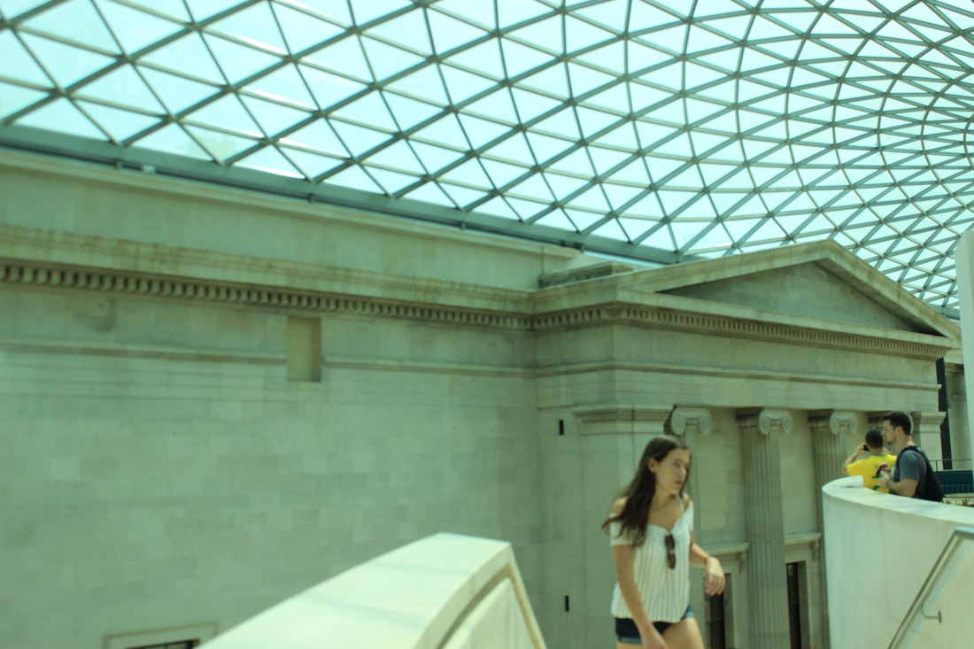
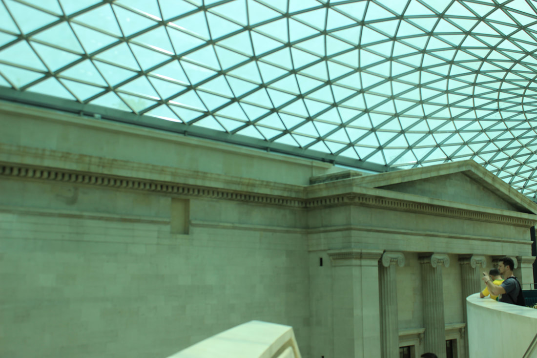
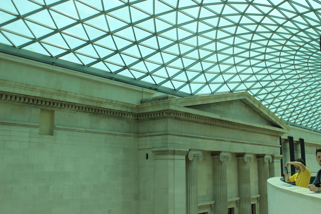
Best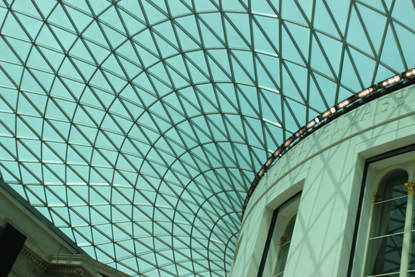
I think this is a good picture because it captures the structure of the museum and it taken at a good angle with the right camera settings.
|
Worst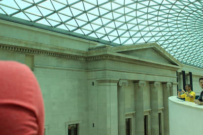
This is my worst picture because the people in the picture have ruined it and I believe it could be taken at a better angle.
|
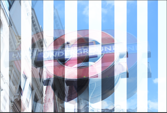
Underground
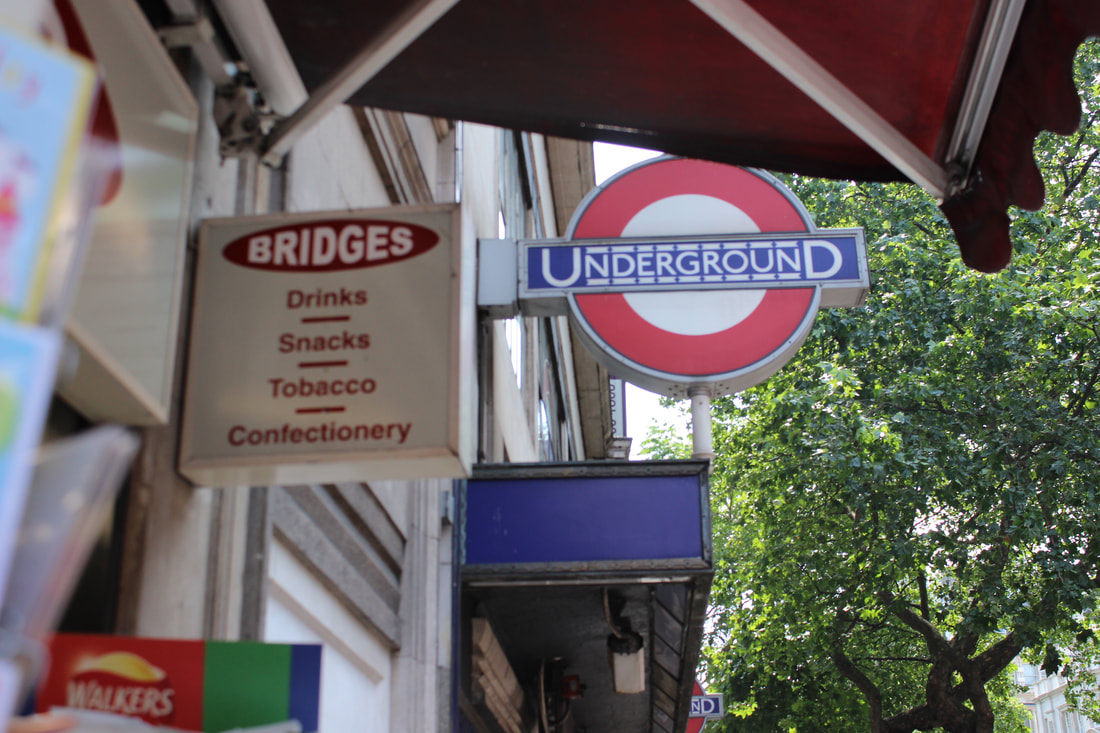
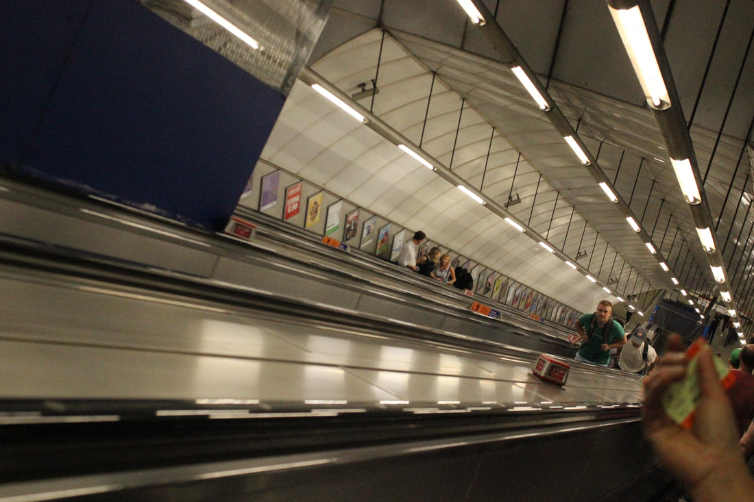
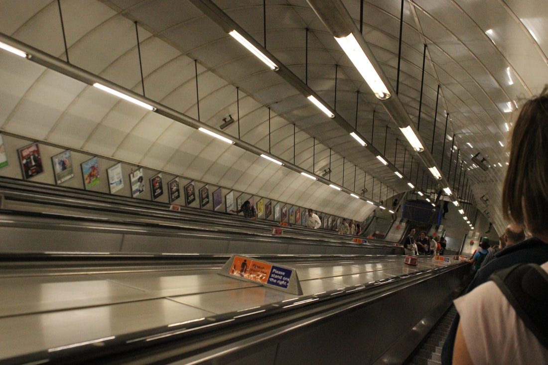
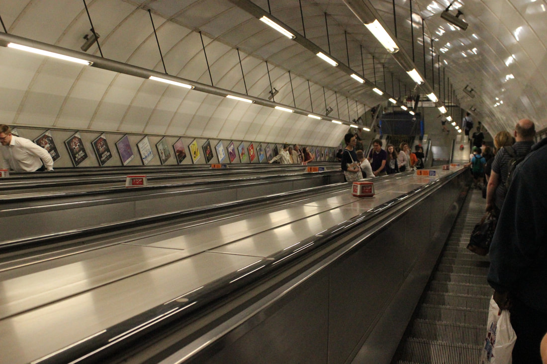
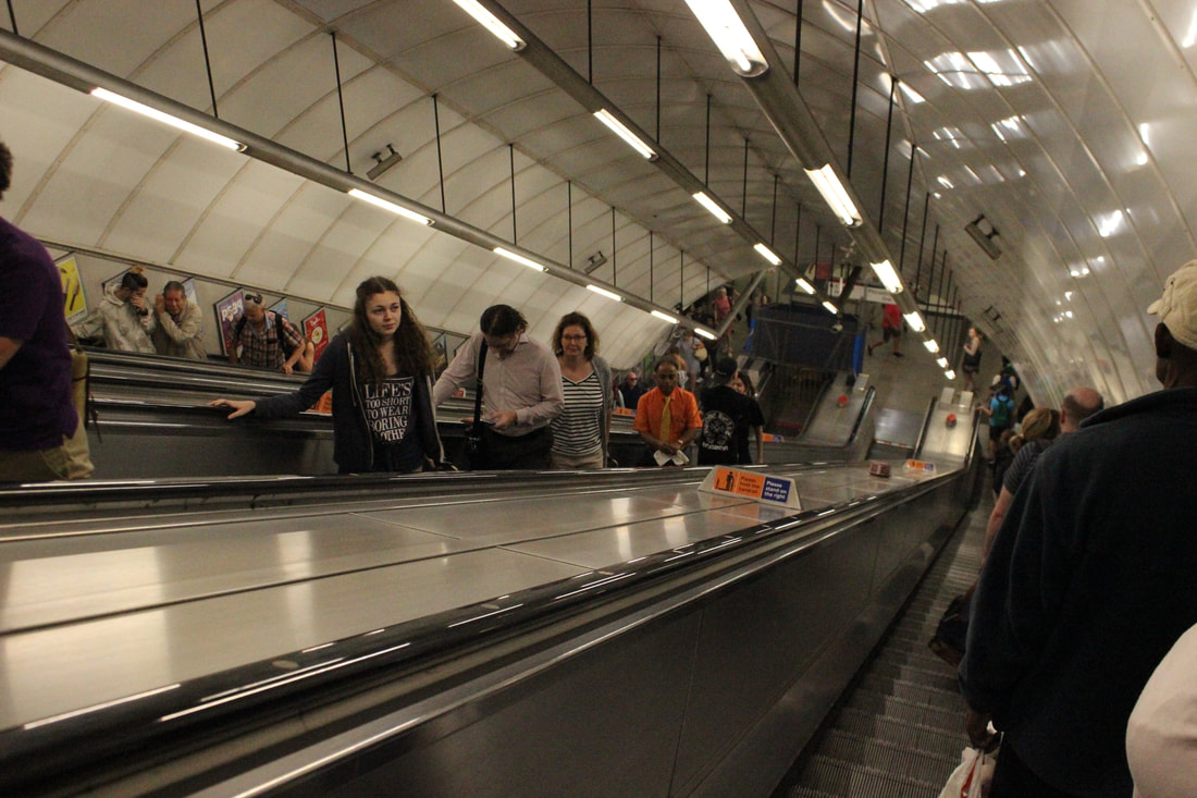
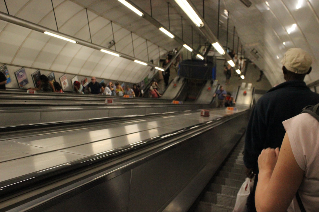
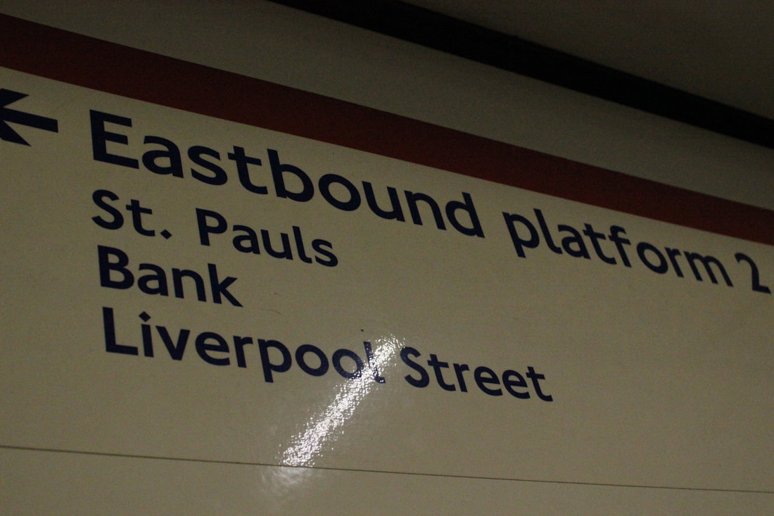
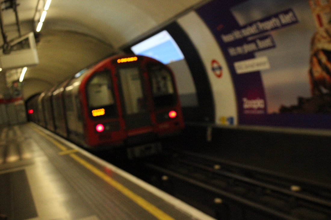
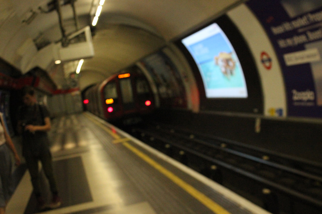
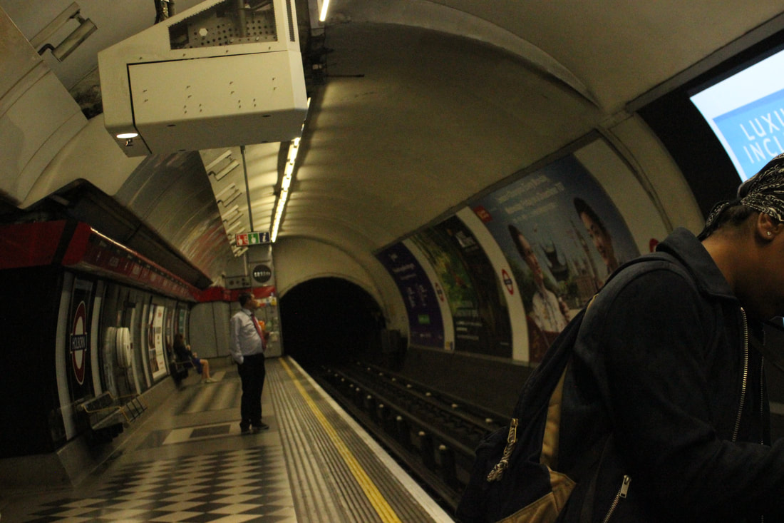
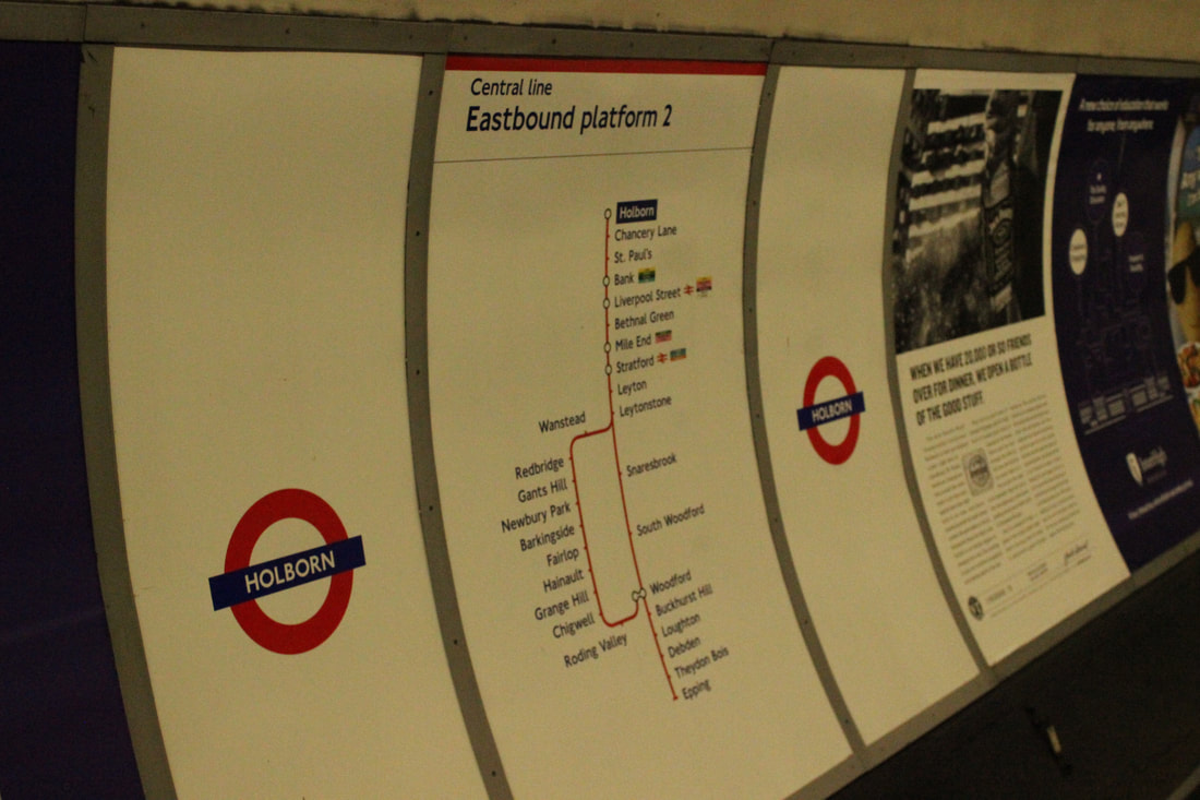
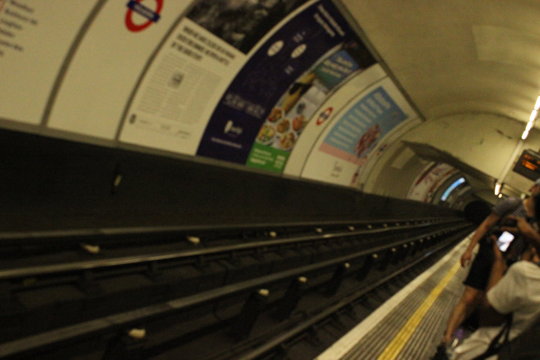
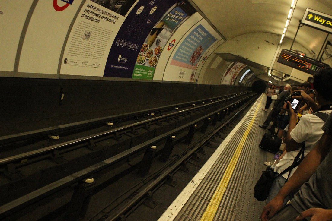
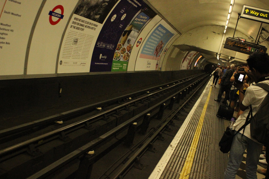
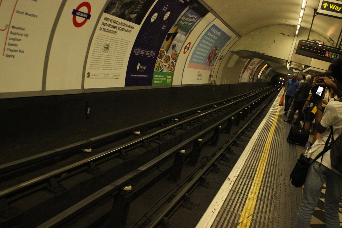
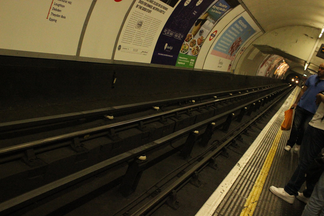
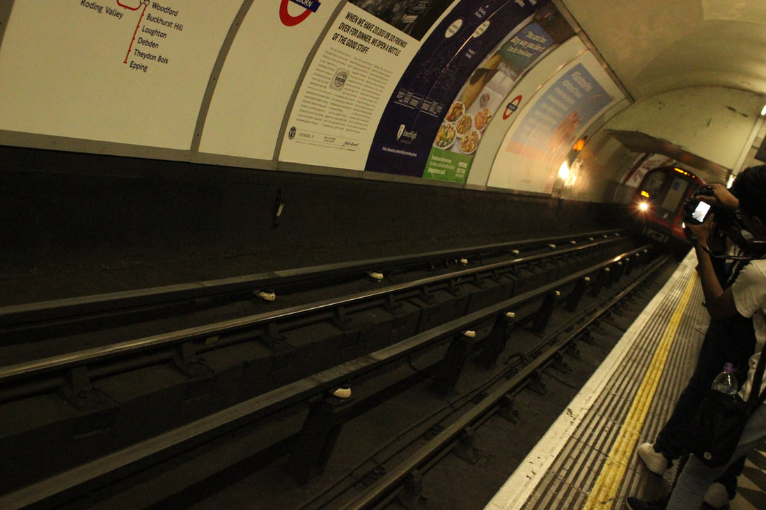
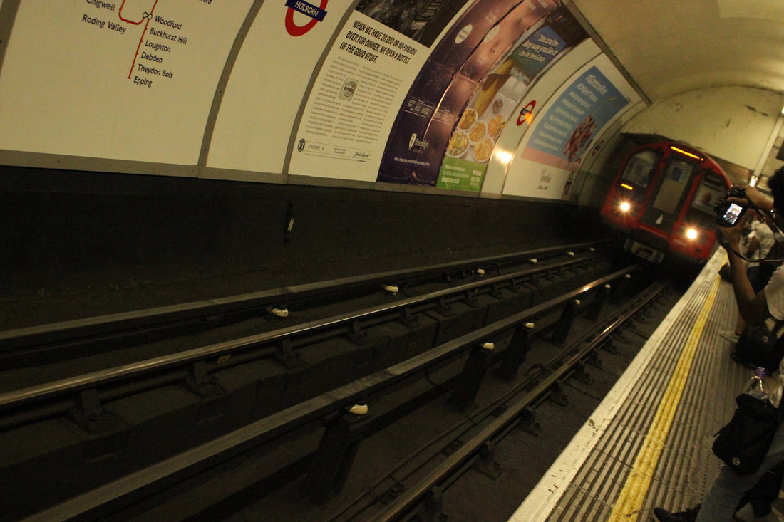
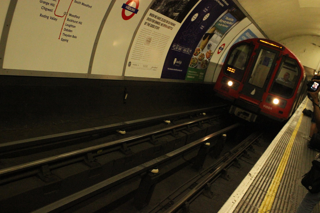
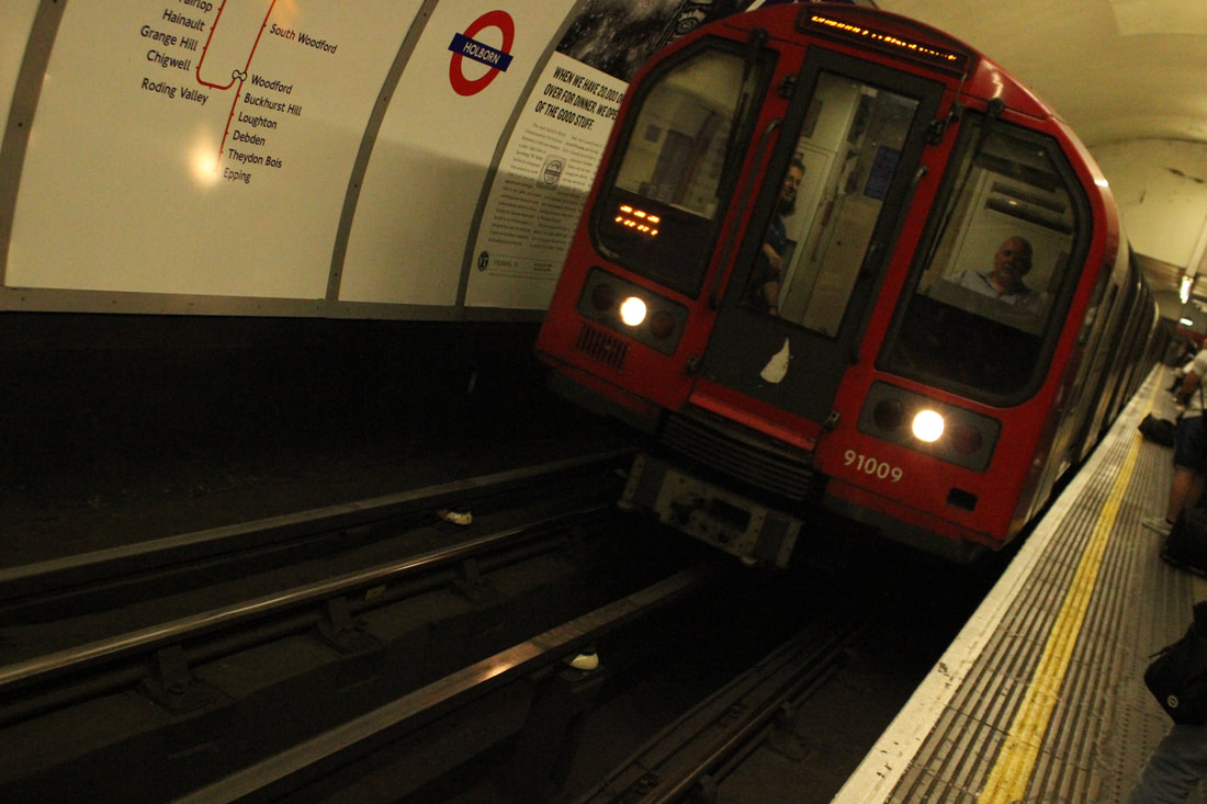
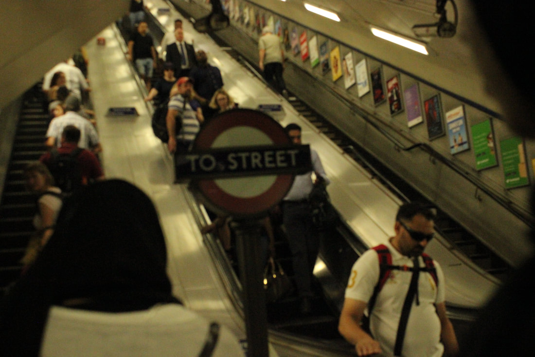
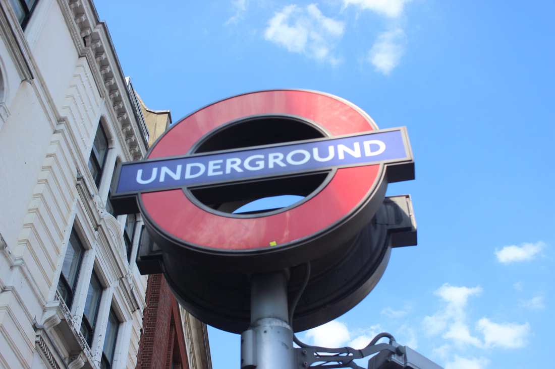
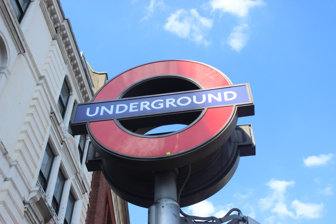
Best
I think this is my best picture because it shows the underground sign at eye level and it is not overexposed but it is taken with the right camera settings.
|
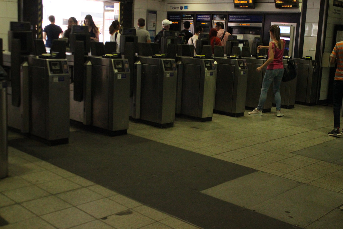
Worst
|
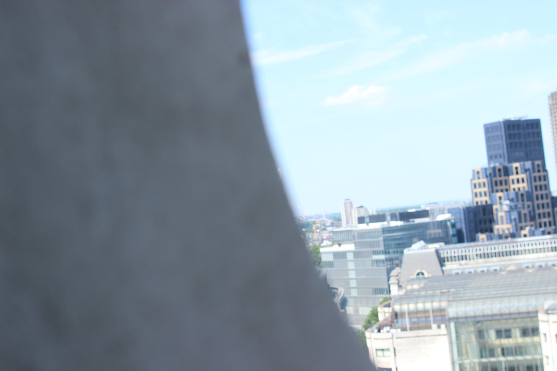
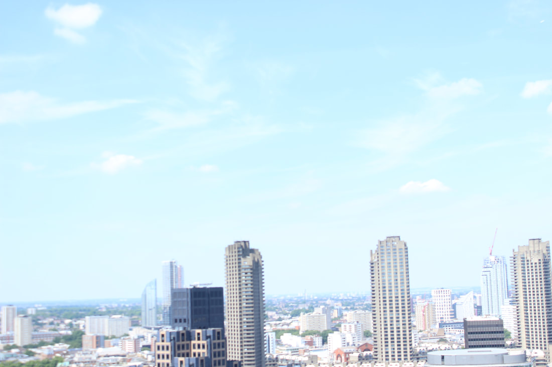
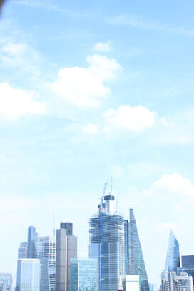
Skylines
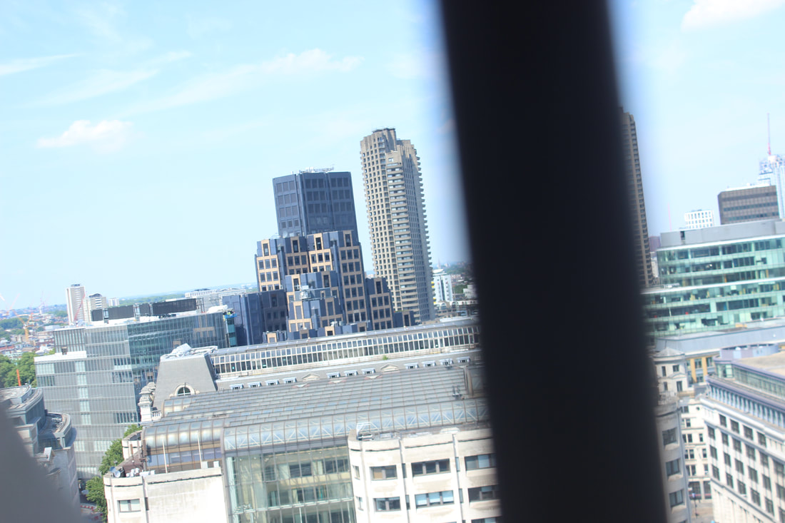
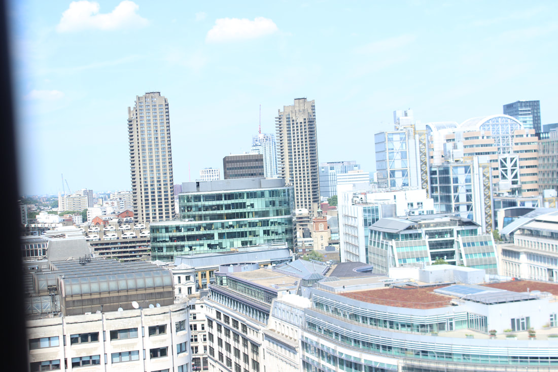
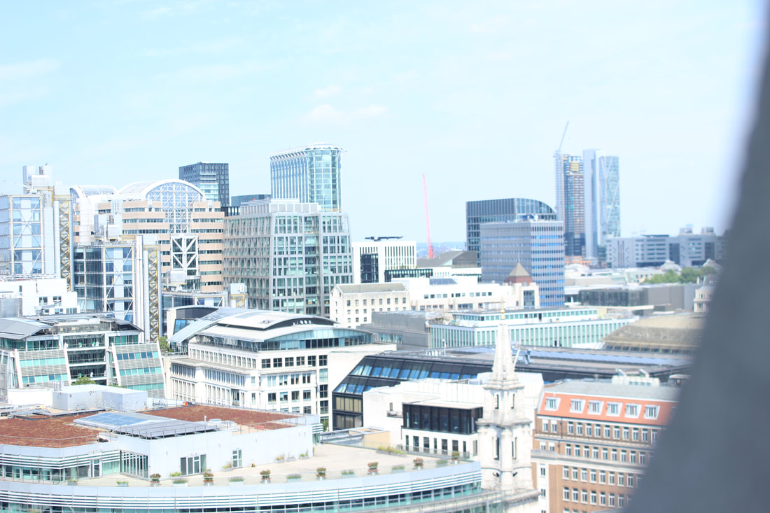
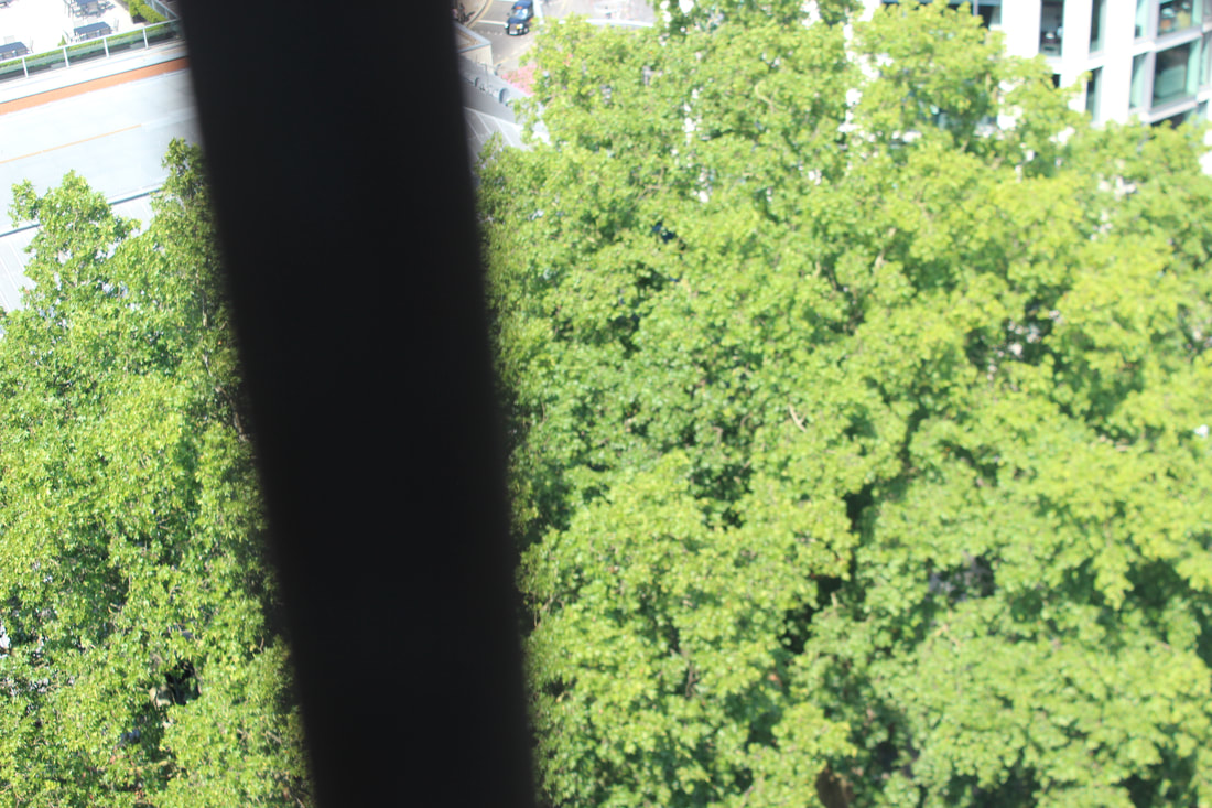
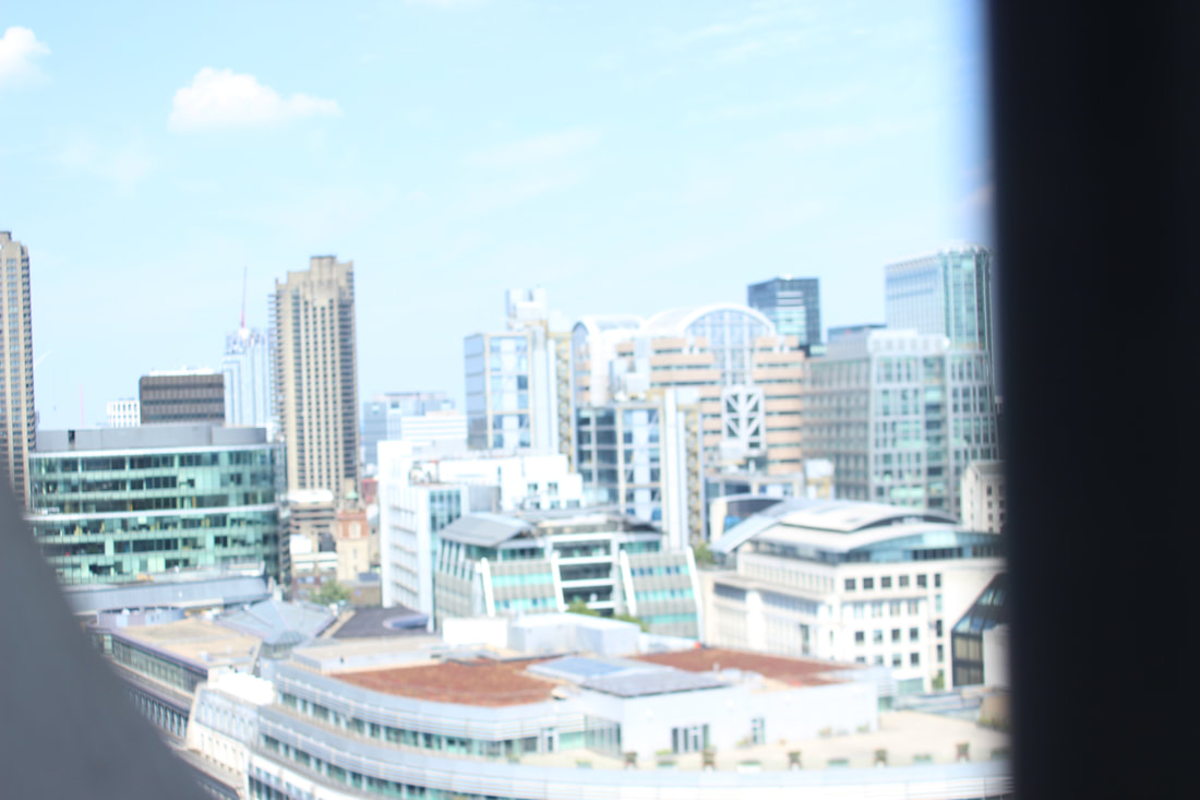
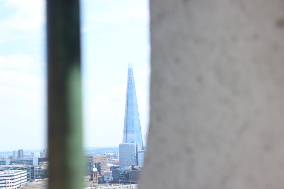
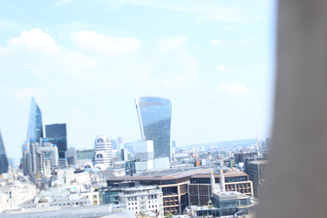
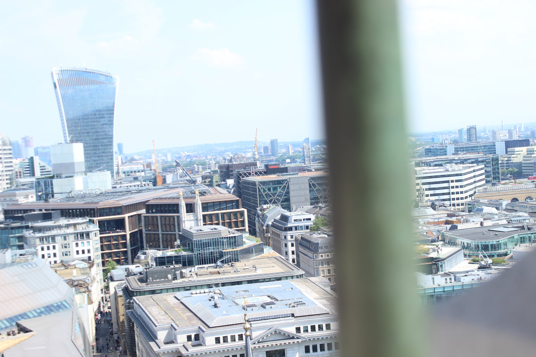
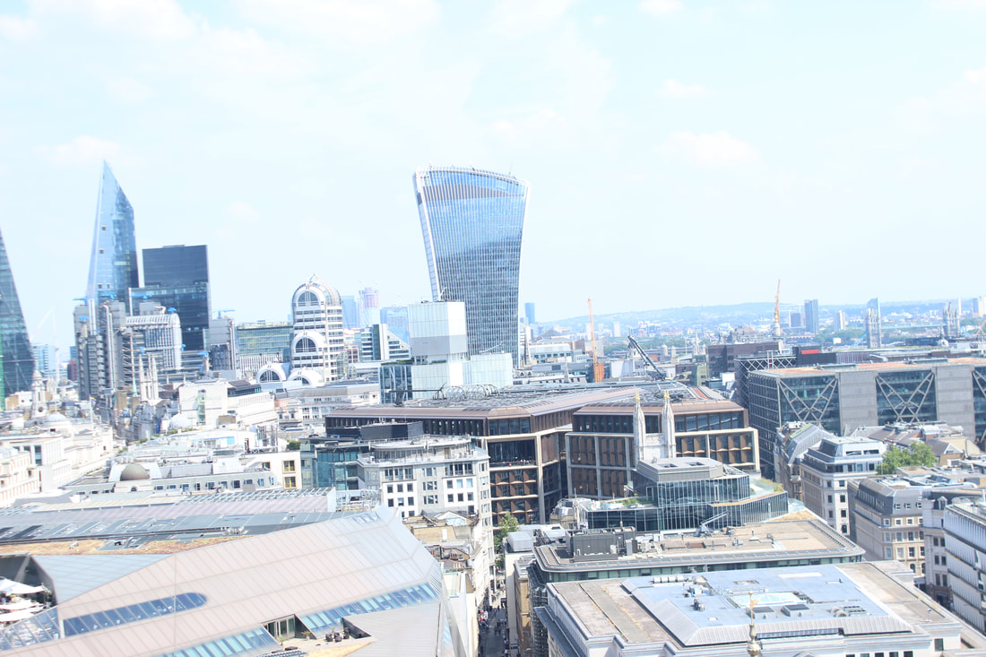
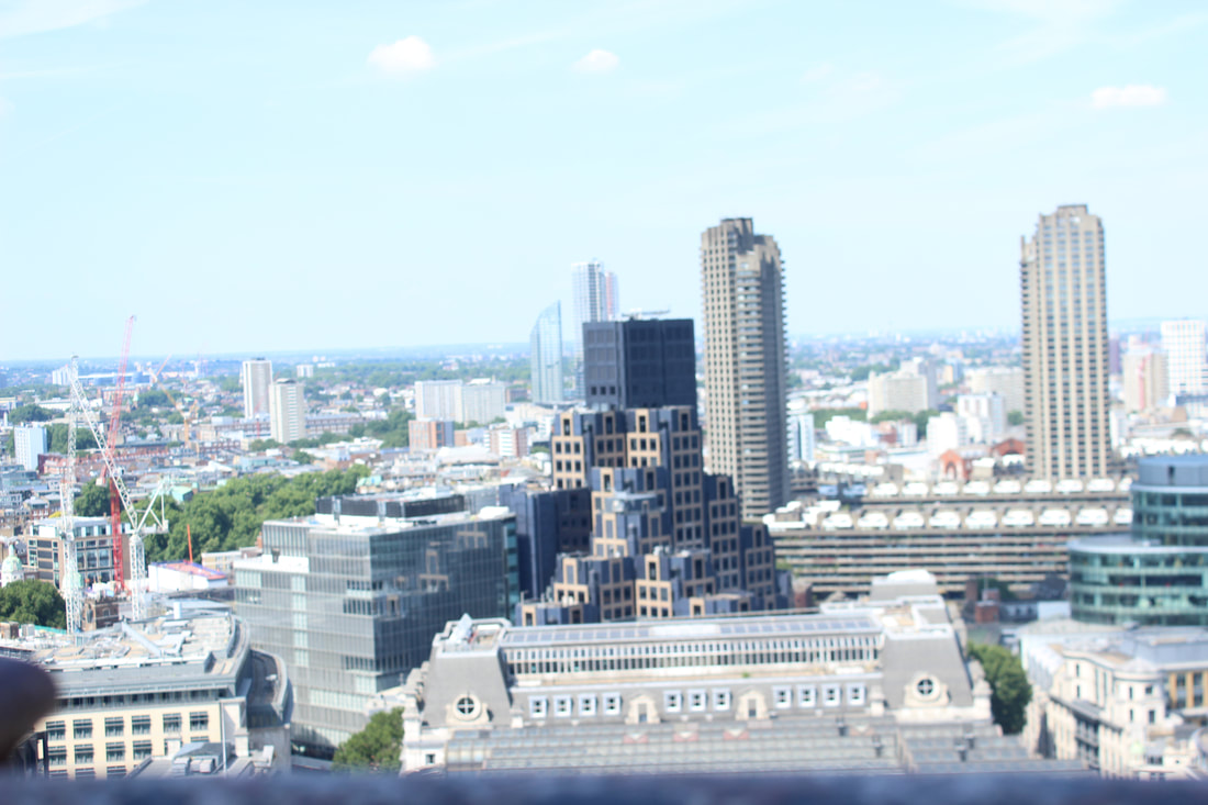
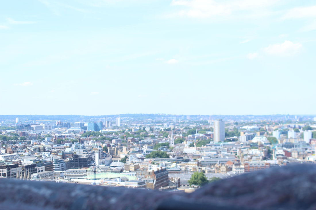
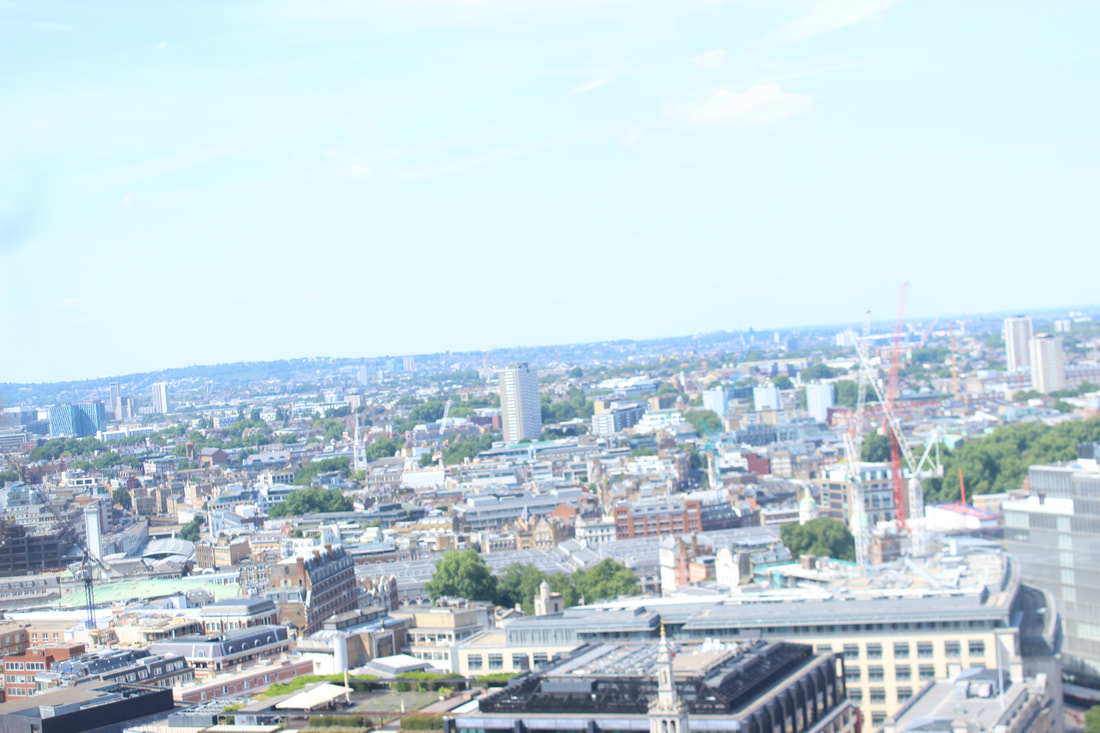
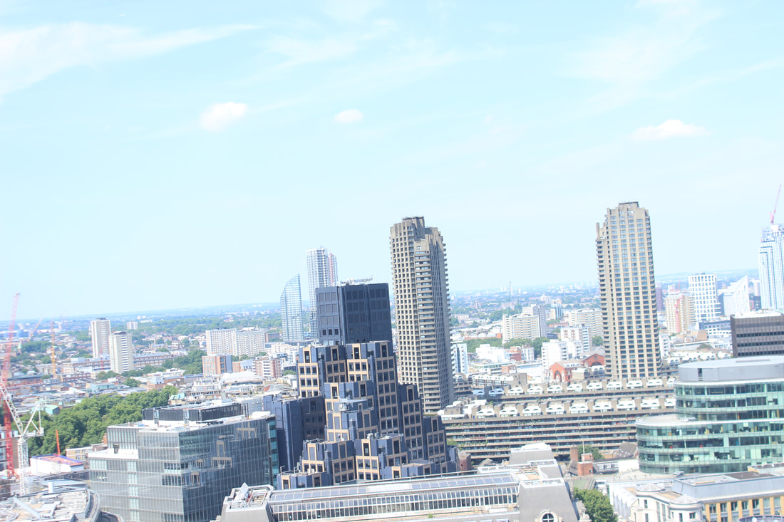
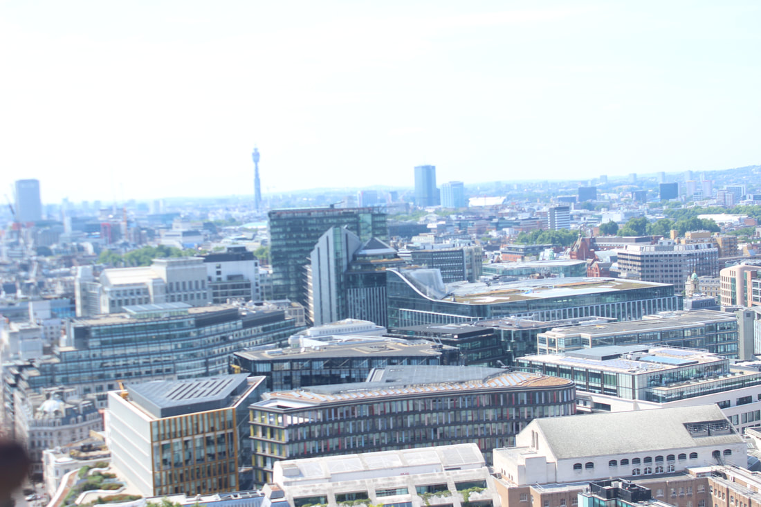
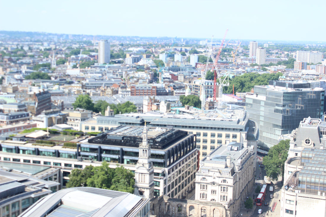
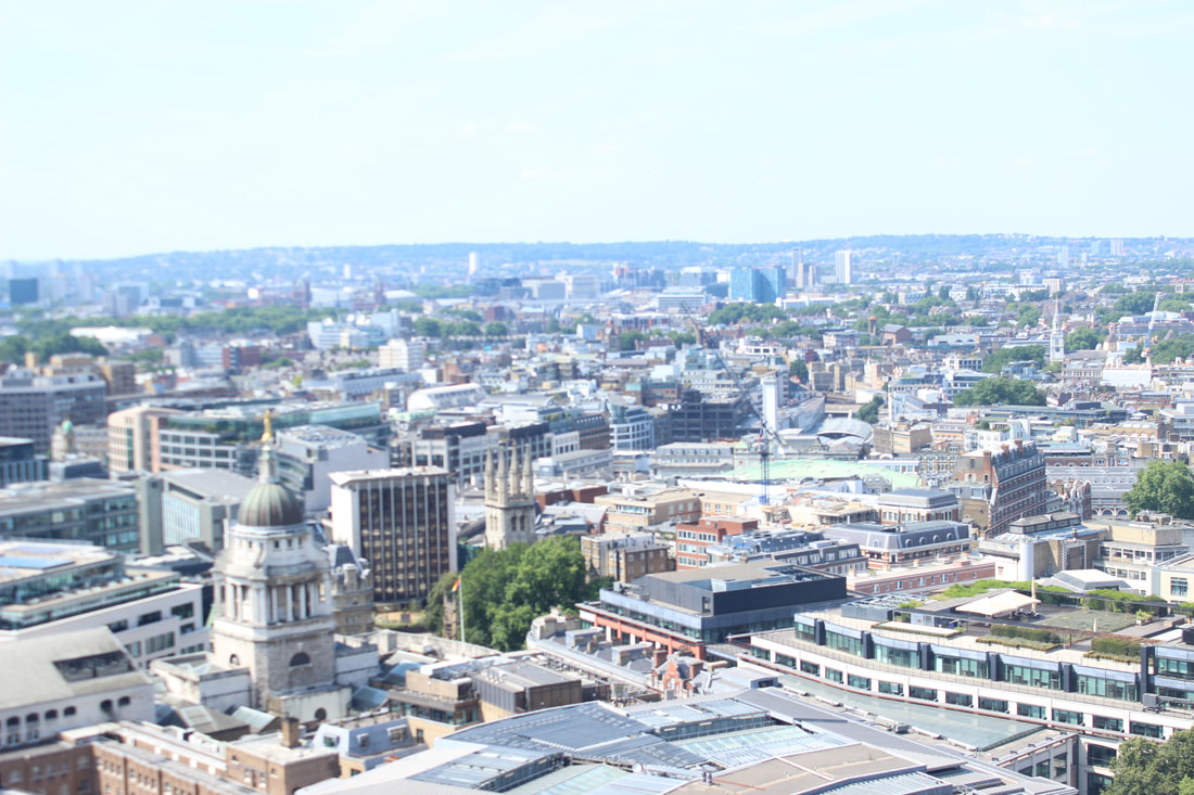
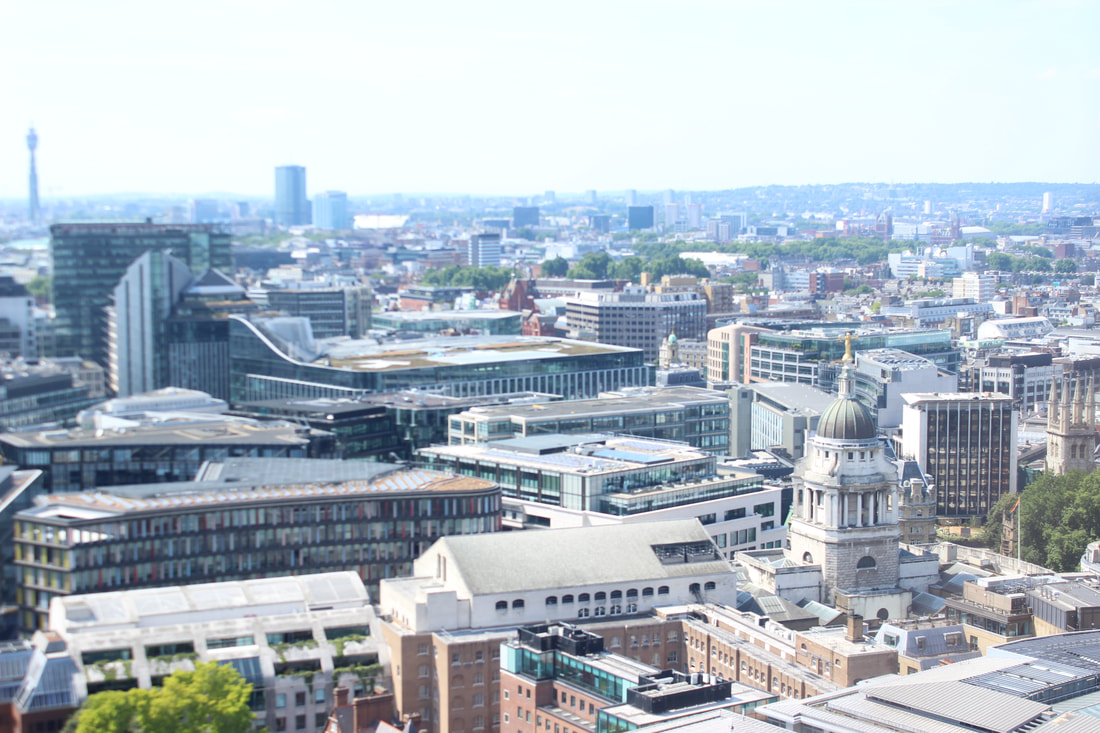

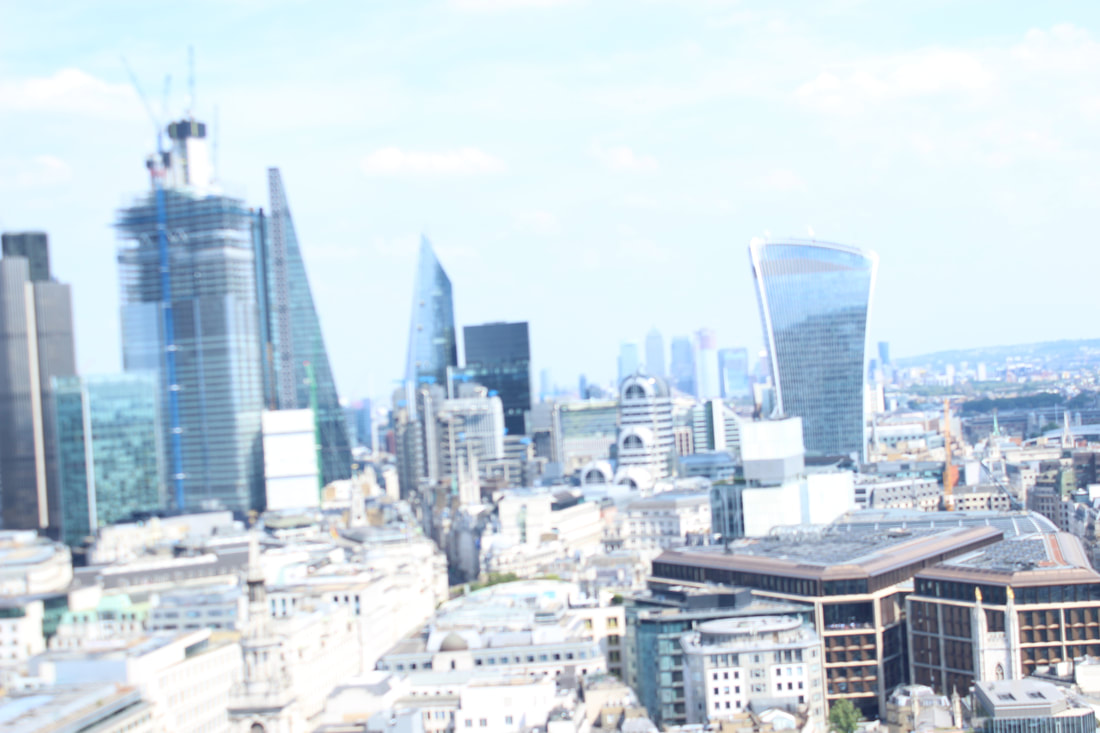
Best
This is my best picture it shows London and how the buildings are structured. The composition of the photo is good as the buildings are in the centre and at eye focus.
|
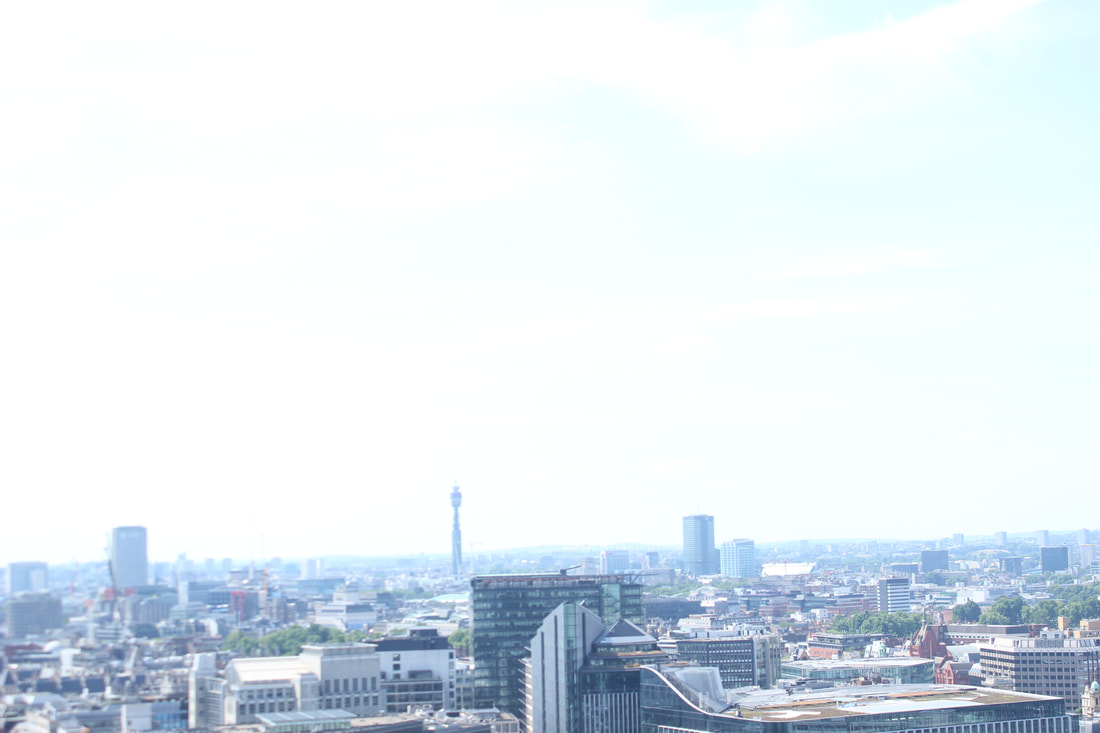
Worst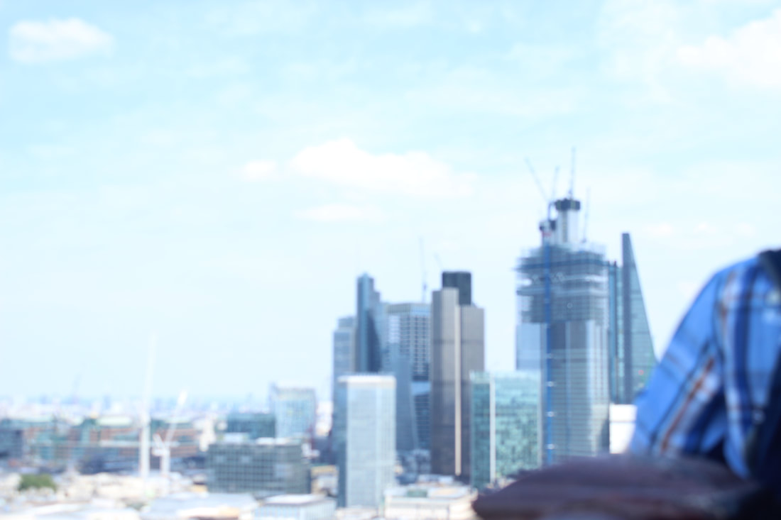
I think this is my worst picture because it has more focus on the mans shirt rather than the buildings and has blurred out on the buildings.
|
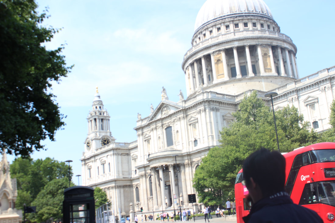
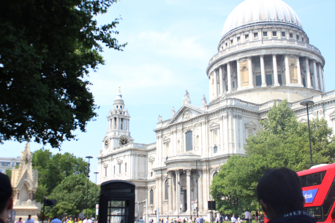
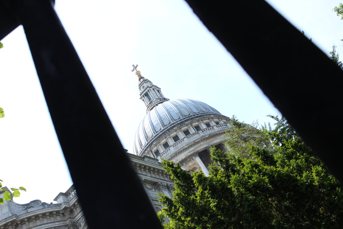
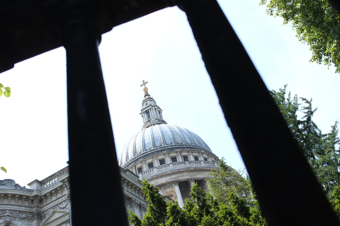
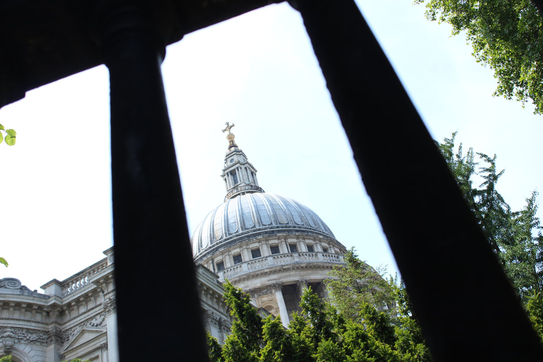
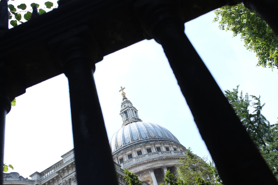
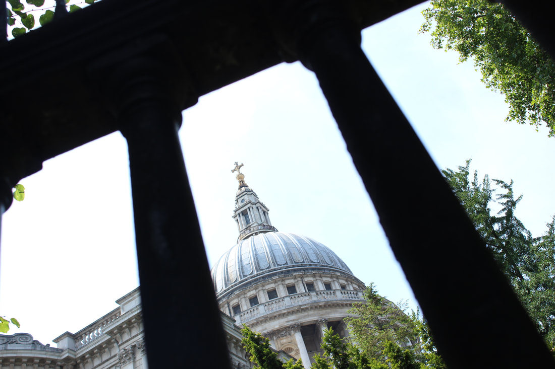
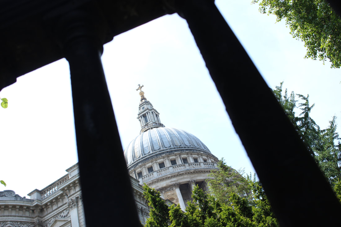
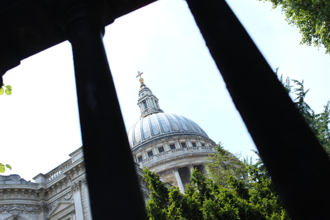
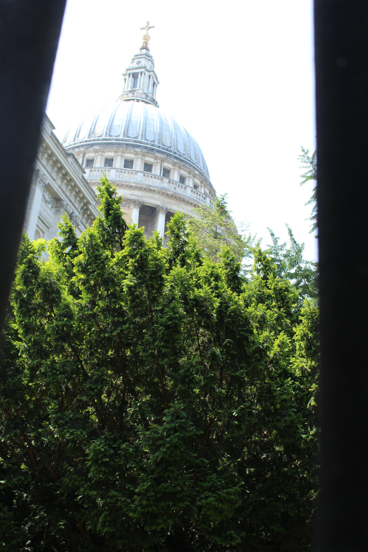
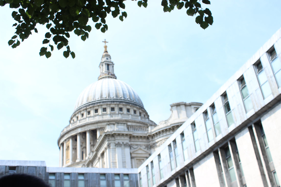
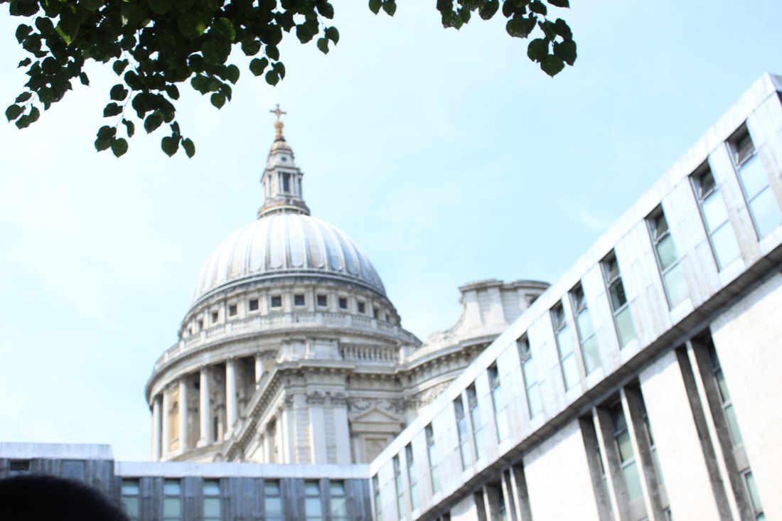
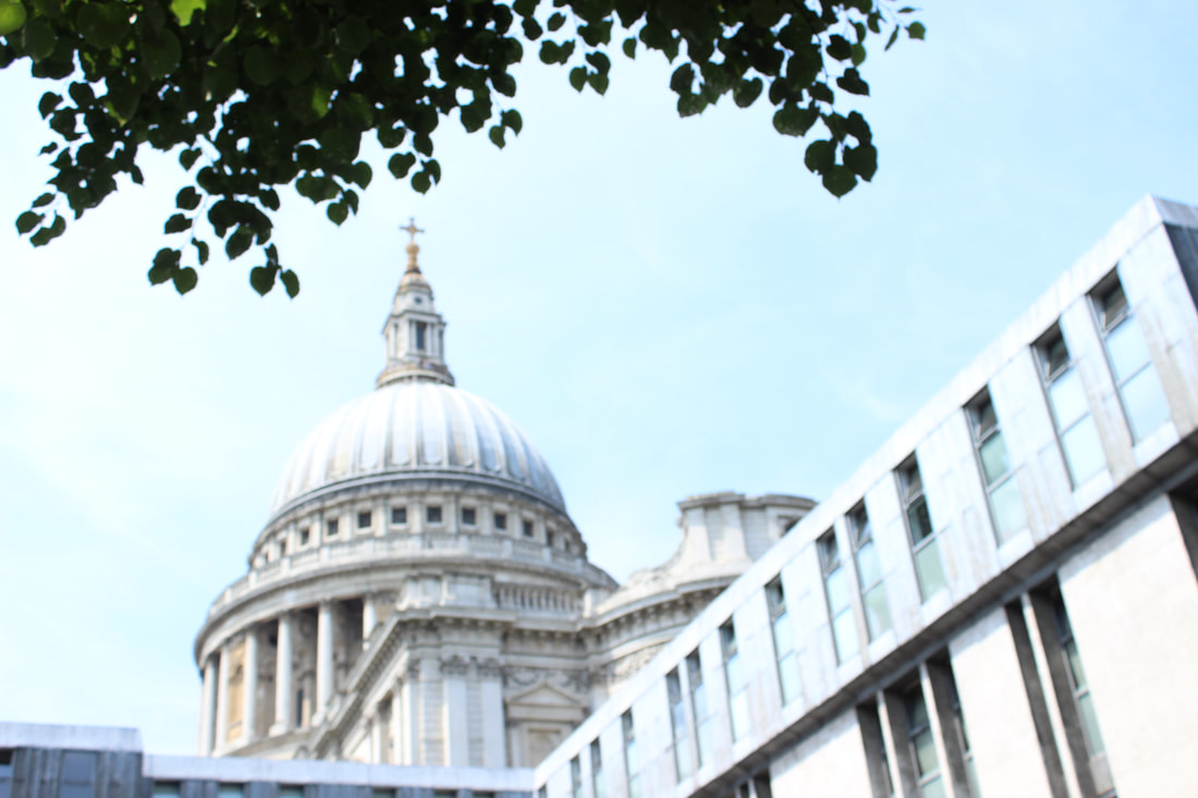
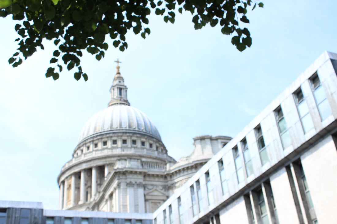
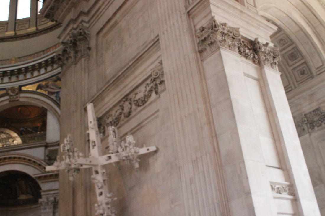
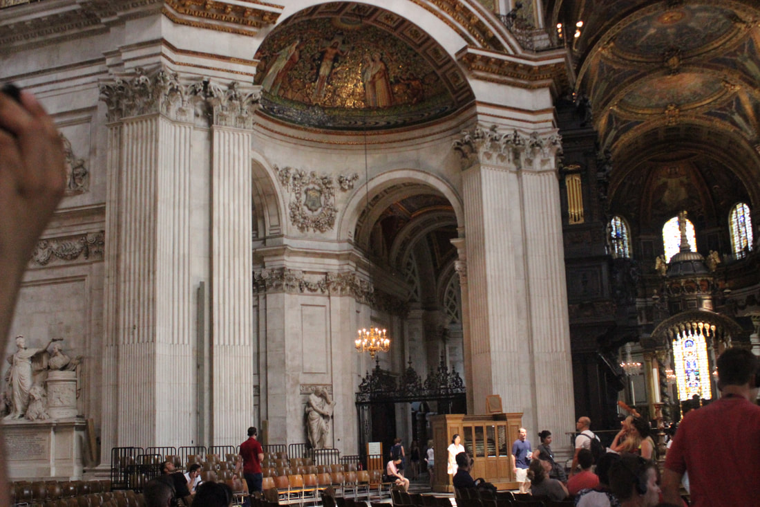
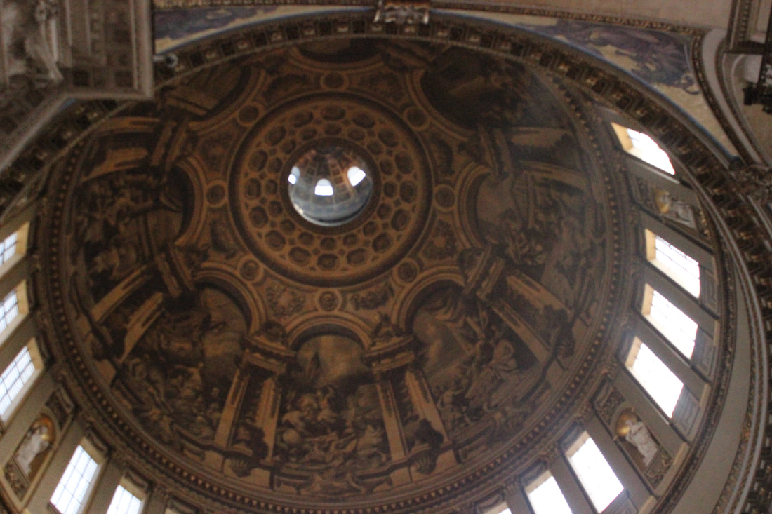
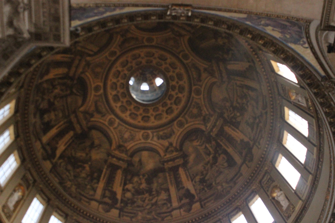
St Pauls cathedral church

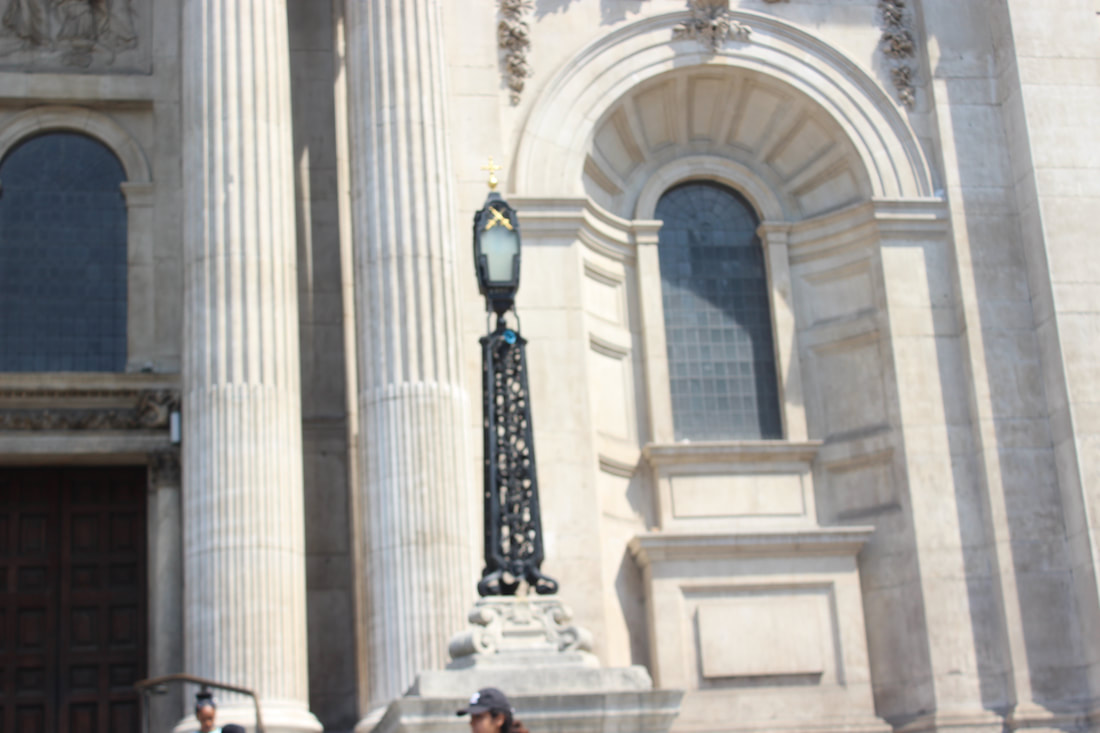
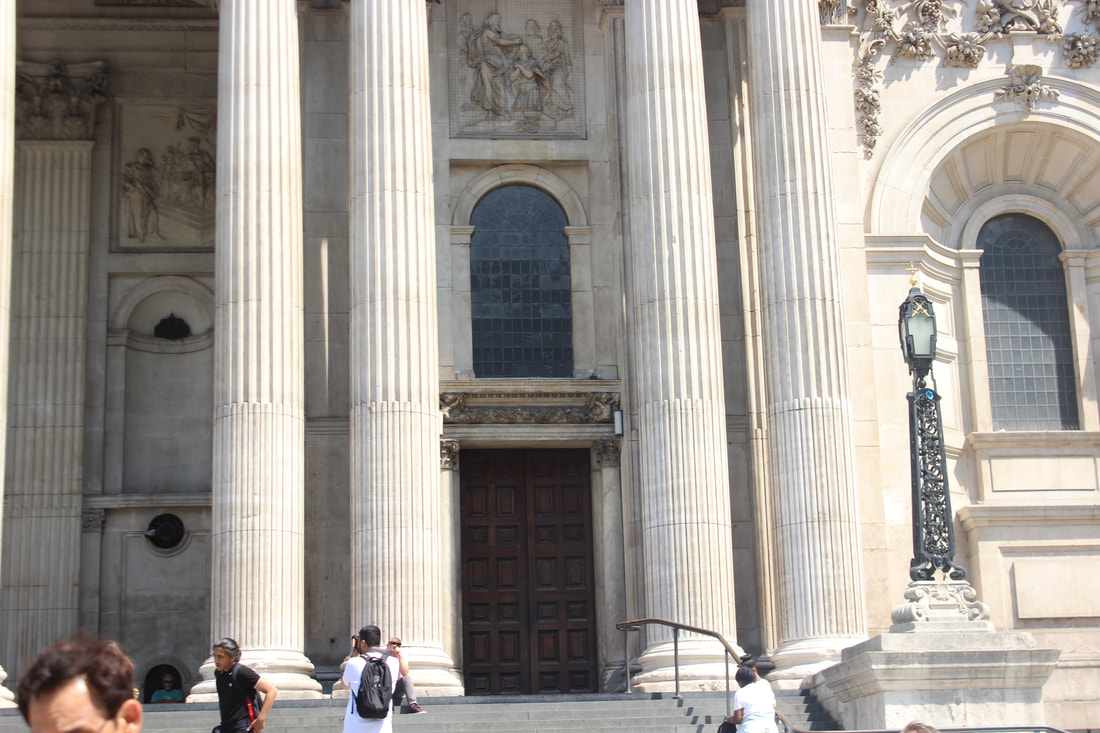
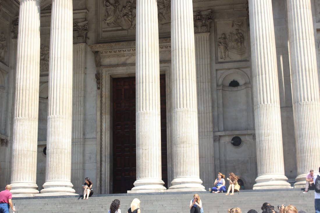
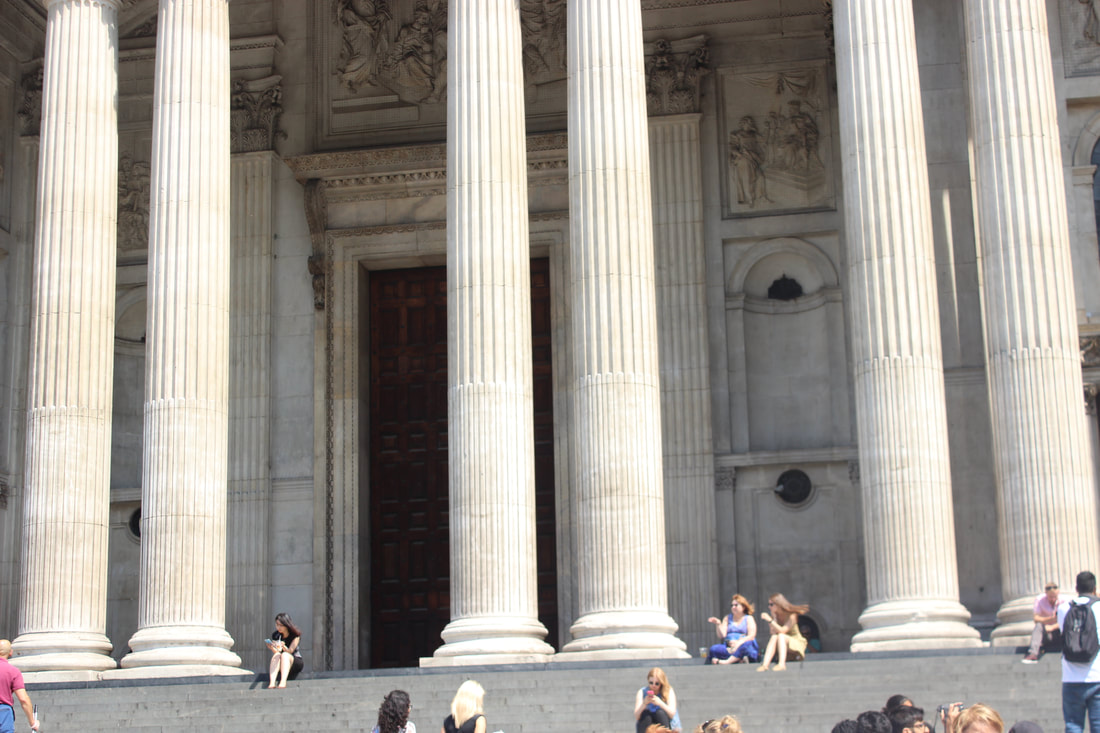

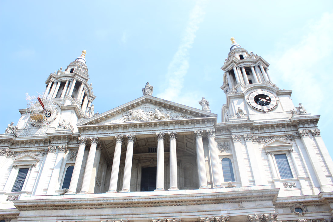
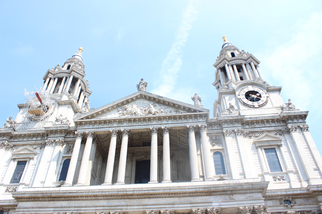
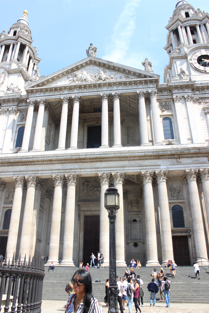
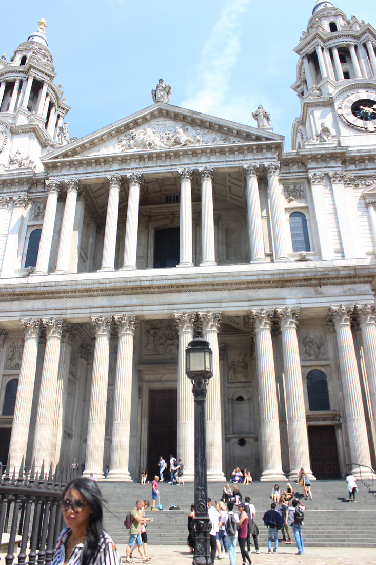
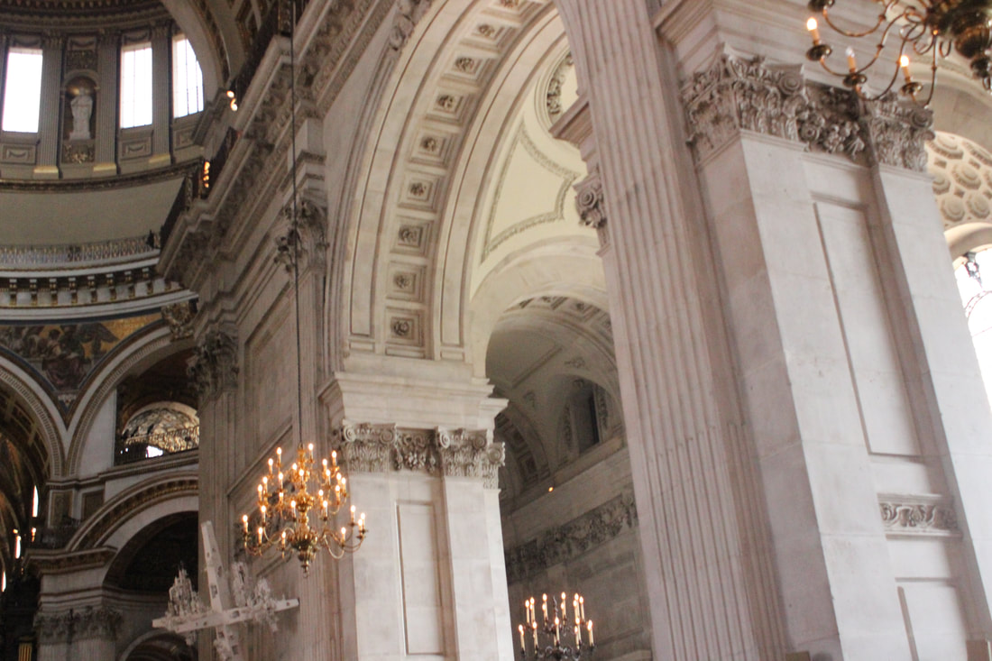
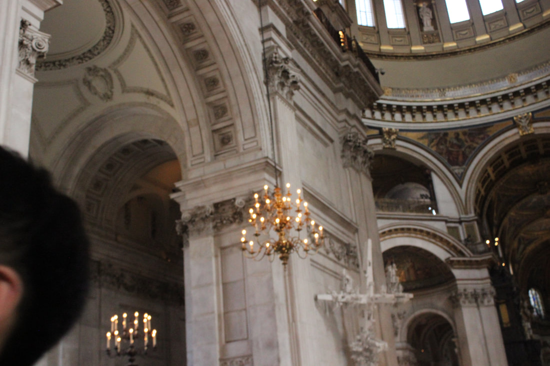
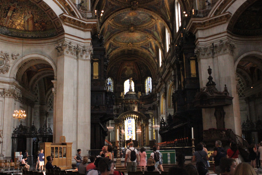
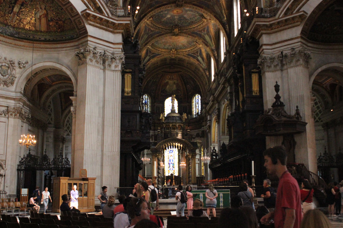
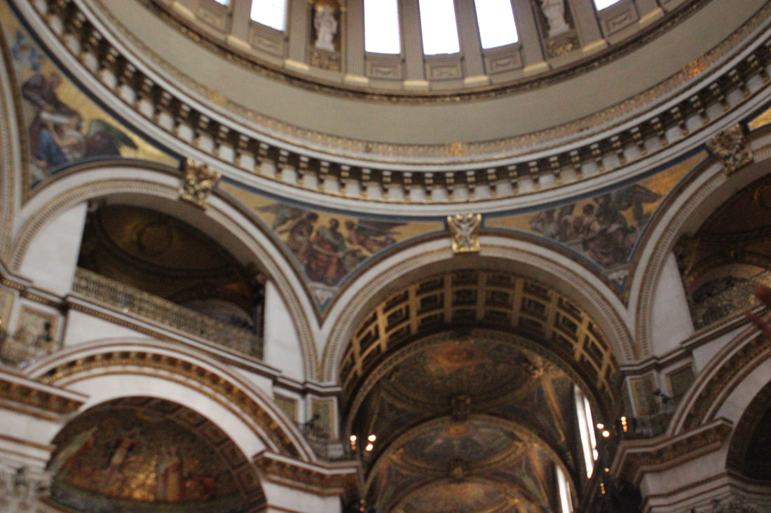
Best
I think this is my best picture because it has a good composition and the aperature and white balance are just right.
|
Worst
I think this is my worst picture as it is not taken at a good angle and does not really show anything.
|
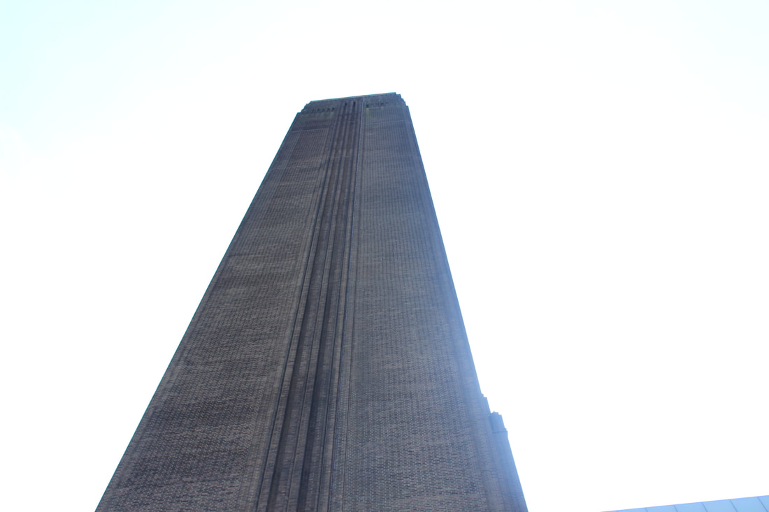
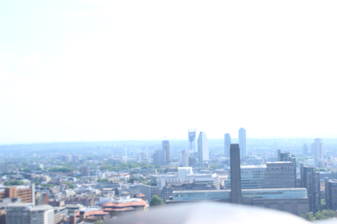
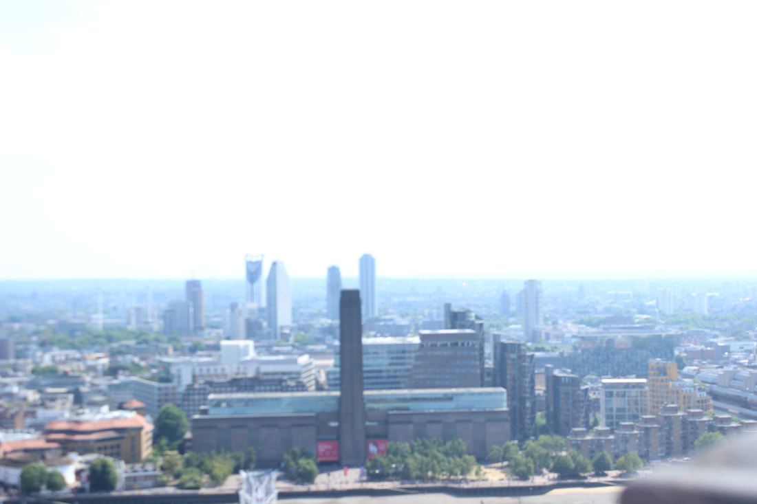
Tate modern
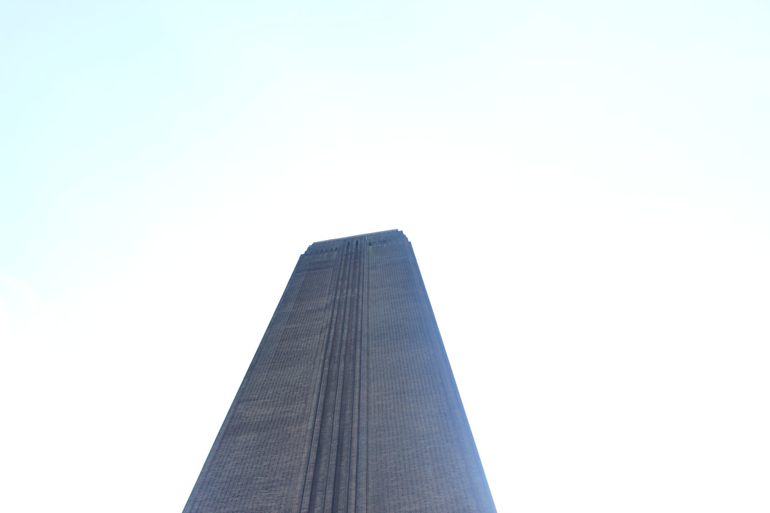


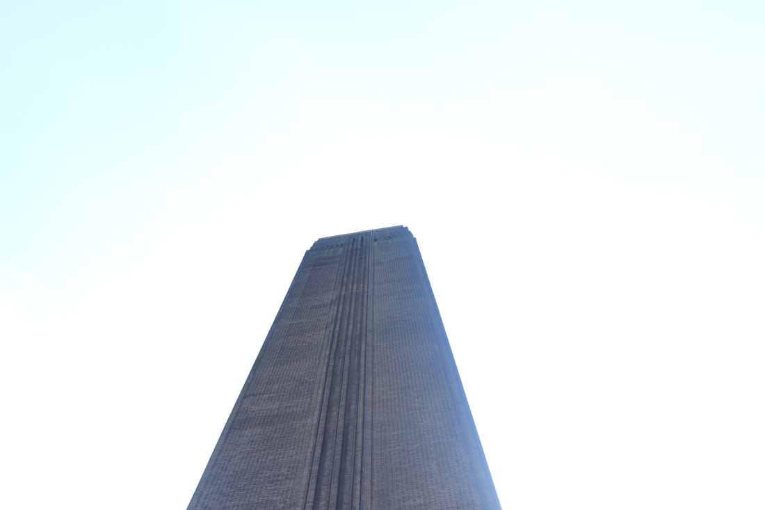
Best
I think this is my best picture because the composition of the picture is well thought about and you can use Photoshop to get a lot of different outcomes of one picture.
|
Worst
I think this is my worst picture as it is irrelevant and you cant get different outcomes with it in Photoshop.
|
Train
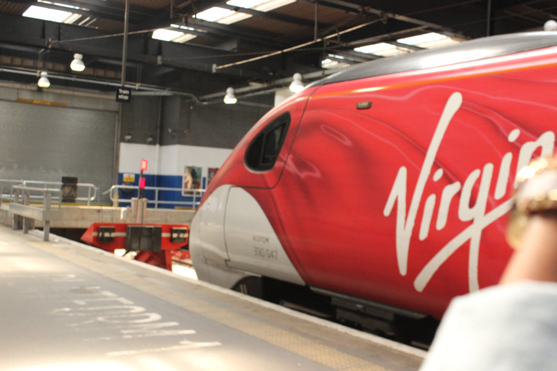

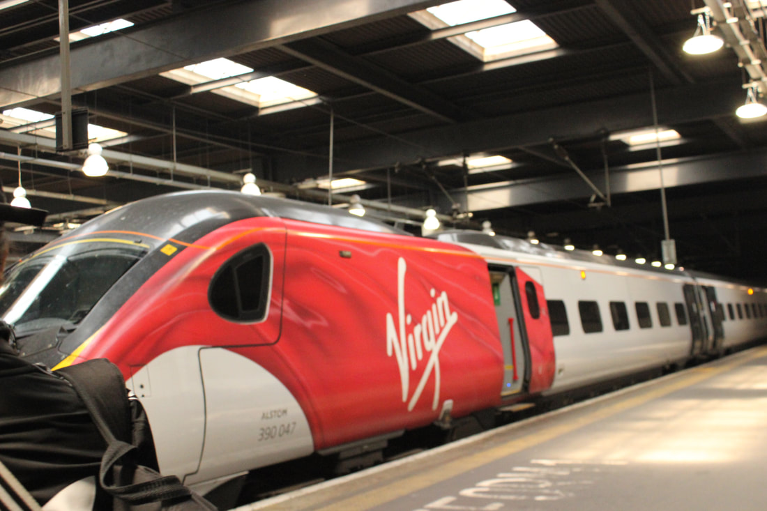
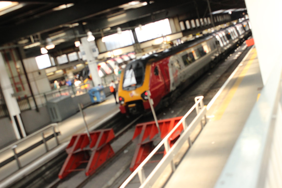
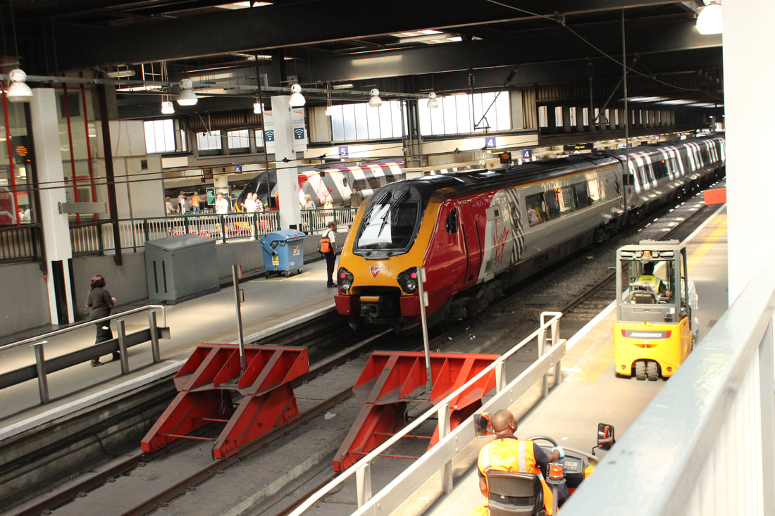
Best |
Worst |

I like this picture because I like the angle of the picture and how it is slightly tilted to get more of the train in the picture.
|
I don't like this picture because it is taken at a bad angle and isn't really appealing.
|
Favorite pictures of London
|


|
Refining my ideas in Photoshop


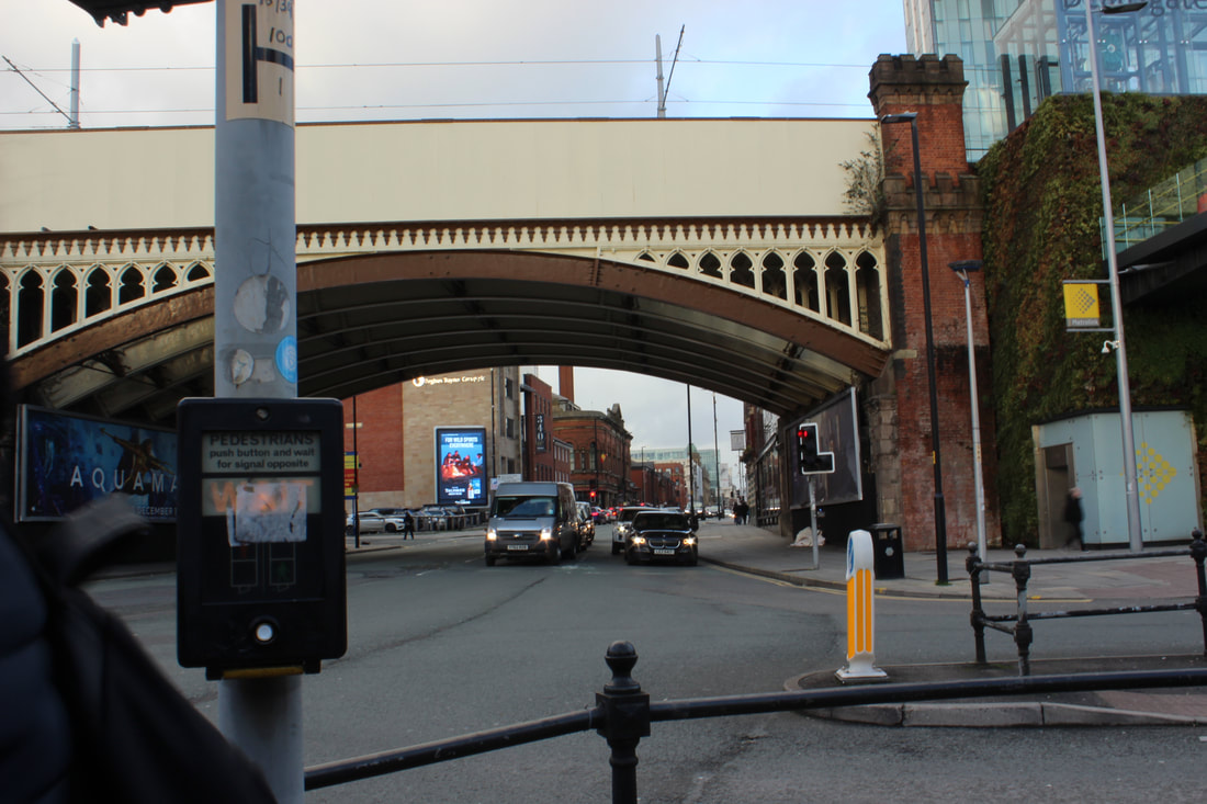
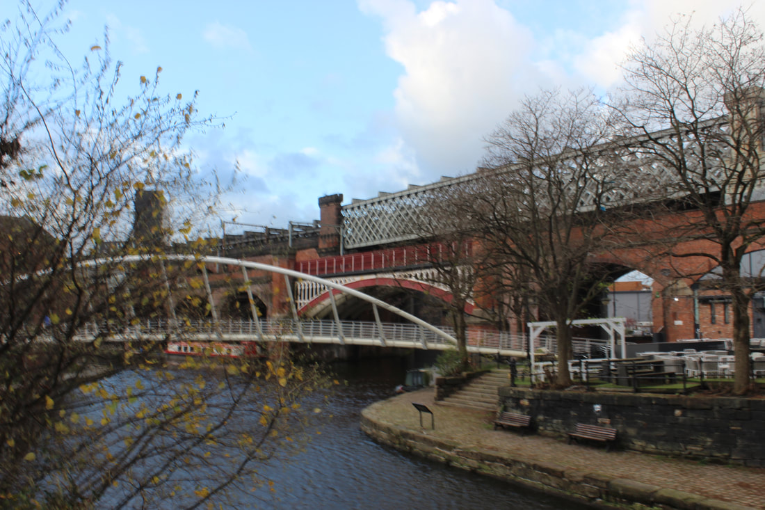
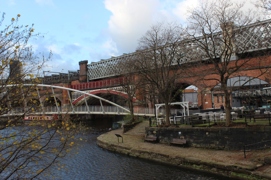
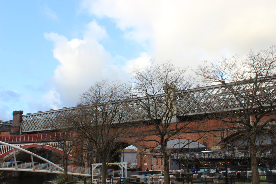
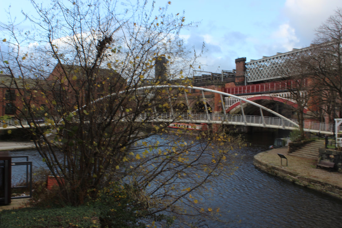
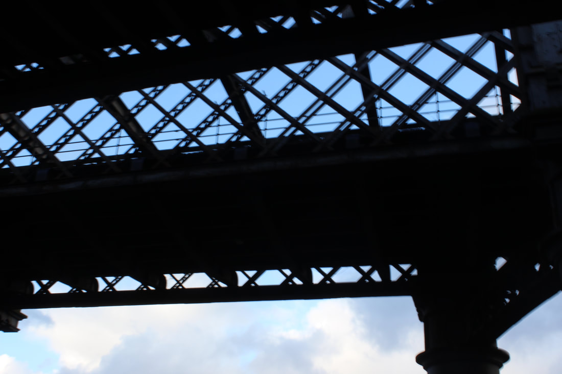
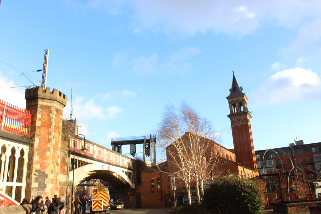
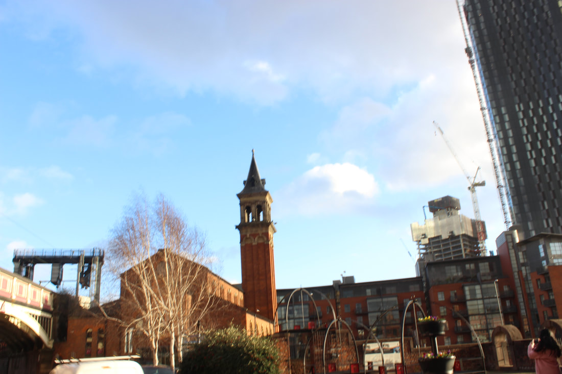
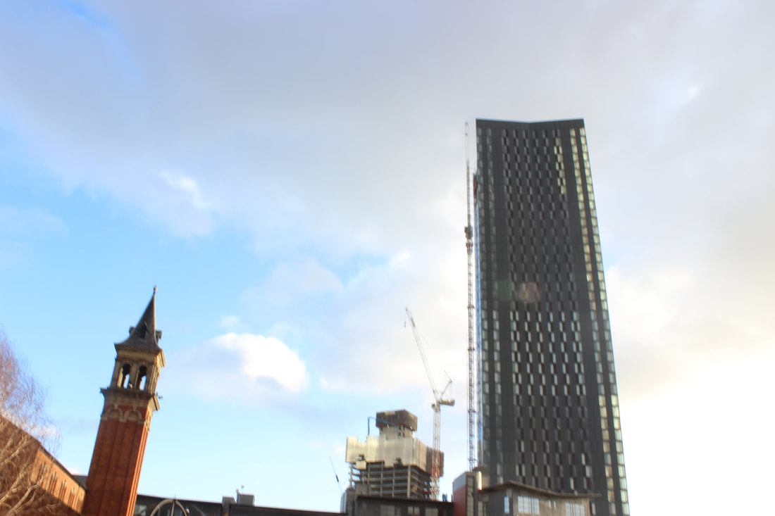
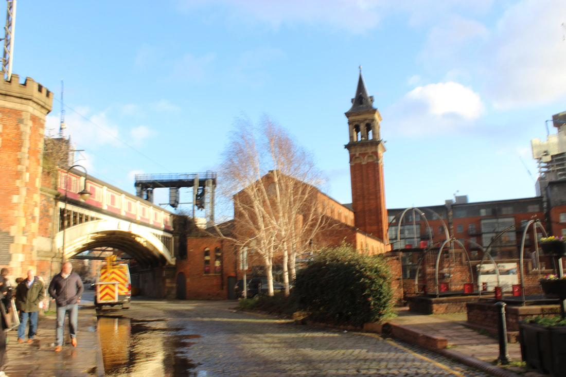
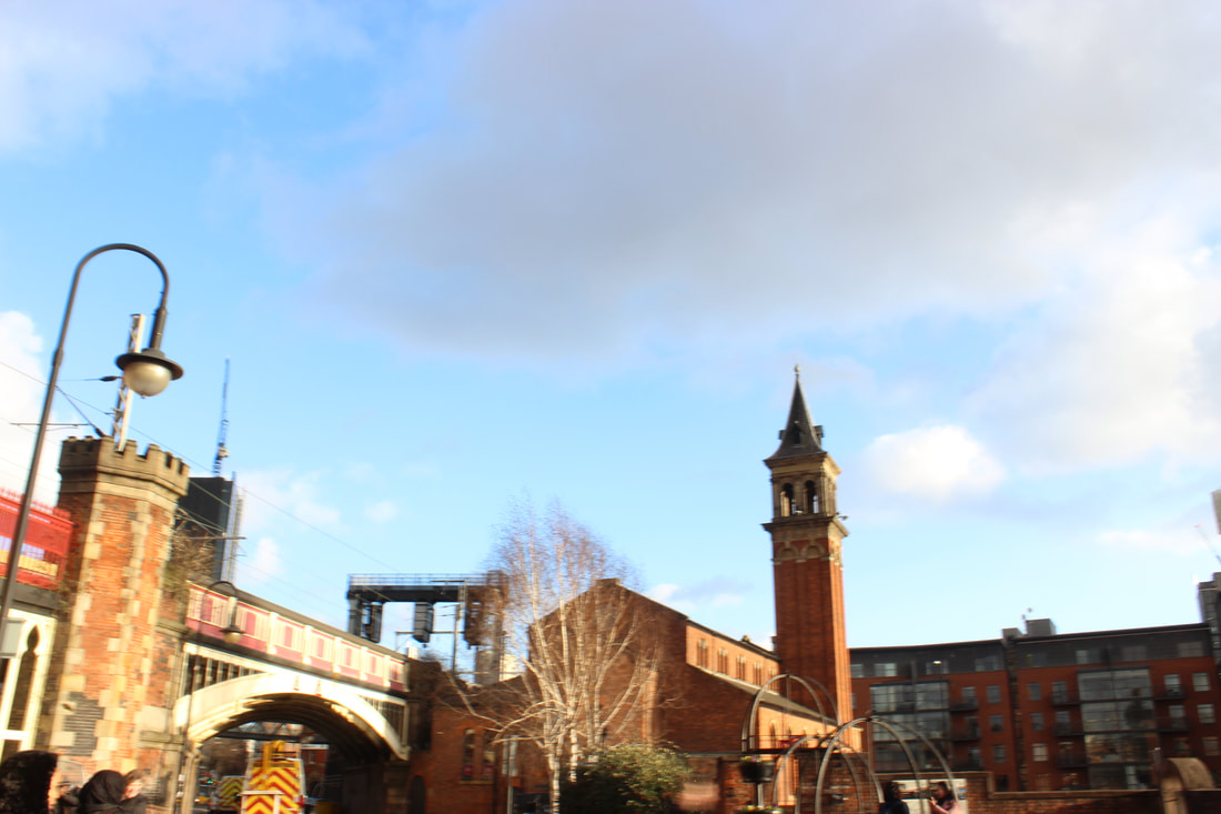
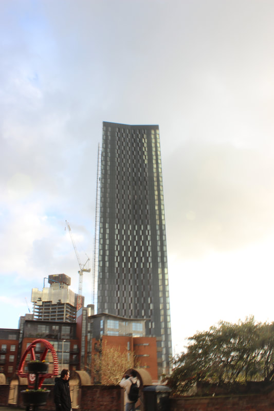
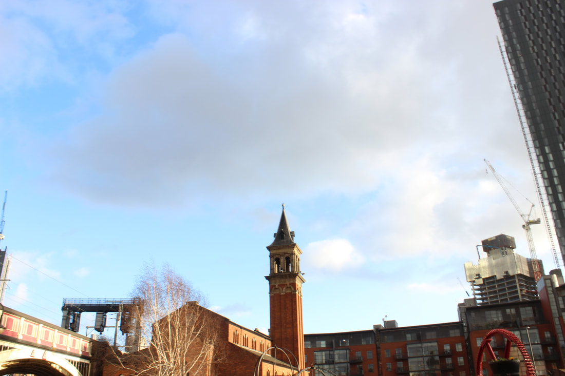
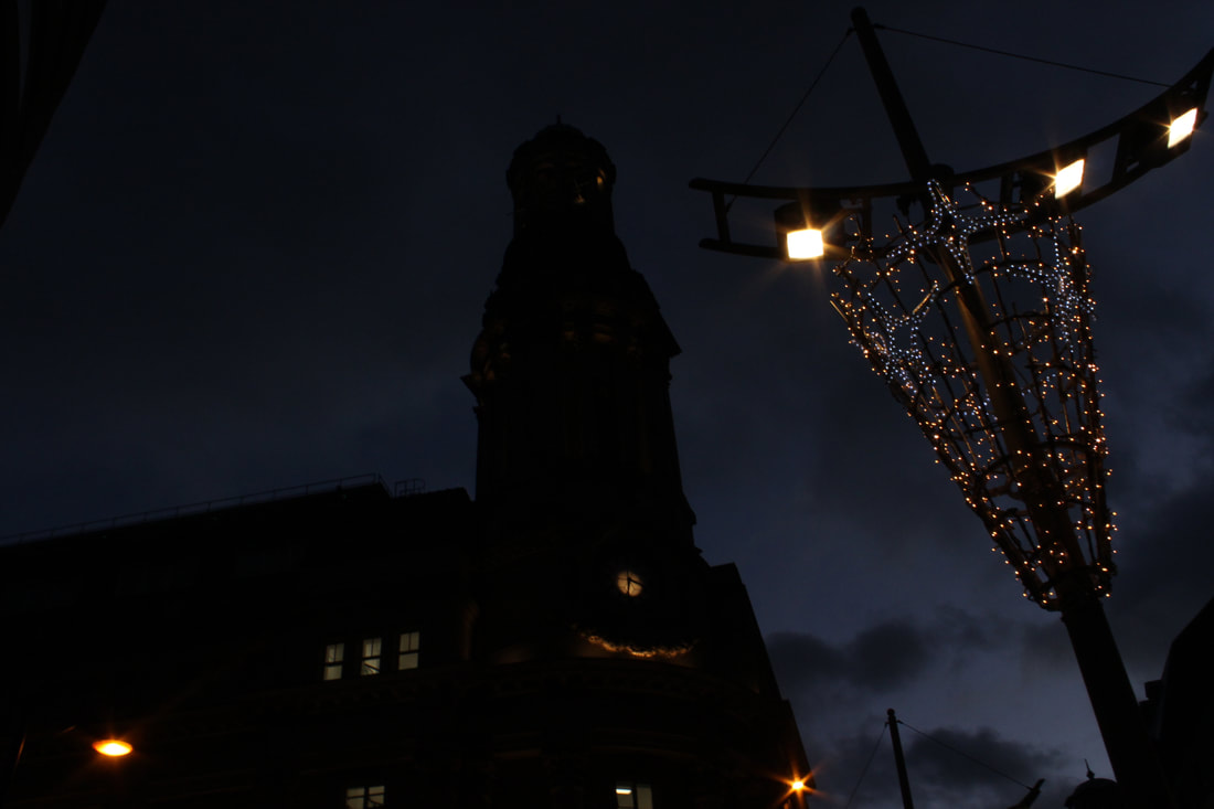
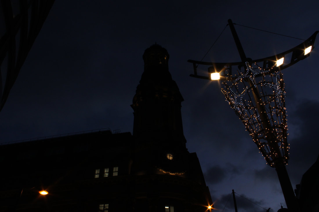
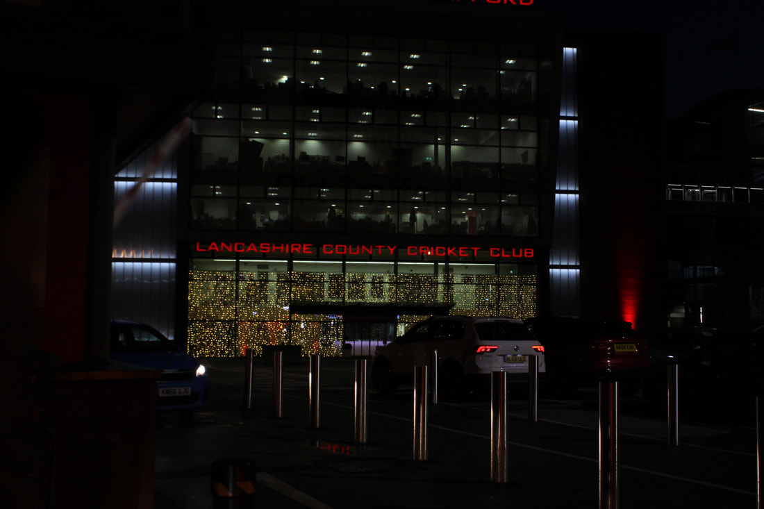
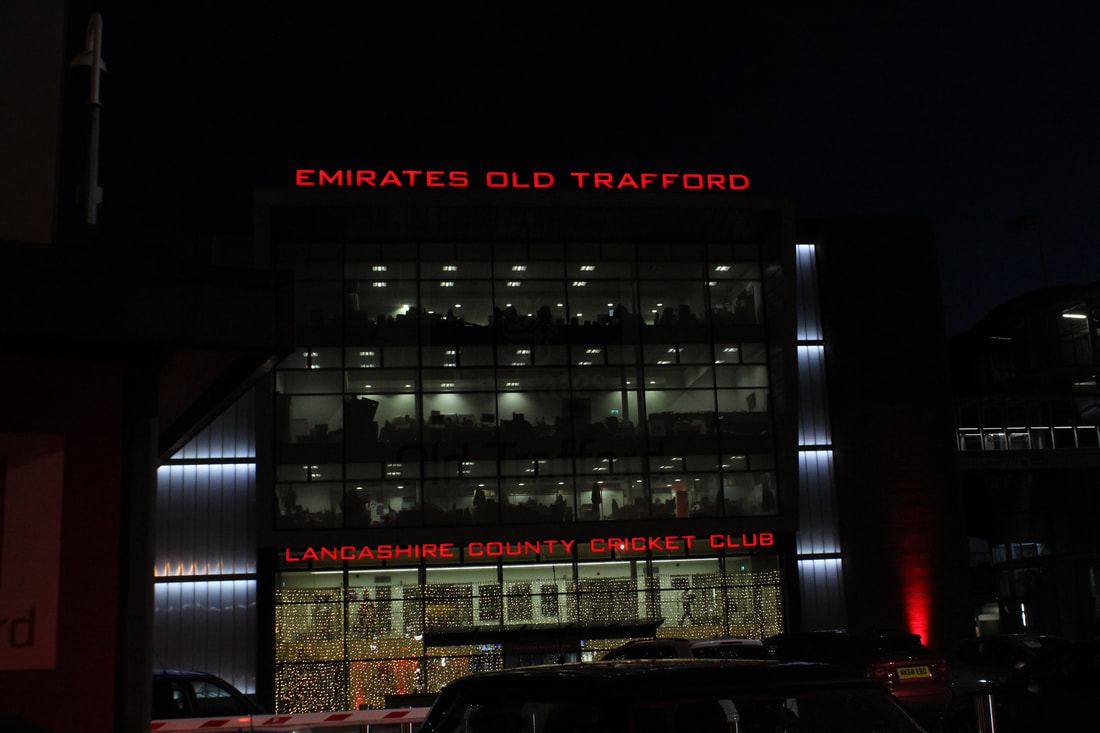
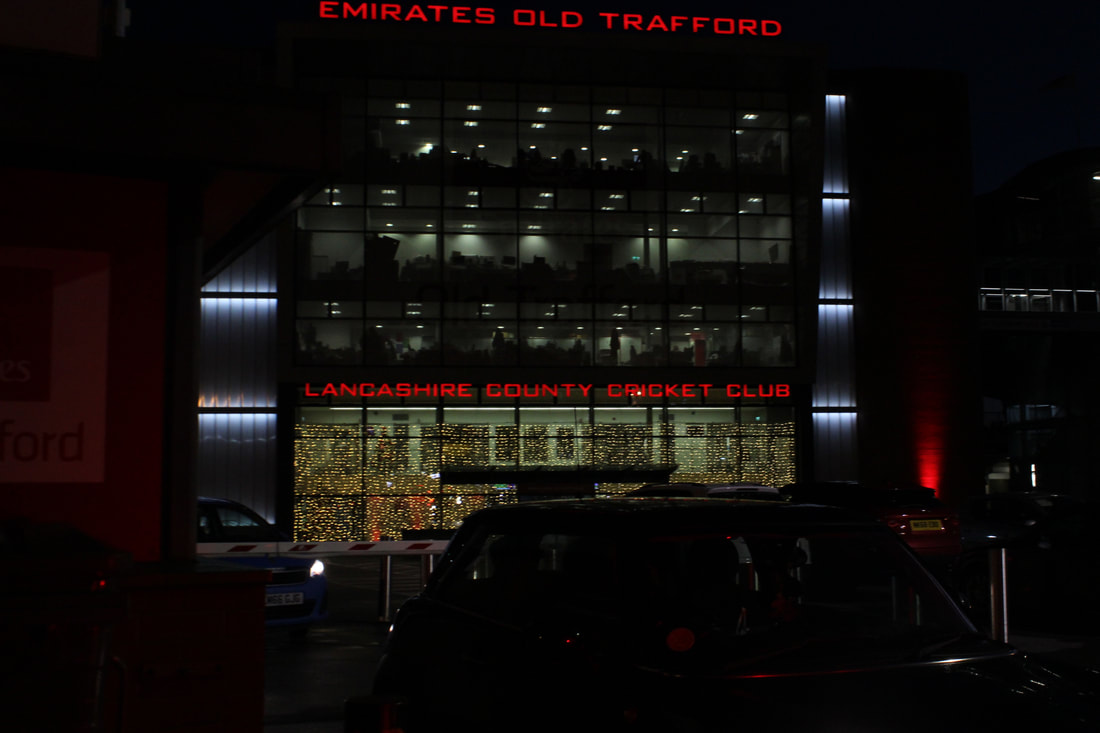
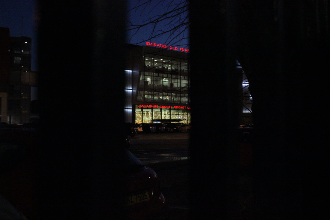
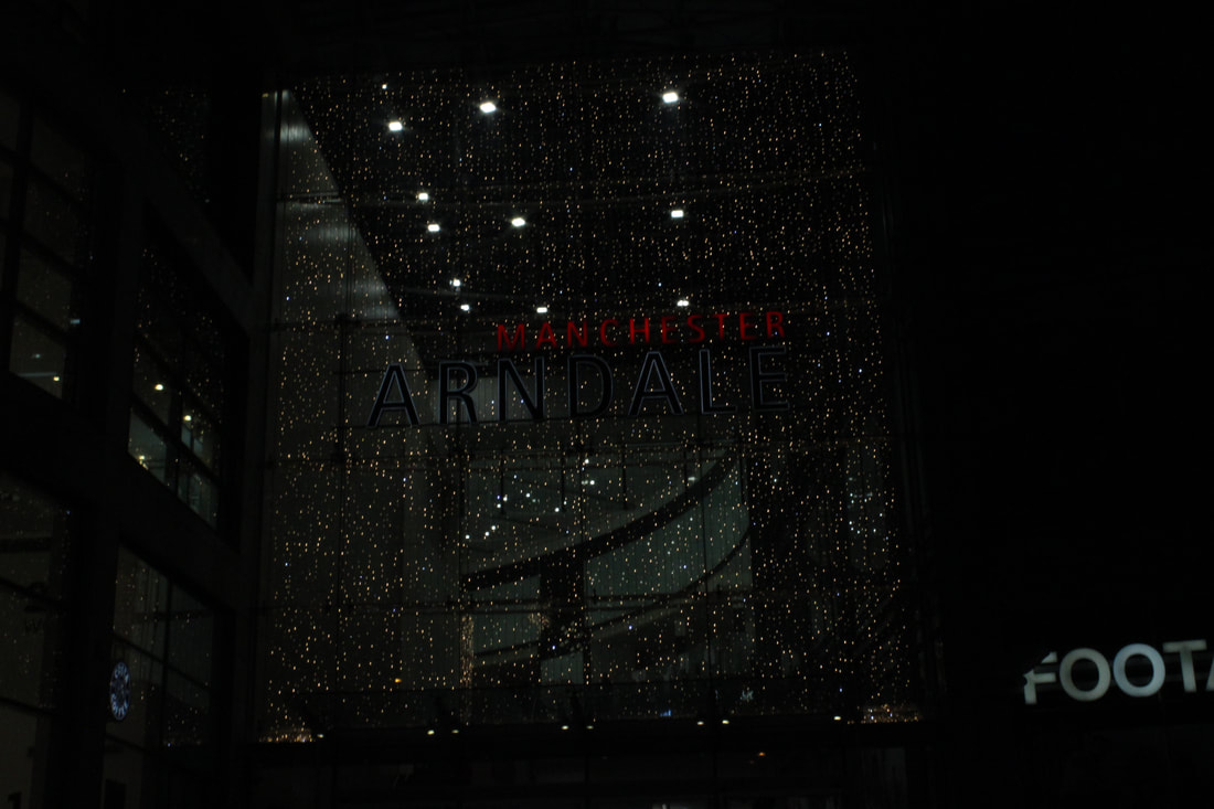
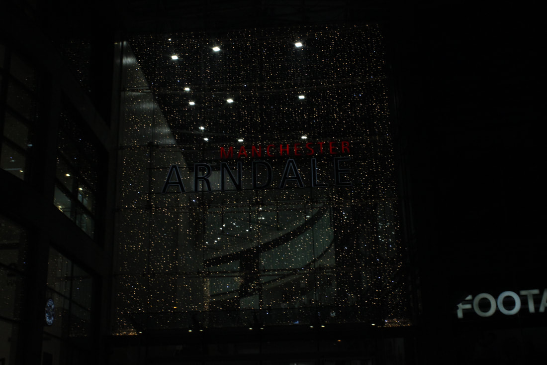
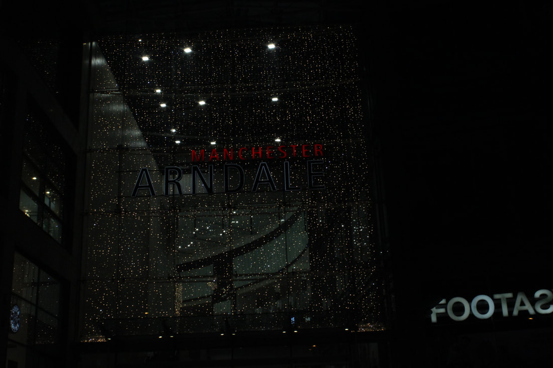
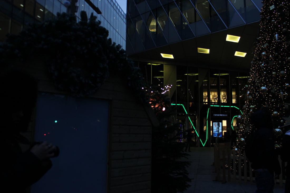
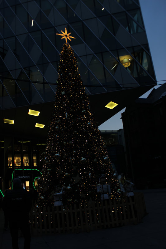
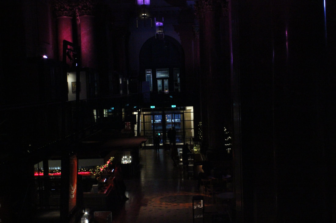
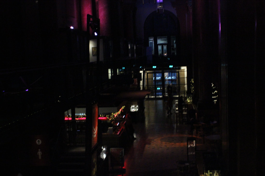
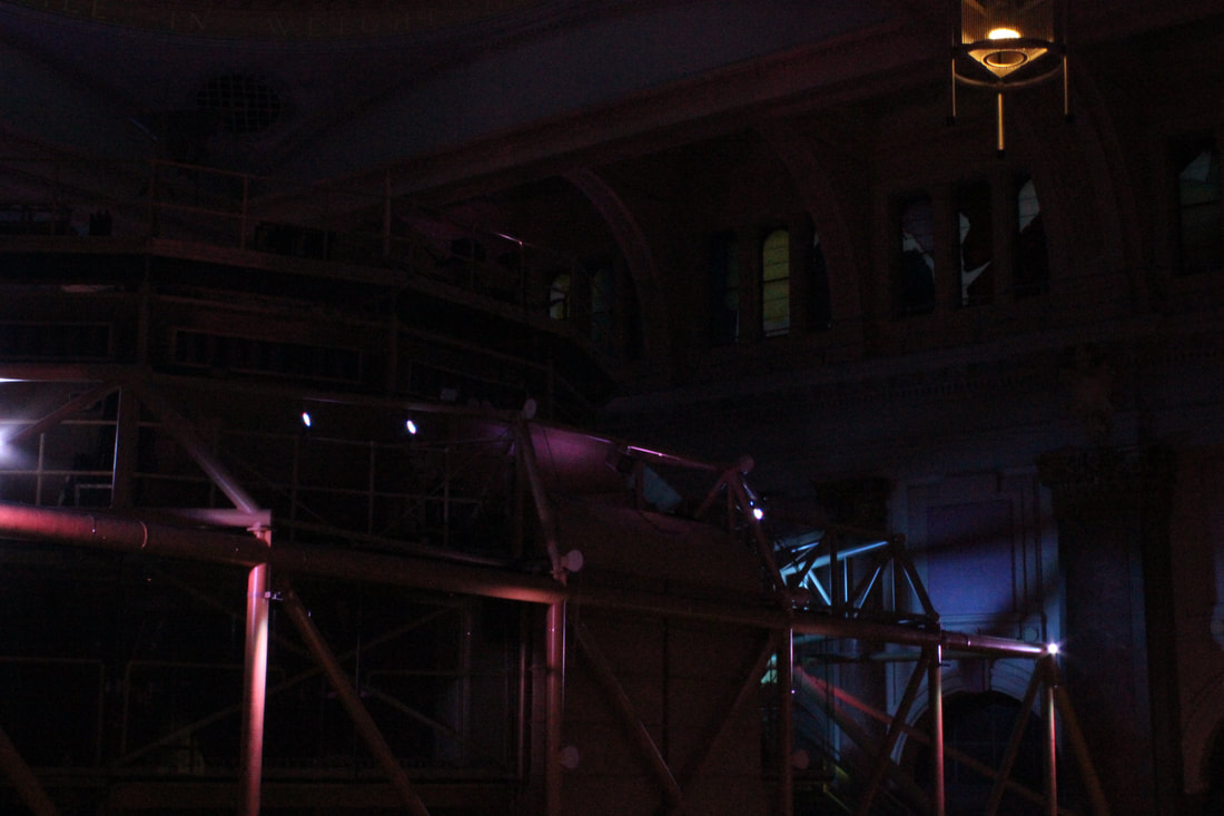
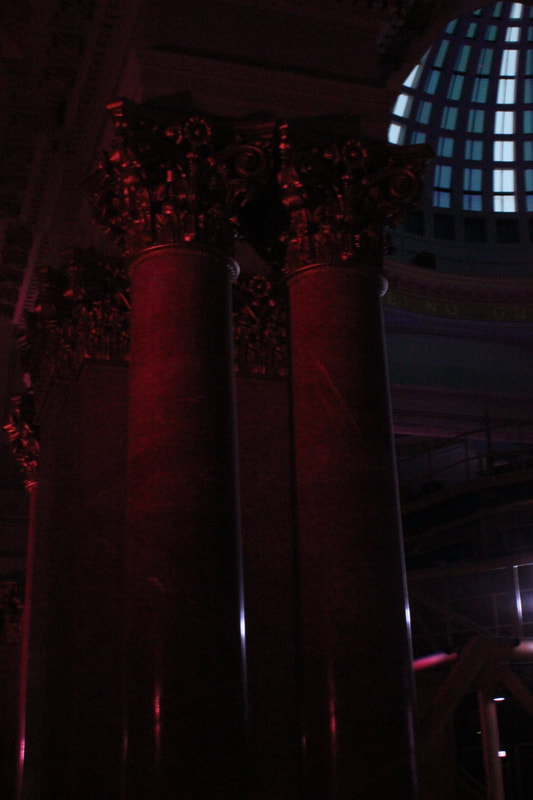
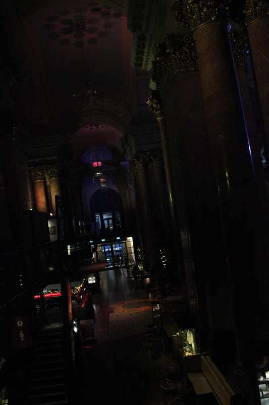
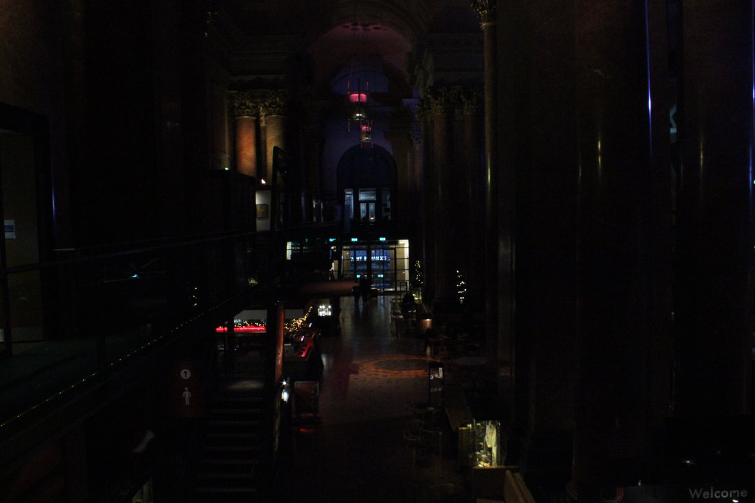
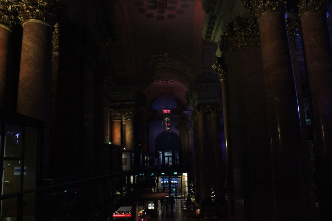
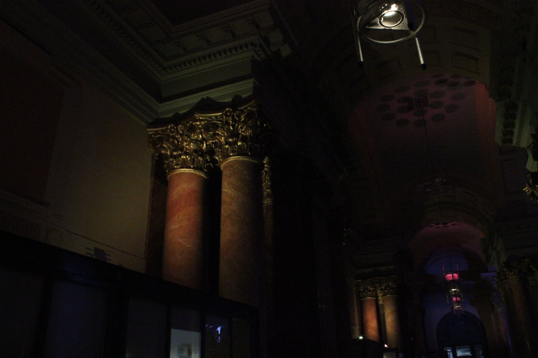
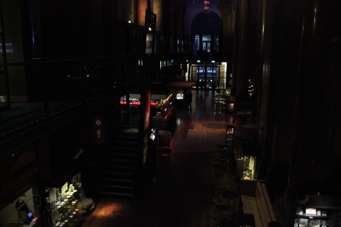
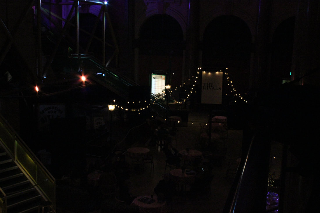
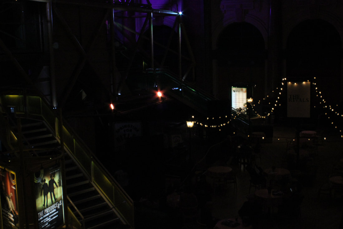
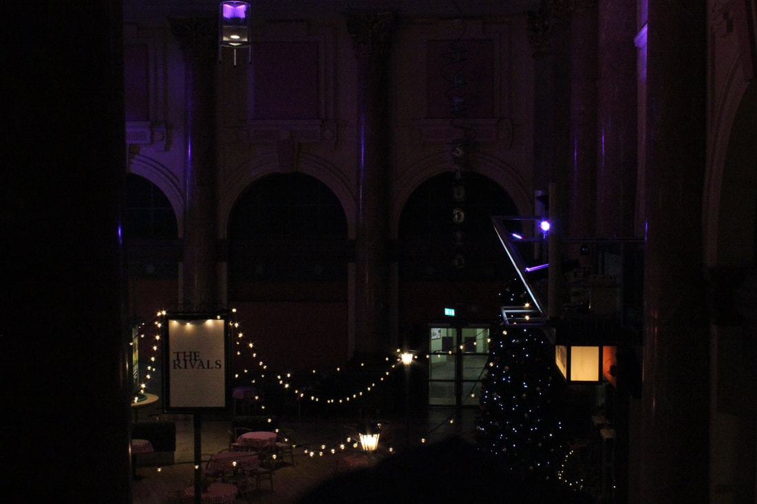
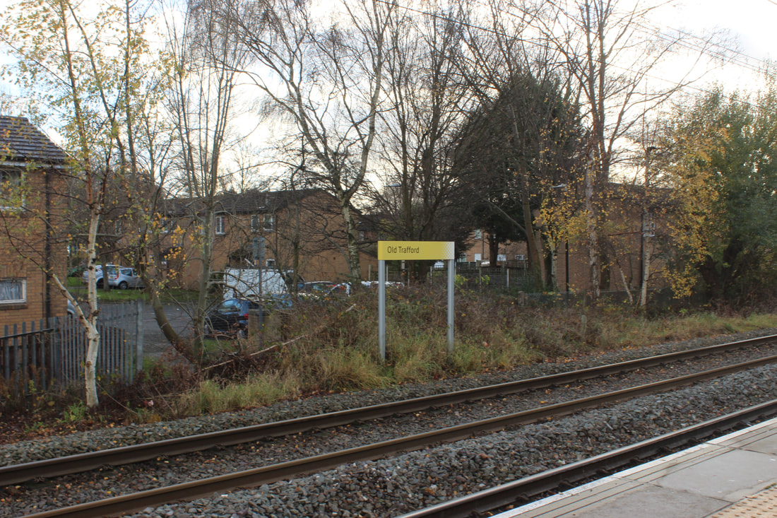
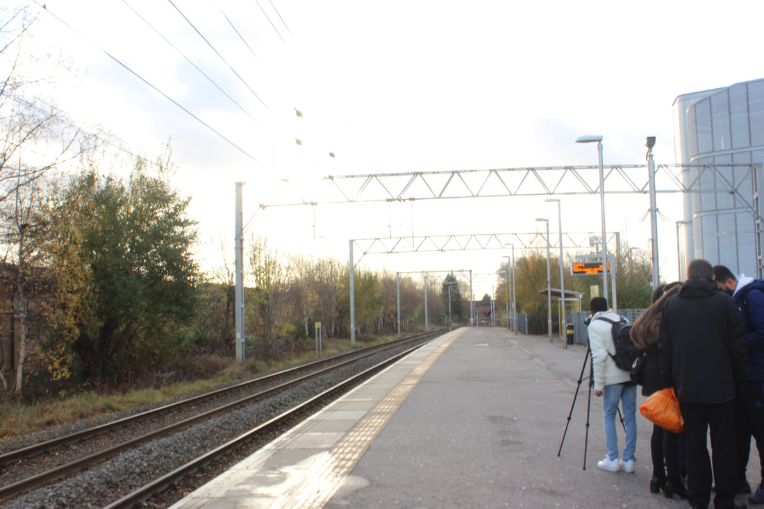
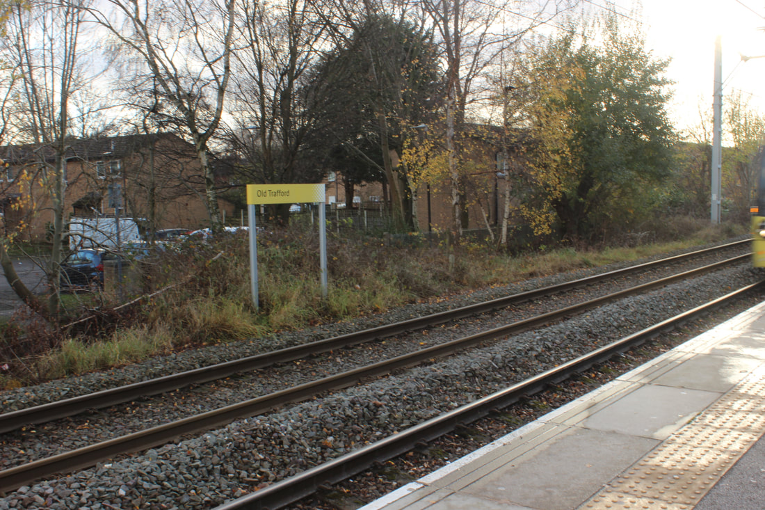
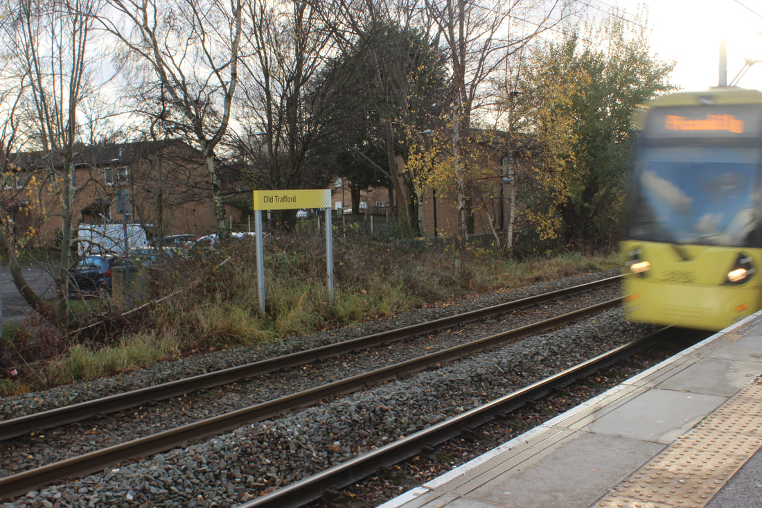
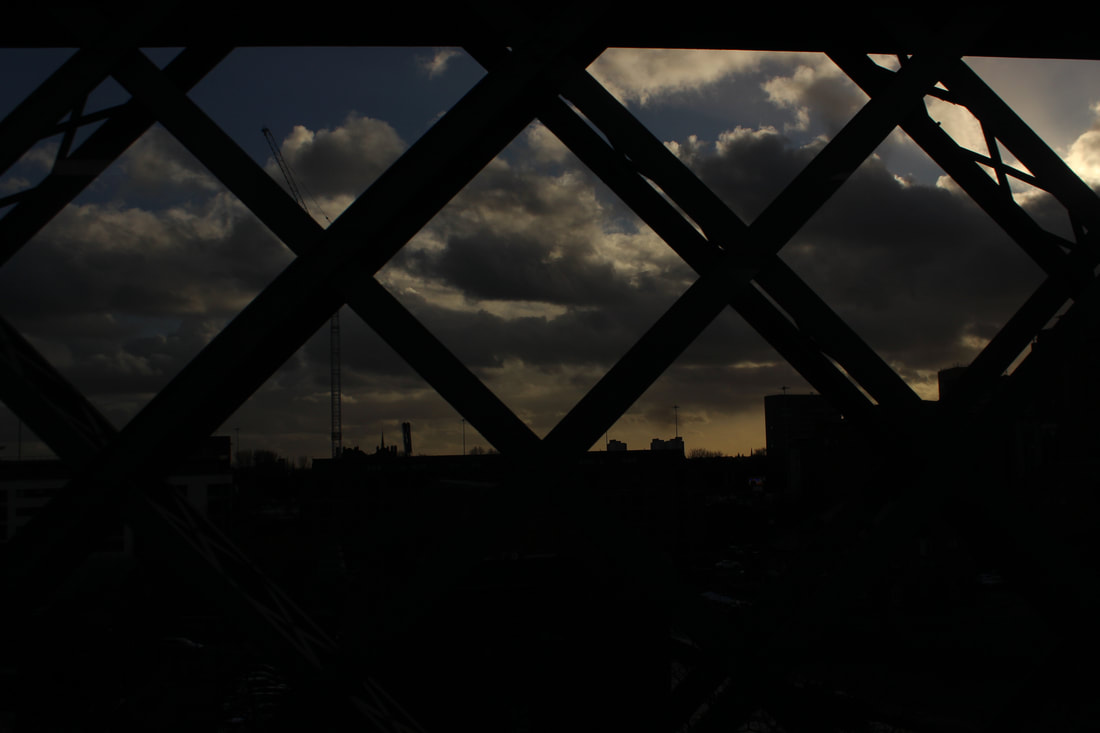
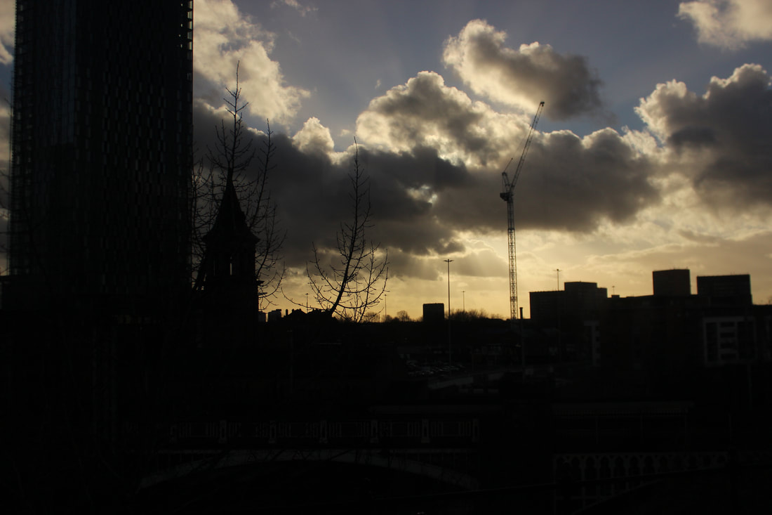
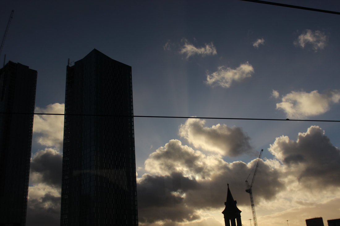
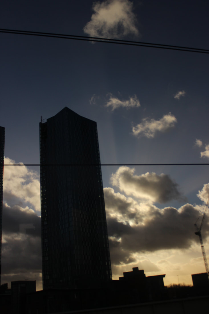
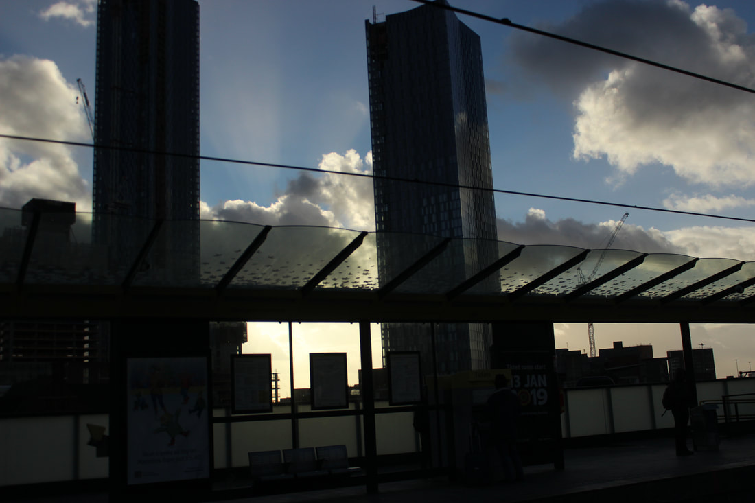
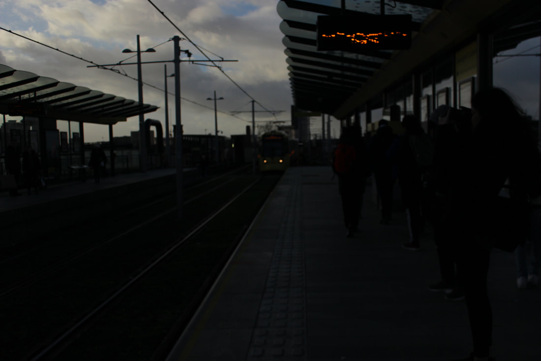
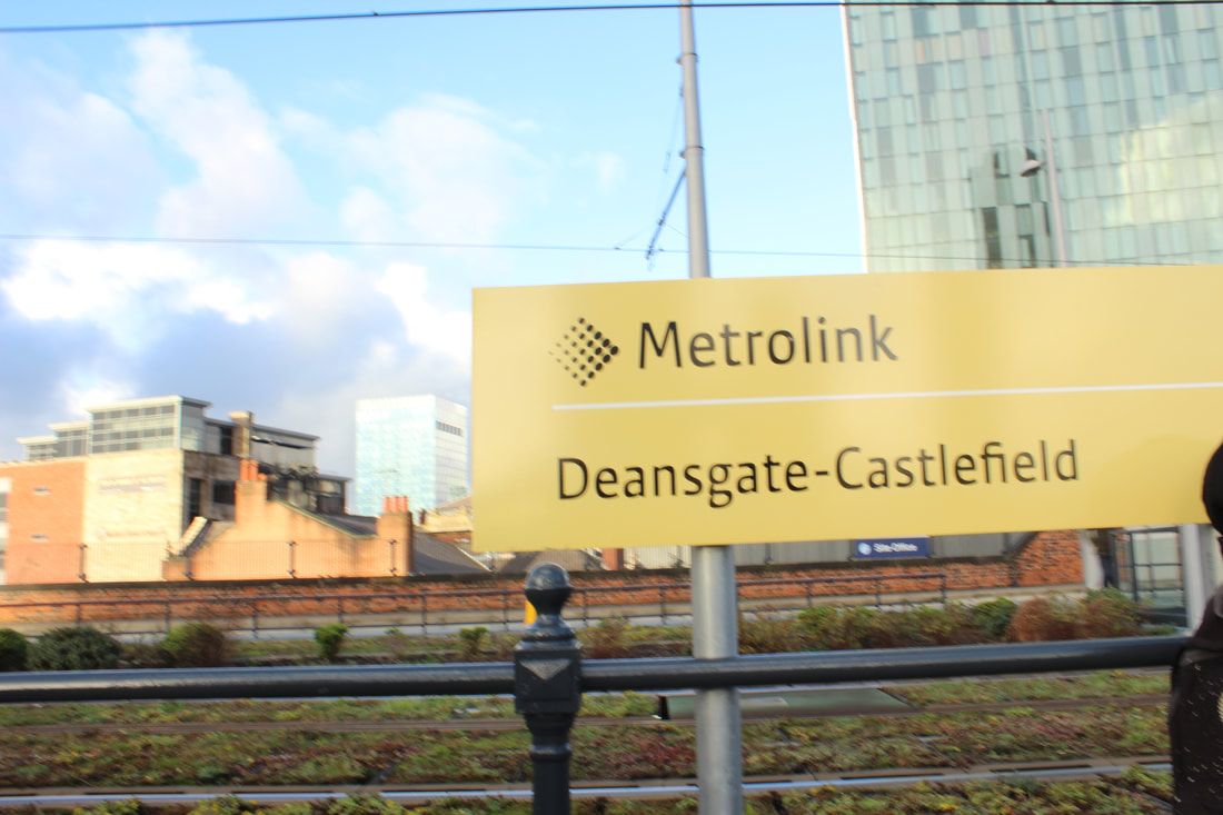
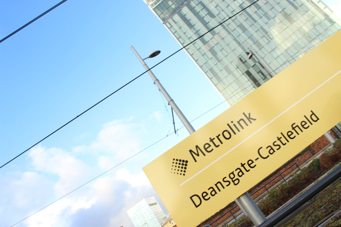
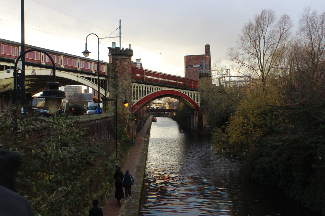
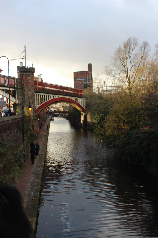
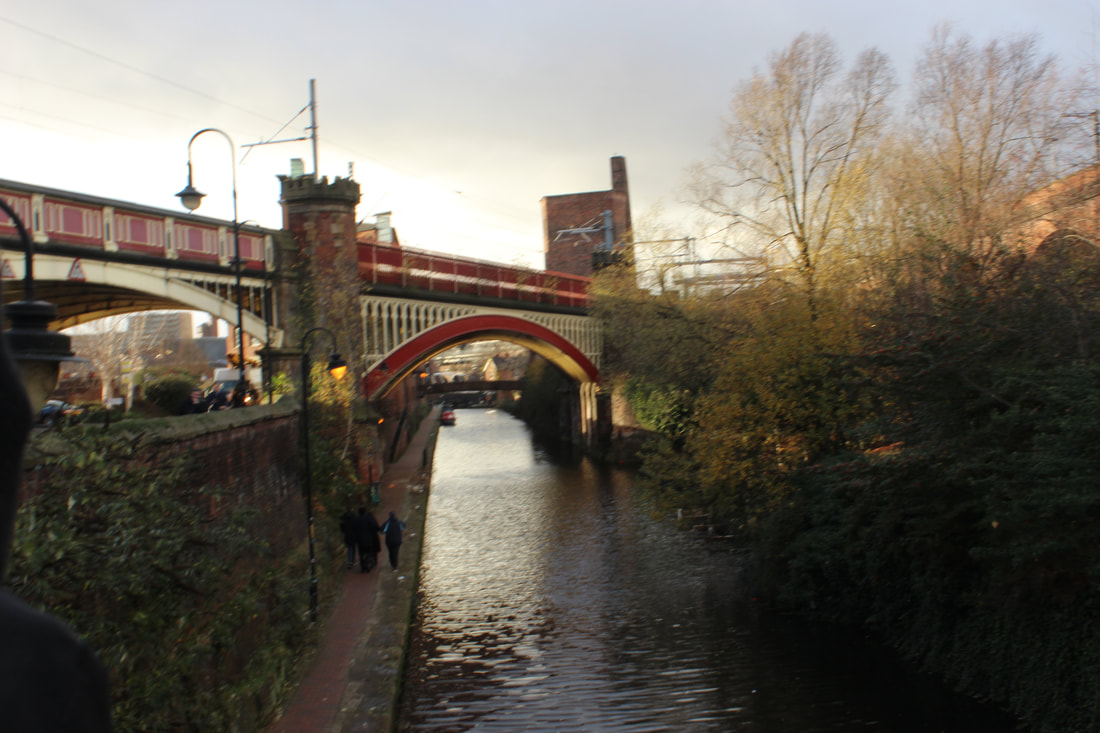
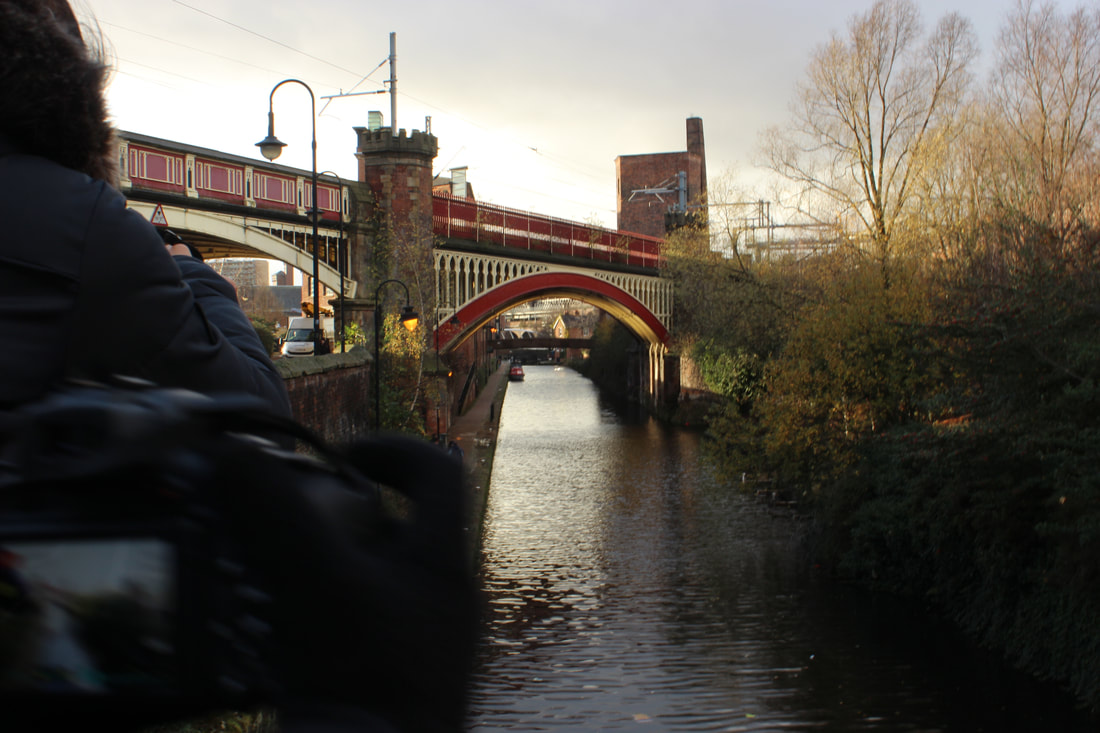
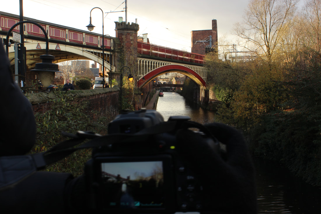
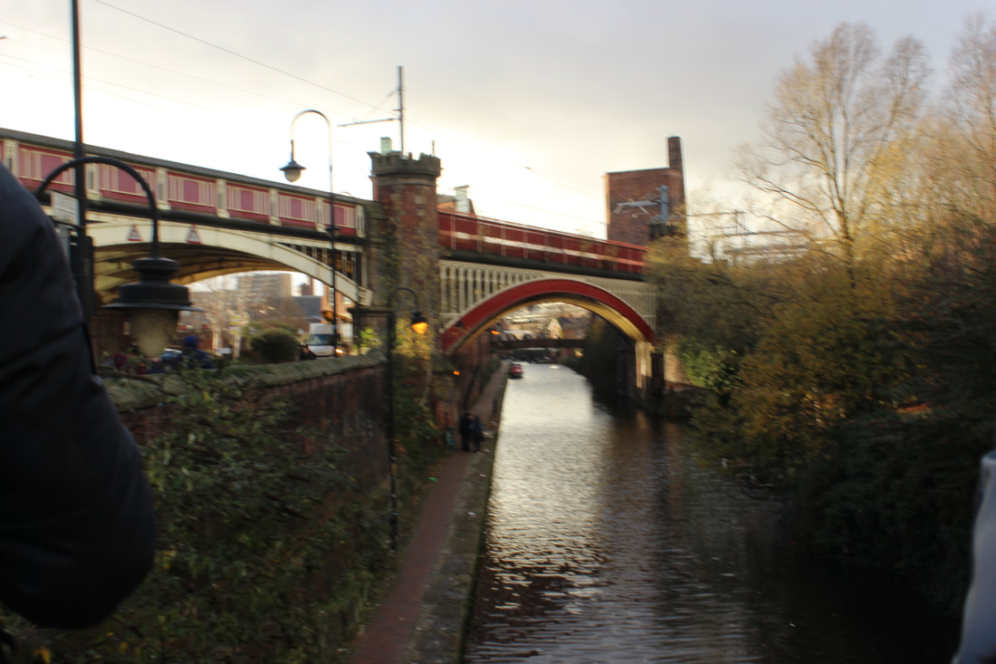
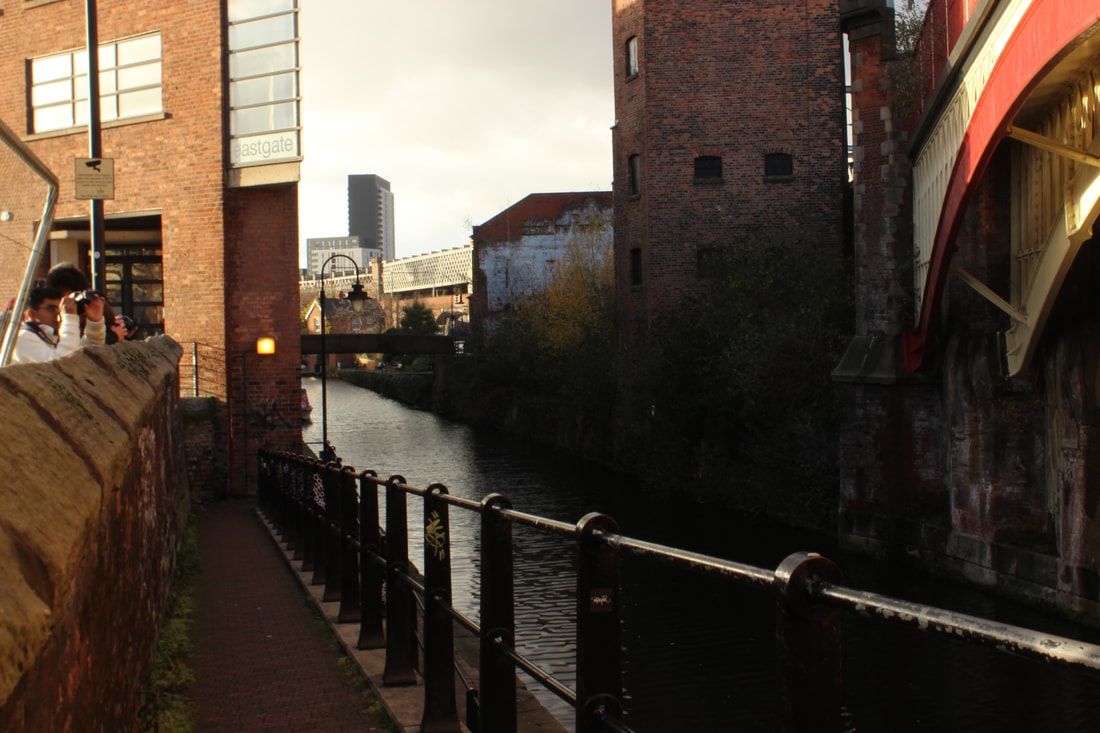
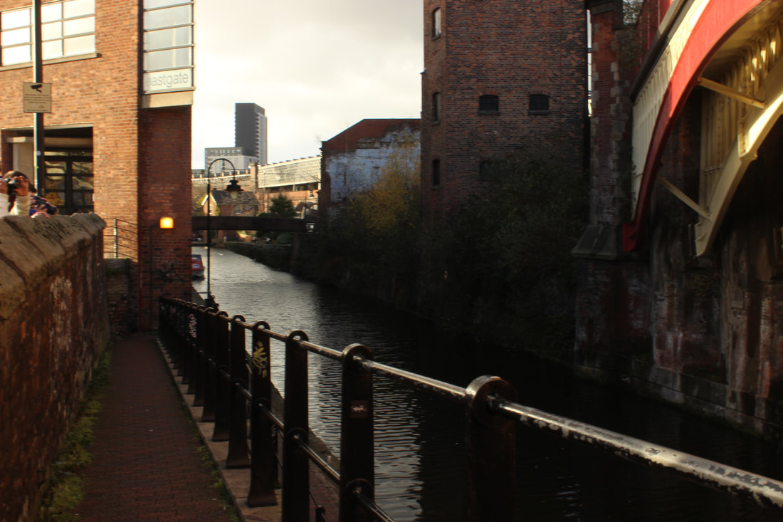
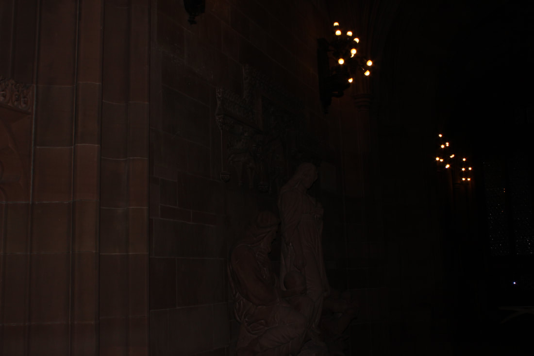
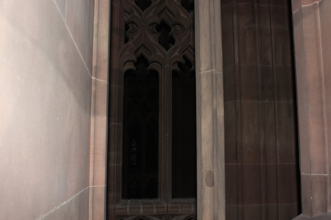
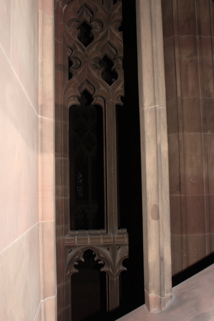
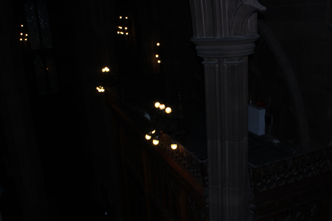
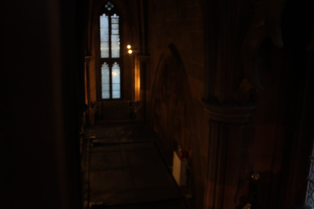
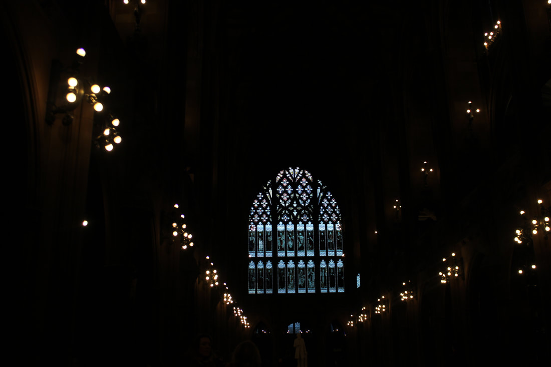
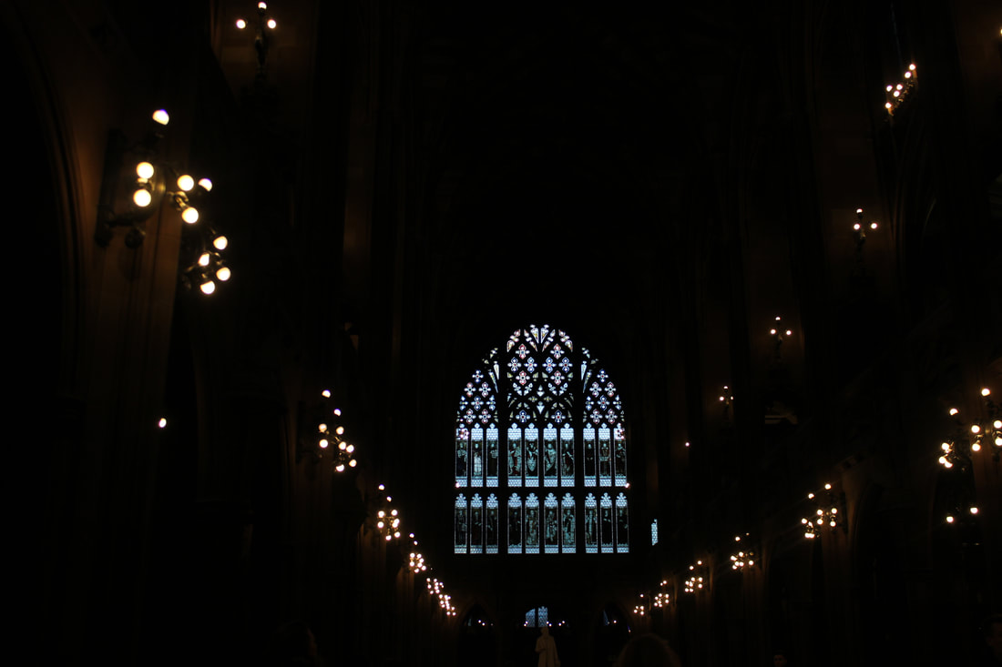
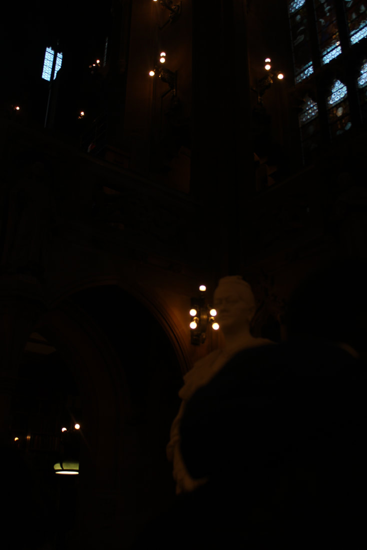
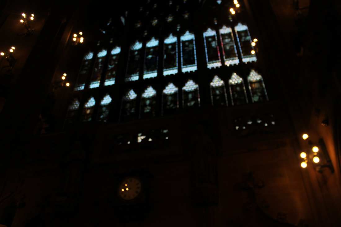
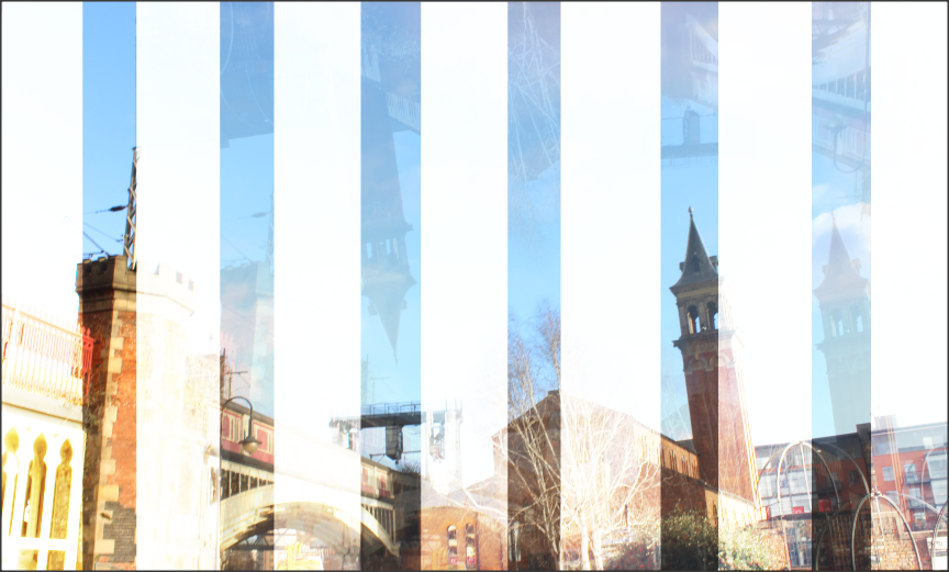
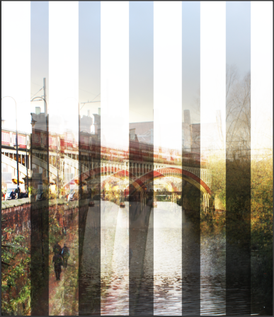
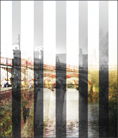
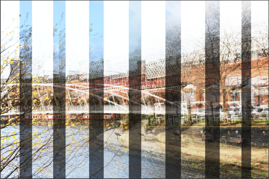
Manchester
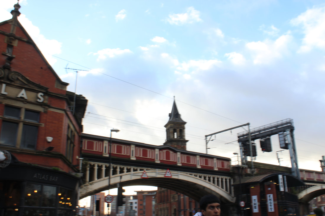
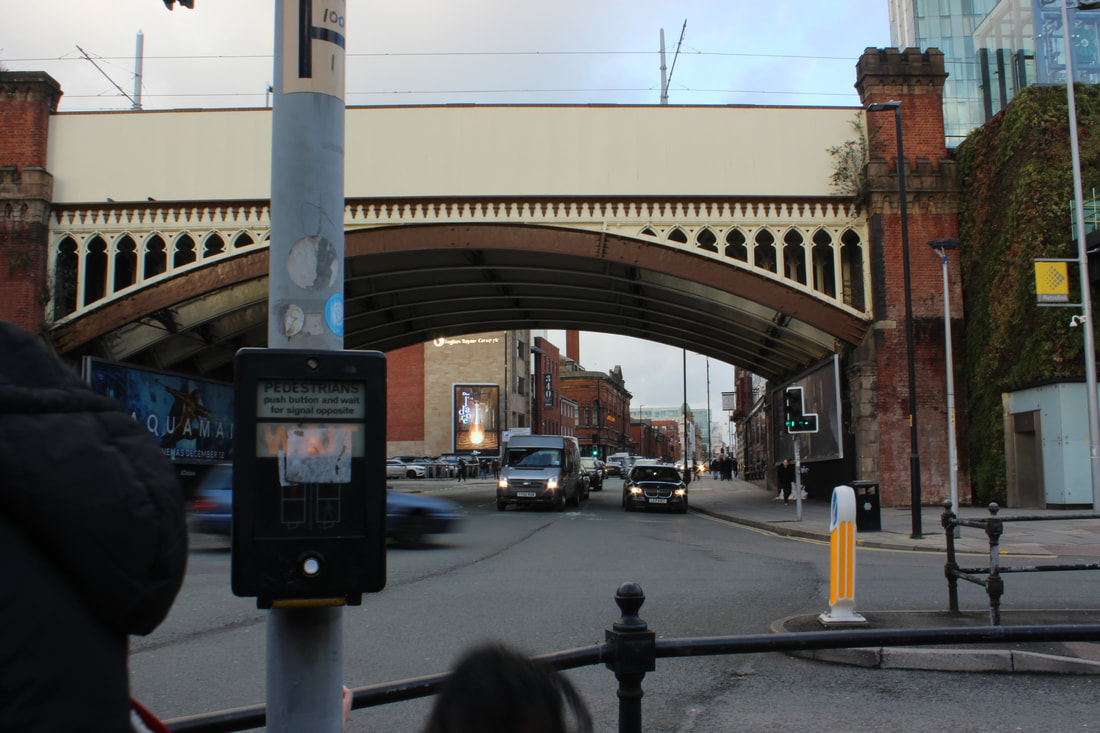
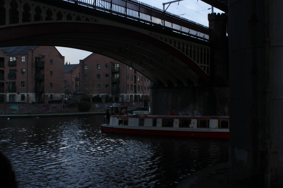
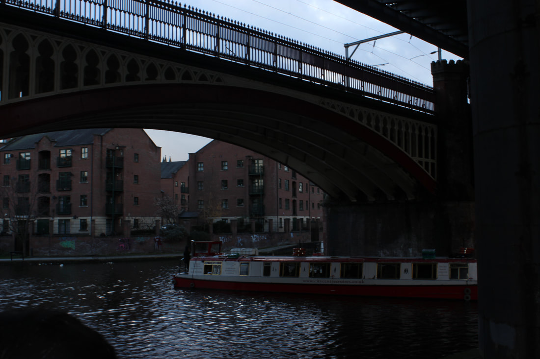
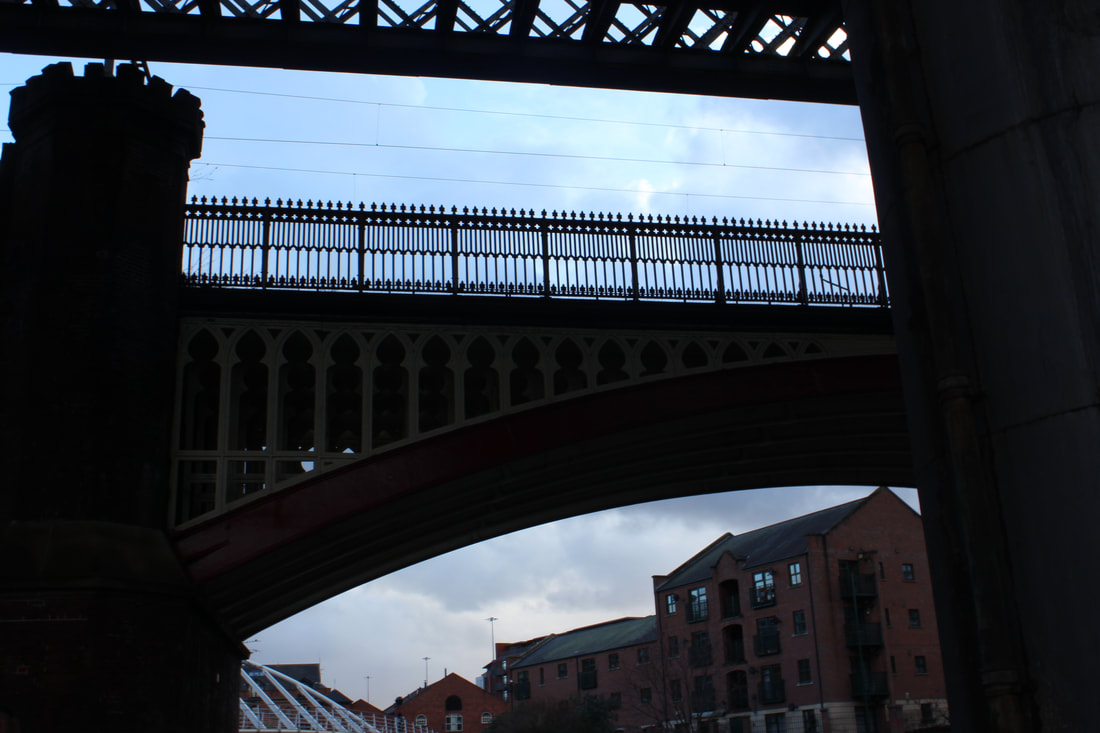
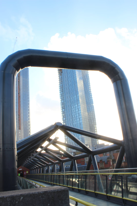
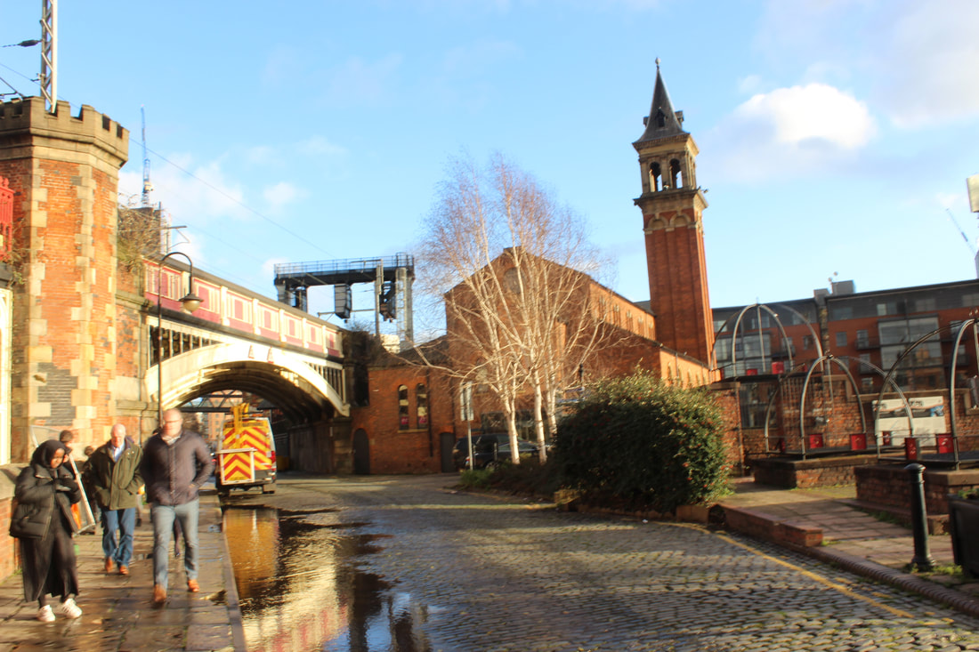
Bridges

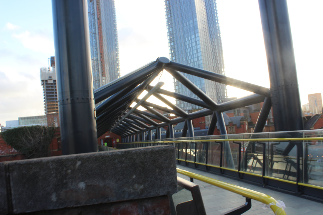
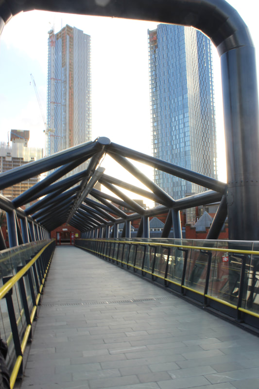
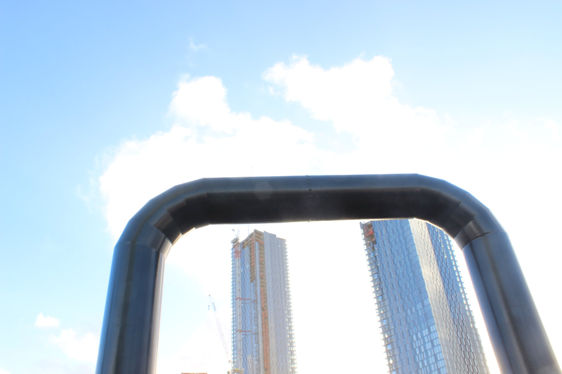
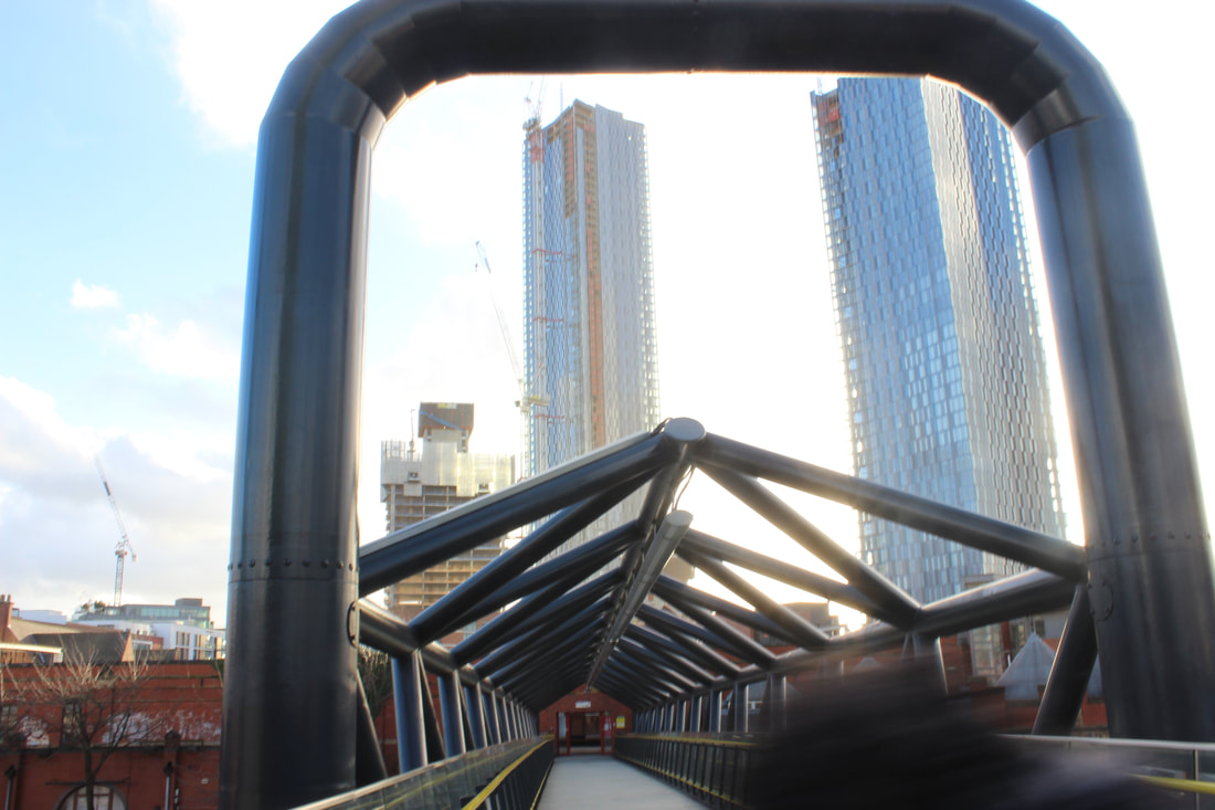
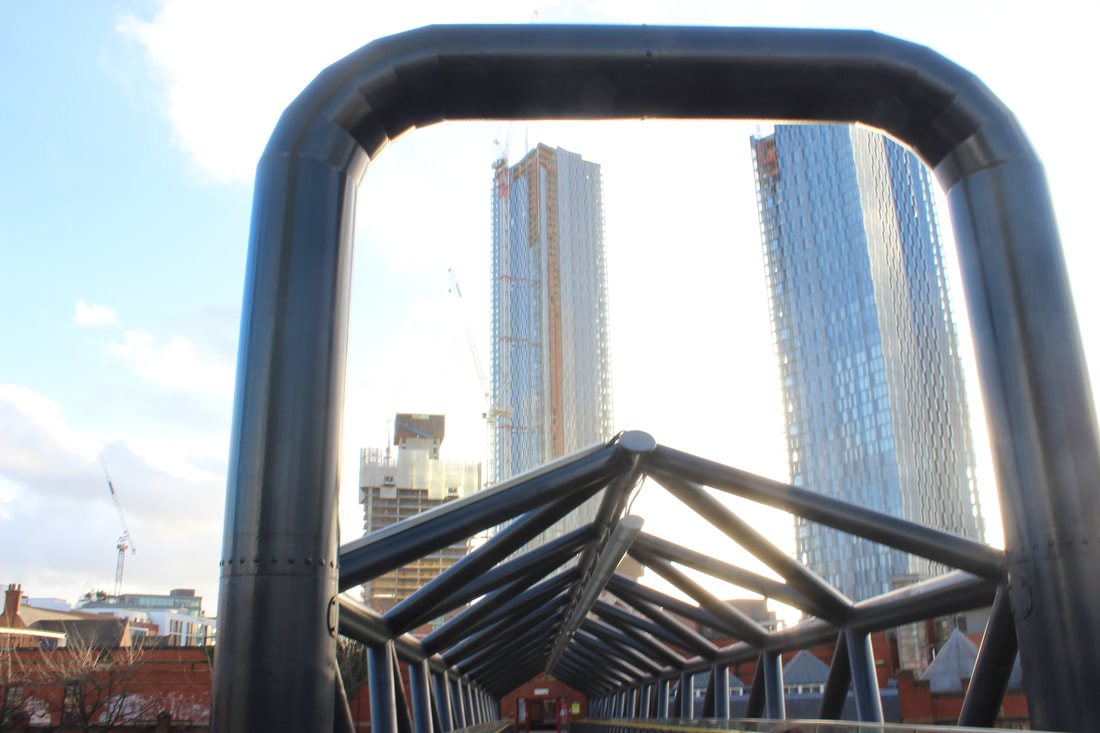
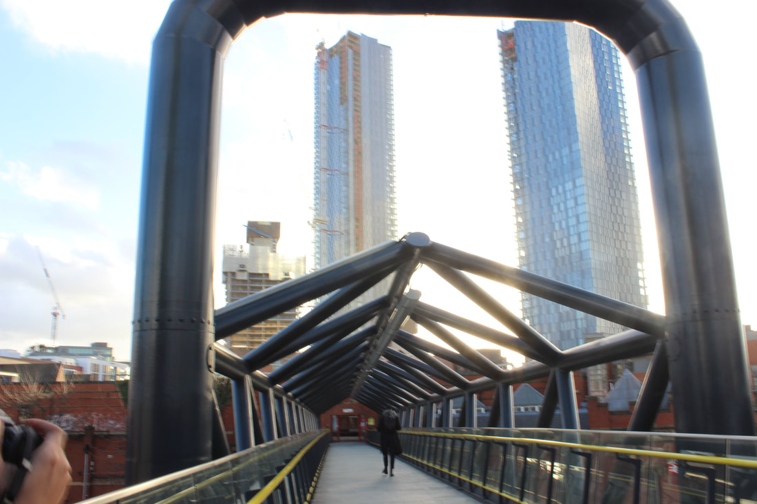
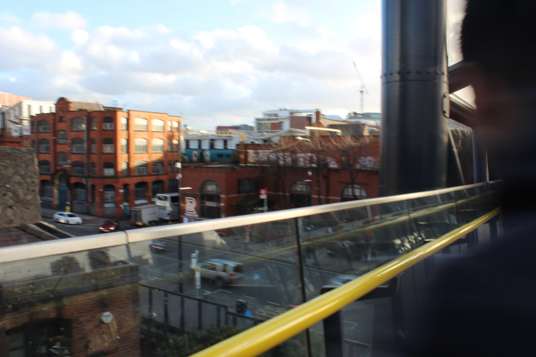
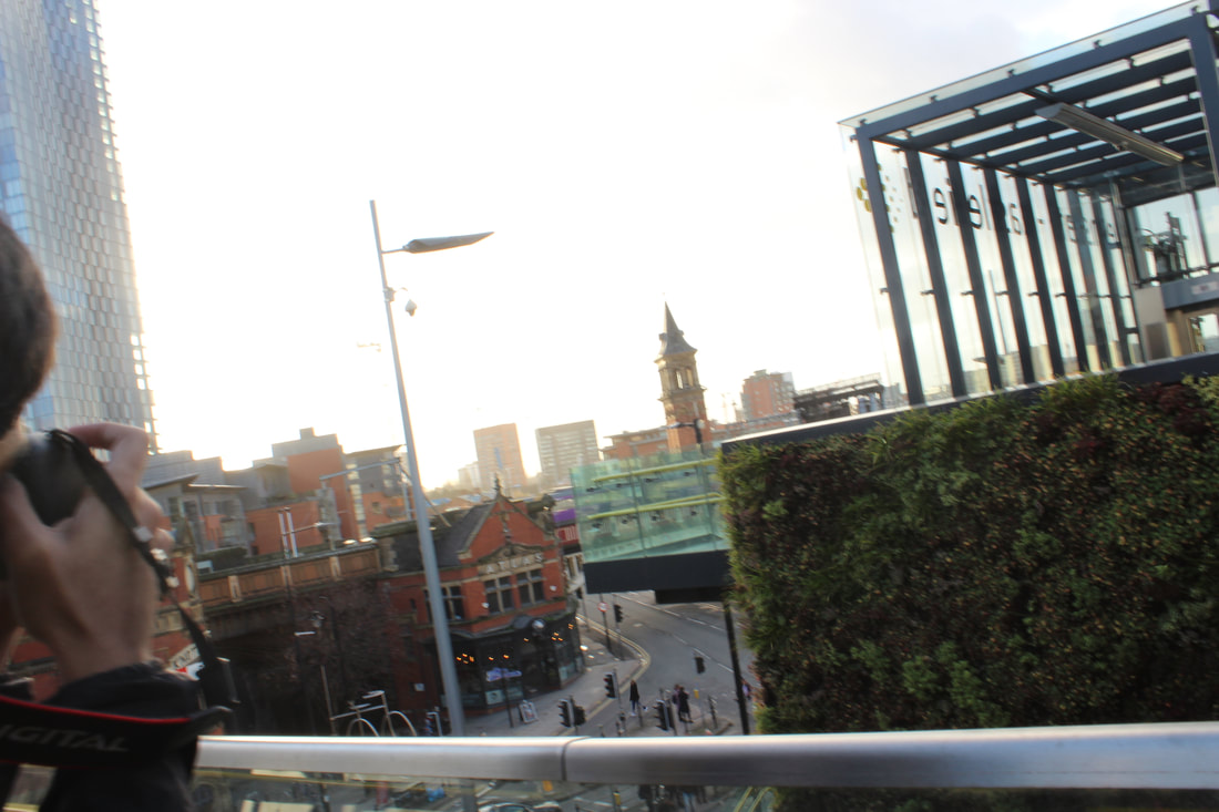
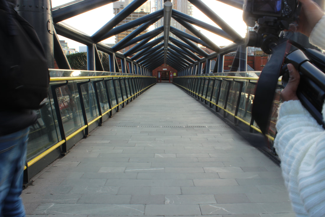

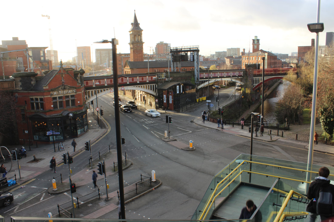
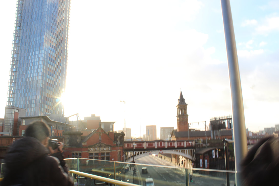
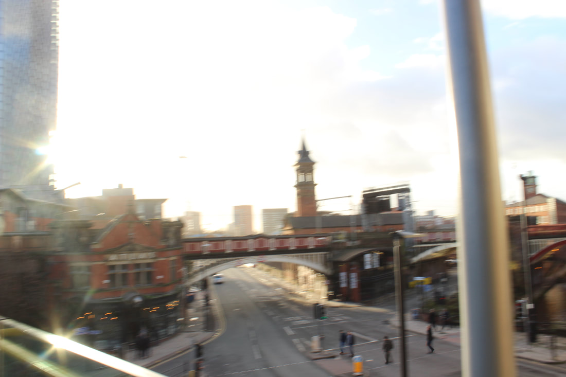
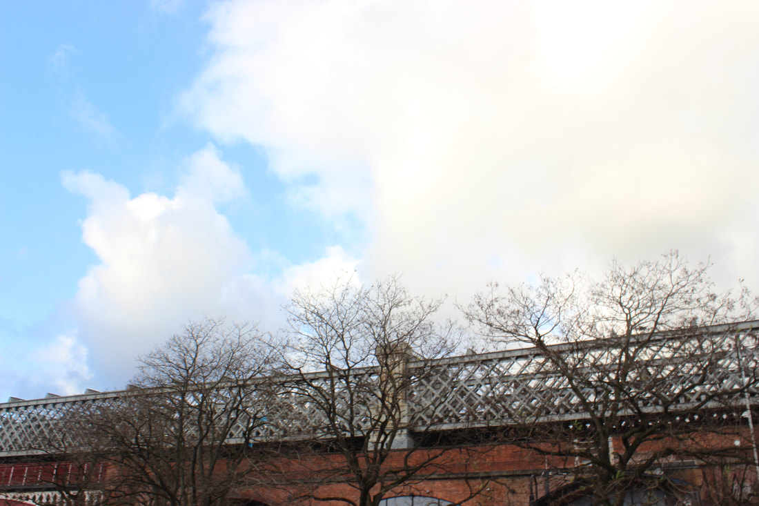
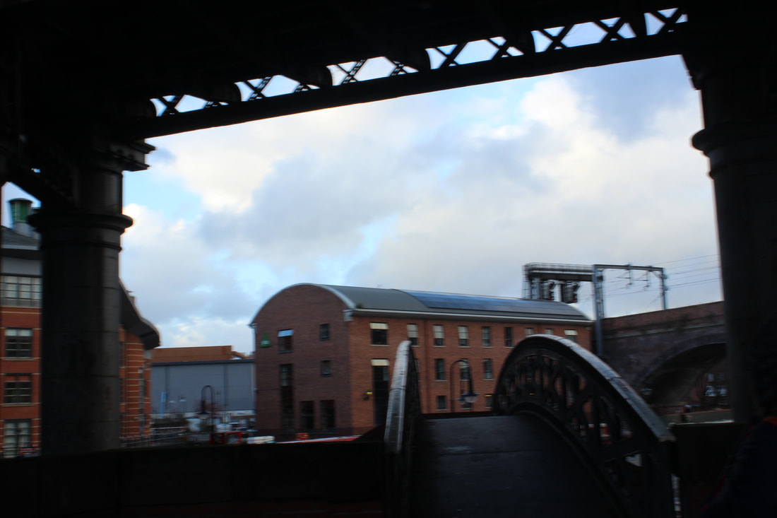
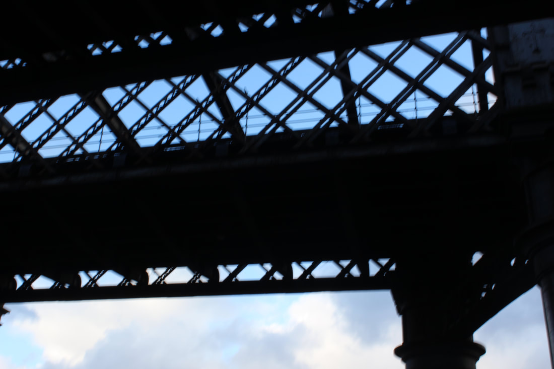
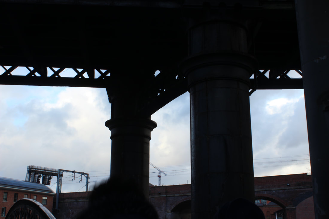
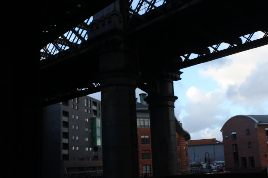
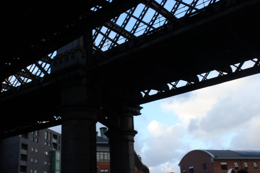
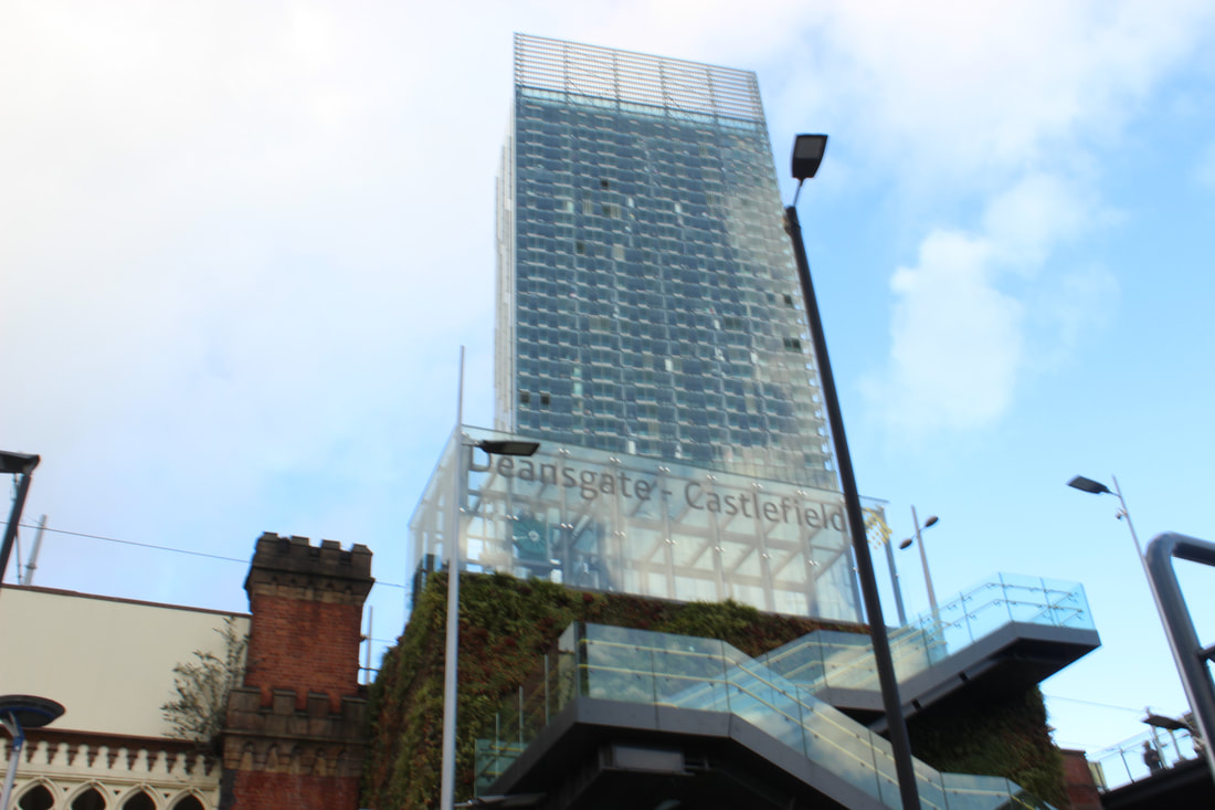
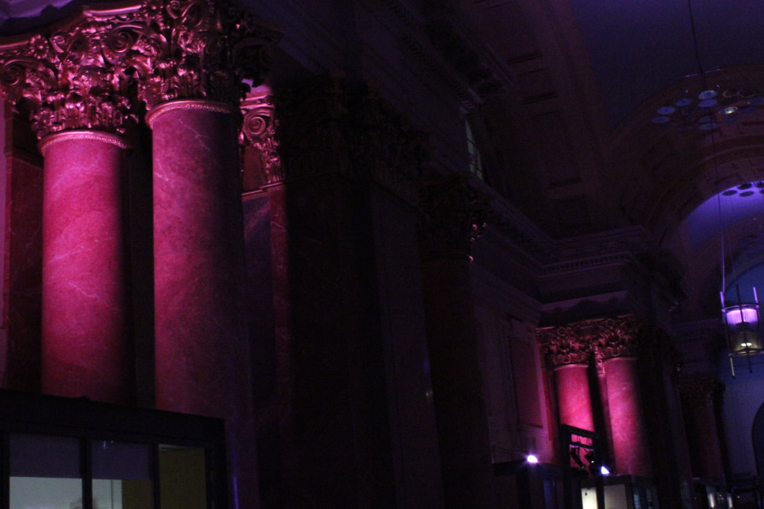
Buildings

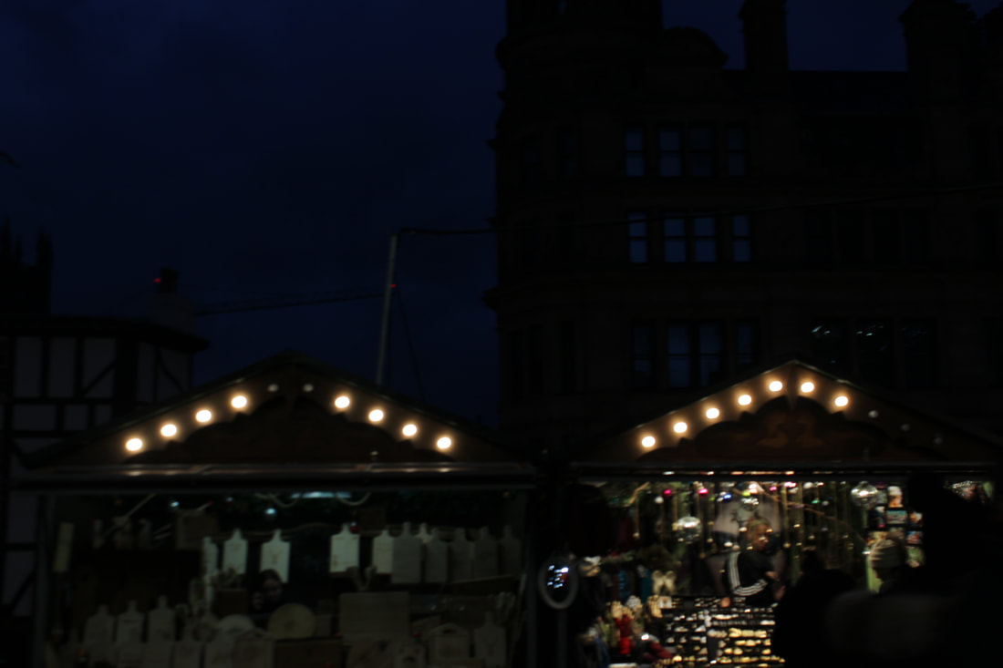
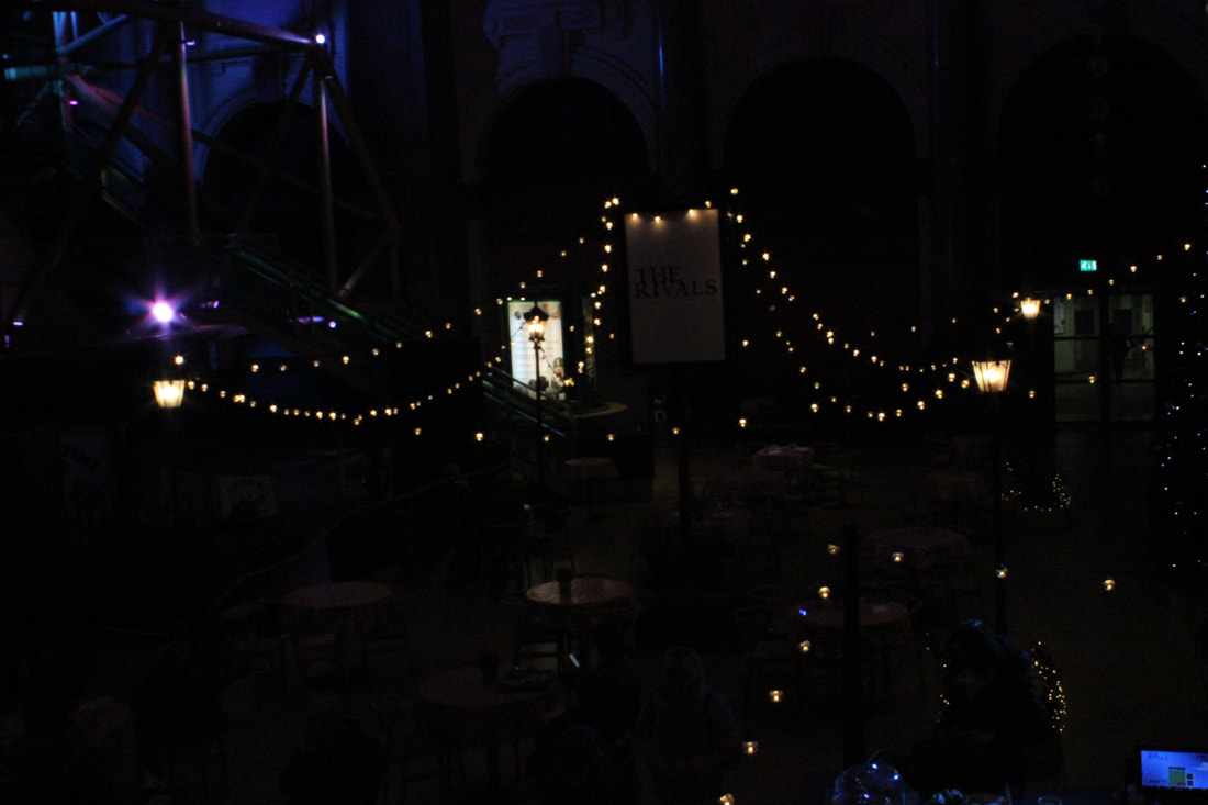
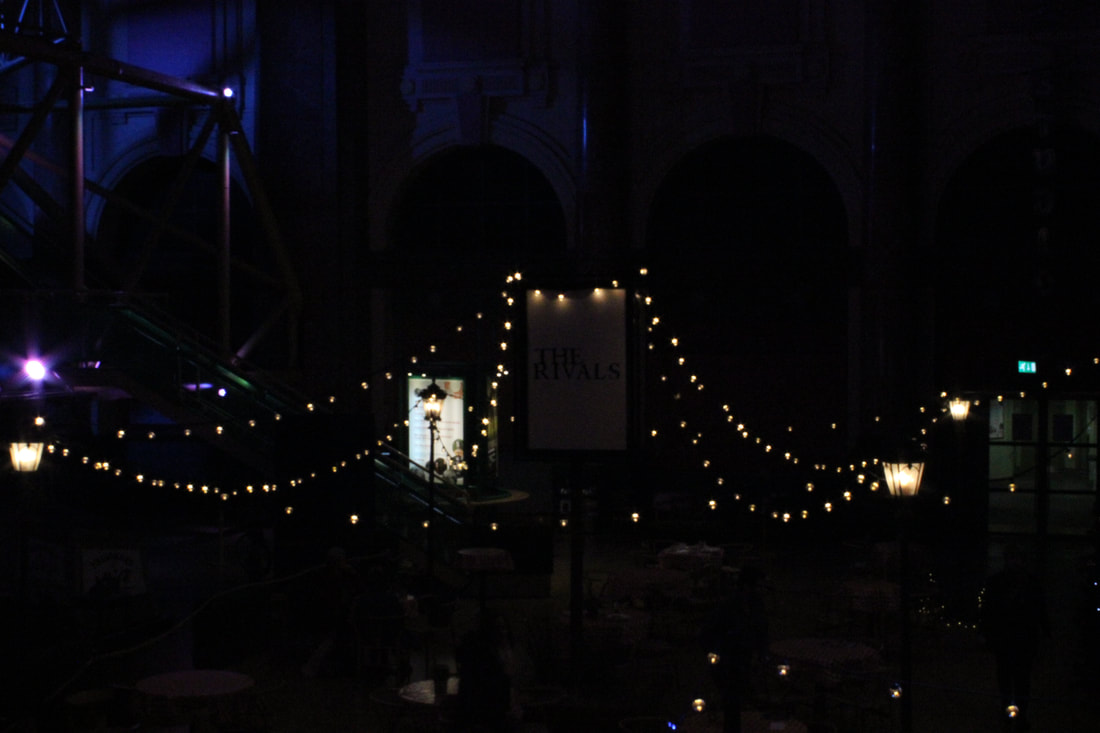
Christmas Market
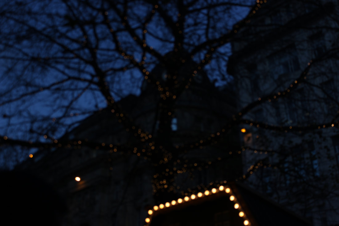
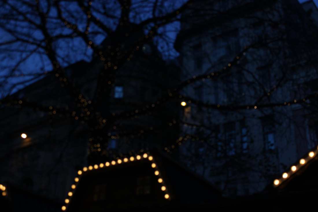
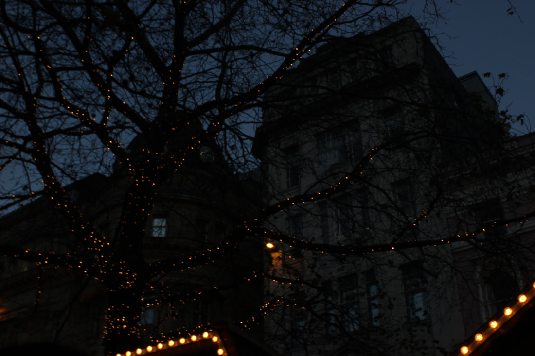
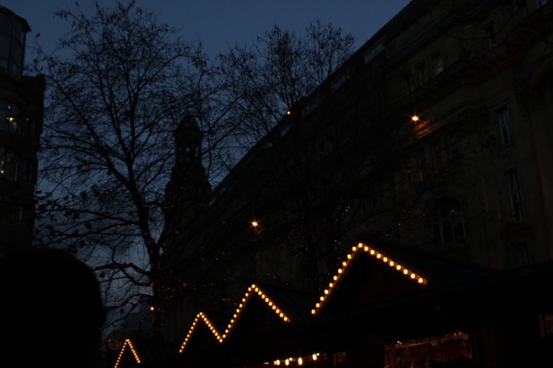
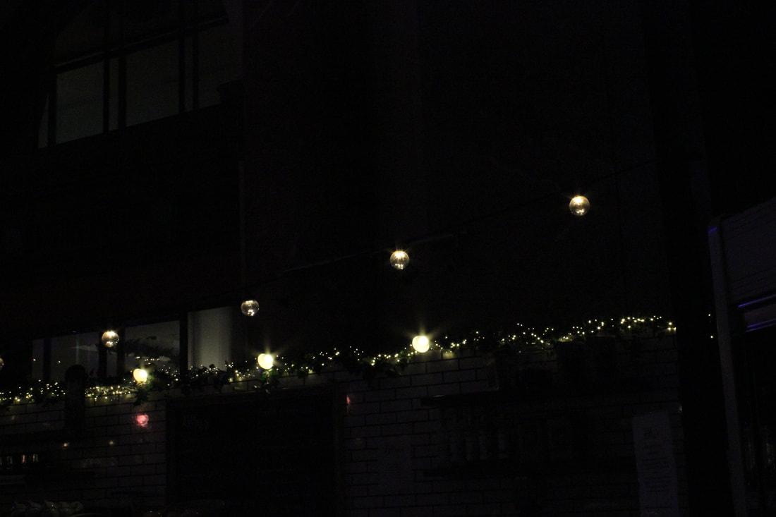
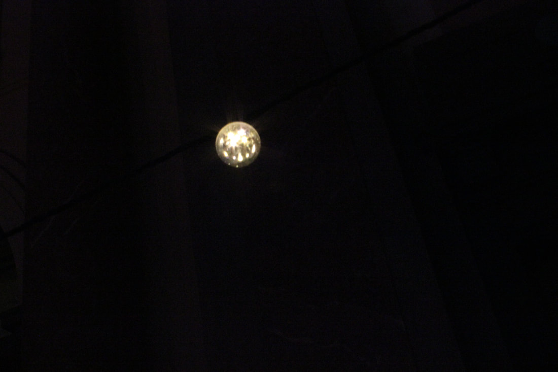
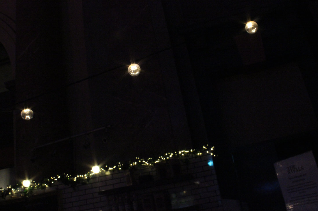
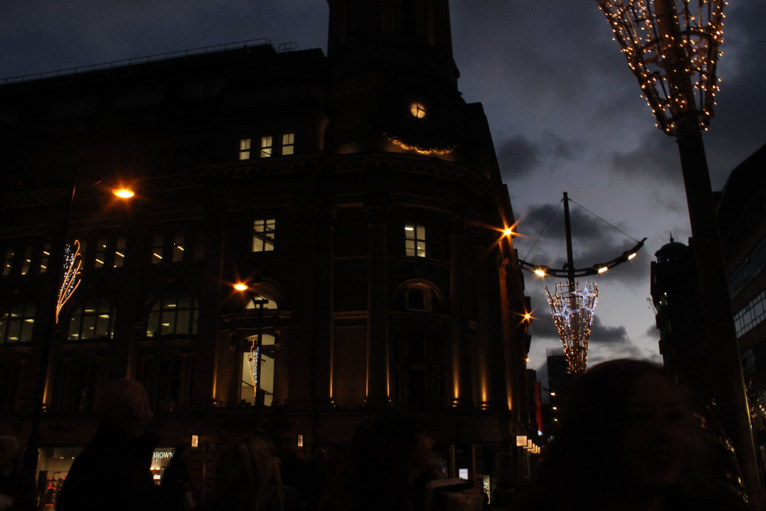
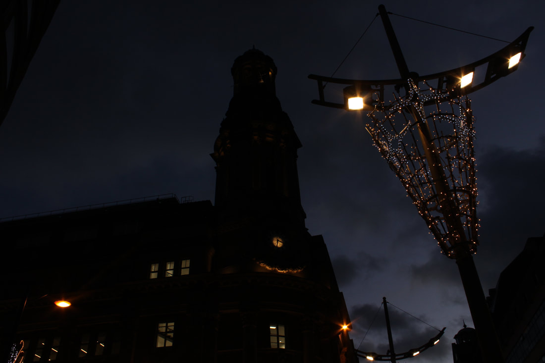
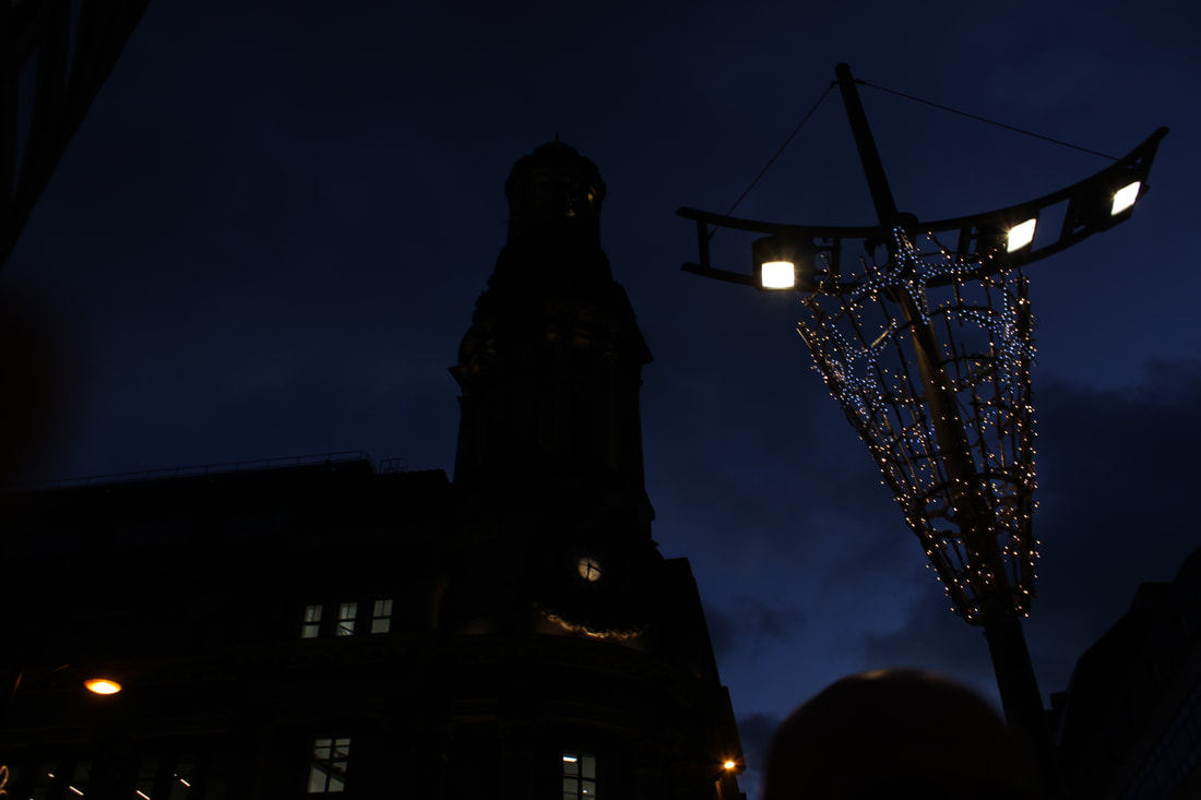
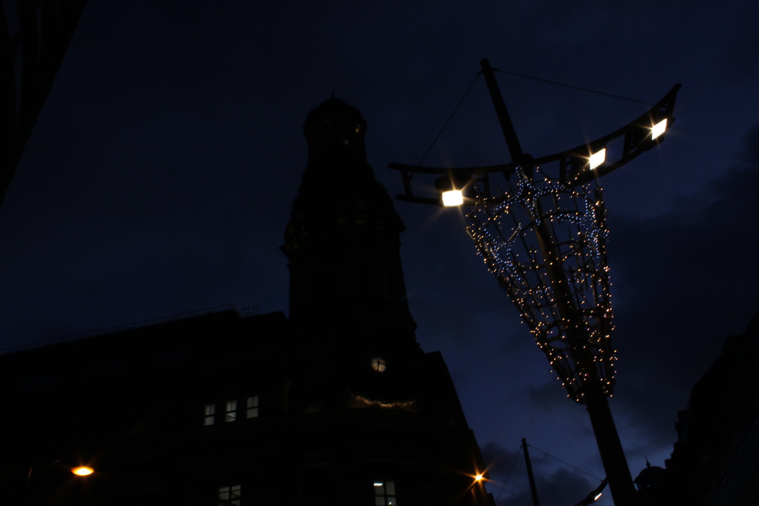
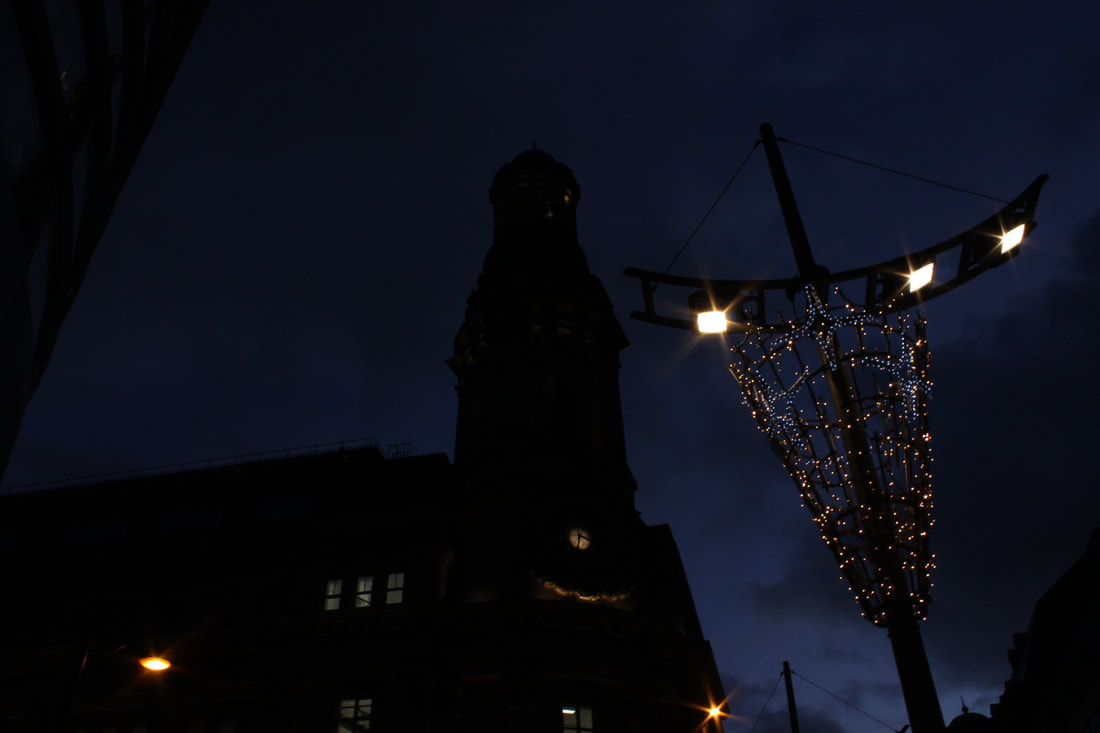
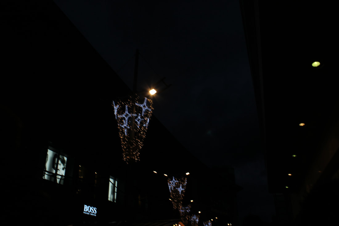
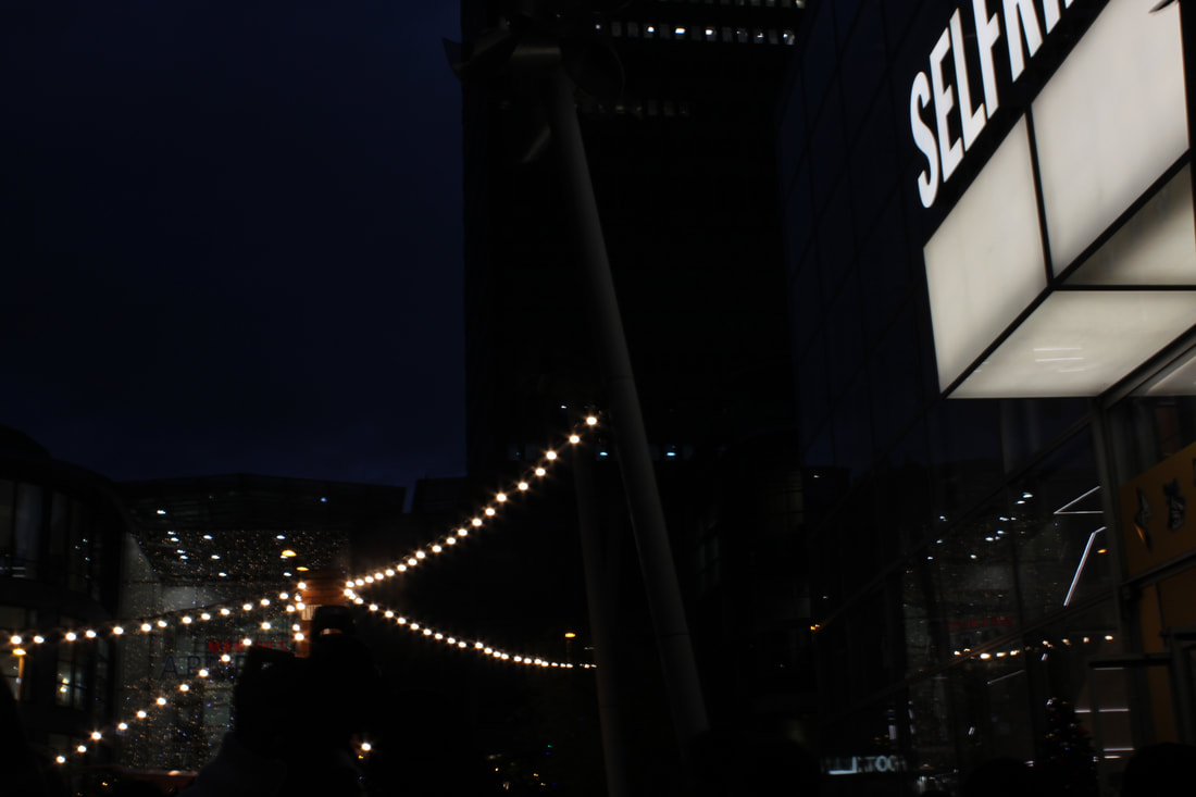
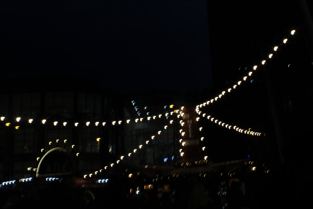
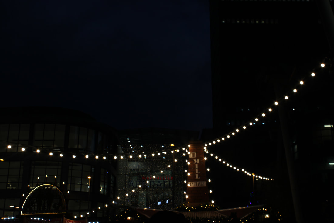
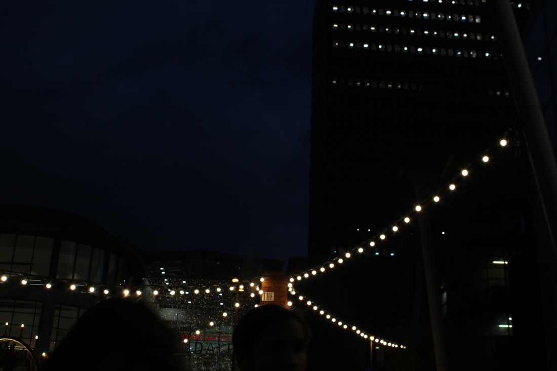
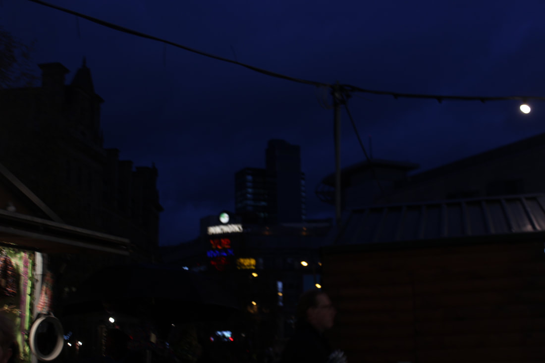
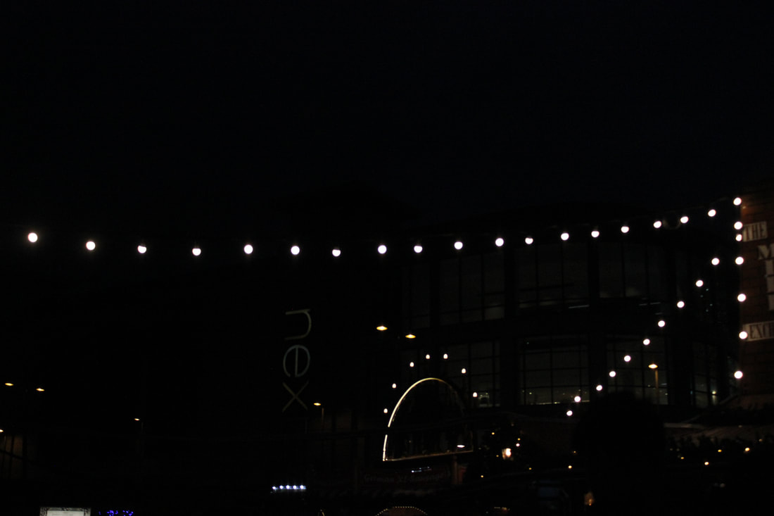
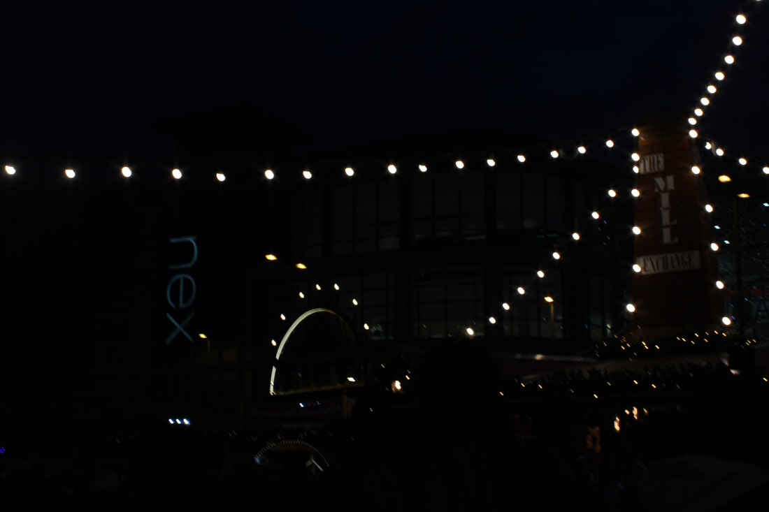
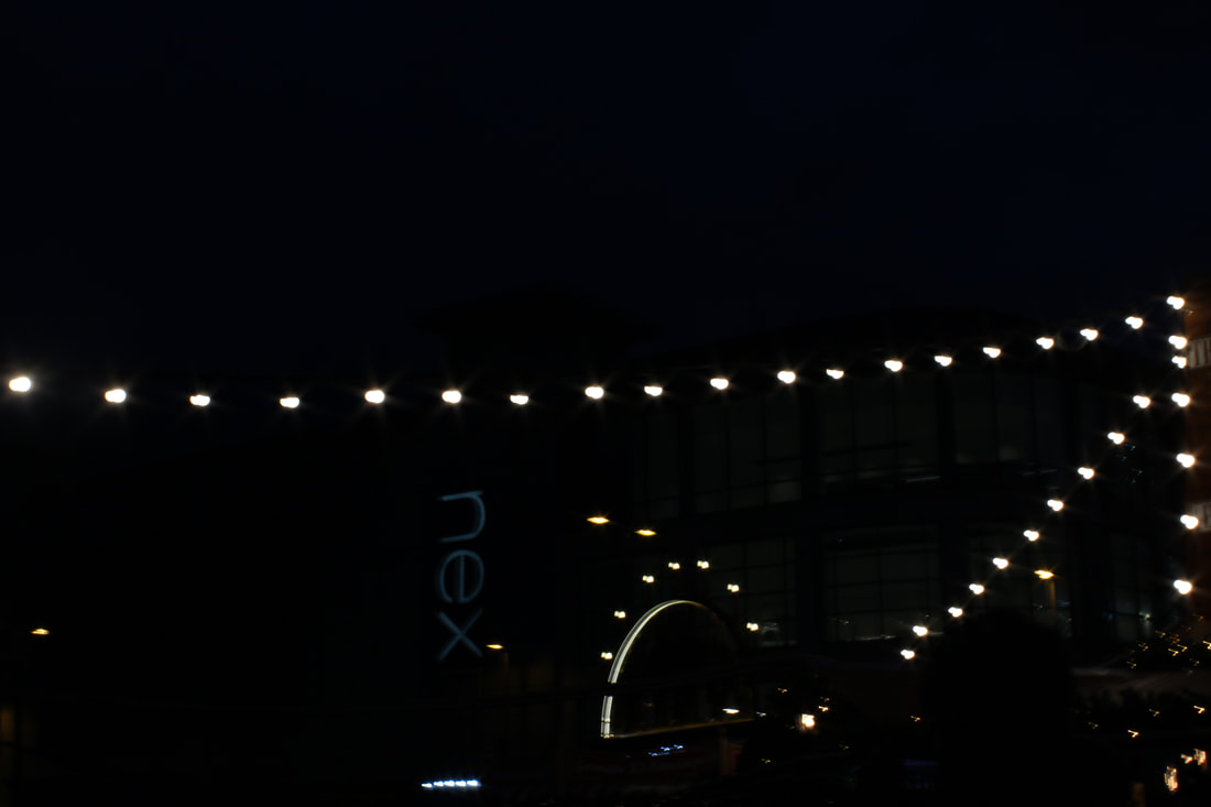
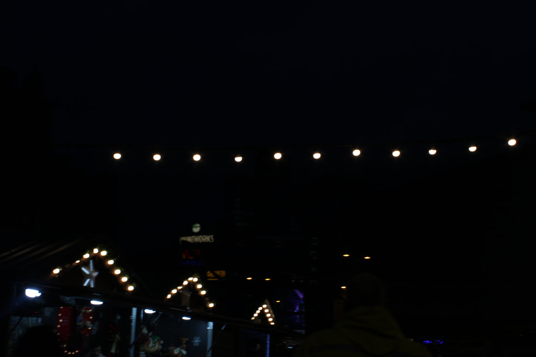
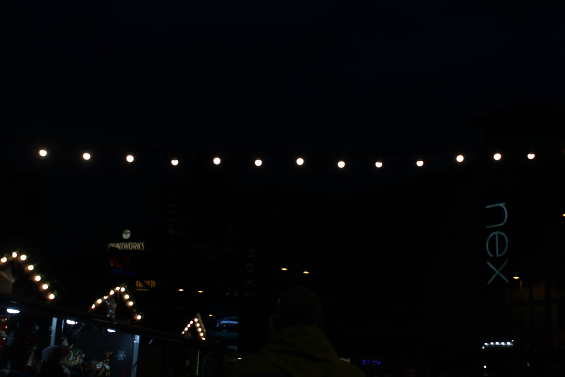
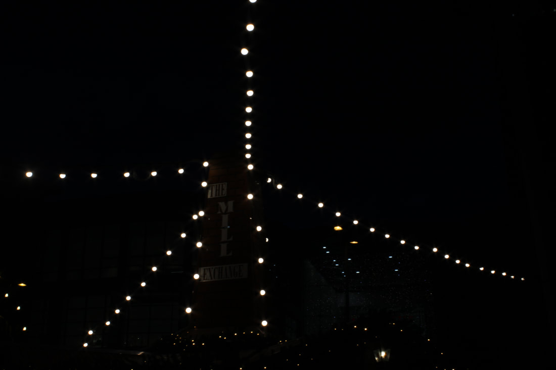
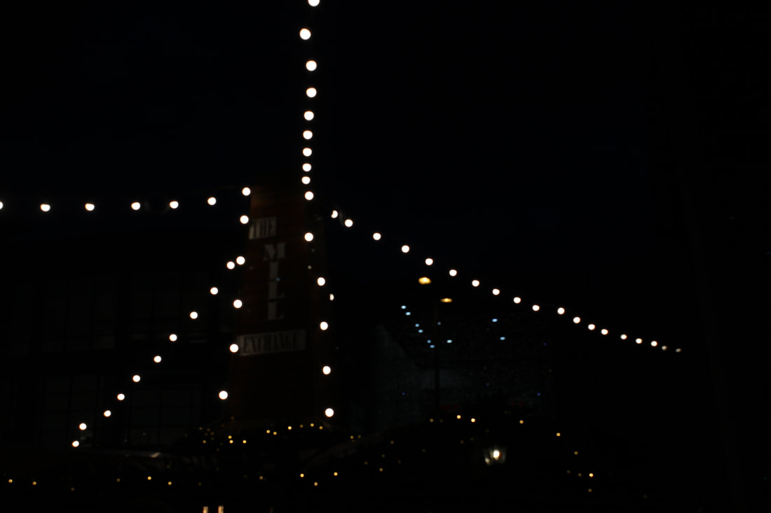
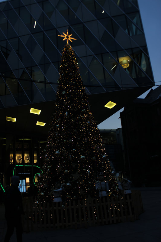
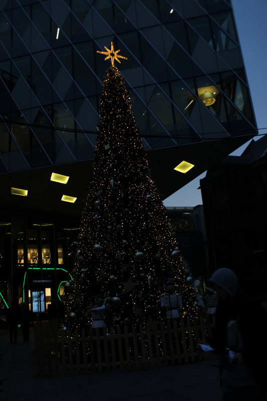
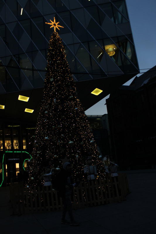
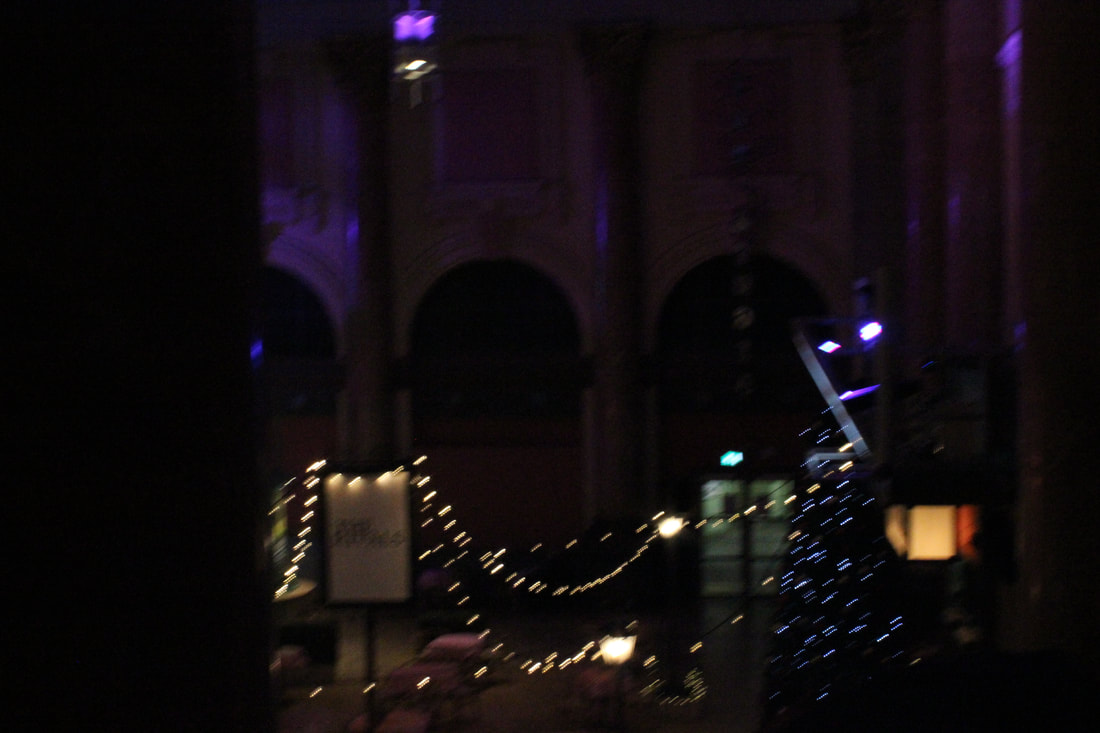
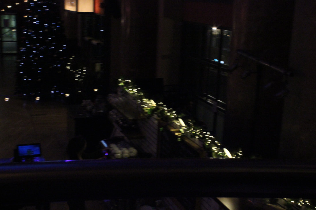
Christmas lights and trees
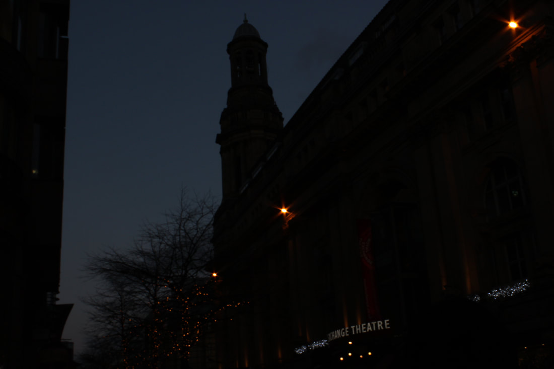
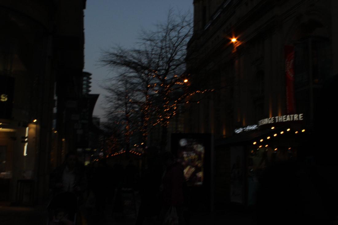
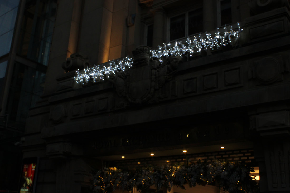
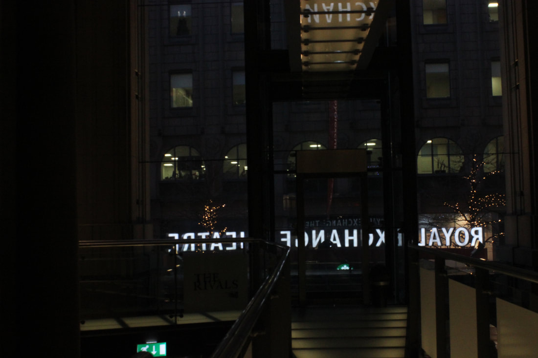
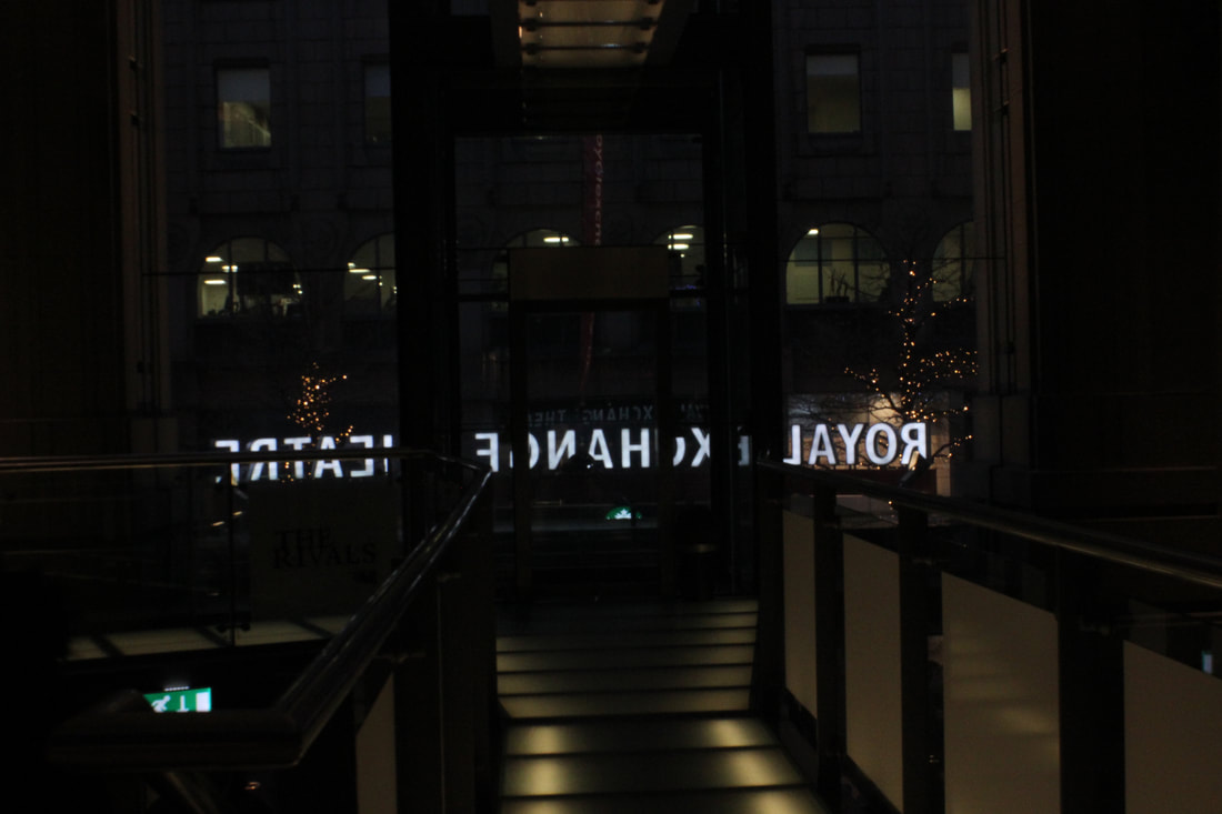
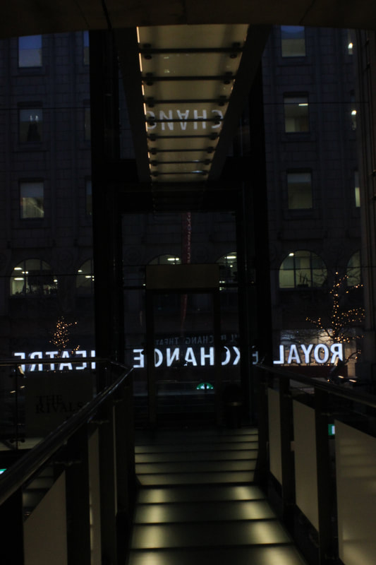
Royal Exchange Theatre
Trams
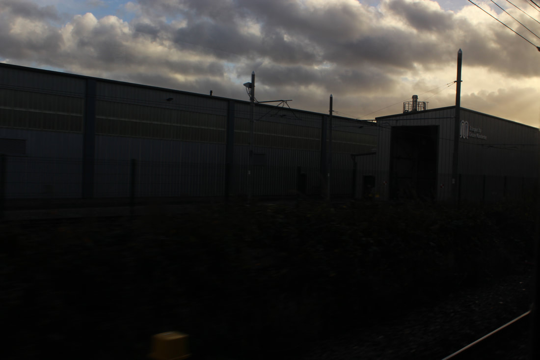
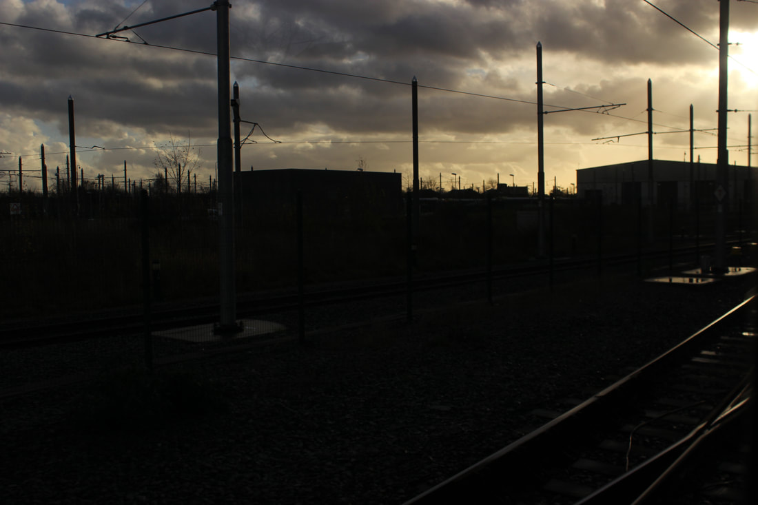
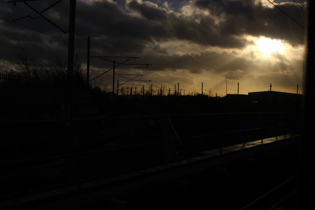
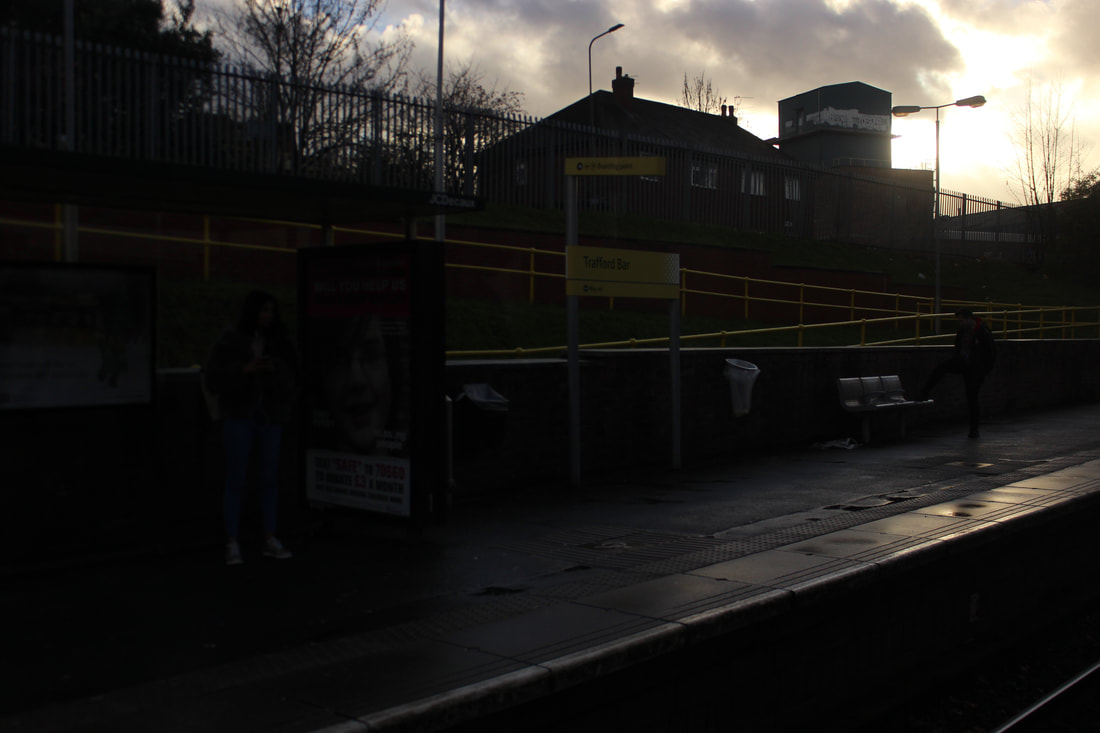
Water
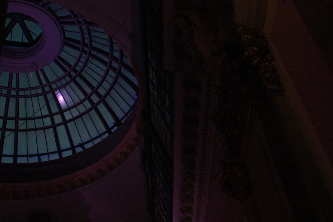
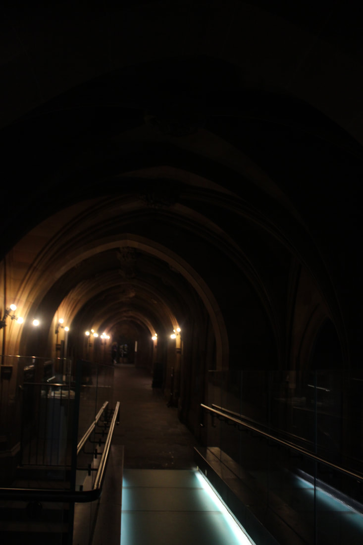
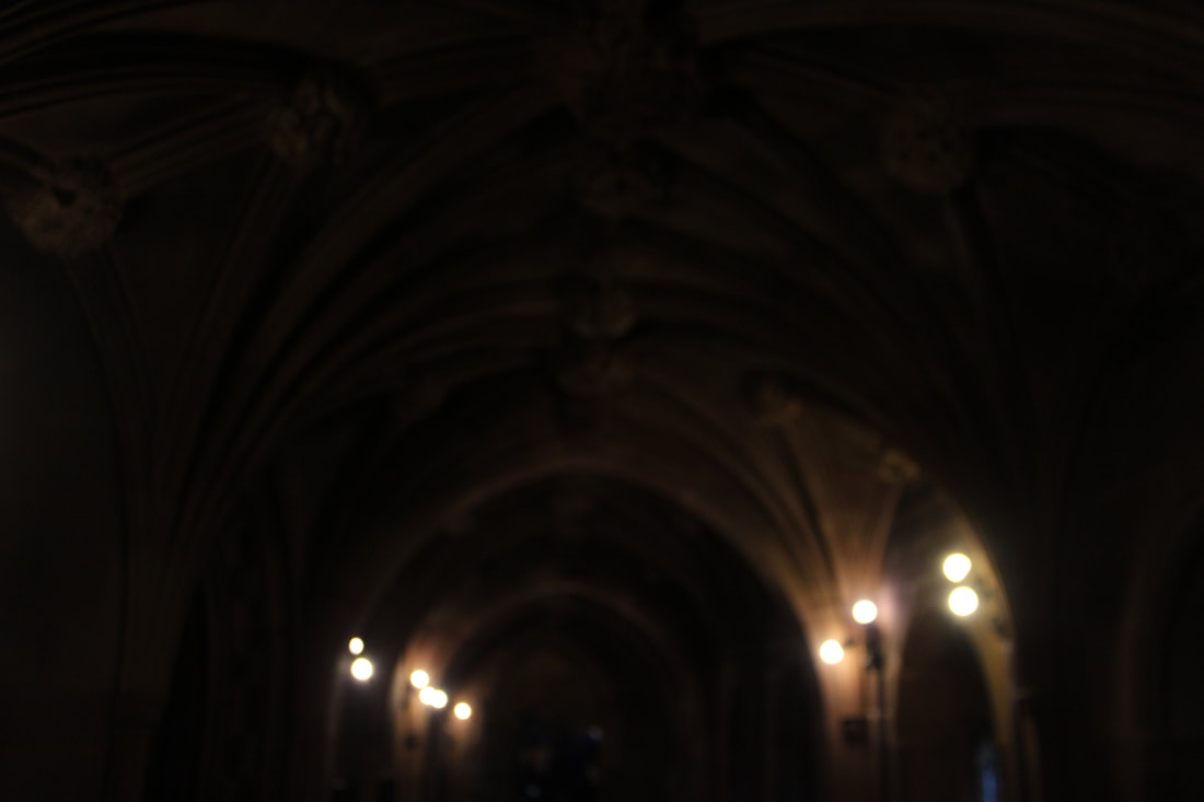
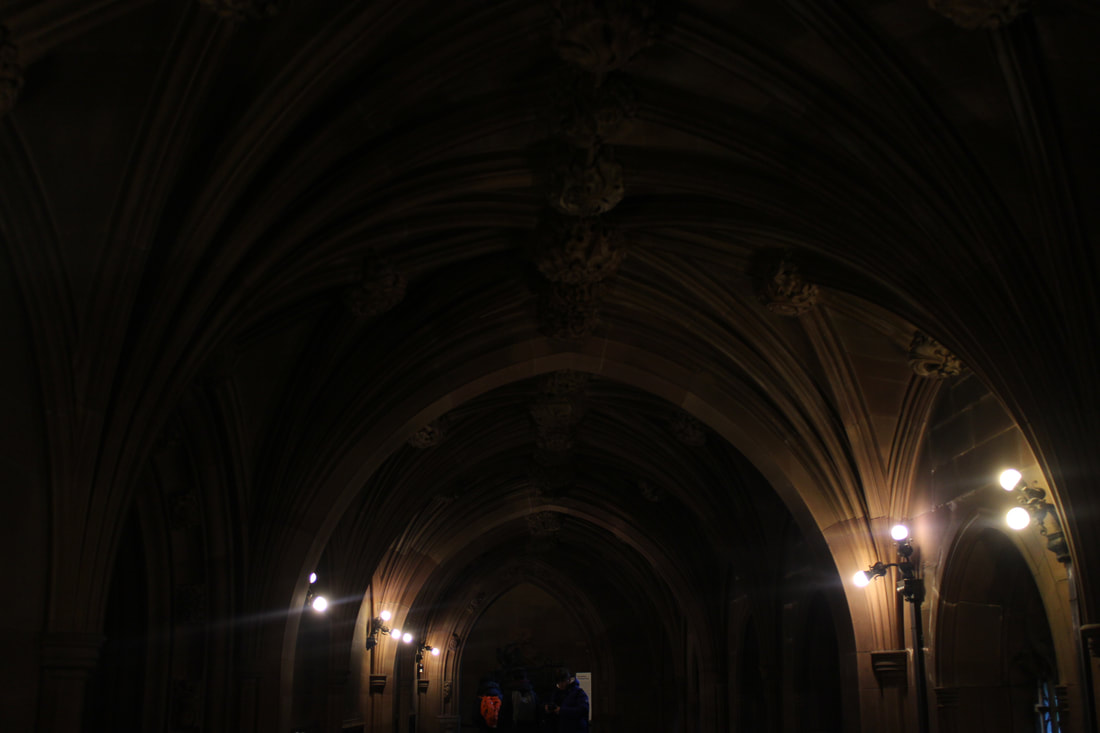
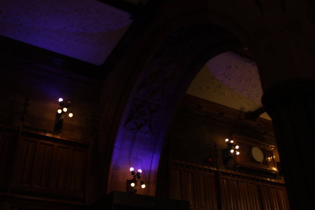
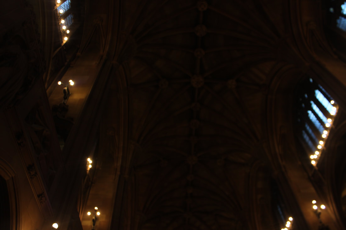
John Rylands Library
Favorite pictures of Manchester


|
|

|

|
|
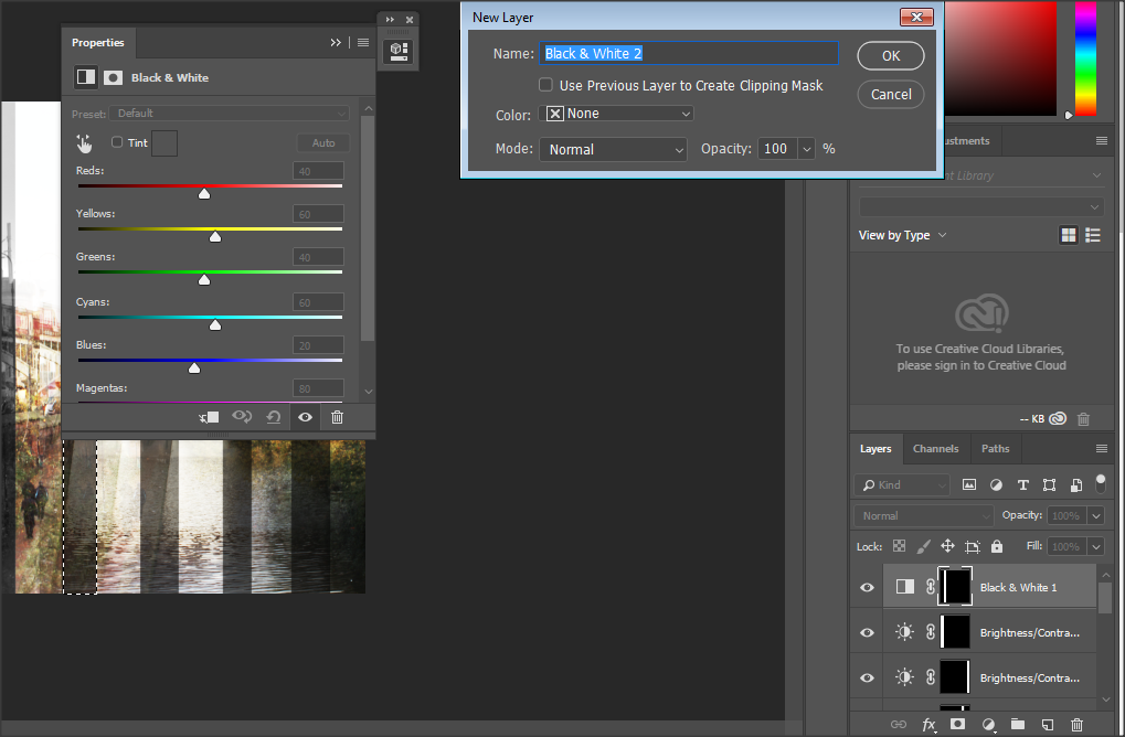
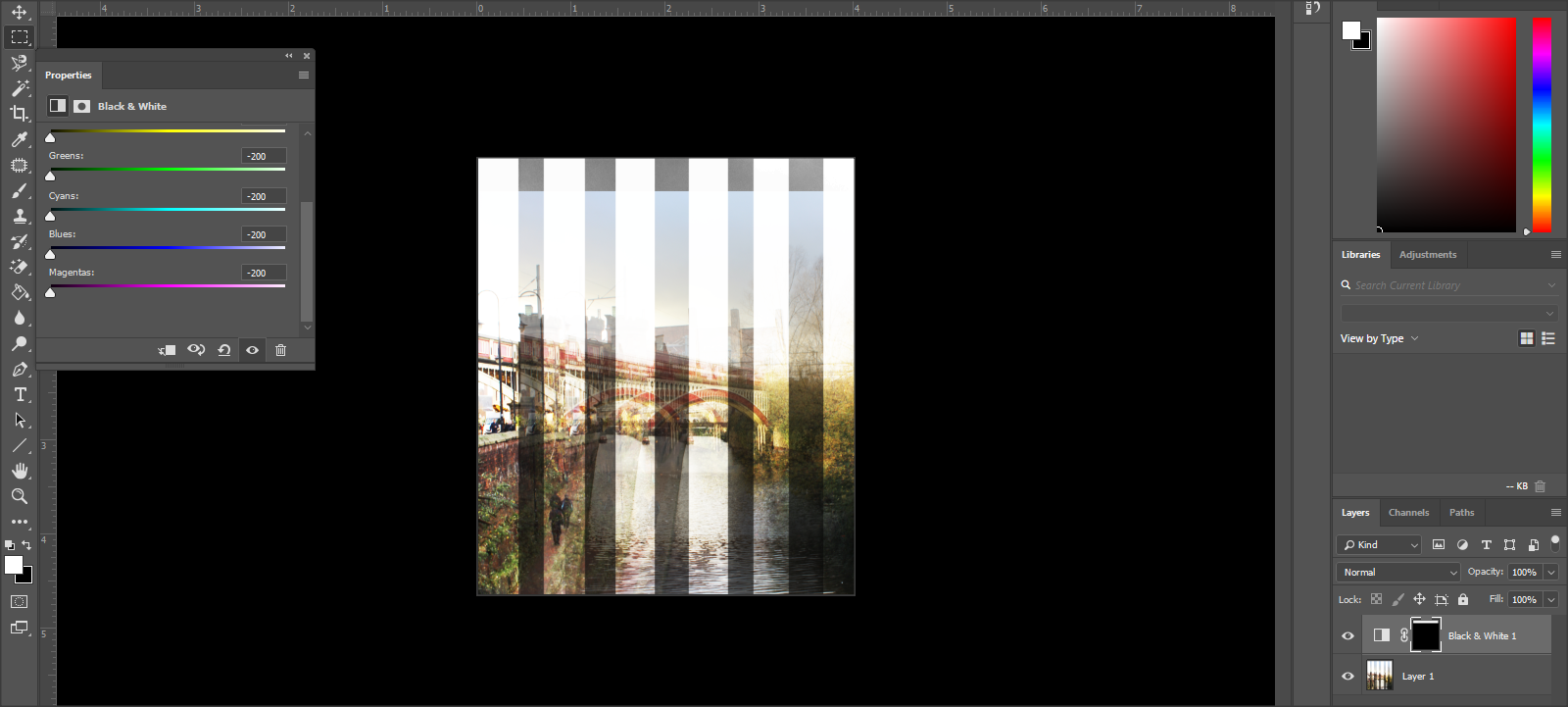
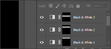
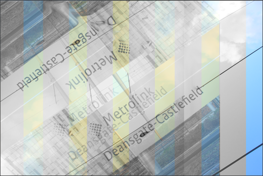
Refining my ideas in Photoshop
|
|

|
|
|

|

|
|
|
Gallery of my final outcomes


Evaluation
My project theme was Landscape. Throughout the project we explored rural and urban landscapes. At the start of the project, we visited Angelsey, Wales which was the rural landscpe. We visited many beaches and lighthouses. Then later on in summer, we went to London to visit the urban landscape. This was contrasting as Anglesey was different and antique compared to London which was modern and busy. After that in winter we went to Manchester which also covered urban landscapes. This was different to London because this was in winter and sunset was pretty early so Manchester was based on lights and the christmas as it was around Christmas.
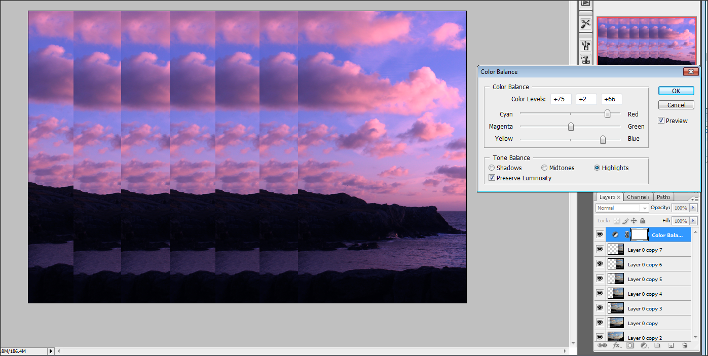
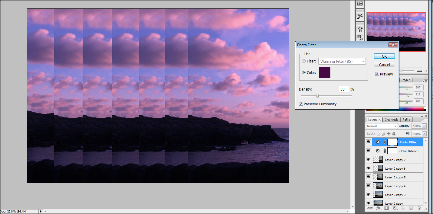
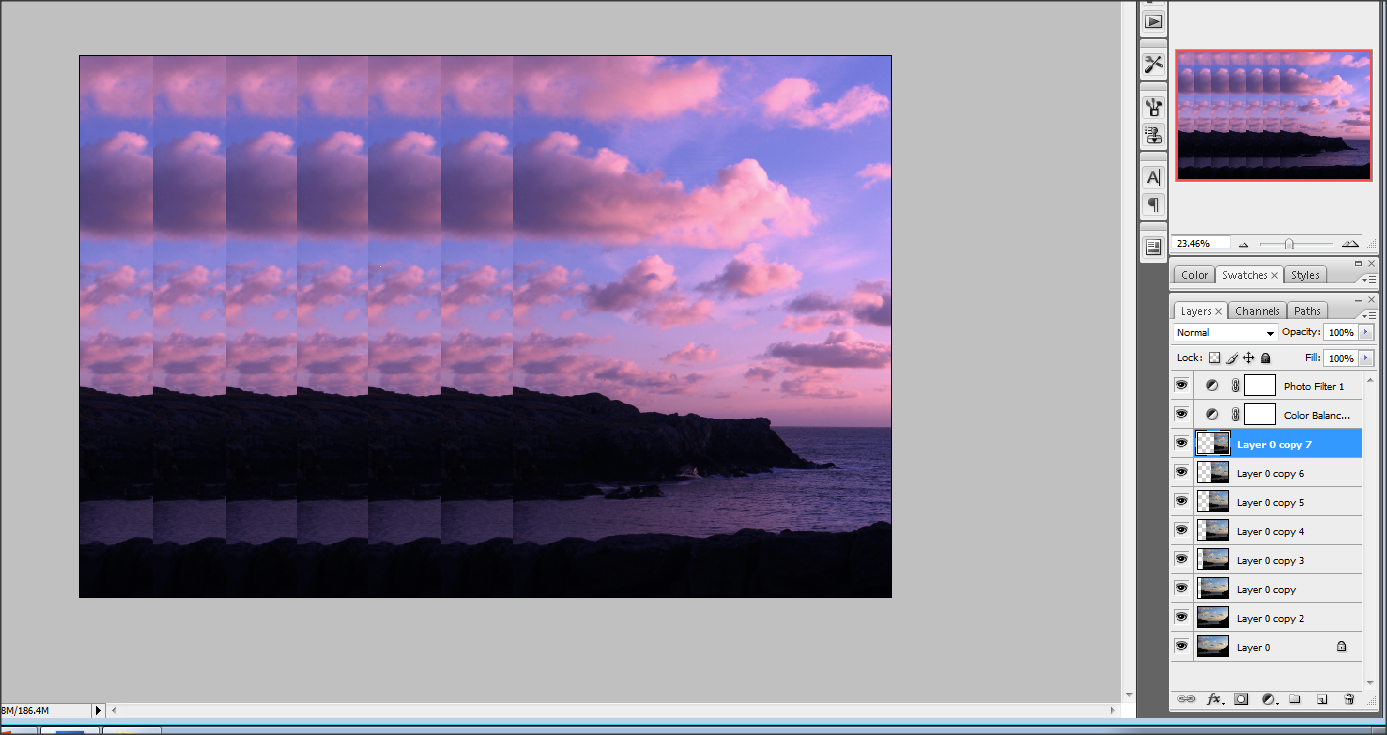
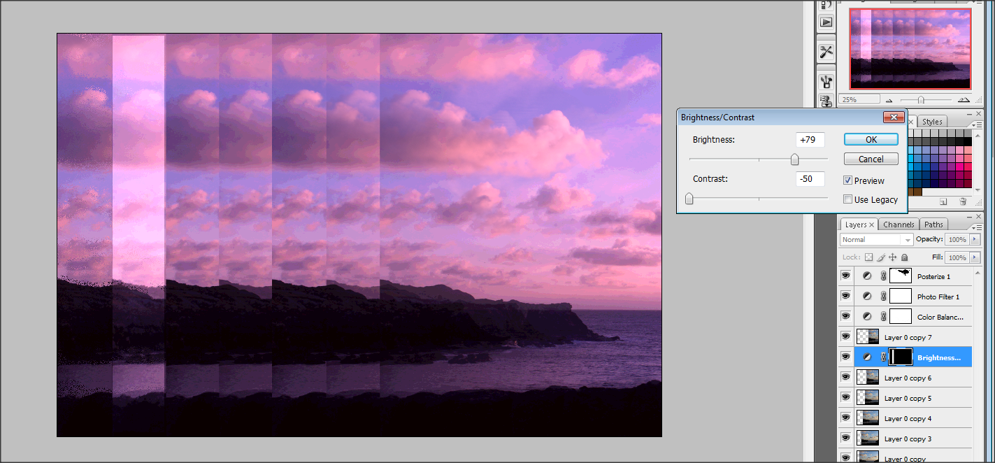
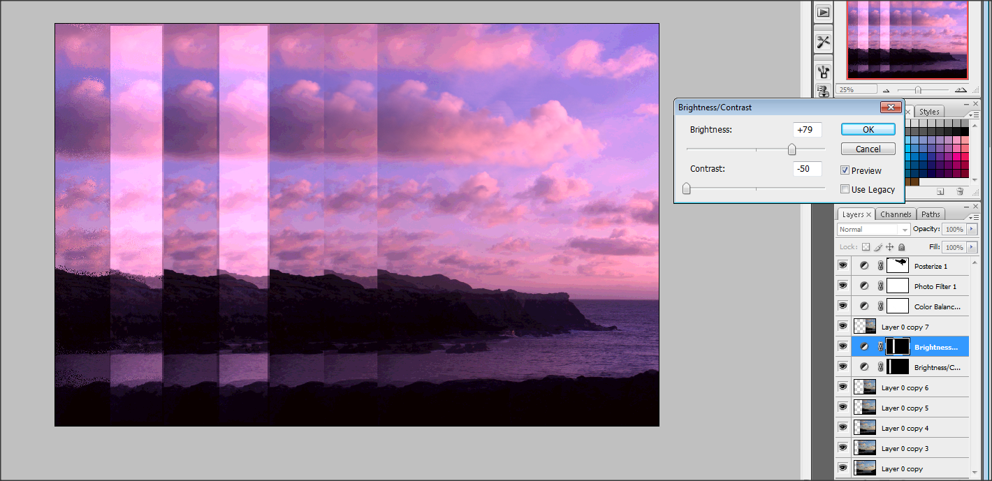
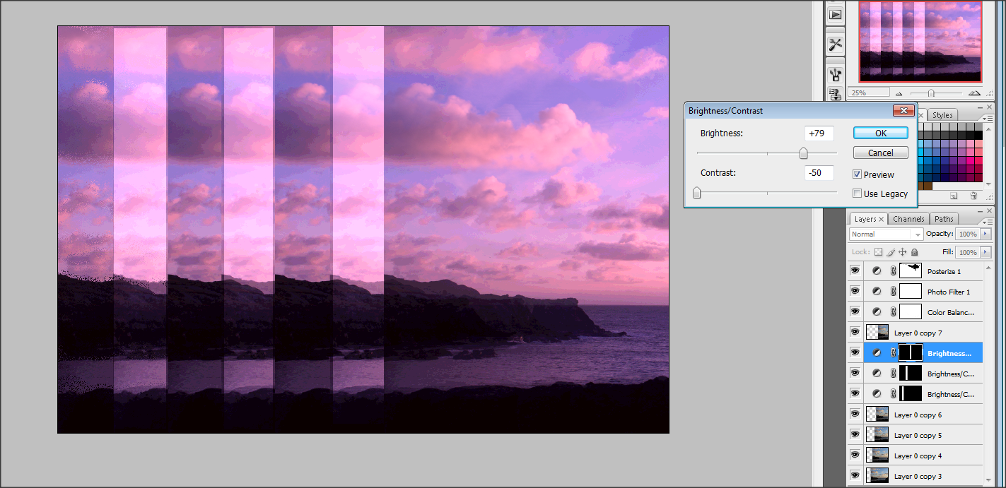
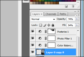
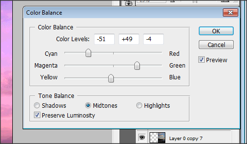
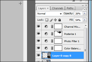
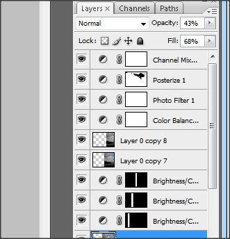
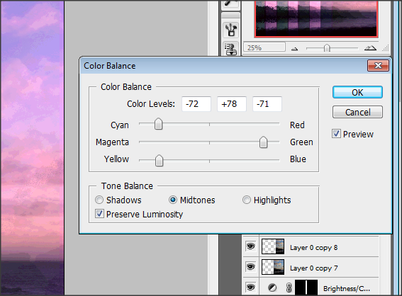
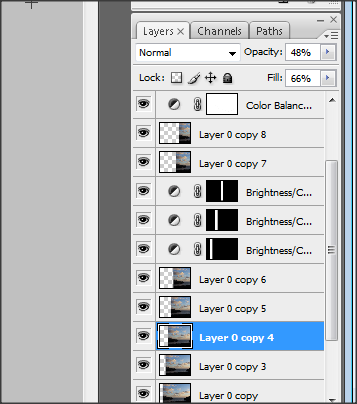
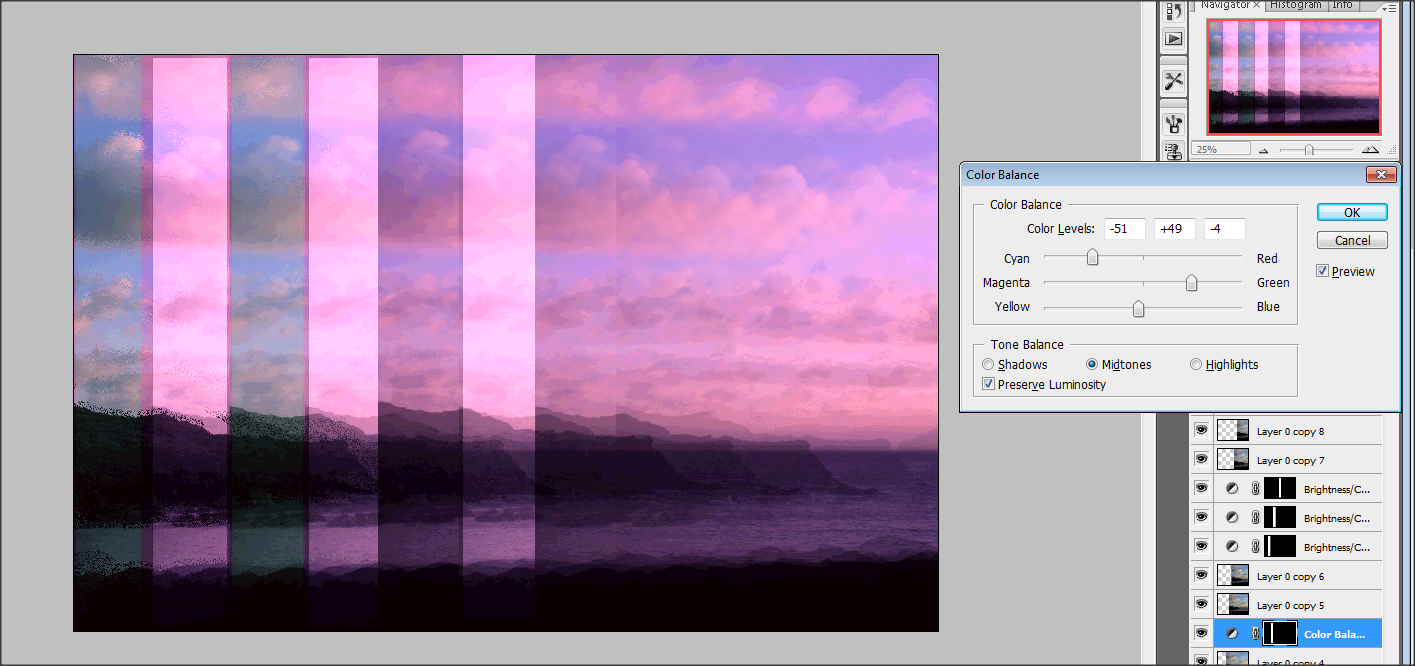
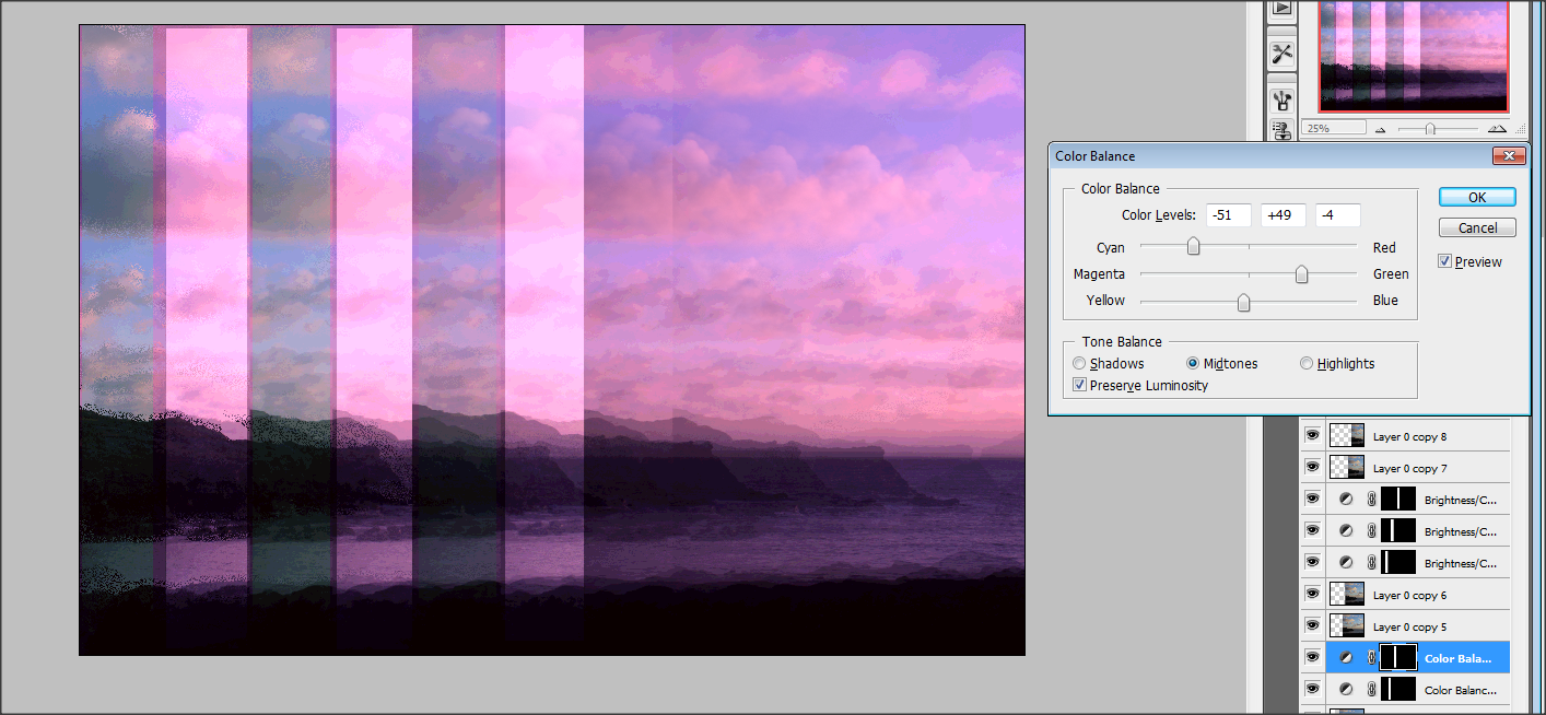
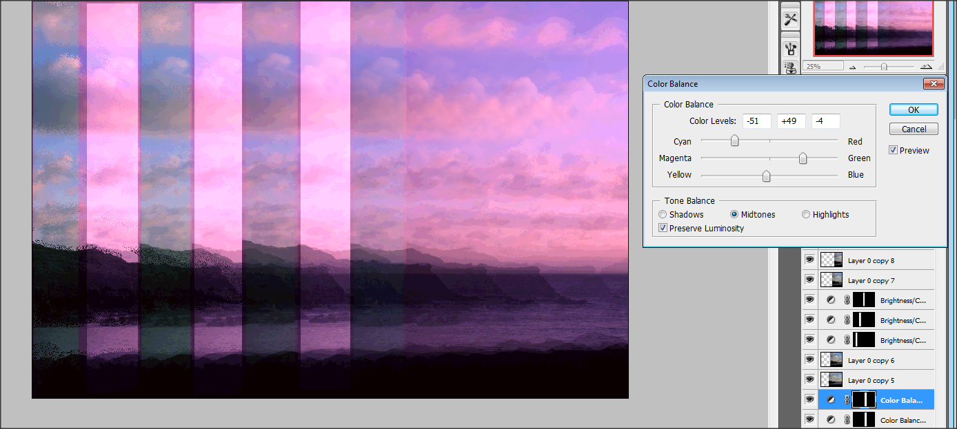
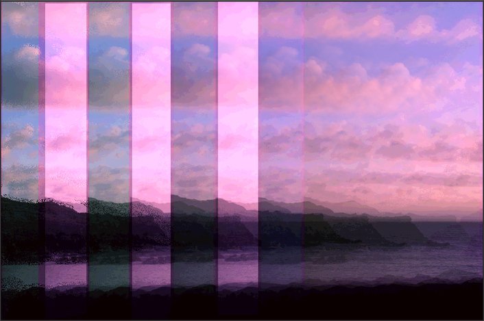
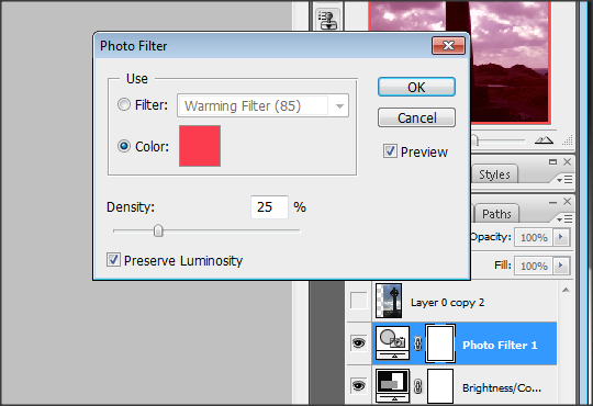
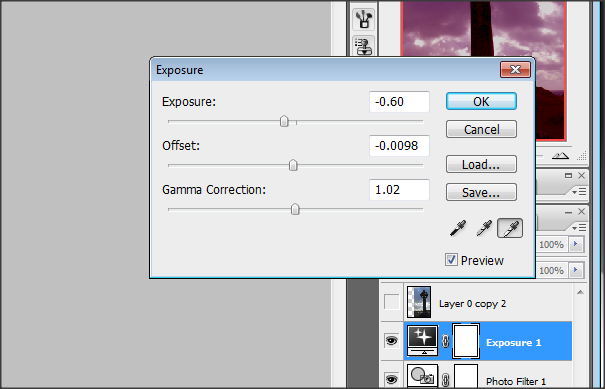
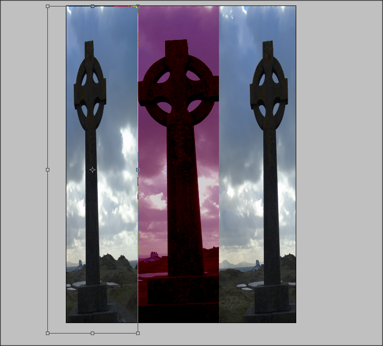
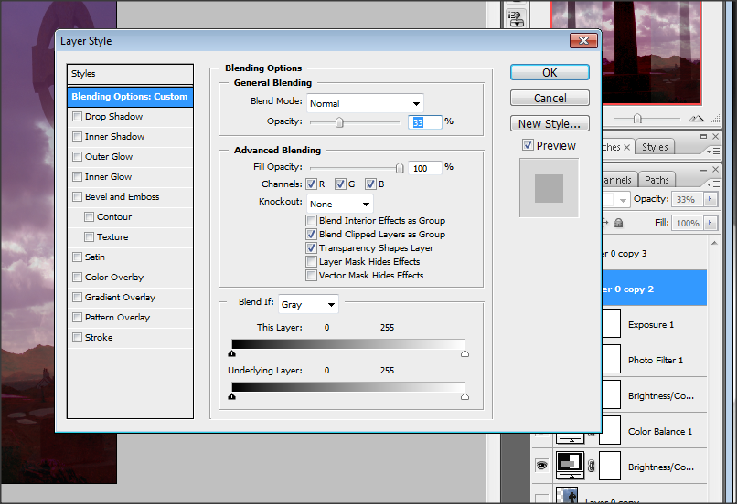
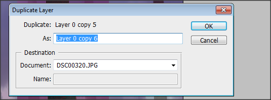
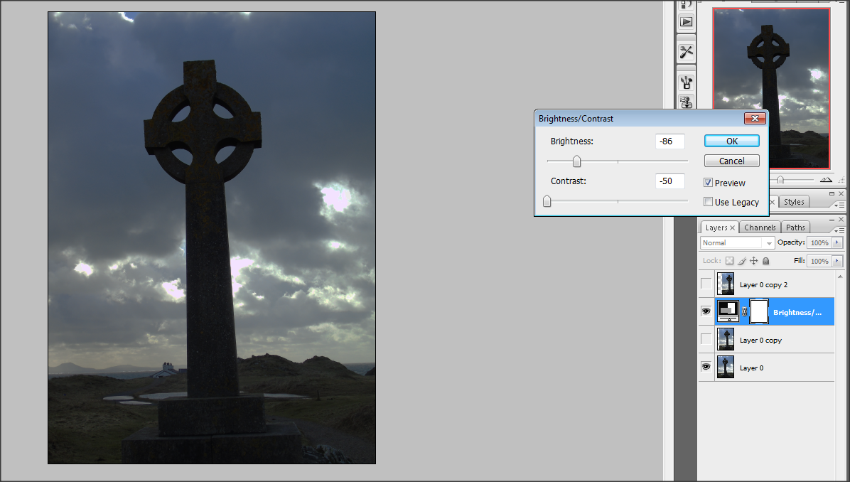
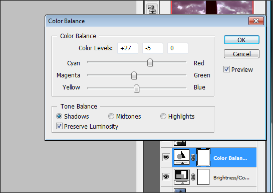
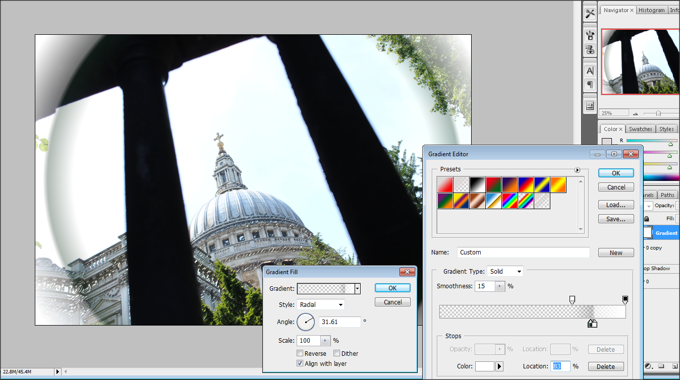
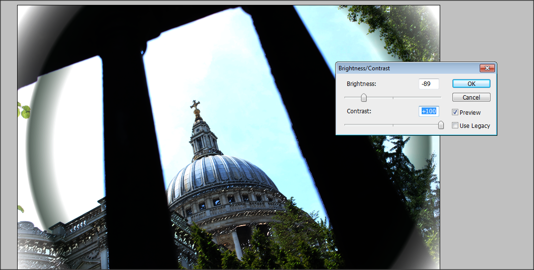
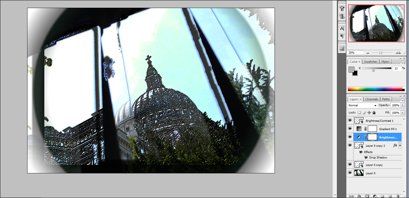
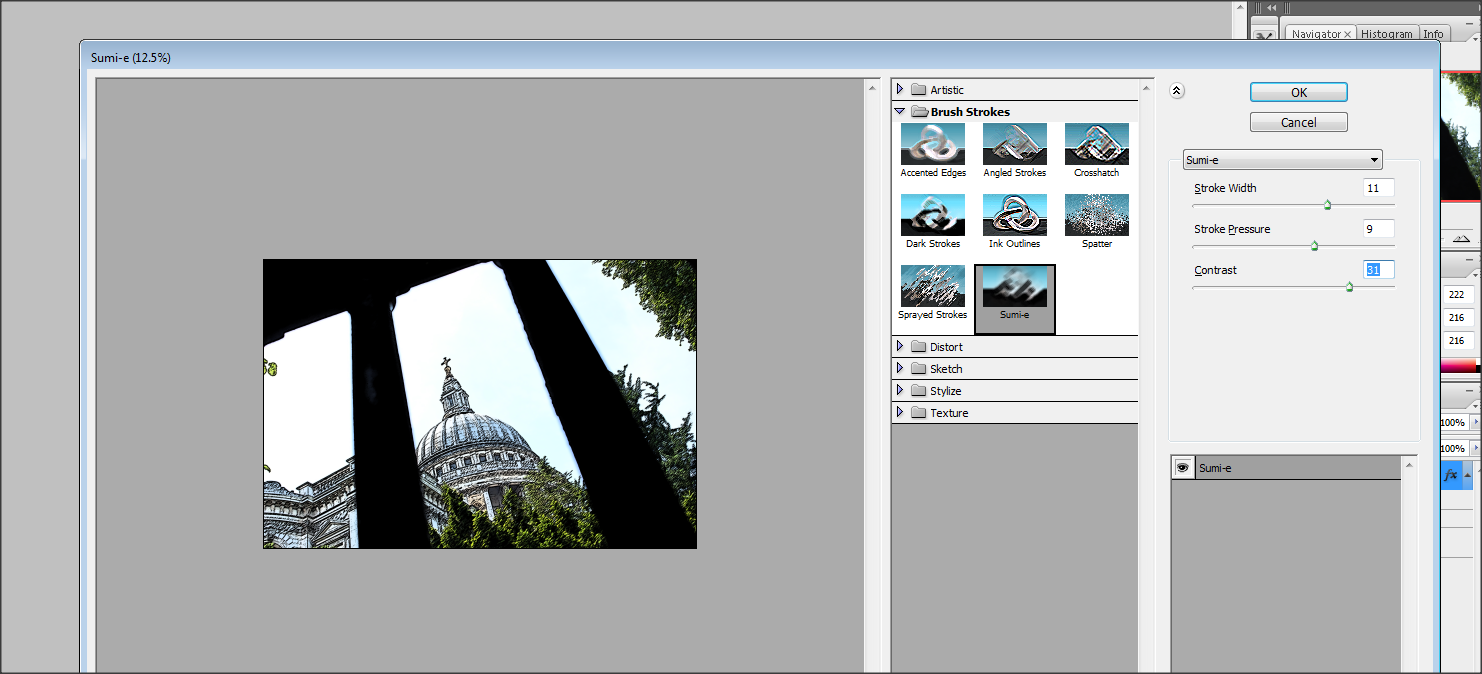
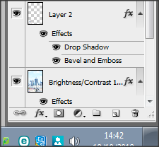
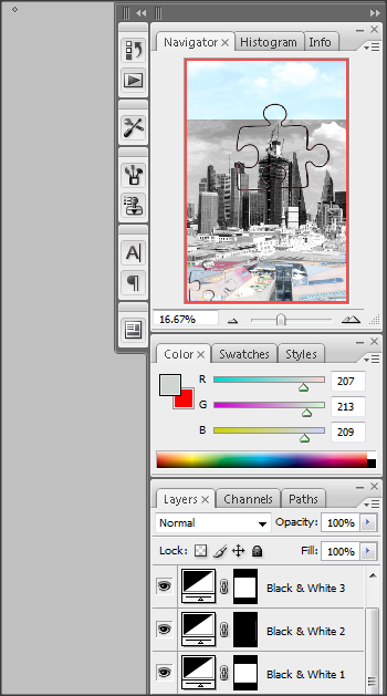
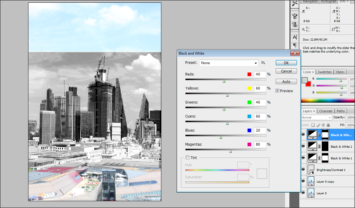
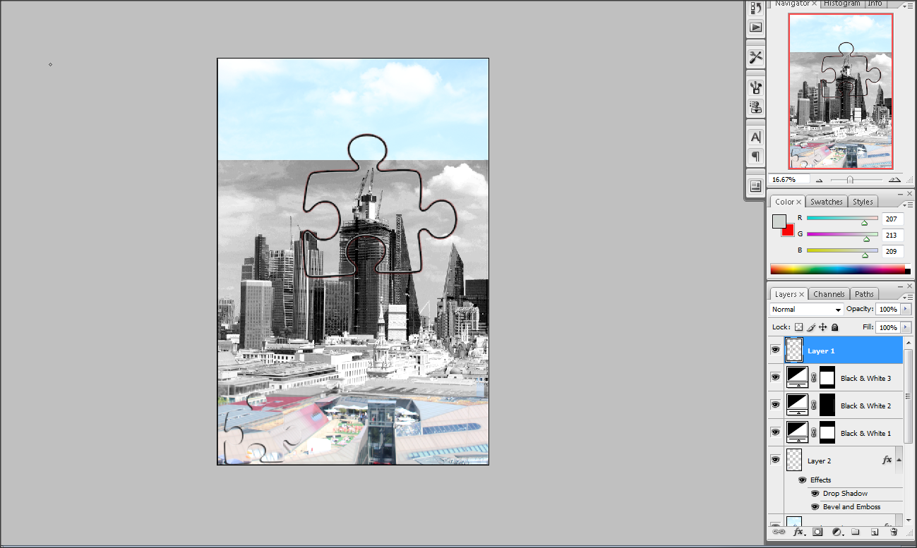
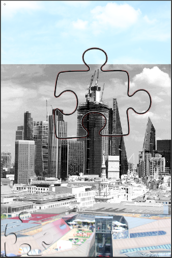
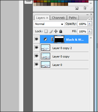
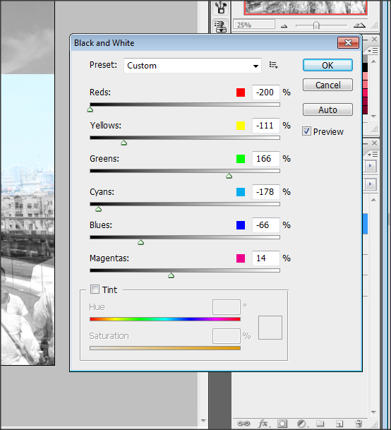
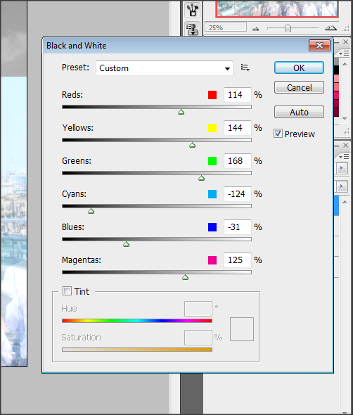
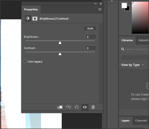
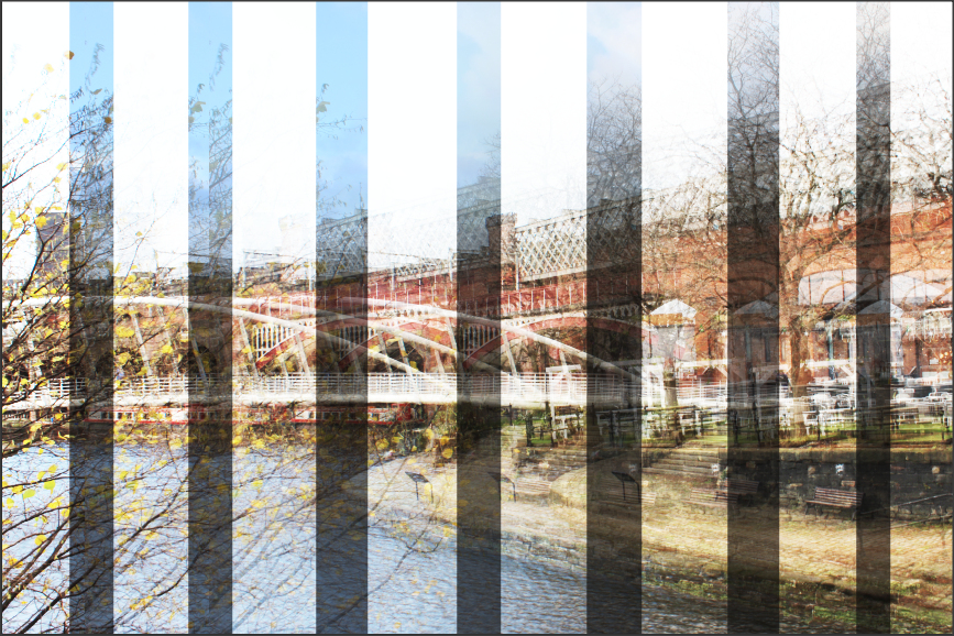
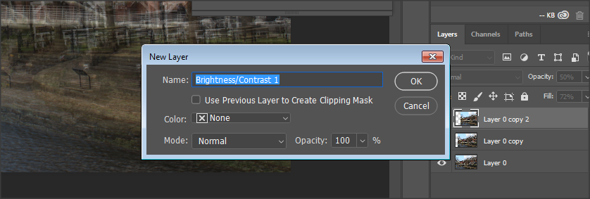
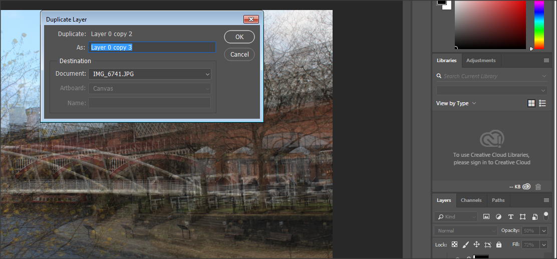
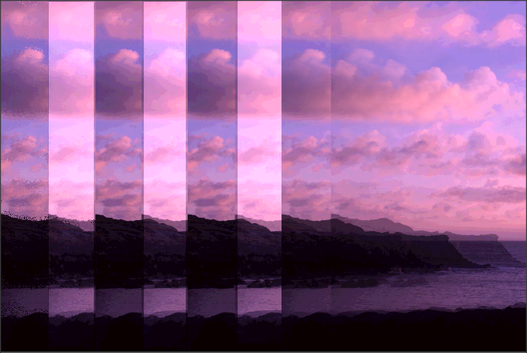
The part I enjoyed over the course was taking the pictures and developing them in Photoshop. I enjoyed this because it made the pictures unique and made it stand out more than the original photo. Refining these in photoshop meant I learnt new skills such as cutting out shapes of the picture but also how to layer a image on top of each other and cutting out sections and instead adding a colour or a filter. Developing my images in Photoshop would boost my grade as it's showing I know how to use photoshop but also AO3.. Previously when I was editing my Anglesey images, I didn't have a clue on what to do. However I watched a few tutorials and it helped me a lot. For my London and Manchester images, I had become more confident in using Photoshop and had developed lots of skills to portray onto my work. However now at the end of my project, I feel very confident with using photoshop.
Throughout the project, the photographers I researched was Simon Kitchin, He also explores landscape photography but also into depth of rural and urban landscape. He inspired me to take amazing pictures that show the beauty of nature and how powerful it is.For some inspiration, I had decided to look at previous students work and tutorials on YouTube. Doing this helped me a lot as I was able to use them on my own work. I did encounter some problems as some of the tutorials I watched didn't quite work due to not having the new version of Photoshop. Over my time in photography, I am very proud of how far I have come from at the start, I didn't have a lot of knowledge on Photoshop. I feel very successful in my work and believe I will achieve a good grade. Also I think Landscapes is my strongest project. On the other hand, I am very happy at what stage I am at and now I am ready to start my exam.
